About the Color Red
Color conveys meanings or evokes feelings in three chief ways. See the resulting associations with red for each trigger.
1. PHYSIOLOGICAL RESPONSE: Red is stimulating, exciting, aggressive, dominant, dynamic, passionate, dangerous.
2. IN NATURE: Red is the color of berries, blossoms, roses and blood. In nature the color is associated with that which is emotionally intense and/or powerful.
3. PSYCHOLOGICAL SYMBOLISM:
- Western:danger, warning
- Eastern: good fortune
- India: wealth, opulence and power
- South Africa: color of mourning
- China: vitality, happiness, long life
- Russia: associated with Communism
- Hebrew: sacrifice, sin
- Christian: passion, love
* SOURCE: Cutural Color
Doris Sander says, “Red is a vibrant color and easy to work with as it fits many themes well. For this page I grabbed several papers and embellishments in an intense shade of red to showcase photos of my three-year-old son partying at my niece’s wedding reception. I love the way the strong play of red paired with the variety of eclectic prints adds energy to the page.”
“These photos were taken at night, so there was a lot of blackness in the background, especially on the second photo. I decided to lighten it up by covering the blackness with red dotted washi tape to highlight and silhouette my son. I am delighted with the results and can’t wait to try it again.
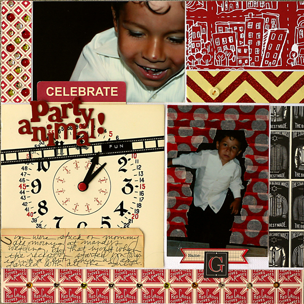
Party Animal by Doris Sander | Supplies: cardstock – Bazzill, patterned paper – Jenni Bowlin Studio, Studio Calico, Crate Paper, chipboard alphabet – Crate Paper, washi tape – Queen & Co., stickers – Jenni Bowlin Studio, Pebbles Inc., paper clip – Tim Holtz, journaling spot – Jenni Bowlin Studio, brad – American Crafts, clock hands, clock, ledger paper – vintage, other – sequins
Barb Brookbank says, “This layout is about how sweet and funny my little grandson is and how much I love him. I used red to match the stripes in his shirt. I also felt it was a perfect compliment to the brown tones and these photos were taken at Christmas so red just seemed right.”
Vicki Walters says, “I used Photoshop to add a sepia filter to this layout and then selectively color the red team’s shirts and hats to draw attention to them. The color red makes me think of sports!”

Baseball by Vicki Walters | Supplies: Supplies: Anna Aspnes-FotoBoost Layered Templates no 2, MonoBlendz Paperie Cayenne no 1 Paperie, ArtsyClocks no 4, Stitched by Anna Borders Black no 1 and Warm Glows no 1; Pattie Knox-Text Bytes Shaped Text Template no 17; font Old Stamper.
Kiki Kougioumtzi says, “This is a layout about me feeling like been a queen in our home. When I have a wish my loved ones turn it into their command. I chose red because of its associating with love and to draw the eye to may focal point cluster.”
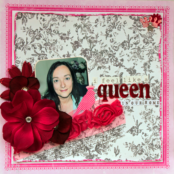
Queen in our home by Kiki Kougioumtzi | Supplies:Patterned paper:Echo Park;Alphas:American Crafts,Echo Park,Authentique;Stamps:Teresa Collins;Flowers:Prima,Heidi Swapp,unknown;Trim:American Crafts;Other:Ink Tsukineko,buttons,charm,brads.
Michelle Houghton says, “This layout is about a sunny afternoon on the beach with my whole family. The main topic of my journaling is the red umbrella we were squished under so I wanted to include red on my page. Red patterned paper defines an umbrella shape running diagonally down the page along with the photos.”
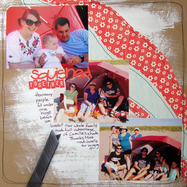
Squished Together by Michelle Houghton | Cardstock – Kraft, patterned paper – My Minds Eye, ribbon – Offray, letters – October Afternoon and Pink Paisley, ink – Sharpie, other – Gesso and thread
Sue Althouse says, “This page is about recent updates to my scrap room. Since the Ohio State accent wall in the photo is hard to ignore, I used this color in a dramatic fashion. The red in the photo and the red chevron patterned paper catch and draw the eye into the focal point. The banners and embellishments highlight the title, then lead the eye down to the journaling strips, creating a diagonal flow.
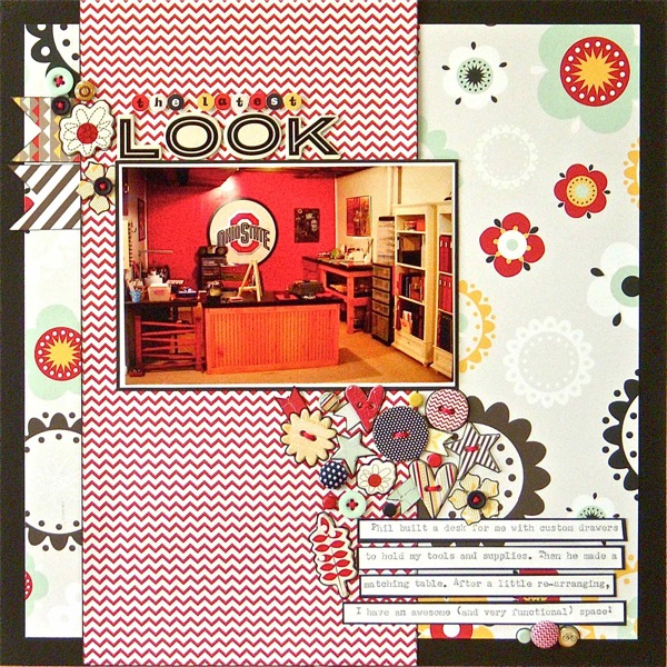
The Latest Look by Sue Althouse | Supplies: Cardstock: Bazzill; Patterned Paper, Brads, Buttons, Chipboard, Small Letters: Fancy Pants; Alphabets: American Crafts; Ink: Jenni Bowlin; Floss: We Are Memory Keepers; Flower Punch: Tonic Studios
Ashley Horton says, “Our local fire station held an open house, and we took the kids to join in the activities. I added accents in red (the color of fire trucks) to create flow throughout the page.”
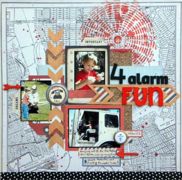
4 Alarm Fun by Ashley Horton | Supplies – Patterned Paper: Crate Paper; Mistery Huey’s Spray Mist, Mister Huey’s Circl Graph Mask & Wood Veneers: Studio Calico; Wood Alphas: Pink Paislee; Thickers: American Crafts; Stickers: October Afternoon & Echo Park; Smash Tape: K&Company; Flair Button: A Flair for Buttons
Amy Kingsford says, “I’ve used pops of red on an otherwise neutral page to create a sense of drama and intensity that matches that of my sister-in-law’s love for her fiance. The best thing about the color red is a little bit goes a long way!”
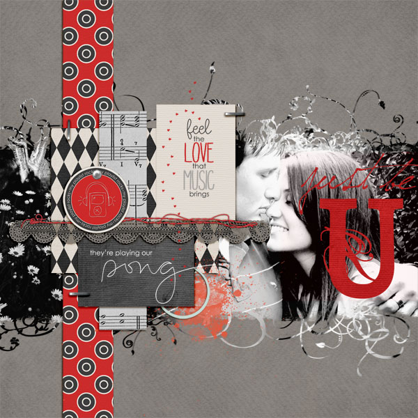
They’re Playing Our Song by Amy Kingsford | Supplies: From My Playlist by Biograffiti and Template by Kitty Designs.
Vicki Walters used red with blue to support her nautical theme. The red guides the eye around the page.
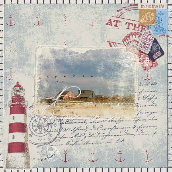
This is the Life by Vicki Walters | Supplies: Wild Blueberry Designs- Hatteras Kit; Anna Aspnes-FotoBlendz Clipping Masks no 7; Font 215000E and Blue Type
[current]


