Patchwork’s history
Patchwork, the piecing of small shapes of fabric into one large piece, has a long history.
The earliest examples came from Egyptian tombs. In the early Middle Ages, layers of quilted fabric were used in armour to keep the soldiers both warm and protected.
Fourteenth century weather changes in Western Europe brought colder winters and people filled patchwork covers with anything they could make work, including moss, feathers, lambs wool and even grass. The pieced whole could be made from leftovers and small scraps.
The use of patchwork came initially out of necessity and thrift, but it also came to be admired for its craft. Patchwork in the Great Depression was a way to recycle worn clothing into warm quilts since even very small and worn pieces of material are used.
Recent patchwork trends in fashion and home decor
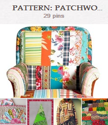
This fall, designers of furniture, home decor, and, accesories and fashion have been designing with a patchwork mix of fabrics and patterns. The result is a homespun and handcrafted look, a look that runs counter to fast fashion and mass-produced goods. It lets the crafter make a personal and original piece.
We’ve pinned fashion and decor examples of patchwork on the Get It Scrapped Pinterest boards.
Creating patchwork pieces
The larger design of a patchwork piece is often built on repeating patterns of basic geometric shapes that are easy to cut and put together. If you’re looking for quick inspiration, check out some of these quilt pattern Pinterest boards.
Of the new decor and fashion applications of patchwork, Brian Patrick Flynn says, “There needs to be an element of randomness to doing patchwork, but a bit of cohesiveness, too. Perhaps a consistent palette that runs throughout the piece. But, in order for that palette to seem effortless, it needs to be applied in a somewhat imperfect manner, mismatched with a keen eye if you will.”
Farima Alavi of HGTV says, “I absolutely LOVE patchwork. I think it takes a keen sense of style to put together crazy patterns and colors and actually make it work harmoniously. Anthropologie does that so well, which is why it’s one of my favorite stores.”
Patchwork on the scrapbook page
Amanda Jones says, “This page was created to document one of the beautiful roses in my parents’ garden. I created my patchwork design with stencils and glimmer mists. I masked off each square and filled with a different, fresh colour. The colors I chose for my patchwork blocks echo the bright floral theme, and I made sure to include a floral mask in the mix.”
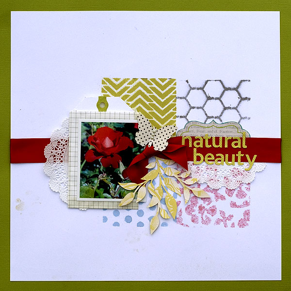
Natural Beauty by Amanda Jones | Supplies:
Masks – Jenni Bowlin Studio, The Crafter’s Workshop; Printable butterfly – Jenni Bowlin Studio; Glimmer Mist – Tattered Angels; Patterned paper – Cosmo Cricket; Alpha stickers – Authentique Paper; Label – Ruby Rock-it; Cardstock – Bazzill Basics; Other: Paper bag, doily, ribbon, Silhouette Cameo, adhesive pearls, tag.
Christy Strickler says, “Our newly rescued, 4-week-old kitten found comfort on his first day in our home with a stuffed animal. I was inspired by plaid patchwork shorts and chose a few plaid patterns and mimicked the squares of plaid I saw in the shorts.”
“I limited the number of patterns and chose both warm and cool tones. Patchwork always reminds me of quilts. Since the kitten is snuggling up to sleep, I wanted to portray the warm comfort of a quilt.”
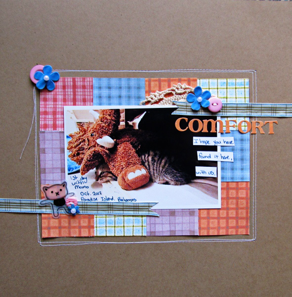
Comfort by Christy Strickler Supplies| Patterned Paper: K and Company; Alphas,Button,Ribbon: Basic Grey; Flowers, Sheer Cat: Maya Road: Other: kraft cardstock, pearls, doily
Deborah Wagner says, “This is the only baby photo I have of my youngest son, and I used patchwork to to resemble a baby blanket.”
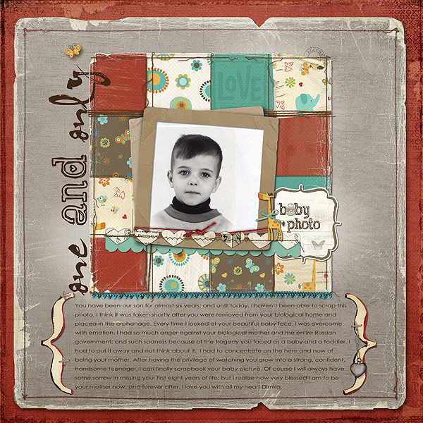
One and Only by Deborah Wagner. Supplies: Katie Pertiet – Little Layette Kit, Stacked Photo Clusters No. 2, Forever Layered Template, Totally Tied Up, In Stitches Hearts No.1, On the Go Kit; Anna Aspnes – Painted MultiFoto Single Layered Template No.1, Love From Russia Kit, Distressed Edge Overlays No.8, Torn N Tattered Scalloped Paper Strips, Torn N Tattered Paper Templates No.2, Foto Glows No.3, Passionaire Brush Set, Stitched by Anna Red No.1, Stitched by Anna White No.2; Lynn Grieveson – Antiquities Paper Pack, Malabar Kit; Ali Edwards – Love Boxes Brushes & Stamps; Cassie Jones – Weaving Words, Bending Shadows
Vicki Walters says, I used colorful papers and Christmas images to make a patchwork design for a card. I stitched it all together and adding a few lines from The Night Before Christmas to finish it.”
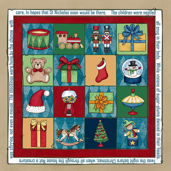
Christmas Quilt by Vicki Walters | Supplies: Anna Aspnes-Fluffy Stuff Pet Paperie, Light Textured Neutrals Paperie no 1, MonoBlendz Confiture no 1 Paperie and XmasWhites no 1 MonoBlendz and Stitched by Anna Borders no 1 recolored; Kate Hadfield Designs-Under the Tree
Brenda Becknell says, “I seem to be collecting a lot of random photos of my little grandson, so I try to use different themes and design approaches when I scrapbook them.
“To make my patchwork ‘quilt,’ I cut 2″ squares from four different patterned papers and adhered them to white cardstock, alternating the sequence of the squares. I used a machine zig zag stitch across each row and around the outside edges of the patchwork design. I used clear stickers to fill the squares and also act as my title and journaling.”
“By using cool pastel/medium tone colors for the squares and matting the photo and the white cardstock in a matching medium blue, it helps convey the look of a baby quilt for a sweet little boy!”

A Baby Brings…..by Brenda Becknell | Supplies: Cardstock: Michaels; Patterned Paper: Provocraft, SEI, DCWV; Floss: DMC; Buttons: JoAnn’s
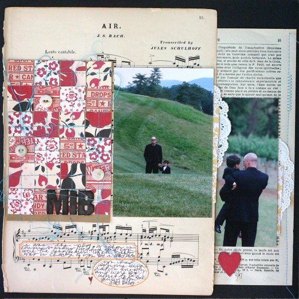
Doris Sander’s Wedding Page “Air” is a mix of emphemera, vintage prints and photos. A patchwork rectangle of vintage prints echoes and balances the size and shape of the larger photo on her page.
Audrey Tan says, “My photos are Scout-themed, and the patchwork here symbolically represents the badges that my son has to obtain and what I have to sew on his Scout uniform. In the photos, the boys were being taught how to brew a cup of tea using a Tangria, a piece of camping equipment.”
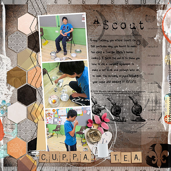
Cuppa Tea by Audrey Tan | Supplies: Title: Jen Maddocks Designs: Secret Indulgences, Smears neutral, Tooth Fairy Dreams; Anna Aspnes: Scout Word Art No1, Scouts Word Art And Transfers No2, Foto Wallets No3; Julianna Kniepp Designs: Comfy Home, Hello Beautiful; Crystal Livesay: Hex Shape V2
Mye de Leon: Mists; Font: Tangie AJF Oysters
Michelle Houghton says, “This layout is about my family at a summer vacation gathering. I used a traditional patchwork pattern called “flower garden” along the right side of my page using patterned papers in hexagonal shapes. I used a patchwork pattern to support the feel of family on my page. Quilts make me think of warmth and all the individual pieces sewn together just like our family. The ‘flower garden’ pattern that I used is one that I have on a heirloom quilt from my Dad’s side of my family.”
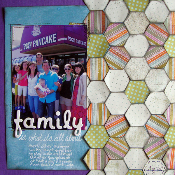
Family by Michelle Houghton | Supplies: cardstock – Bazzill Basics, patterned papers – Basic Grey, letters – Creative Cafe, ink – Sharpie and Tsukineko, other – thread
Amy Kingsford says, “This chevron-patterned patchwork foundation was a great way to mix fun patterns and colors on a page about my son’s favorite pasttime. I chose my papers all from the one kit. The patchwork pattern also loosely echos the bold stripes on my son’s hoodie. I think the stitching reinforces these patterns as a collection and adds to the ‘patchwork effect’ as well.”
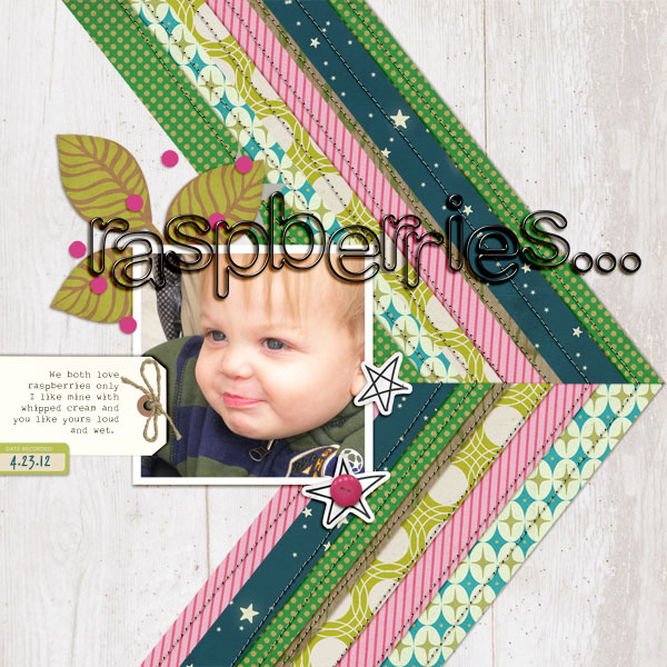
Raspberries by Amy Kingsford | Supplies: Sahlin Studio: Summer Camp, Black Rimmed Alpha, A Spring Day; Pink Trike Designs: All Stitched Up Template.
Ashley Horton says, “Fall is my favorite season of the year and I love driving around and snapping photos that capture the season. To create the patchwork look at the bottom of my page, I cut rectangles 1″ x 2″. I placed the first rectangle on the page at a diagonal angle and worked from there, adding all of the other pieces for the pattern. I left the rectangles unfilled, because I wanted the patterned papers to be visible, but I did add some stitching around several of the shapes. When I think of patchwork, comforting and homey are words that come to mind. I thought this pattern would work perfectly with my photos, because those are the same feelings that Fall brings home for me.”
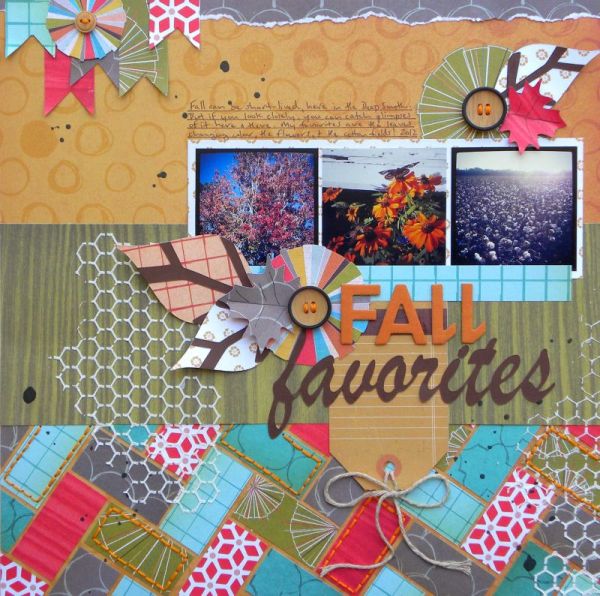
Fall Favorites by Ashley Horton | Supplies – Patterned Paper & Mister Huey’s Spray Mist: Studio Calico; Buttons: Stampin’ Up; Thickers: American Crafts; Font: Brush Script; Modeling Paste: Liquitex; Mask: The Crafter’s Workshop; Other: Embroidery Floss
Lynnette Penacho says, “My inspiration for the design of this layout came from a quilt design. I loved the clean lines and bold colors of the pattern (it was almost Tetris-like) and figured it would be a fun challenge to recreate using digital patterned paper and my trusty shape tool in Photoshop. I started by blocking the quilt design onto my layout and then pulled my favorite elements from the kit to create a more layered design. I also added a bit of digital paint under the blocked design to help soften the lines of the blocked shapes. I love using Pinterest for this type of inspiration because I can take bits of pieces from other mediums or styles and add merge them with my style to make them my own.”
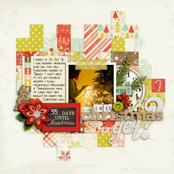
Is It Christmas Yet? by Lynnette Penacho | Supplies: Christmas Countdown by Zoe; Pearn & Kristin Cronin-Barrow; Kraftelicious by Mari Koeglenberg; Teeny Type Alpha by Zoe Pearn (retired); Font is 4 Lynnette by Darcy Baldwin
Emily Pitts says, “I had a tough 2011 and a friend suggested I do a layout about it as part of the letting go process. This helped so much that I should have done it a lot sooner in the year! I had some paper with months of the year printed on it. I used a quilt pattern as my inspiration and thought I could support my “year” theme by punching a square for each month and using it in the design. I enjoy employing typography is subtle and supportive ways like this, something you could miss if you weren’t looking for it. The squares blend in like a part of the quilt, but there is a deeper meaning if you look for it.”
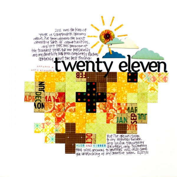
Supply list: Cardstock: Bazzill Basics; Patterned Paper: Simple Stories, Basic Grey; Studio Calico, Sassafras; Alphabet: American Crafts, KaiserCrafts; Chipboard: Studio Calico; Fabric Yo Yo: Basic Grey
Leah Farquharson says, “On this page I wanted to document one of my craft ‘fails.’ I try to be pretty laid back about most things, and I love trying out new ideas. This was my attempt at ombre, and as you can see, I just ended up with an unevenly dyed skirt! I do still love and wear it, though, so I’ve got no regrets! I love mixing patterned papers, quilt inspired designs, everyday stories, and mixing modern and vintage elements.”
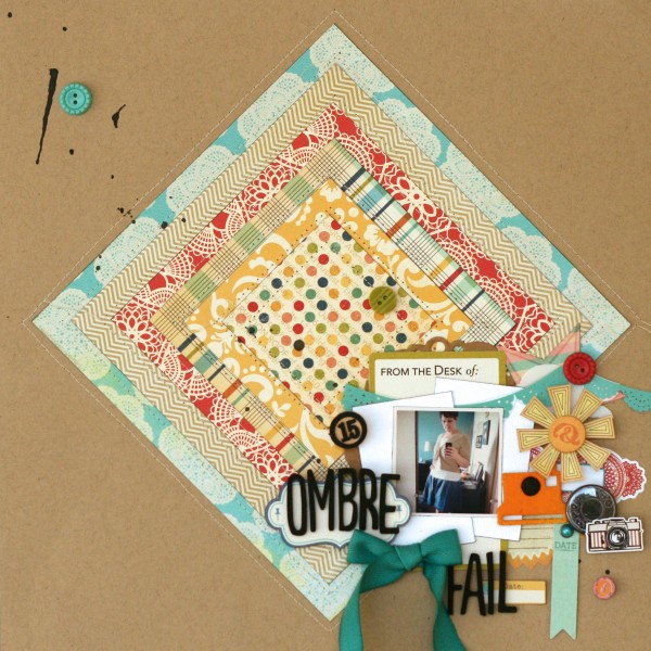
Supplies: cardstock: bazzill. Patterned paper: Lily Bee, October Afternoon, Echo Park. Kraft doily, bingo piece: Maya Road. Element stickers: Sassafras Lass, October Afternoon, Echo Park. Date tab and brad: My Mind’s Eye. Transparency: Hambly Screenprints. Foam letters: American Crafts. Buttons: October Afternoon. Ink, canvas Polaroid camera: Studio Calico. Journal card: October Afternoon.
[ontrend]

