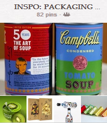
Another spot to find packaging inspiration is at our INSPO: PACKAGING & BRANDING Pinterest board.
You can find inspiring packaging in your home–check out the shelves of your kitchen or bathroom, entertainment packaging, or clothing tags to start–and in any store you visit.
Look to these pieces for guidance in placement of photos, titlework, journaling and embellishments. Keep an eye out for color, image, and typography inspiration. Analyze packaging you like to see what it is that you like about it and how design techniques are used to make it appealing.
Online Resources for Packaging Inspiration
- TheDieline
- Packaged Group on Flickr
- Lovely Package
- Packaging of the World
- Get It Scrapped Packaging and Branding on Pinterest
Find inspiration for motifs in packaging.
Jennifer Matott was inspired by the motif and papers on this David Bull Laboratories pharmaceutical packaging. She says, “I loved the block of kraft and the repeating triangles. I used rub on text for the top of my layout and added my title below, in the bottom area. The results are clean and have a graphic feel.”
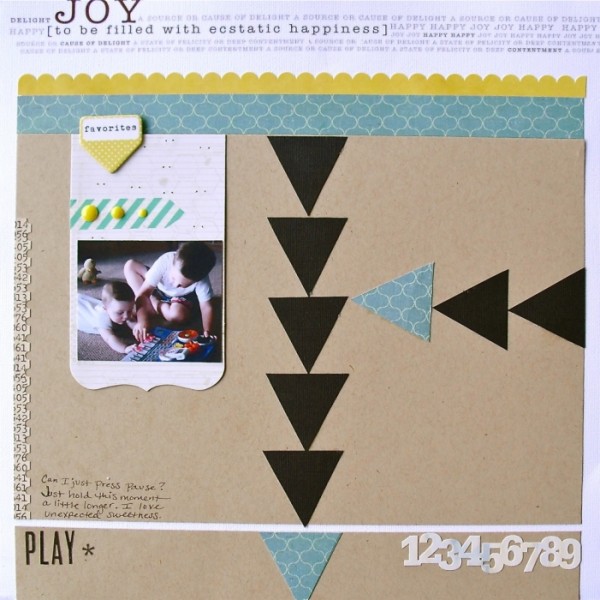
Play by Jennifer Matott | Supplies: Patterned Paper: Crate Paper; Cardstock: Bazzill; Rub on: Lily Bee Designs; Stickers: Studio Calico; Embellishments: American Crafts, Teresa Collins, Studio Calico, My Mind’s Eye.
Kiki Kougioumtzi was inspired by half circles on the MOR Nordica Cosmetics Body Oil Packaging. She says, “This layout is about an installation called Cow Parade that’s shown around the world. Artists alter cow statues, for exhibition all around town. When the exhibition is over the statues are auctioned for charity. I liked the order of the scallops on this packaging and repeated the pattern on my layout. The order felt suitable for a parade.”
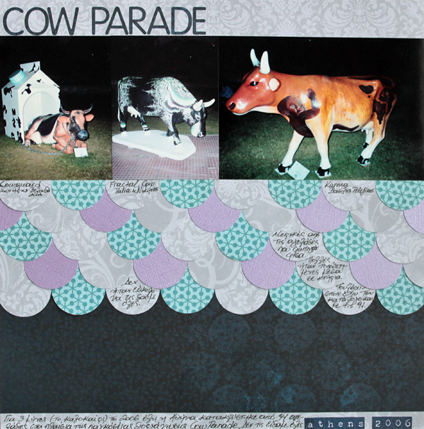
Cow Parade by Kiki Kougioumtzi | Supplies:Cardstock:Bazzill; Pattern paper:Echo Park,Basic Grey;Alphas:Basic Grey,Authentique; Paper punch:EKSuccess.
Find inspiration for color combinations in packaging.
Deborah Wagner says, “When I saw this can for JUST water, it spoke to me. I loved the colors and the clean, linear design. Now I plan to keep my mind open for inspiration everywhere, including packaging.”
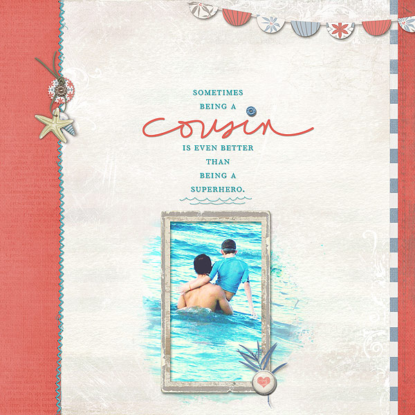
Cousin by Deborah Wagner | Supplies: Designer Digitals: Lynn Grieveson – Charlie Kit; Ali Edwards – Family Hand Drawn Brushes, Brothers Brushes & Stamps; Katie Pertiet – Little Fishy Kit, Watery Photo Masks No.1, Assorted Messy Stitches No. 7, Atlantic Kit, Beach House Memories Kit, Travel Clusters No.3, Spot Dot Flourishes No.1, Defined Blocks Brushes & Stamps; Cassie Jones – Bending Shadows
Use packaging to guide the layout of elements on your page.
Audrey Tan took inspiration from the placement of elements on food packaging and the background design. The packaging background is a subtle tone-on-tone pattern of swirls in reds. Audrey’s tone-on-tone pattern is of flowers, but still red. She mimicked the centered-band of vertical stripes with hanging charms, and she framed her photo in a centered circle, just as the product name is framed on the packaging.
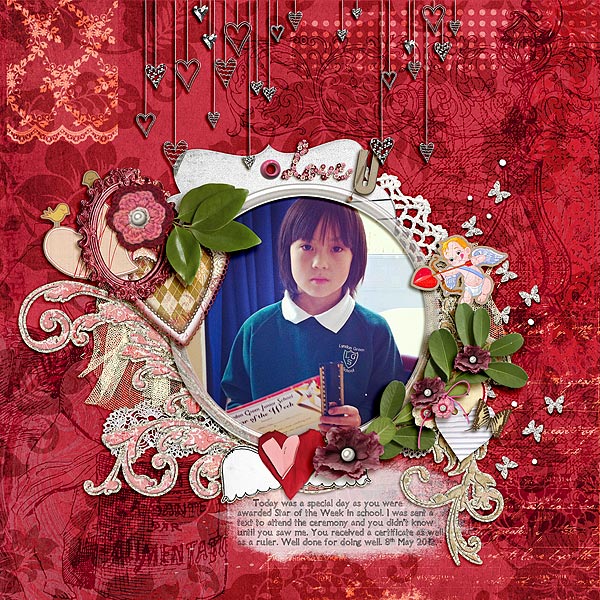
Love U by Audrey Tan| Supplies: Julianna Kniepp Designs: 4ever; Anna Aspnes: Acrylic Frames No1, Magic Sprinklez No6; Tangie Baxter: AJC11 Parcel30; Fonts: Tangie AJF Cheshire
Use repetitions of a package for layout inspiration.
Barb Brookbank took her inspiration from an ad featuring four packaged chocolate bars. She says, I took design cues from the single chocolate bar designs, including the gradient effect and border along the bottom, and I also used the image of the four of them together to inspire the layout of my page.”
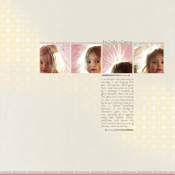
Hairlarious by Barb Brookbank | Supplies: Valorie Wibbens: Head in the Clouds (collaboration with Paislee Press); Anna Aspnes: ArtPlay Sun Fun; Katie Pertiet:stitching; Font: Courier New
Lift your title work treatment from packaging
Debbie Hodge was looking for a clever way to render a title and subtitle that echoed the fun her husband (and the whole family) had as he and a co-worker filmed portions of an online Economics class. On this day they were using what they had at hand–an assortment of fingernail polishes and a box of cupcakes–to illustrate the concept of Production Possibilities.
“I made a scalloped label based off of this spice packaging, lifting the two-word-with-ampersand brand name format for a title that became “Cupcakes & Nail Polish.” The packaging also drove my choice of a script font. The band across the bottom with the name of the spice being packaged was where I placed my subtitle – using an all-caps, san serif type treatment as on the packaging.
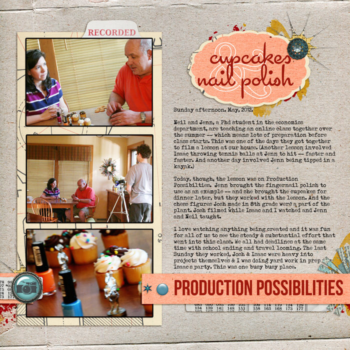
Cupcakes & Nailpolish by Debbie Hodge | Supplies: Strike a Pose by Amy Wolff and Little Butterfly Wings; Nuts and Bolts by Maya DeGroot; Double Decker Element Set by Katie Pertiet; Star Brad by Pattie Knox; Typenoksidi, Cocktail, Fling LET, Bebe Neues fonts
Reinforce theme with packaging inspiration that comes from your story.
Christy Strickler says, “For a long time, my son would not eat peanut butter. We kept telling him he was missing out, and, finally, he tried Reese’s peanut butter pumpkin. I wanted to use the packaging for the candy to document the moment.”
I used kraft cardstock to tone the down the intense colors. I liked the way the black and purple divided the package in half, and I did something similar, using orange and purple and a strip of black lace. I turned the trim to mimic the grass. I used embellishments similar to the images on the packaging, and placed photos in the center, just as the pumpkin is centered on the packaging. I hand-lettered the title to look as close as possible to the original.
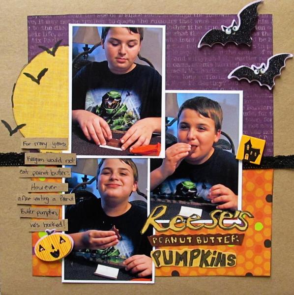
Reese’s Peanut Butter Pumpkins by Christy Strickler| Supplies: Patterned Paper: Pink Paislee, Sassafrass; Trim: Webster’s Pages; Stickers: K and Company;Markers: Ranger, Bic Mark-it’s; Other: stencil,patterned paper, kraft cardstock
Use actual packaging on your page.
Doris Sander says “I love to use product packaging on my layouts. I feel like I’m getting bonus treats when the product packaging is beautiful and inspiring and oh so usable. A favorite piece of product packaging that I’ve used on several layouts is the label shaped chipboard backing on Jenni Bowlin Studio’s chipboard pieces. (See the top left portion of the grid on my layout). The shape adds extra detailing to my projects while the chipboard adds dimension. I adhere patterned paper directly to it, cut it out, then polish the edges with an emery board. It’s an elegant look that’s easy to achieve.”
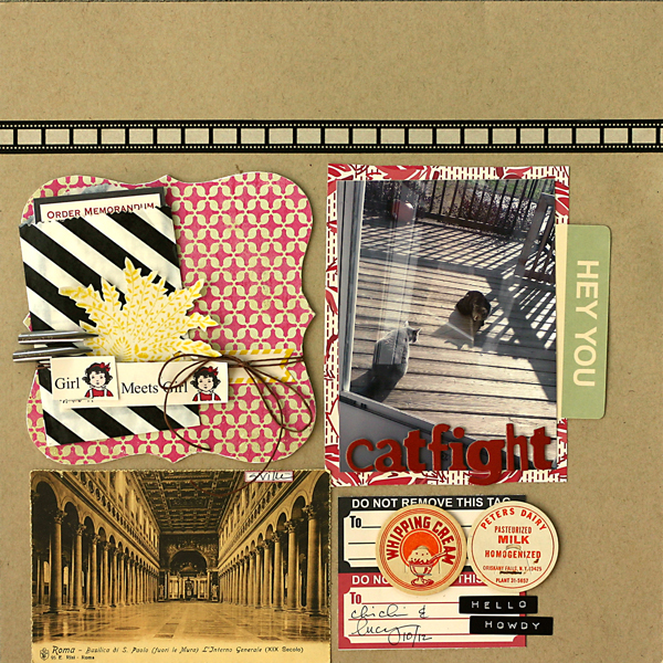
Catfight by Doris Sander | Supplies: cardstock – Bazzill, patterned paper, journaling cards, label sticker, stamp – Jenni Bowlin Studio, ink – Jenni Bowlin for Ranger, chipboard alphabet – Crate Paper, washi tape – Queen & Co., stickers – Pebblies, Inc., postcard, pen nibs, milk caps – vintage, other – treat bag, twine, staples

