Mint, like other shades of green is often related to nature and representing growth and freshness. It’s a color we’re used to seeing around us and works well for backgrounds.
Mint is also a currently trendy color. It’s a popular color for weddings in 2013, and it’s showing up in fashion, home decor and front doors. Mint is a great mixer with other colors and makes a great base.
More on mint:
- GIS Pinterest Board | Color: Mint
- Mint is a Refreshing Color Trend in 2013 Weddings
- Can mint really be the new black?
- Color Trend: Mint Green
Ashley Horton says, “I wanted a romantic, but modern look for this photo of me with my hubby, but I didn’t want use the traditional “love” colors of pink and red. I thought a soft mint would be the perfect background for this photo.” Ashley accented mint with pink, brown, and white — as well as the red in the photos. Combining mint with traditional love colors gives things a new twist.

Just the Two of Us by Ashley Horton | upplies – Patterned Paper & Stickers: Echo Park; Mister Huey’s Spray Mist & Butterfly Stickers: Studio Calico; Thicker & Flair Buttons: American Crafts; Font: Brush Script; Teeny Alpahs: Glitz Designs; Washi Tape: Love My Tapes; Color Magic Papers: Heidi Swapp; Other: Staples
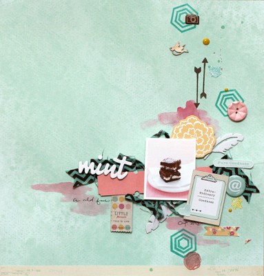
The color mint was a great base for Leah Farquharson‘s page about the mint brownies she used to make when she was younger. She says, “I’ve been thinking about these brownies and just had to pull out the recipe. I love working with the soft color of mint. It’s been a favorite for quite a while, I’m just glad I have an excuse to use it now that it’s so popular!”

Mint by Leah Farquharson | Supplies: patterned paper, diecuts, stickers, chipboard letters, puffy stickers, stamping ink: American Crafts. canvas feathers, flair button, wood veneer bird, ink: Studio Calico. Stamps: Studio Calico/Hero Arts. Watercolor: Crafts supply.
Stefanie Semple chose this mint green patterned paper for the sense of texture and grass-like feel it added which were perfect for her photo. She says, “I added the baby bird on top of my title as my daughter was looking up and I wanted it to appear as though she was looking at the birdie. She is my last little one, the smallest chick in our nest so the bird is symbolic of that too.”
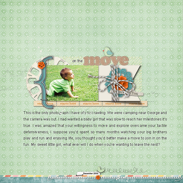
On the Move by Stefanie Semple | Supplies: Layer Works number 194 from Studio Double D; Wishin’ & Hopin’ and Waitin’ by Sweet Shop Designs.
Kiki Kougioumtzi says, “These photos are from my daughter’s first time at a ski resort. When she saw the snow, the first thing she said (with eyes wide open in awe) was, ‘There’s so much!’ I used mint because it’s refreshing and a variation from so many pages about snow in blue hues.”
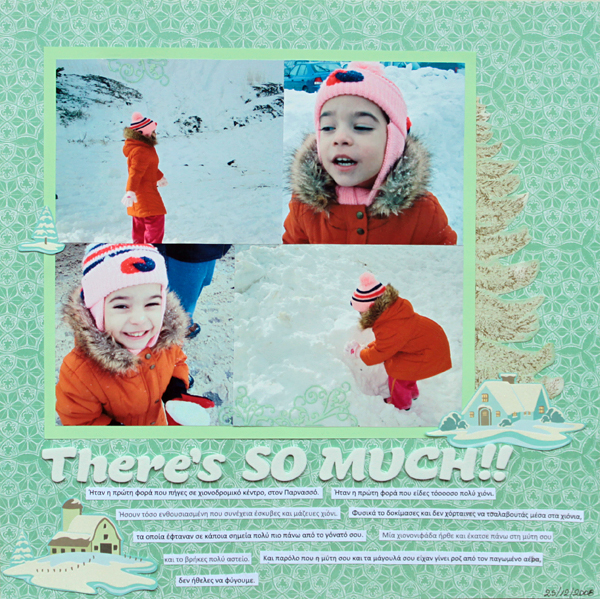
There’s So Much by Kiki Kougioumtzi | Supplies:Patterned paper:Webster’s Pages,K & Company; Cardstock:Bazzill;Alphas:American Crafts;Rub-ons:My Mind’s Eye.
Terry Billman says, “My husband’s dream vacation was a two-week trip golfing the Robert Trent Jones courses in Alabama. We took this trip last year, and would you believe it rained every single day we were gone? We did manage to golf in between the downpours. I wanted to show the magnitude of the rain that we had to contend with. It was no little drizzle! The smaller photo is of my husband sitting in the rocking chair on the porch. You can see the stream of water in the small photo also.”
I made the background using shades of mint and Anna Aspnes’ Art Play Storm paper to get the effect of dark storm clouds in the sky. I added the texture to give the feeling of thunder and lightning. The water in the picture flows downward to the acrylic alpha, keeping the idea of water flowing. To create movement I repeated the mint color from the top left, to the embellishments in the middle above the small photo, to the title under the small photo.”
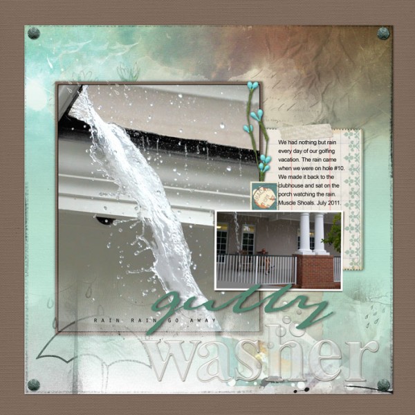
Gully Washer by Terry Billman | Supplies: Anna Aspnes: Art Play Solids Gather
Art Play Solids Retro Holiday, Basic Blendz Basic 1, Art Play Palette Storm, Art Play Special One, Anna Blendz Artsy 2, Art Play Crazy Life, Acrylic Alpha Numbers Set 1, 12 x 12 Artist Edge 6; Katie Pertiet: Vintage Blendable, Blendable Journaler, Chandra Kit, Collageable Notions; Lynn Grieveson: Geometric Hints 4
Christy Strickler says, “There are a lot of vintage items in the Get It Scrapped Mint Inspiration Board on Pinterest. Mint often seems to be paired with silver. Occasionally, there are bright pops of color to warm up a very cool color palette. I am often reminded of cooking in a kitchen when I see mint paired with brighter colors. I wanted to capture the retro vibe of mint but give it a fresh look. I used a tone-on-tone white background with equal parts of mint and orange. My goal was to draw the eye to the photo with the mint matte and orange frame. I inked the papers in silver and added a few silver accents.
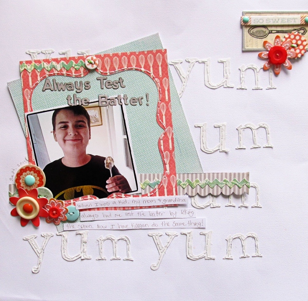
Always Test the Batter by Christy Strickler| Supplies: Cardstock: Colorbok; Patterned Paper: My Mind’s Eye,Little Yellow Bicycle; Alphas: Jillibean Soup, Sizzix; Ink; Clearsnap; Buttons and Enamel Dots: My Mind’s Eye; Sticker Border:Basic Grey; Flowers: Sassafrass; Twine: October Afternoon; Other: canvas, framed spoon photo, DMC floss
Chris Asbury says, “I love the soft combination of mint and soft pink. The colors in the photo are achieved by blending it on color burn mode into a patterned paper. To complete the page, I added a frame under the photo and layered elements down the left side for balance. I added a green and pink paint strip to enhance the color theme. (The photo was taken by a friend who recently traveled to Venice).”
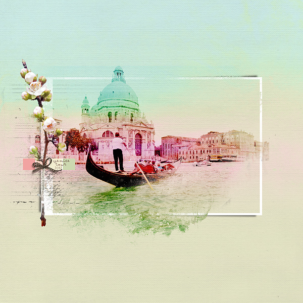
Venice by Chris Asbury | Supplies: Anna Aspnes Designs: ArtPlay SolidsRetroHoliday, ArtPlay Palette Blossom, ArtPlay Palette OuterSpace, Scanty Journal Lines No.2, WaterColor FotoBlendz No.1, WarmGlows No.3,Script Tease Happiness No.1; OneLittleBird: Worn Collab; Other: Paint Strip
Amy Kingsford says, “This is heritage page about my great-grandparents, and I was inspired to use mint on this page because of my photos minty color casts. I used a mint colored border and mint leaf accents sprinkled throughout the page to keep the eye moving.”
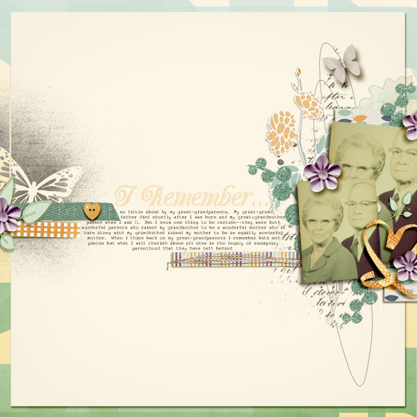
I Remember by Amy Kingsford | Supplies: Fresh Buds Vol. 3 by Magnolia Street and Summer Lovin’ Collab by ZigZag Scraps.
[ontrend]

