Clocks are a common part of our everyday lives–in fact most of us wear a watch, keep clocks in our homes, or find ourselves constantly checking our cellphones. The concept of time is an important one.
Clocks are THE face of time and are visual representations that we associate with specific moments in time, passing time, fading time and more. Below are a number of ways you can use clocks on your scrapbook pages–to represent time and its inevitable place in memory keeping.
Combine clock-motif patterned papers.
Doris Sander used coordinating clock prints for scrapbooking this photo of her son and his grandmother taken six years ago. The clock prints are at two different scales, mix well together, and are perfect for reflecting on memories past.
Doris says, “I’m so glad that I don’t stay ‘caught up,’ because I love scrapbooking older photos. I find that my thoughts and feelings reflecting back on the moment are very different from the thoughts I had at the time they were taken. Scrapbooking these different perspectives gives me a nice variety in my pages.”
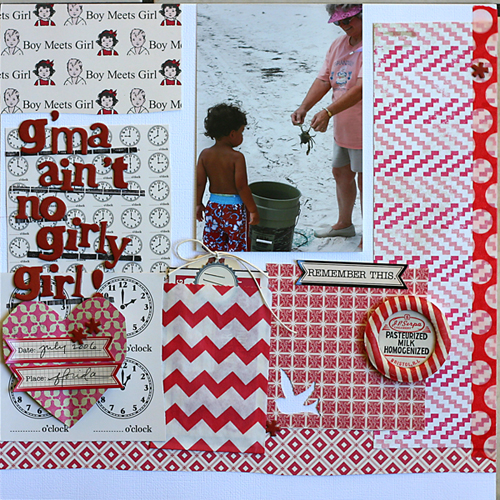
G’ma Ain’t No Girly Girl by Doris Sander | Supplies l patterned paper – Jenni Bowlin Studio, Crate Paper, cardstock – Bazzill, chipboard alphabet – American Crafts, stickers – Jenni Bowlin Studio, tag – Avery, punch – Jenni Bowlin for Fiskars, washi tape – Queen & Co., milk cap – vintage, other – paper bag
Use a large clock element as a foundation.
Jana Morton used an oversized clock that runs off the edge of the page as the foundation for her layout about the family dog.
Jana says, “As our dog gets older and we can see changes in his health, I worry what the future holds for him and us. He has been a precious member of our family, and I just want to hold onto this time with him for as long as I can. I used the clock as a symbol of how he spends his time as well as a symbol of how we cherish our time with him.”
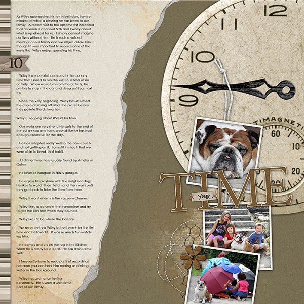
Time by Jana Morton | Supplies:Katie Pertiet: Stitched Chip Strips; Farm Fresh Collection, Home and Garden Collection, Award Alpha No. 3, Berks Lane, Twisted Stitches, Autumn Artistry, Ripped Cardstock Krafty No. 1, Pressed Together; Pattie Knox: A to Zoo Kit, Absolutely Acrylic Clocks; Maplebrook Studios: Annalise Neutrals
Crop clocks into half-circles.
Amy Kingsford added a variety of cropped clock accents to a page about a special story time shared between her husband and her oldest son. She used digital clock stamps blended into her background along the right side of her page to add interest, accenting them with buttons for pops of color and dimension. And a tone-on-tone clock diecut runs off the left edge of the paper.
“By cropping my circular clock elements, I’m able to use them in a way that is subtle yet refreshing and that ties in nicely with my title and the vintage feel of my page.”
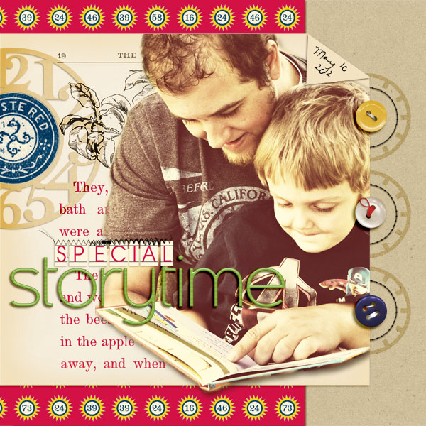
Special Storytime by Amy Kingsford | Supplies: JBS: Red & Black Extension 2, Play Date Collection, Clocks & Numbers Cut File, Chalkboard Alpha, Soda Water Collection; Sahlin Studio: Sweet & Skinny Alpha, A Wonderful Day Mixed Media Elements (stitching), Rejuvenate Papers (kraft cardstock); Jenn Barette + Stolen Moments: Life Love & Liberty (buttons); Karen Funk: Simple Stitches.
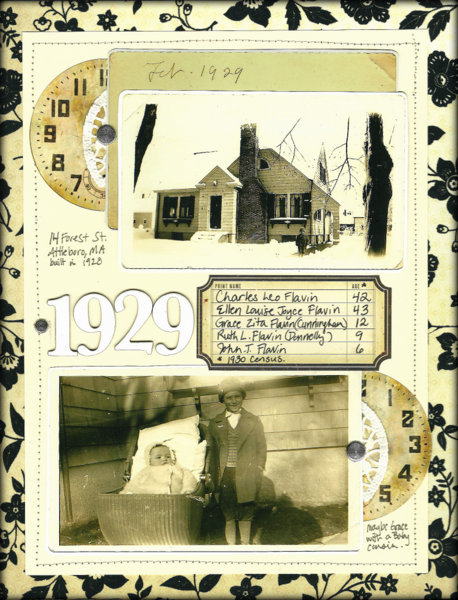
Katie Scott used clocks cropped into half-circles to accent each of her photos on this heritage page of her ancestors’ home in 1929. These accents create emphasis and move the eye from one photo to the next.
Katie says, “Clocks worked well for this page, not only for their sepia color, but for representing the passage of time and for the fact that the place pictured, Attleboro, Massachusetts, was famous for making clocks, jewelry, silver, and eye glasses around the turn of the century.”
Repeat clock accents to reinforce theme.
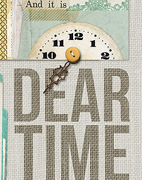
Deborah Wagner used a variety of clocks on this “comparison” page featuring photos of her oldest son at age 4 and again at 18. Her repetition of the motif moves the eye through the page and reinforces the power of time to affect our lives.
Deborah says, “I love embellishing with clocks. They add interest, texture and depth, but aren’t overly trendy. I used a sprinkling of clocks in upper left corner, a clock to embellish the title, and another in the embellishment cluster on the right side of my page.”
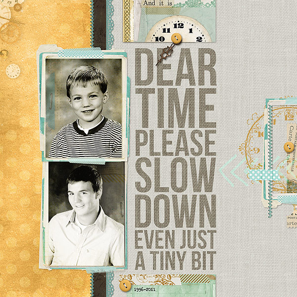
Dear Time… by Deborah Wagner | Supplies: Available at Designer Digitals. Katie Pertiet – Chandra Solids, Pocket Cards Vintage, Simple Collage frames No.2, Yesteryear Lace, Time Clusters No. 3, Gingerbread Runaway Kit, Clock Parts No. 2, Carte Post Kit, Family Time Chat Freebie; Ali Edwards – Hand Drawn Arrows, Time Flies Word Art
Add a “vintage feel” with clocks.
Brenda Becknell used paper and embellishment choices to evoke a vintage feel on a page featuring an older photo of her children playing. The strip of clock patterned paper on the left side of her photo ties everything together well.
Brenda says, “I wanted this page to be about capturing the little moments in time, because sometimes those are the most precious memories. This photo of my kids has always been one of my favorites just for that reason.”
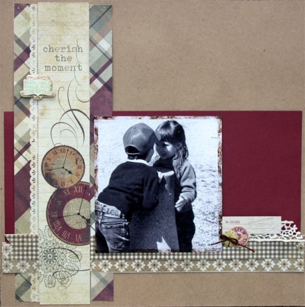
Cherish the Moment by Brenda Becknell | Supplies: Patterned Paper: Simple Stories; Cardstock: Bazzill (burgundy) and Paper Studio (kraft); Cardstock stickers: Little Yellow Bicycle; Epoxy clock sticker: EK Success; Chipboard: American Crafts; Vintage Photo Distress Ink; Decorative tape: Vintage Street Market
Amanda Jones used a cluster of clock accents in combination with a neutral color scheme and vintage papers/embellishments on this cleverly-titled page which captures the first time her grandmother and her son met. These vintage clock die cuts mix perfectly with the different sizes of polka dot papers, while the colors and textures further the vintage charm.
Amanda says, “The clocks I used represent the passage of time for me: the length of my Grandmother’s life contrasted with the short time my son had been in the world. I love the contrast of my Nan’s aged hands against my brand new baby son’s skin.”

The Hands of Time by Amanda Jones | Supplies: Patterned paper, chipboard, stickers, twine, washi tape, die-cut borders, button, brads – Teresa Collins Designs; Cardstock – Bazzill smooth; Ink – Ranger.
Use the clock motif in digital blending and brushwork.
Audrey Tan sprinkled the clock motif throughout a page about time spent with her “besties” from around the world. The use of subtle clock-inspired brushes in the background–including the clock hands that run off the left side of her page and the numbers inside of the sunburst used in the top left corner–set the tone for her page and compliment the more obvious time-related elements on the page wonderfully.
Audrey says, “I’m grateful for the time that my friends take from their busy and hectic lifestyles to spend time with me. And the clock images here denote how short, yet precious, the time spent with them is.”
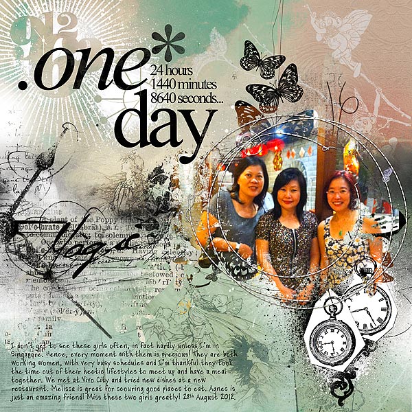
One Day by Audrey Tan | Supplies: Anna Aspnes: Artsy Layered Template No15, ArtPlay Palette Fairy, FlutterBy Foto Blendz No1, Mod Clocks No1, Hands of Time No1, Time Word Art No2, Artsy Clocks No1; Font: Casual Perfectionist
Terry Billman repeated similar clusters of blended clocks on a touching page about spending time with her husband. Their placement establishes a diagonal flow to the page but they also help to underscore the deeper meaning behind this page.
Terry says “When I think of clocks, I think of time. When I think of time, I realize I don’t have enough time to do the things that I want. This particular photo was taken on a weekend trip to the river in the Hill Country. My husband had just completed a cancer treatment and we were just trying to ‘recover.’ When I watched him walk down the dirt path, I thought of how much I wished we could have more time together. The words in Jim Croce’s song Time In a Bottle express how I feel about spending time with him.”
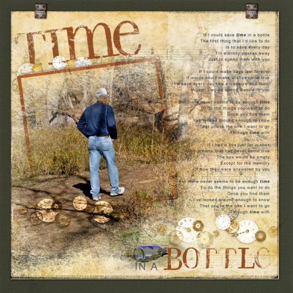
Time in a Bottle by Terry Billman | Supplies: Katie Pertiet: Time Clusters No. 3
Letterbox; Roughed Up Solids Hereford, Messy Stamped Alpha No. 2; Maplebrook Studios: Just Linens No. 30; Anna Aspnes: Abstract Fotoblendz No. 2, Label Transfers No. 1
Tuck a clock into an embellishment cluster.
Debbie Hodge used a clock embellishment in a literal way on “Lunch Break” to represent the actual time of day she’s scrapbooking. The round clockface made a great foundation for her embellishment cluster. The clock motif works with so many subjects, it’s quite often a great addition to an embellishment cluster.
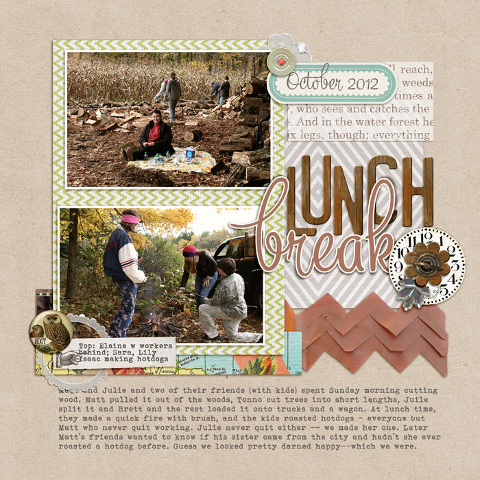
Lunch Break by Debbie Hodge | Supplies: PageKraft by One Little Bird; Dashing, You are here by Allison Pennington; Petals 3 by Sara Gleason; Autum Moon by Sahlin Studio; Vellum Ellies by Snips and Snails; Fall Festival by Lynn Grieveson; Brown Transferware by Jenni Bowlin; Star on Top by One Little Bird; Wood Alpha, Color Study Fall Flair, Wood Flowers by Katie Pertit; Artplay Palette No 7 by Anna Aspnes; Mercury font.
[akingsford]
[current]

