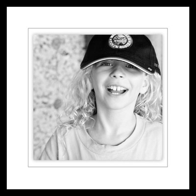
When my children were babies, I would take a roll of photos in black and white every few months. Getting black-and-white photos had to be a planned thing. Today, the majority of scrapbookers are taking photos in color, knowing they can easily convert them to black-and-white when needed.
You can use black and white photos on your scrapbook pages for both artistic and practical reasons.
1. Use black-and-white photos when they are what you have.
While Sue Althouse rarely converts color photos to black and white, she does have a collection of black and white photos printed and waiting to be scrapbooked. She paired a formal business portrait of her husband with a brief story about his work. The result is a piece of family history that she’s happy to have preserved for future generations.
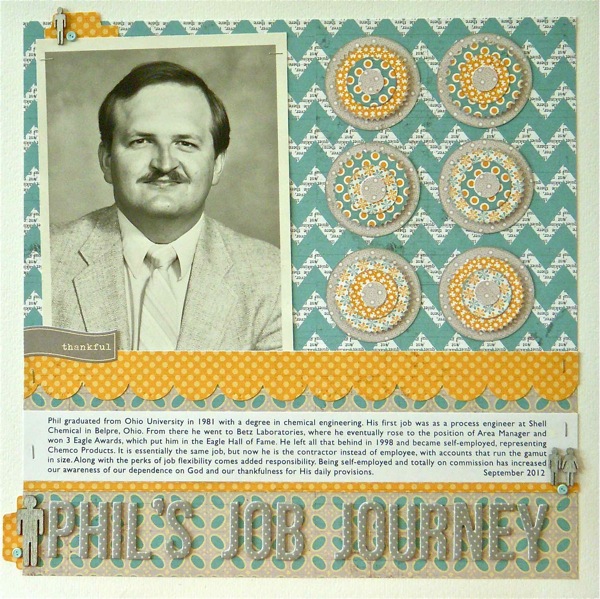
Phil’s Job Journey by Sue Althouse | Supplies: Cardstock: Bazzill
Patterned Paper: Lily Bee; Border Punch: EK Success; Alphabets: American Crafts; Inks, Mists: Jenni Bowlin; Sticker: Jillibean Soup; Brads: miscellaneous; Other: Studio Calico Wood Veneer People, Uni Ball Silver Gel Pen, Tim Holtz Tiny Attacher; Tools: Jenni Bowlin Tab Punch, EK Success & Fiskars circle punches, Spellbinders Small Pinking Circle dies
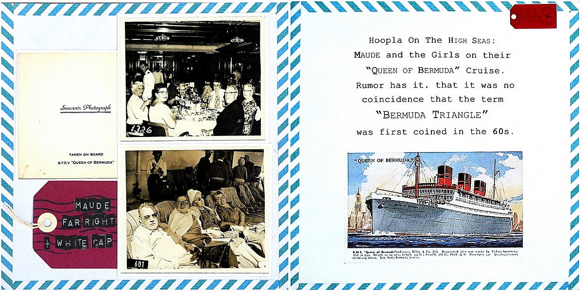
Katie Scott had black-and-white photos of her great-grandma Maude on a Cruise to Bermuda in the early 1960s but didn’t know any details about the trip. She says, “I decided to make up a story, the way that MikWright, Ltd. books are done. The authors pair funny old photos with made up quotes that give them attitude. I googled the name of the ship and found the color image of the ship and printed that for the second page.”
Doris Sander scrapbooked photos taken of her almost-one-year-old cousin right before Doris was born. The two share birthdays a year apart. The title comes from thinking on an old family story. “My mother held this baby girl in her arms in the hospital and told my aunt she might like to have one more baby of her own if she knew for sure it would be a girl. I was born exactly one year later.”
Doris says, “Since the photos are older and the subject is so tiny, I embellished with lighter colors and smaller product so as not to overpower them.”
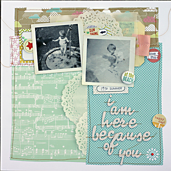
I Am Here Because of You by Doris Sander | Supplies | patterned paper – Allison Kreft for Echo Park, Jillibean Soup, flair, diecuts – Evalicious, ribbon, mist – Maya Road, chipboard alphabet – American Crafts, enamel dots – My Mind’s Eye, punch – Jenni Bowlin for Fiskars, other – doilies, vellum bag, tag
2. Convert photos to black and white to improve a busy or poorly lit photo.
Terry Billman took this photo in a gym and because of the lighting, the photo had a dark yellow cast. “It was perfect, though,” says Terry, “when I converted it to black and white. I didn’t want a lot of color or action in the layout so I used a monochromatic color scheme and very few embellishments. I added a couple of digital fotoglows to highlight the photo.”
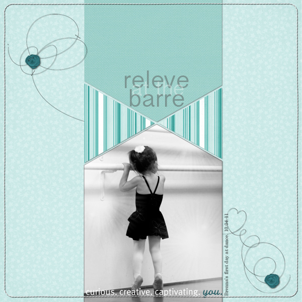
Releve at the Barre by Terry Billman | Supplies: Katie Pertiet
Template Inspiration 081113, Color Inspiration 33112; Anna Aspnes: Heart Loopdaloop No. 2, Flower fotoglows No. 1, Curvy Corner Stitched Borders No. 1; Maplebrook Studios: Just Linens No. 22, Jacinda Kit.
Meghann Andrew took this photo of her husband getting a pedicure–a result of her persistent coaxing. “The photo was taken with my iPhone in Instagram, and the image is grainy and the background is busy with the goings-on at the salon. When I have a photo that isn’t great technically, I like to convert it to black and white. My husband probably won’t appreciate me posting this, but I was proud of him for getting over his ideas about masculinity!”
Meghann says, “Whenever I use a black and white photo, I use a lot of color on the remainder of my layout to balance the lack of color in the photo.”
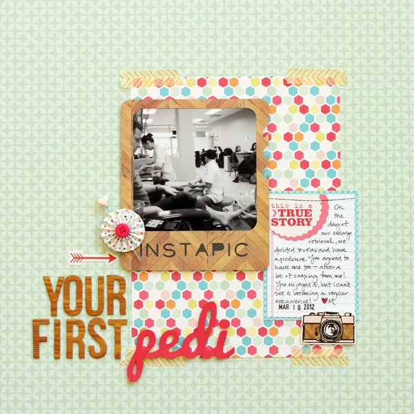
Your First Pedi by Meghann Andrew | Supplies: Cardstock- Bazzill; patterned paper & cardstock stickers- Echo Park; journaling tag- Elle’s Studio; chipboard letter stickers- American Crafts; pinwheel embellishment- American Crafts; heart pin- Making Memories; washi tape- American Crafts; date stamp- Project Life by Becky Higgins; ink- Stampin’ Up!; pen- Sharpie; font- Pacifico; die-cut file- Studio Calico (‘instagram’ frame); die-cutting machine- Silhouette Cameo
Because her father’s complexion is ruddy, Stefanie Semple finds that his features look better in black and white. “His character is more visible,” she says.
Stephanie used Photoshop Elements to convert the color photo with their portrait setting. She then used a levels adjustment to boost the contrast slightly. Stephanie says, “I kept the layout simple, using minimal embellishment as the heart of this layout is found in the journaling.”
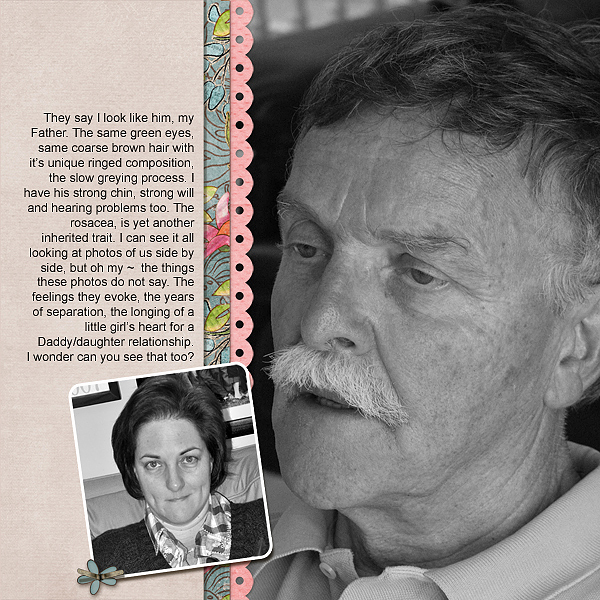
Untitled by Stefanie Semple | Supplies: Mye De Leon: Love Bug; Kim Broedelet: The Bigger Picture Template.
The focus of Celeste Smith’s “Crazy Circular Car Conversation” is a told in dialogue. She included a photo of her sons–the source of these crazy conversations–but their shirts were busy with images, words and color. A conversion to black and white emphasized their faces, their expressions, and their comfortable relationship with each other. Additionally, her journaling is rendered in three colors (for the three different speakers) and that color doesn’t have to compete with any color in the photos.
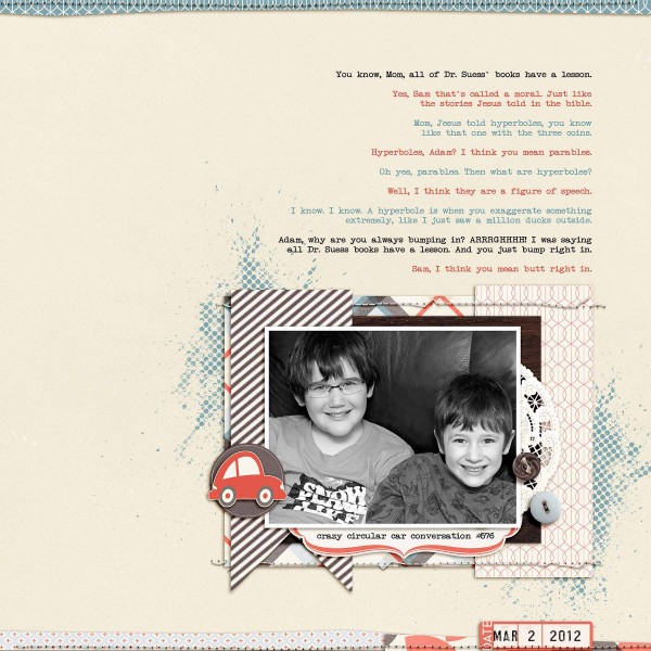
Crazy Circular Car Conversation #576 by Celeste Smith |Supplies: kit: Retrospective by One Little Bird (Oscraps); masks: CutItOut by Robyn Meierotto (Design House Digital); stitching: In Stitches Neutral by Robyn Meierotto (Design House Digital), Bad Sewing Machine Basics by Traci Reed (Sweet Shoppe Designs); car sticker: One for the Road kit by Dani Mogstad (Sweet Shoppe Designs)
3. Convert photos to black and white for visual impact
Black and white emphasizes tonal range, and is a great choice when you want to emphasize light over color.
Adryane Driscoll likes high-contrast black and white photos, and made her own Photoshop action for conversions. She says, “After my initial conversion, I adjust the levels in Photoshop. I composed the page simply to put the focus on the photo and so that I can include it in a grouping of photos that will have a similar design.”
Dina Wakley made a colorful graphic background for “My Joy” with stencils and mist. Over this colorful base, she layered a strong diagonal black stitching line, black alphas and a high-contrast black and white photo. The resulting composition has a strong focal point and high-contrast energy.
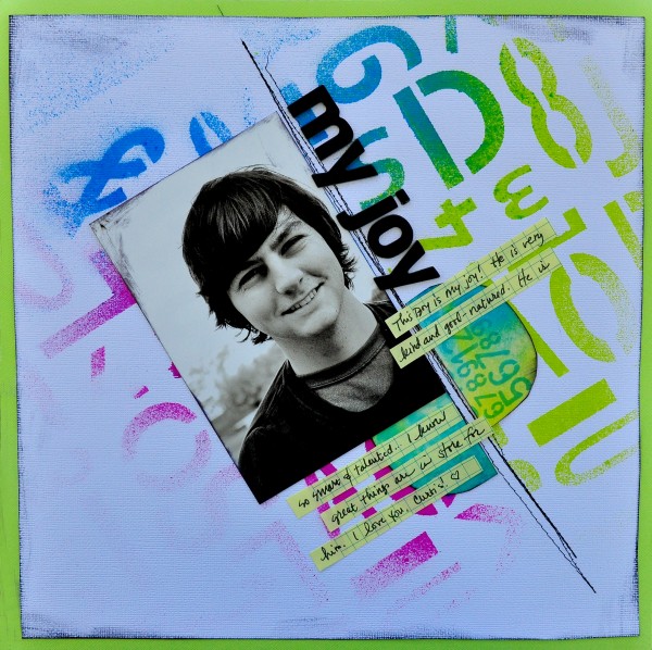
My Joy by Dina Wakley | Supply List: Cardstock: Bazzill, American Crafts; Paper: American Lab; Tag: Xpress Tag; Ink: Dylusions by Ranger; Alphabet: Thickers by American Crafts
4. Convert photos to black and white to support story and tone
Tiffany Tillman says, “Ah, this page deeply reflects a journey from shadow to sunshine. My goal was to visually represent the heart I poured into my journaling. The page plays completely on duality: light, sunshine on the top half with darkness on the bottom. The top half is busier as compared to the bottom. And even the subway art is more colorful at top when compared to the bottom.”
The image of Tiffany with her newborn son is an interesting layered collage of the same photo, in black-in-white, cropped and layered.
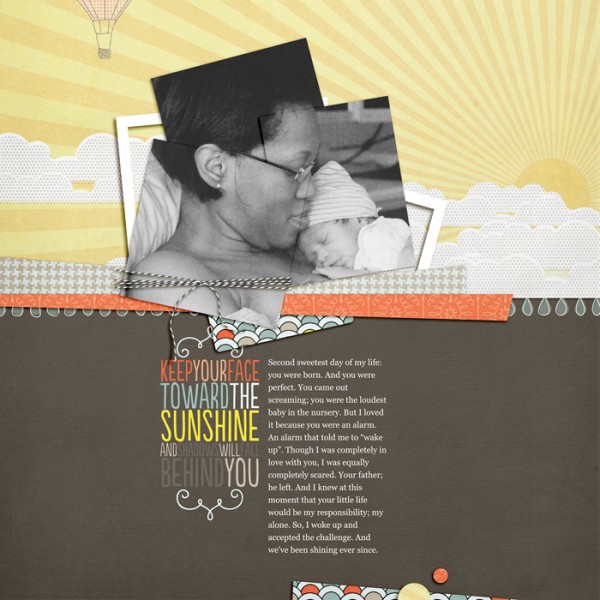
Sunshine by Tiffany Tillman | Supplies: Digital Kit: When Skies are Grey by Gennifer Bursett; Page Template: Easy Going no. 1 by Simply Tiffany Studios; Font: Georgia.
Amy Kingsford converted her photo to black and white for this particular page to add a contemporary vibe to the page subject. She says, “The page is a salute to the “Bieber Haircut” my son sported for over two years. I enjoy capturing fads like this in my pages as a way to time stamp my memories and send a piece of them into the future.”
“I like to pair black and white photos with bright colors and bold patterns. I usually bump up the contrast and brightness in the photo for the added glow it brings to the photo.”
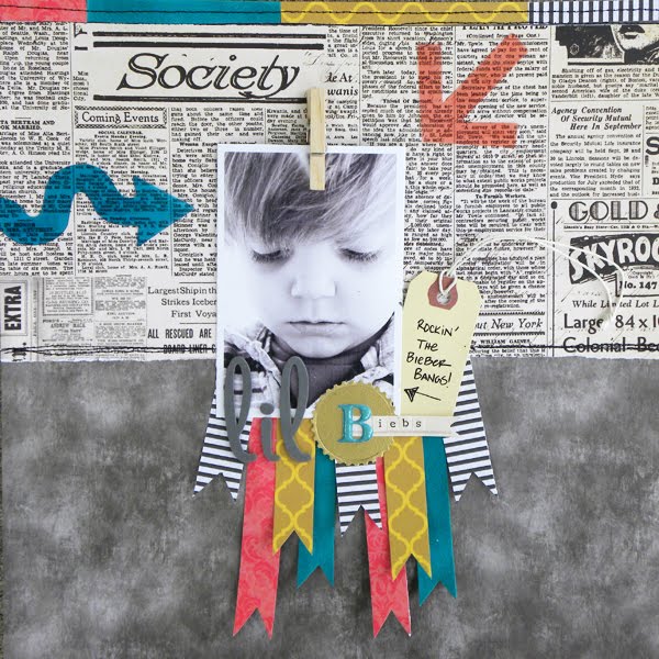
Lil’ Biebs by Amy Kingsford | Supplies: Papers: Homestead, Field Notes and Vanilla Sunshine Collections by SEI; Acrylic Accents: Mayberry Decoder Arrows by SEI; Alphas: Thickers by American Crafts and Blue Raspberry and Desert Sprint Alpha Stickers by SEI; Diecut: Small Medallion by Provo Craft; Cuttle Bug: Provo Craft; Gold Foil.
5. Convert to black and white for a retro feel
The styling and colors of the products Audrey Neal used on “14 kt gold” have a retro feel, with the pinks, greens, and reds harkening back to 1950s kitchen colors. A black-and-white photo is in keeping with a photo of that time. Audrey says, “This is a simple story, but it is representative of a million similar stories I could tell. Each day as Cami unpacks her backpack and prepares to do her homework, she “reports out” on all the interesting things that happened at school that day. The kid knows how to deliver a line as she did in this story.”
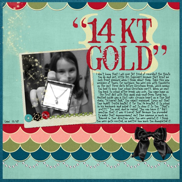
14 Kt by Audrey Neal | Supplies: alphabet: Foam Stamped Alpha, Emily Powers; papers and elements: Love Birds digital kit, Emily Powers ;
font: Daily Birdie, Audrey Neal, Design House Digital
In the side view mirror of her car, Corrie Jones caught a glimpse of her 8 year old enjoying the wind and snapped a couple of quick shots. She says, “I love the look on her face. I know she was happy to be on this road trip because of the destination and her grandparents waiting for her.” The high-contrast blown-out conversion of the photo to black and white creates an image that could have been taken yesterday or 40 years ago.
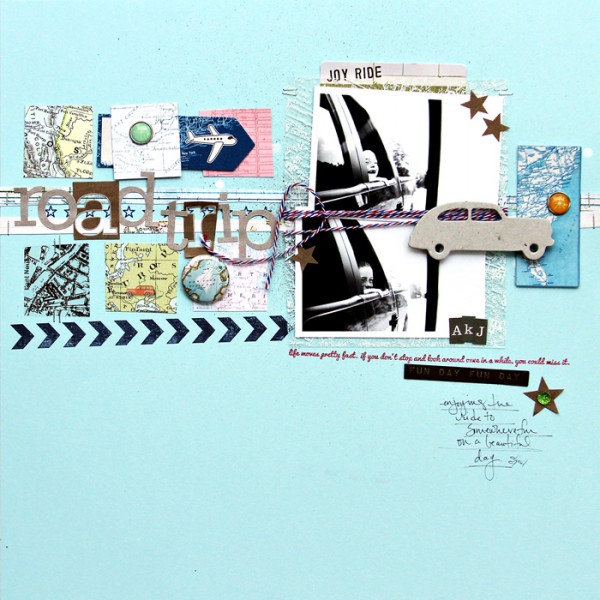
Road Trip by Corrie Jones | Supplies:Cardstock – Bazzill; Mist – Studio Calico; Patterned Papers – Crate Paper, October Afternoon, Pink Paislee; Rub Ons – October Afternoon; Die Cuts – American Crafts, My Minds Eye; Ink – Jenni Bowlin; Stamps – Studio Calico; Chipboard – October Afternoon; Flair – Evalicious; Alpha – Studio Calico; Bling – Queen & Co; Brads – American Crafts; Pen – Kuretake; Other – Paint, Twine
[current]

