About Blue | Blue Dominating | Blue Drawing the Eye | Blue Guiding the Eye | Blue Accenting
About the Color Blue
 Color conveys meanings or evokes feelings in three chief ways. See the resulting associations with blue for each trigger.
1. PHYSIOLOGICAL RESPONSE: Blue is calming, comforting and soothing. People are more productive in blue rooms. Weight lifters can lift more in blue gyms.
2. IN NATURE: Blue is the color of the ocean and sky and thereby associated with that which is restful and calm.
3. PSYCHOLOGICAL SYMBOLISM (associations with the viewer’s own psychological symbolism):*
- Western: depression and sadness
- Eastern: immortality
- Japan: everyday life
- Egypt: virtue
- Middle East: protection
- Iran: heaven and spirituality
- Mexico: trust
- Judaism: holiness
* SOURCE: Cutural Color
Blue Dominating
Tara McKernin‘s son is going to be 10 years old soon, and she gave these old photos a vintage effect. The blue-on-white small-scale chevron pattern has an old fashioned look and is perfect for a boy page. Large chevrons in a bold blue are high-contrast embellishments.
Tara says, “My mother-stress level was through the roof at that park, and I have the video to prove it, which I will add (on disc) in with a pocket page from Becky Higgins when I print this layout. The blue reminds me of swing and the sky, and it’s subtle and relaxing. I love how it turned out.”
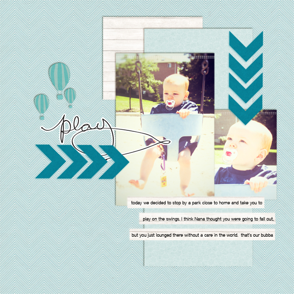
Play by Tara McKernin | Supplies: Template September Freebie from Sahlin Studios, Paislee Press weekender, Up and Away and presscard no. 16, font district thin. Totally RadLab for photo processing.
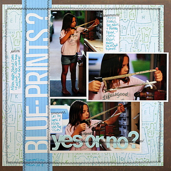
Katie Scott‘s use the color blue to support her “blueprint” themed page. A bold blue strip for the title contrasts well with the tone-on-tone paler blue patterned base.
Katie’s daughter is making Barbie house shutters here, and Katie wanted to highlight that while Daddy always uses blueprints, Mommy never does. She says, “My husband and I are polar opposites when it comes to attacking a project: he’s a planner and I like to wing it. My son takes after me, but I’m not so sure about my daughter – I think she’s a mix – I’m going to ask her about this after school and write the answer on the back of the page!”
Barb Brookbank used a bright and bold blue for her base about a fun incident with her grandson.
Barb says, “This little incident made me laugh so hard. I went over the details with my husband to find out exactly how it went, because I had lost track of it (funny how that happens)! I wrote the journaling first, and the rest of it fell into place. It was all coming from the heart, so it was easy.”
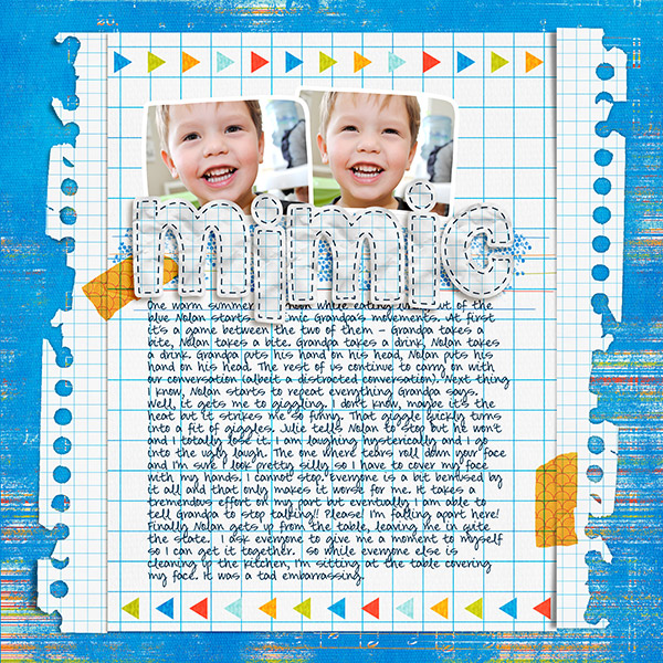
Mimic by Barb Brookbank | Supplies: All papers and elements from “HE” by Dunia Designs; Font: DJB SMARTYPANTS by Darcy Baldwin
Blue Drawing the Eye
Amanda Jones cut everything except for the photo, butterfly, and button with her Silhouette Cameo and made an eye-catching backdrop for this photo.
Amanda says, “I used a fabulous royal blue patterned paper for most of my design elements. It’s backed by crisp white cardstock for maximum contrast. To ensure that my photo frame would be seen amongst the other blue items, I used a pale blue woodgrain paper and added two hearts cut from the same paper to balance the design.”
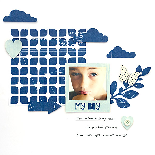
My Boy by Amanda Jones | Supplies: Jenni Bowlin Studio – Patterned Paper, Butterfly, Button; My Mind’s Eye – Patterned Paper; Bazzill Basics – White Cardstock; Silhouette Cameo
Meghann Andrew says, “I am loving the influx of navy blue in scrapbooking supplies this fall.” She pulled colors for her titlework and embellishments from the photo and then mounted them on a navy dot patterned paper that provides the contrast to show them off well.
The white canvas is a woodgrain print to mimic the texture of the trees in the photo. Meaghann says, “To really make the layout pop, I created a 1/4″ border around the navy paper in bright orange.”
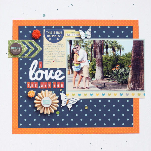
I Love the Way You Love by Meghann Andrew| Supplies: Cardstock- LCI , Bazzill; patterned paper- Studio Calico, Bo Bunny, American Crafts, October Afternoon; journaling tag- Elle’s Studio; date tag- October Afternoon; punches- Martha Stewart, Stampin’ Up!; pinwheel embellishment- American Crafts; stickers- Studio Calico (letters), My Mind’s Eye (‘love’); rhinestones- My Mind’s Eye; Cosmo Cricket, Queen & Co; badge- Studio Calico; cabochon- Milky Way Jewelry, Prima; spray mist- Studio Calico; font- Pacifico; die cut file- Loni Stevens; die-cutting machine- Silhouette Cameo.
Vicki Walters likes using blue with gray and says, “Blue is probably the easiest color to scrap with because there are so many places in which we appreciate blue in nature, and it comes in so many shades. Just look up at the sky or at the ocean.” Bright pops of blue against gray grab the eye and pull the viewer into the photos and story.
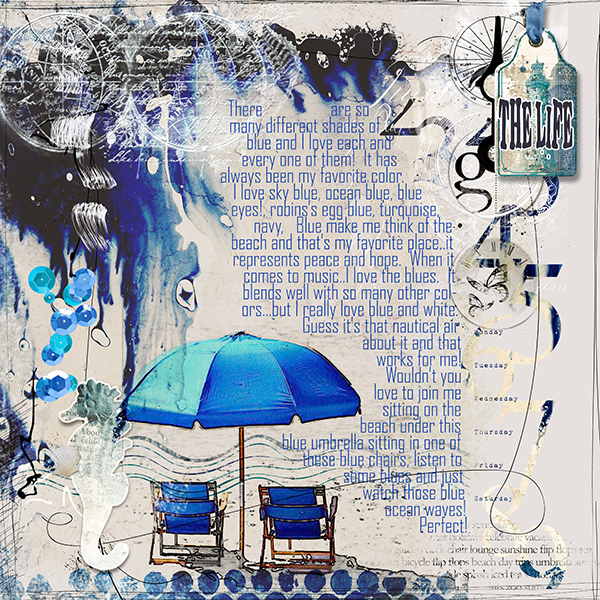
The Life by Vickie Walters | Supplies: Paula Kesselring: Sea Paper Tags, Sea Art Journaling Paper Pack, Sea Brush Set: Anna Aspnes: 12×12 Scratched Edge Overlays no 1, 12×12 Artist Edges Overlays no 5, MultiMedia SeaLife no 1, ScripTease Summer no 1 Brushset, Artsy Clocks no 4, EnCounting Brush Set; Fonts: stickons two and Agency.
Blue Guiding the Eye
Debbie Hodge’s photos in “Proud & Happy Tourist” all have hits of blue, and the title is backed up by blue. The result is a z-flow guided by spots of blue, starting at top left and moving across the page and then down and over for the title.

Easy Breezy by Crisdam Designs; TheTraveler by River Rose; Comic by EnKay Design; Knockout by Splendid Fiins; Blackout, Cookie fonts.
Adriana Puckett‘s focal point is a blue-skied photo of the Windseeker ride at a local amusement park. A burst of blue, white and red lines all point the eye into this focal point. The blue title and blue ticket strips do the same.
Adriana says, “The sky-oriented theme seemed a perfect match for a predominately blue layout. The light blue combined with the dark blue and reds reinforce the retro design and the ethereal quality of the ride.”
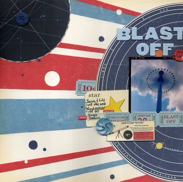
Blast Off by Adriana Puckett | Supplies: Paper and embellishments: October Afternoon Rocket Age; Letters: Studio Calico; photo processing: Instagram.
Amy Kingsford used pale blues to add masculinity to this page about the bond between her oldest son and her husband, a page that has a soft and tender feel. Amy says, “I’ve used strips of blue washi tape and a single blue flower to create a visual triangle which directs the eye over the key elements of my design.”
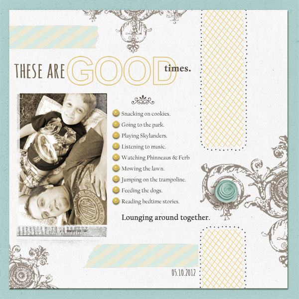
These Are Good Times | Supplies: Sahlin Studio: Paper Pierced Holes: Basic, Sunny with Blue Skies, The Good Life Word Art, Washi Tape Strips No. 2 by Sahlin Studio; Anna Aspnes: Original FotoBlendz No. 7.
Blue Accenting
Amber Ries‘ bar-b-que party page is dominated by woodgrain, orange, and green, but small spots of blue add powerful accent points. Notice also, the more subtle blues in the “paintwork” on the woodgrain base.
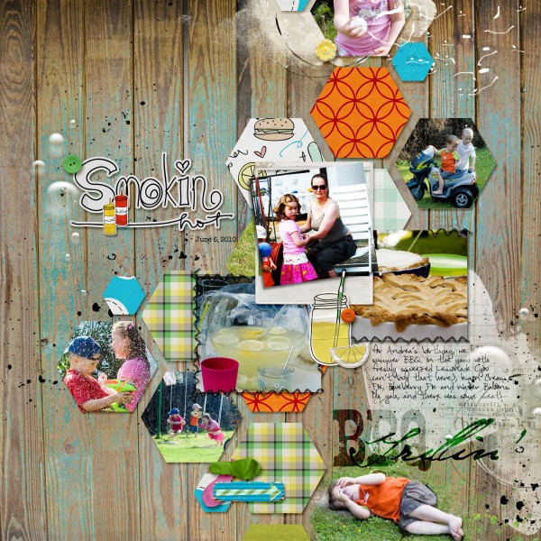
BBQ Grillin’ | Supplies: The Tattered Pear: Smokin’ Hot Elements | Smokin’ Hot Papers; Amy Martin: Sketches: Shaped Up Templates; Valorie Wibbens: Make Lemonade; Sahlin Studio & Jacque Larsen: waterpark collab; Allison Pennington: My Own Backyard; TLP: Hoppy Birthday; Anna Aspnes: Artplay Palette BBQ | WaterDrops 3 | APP SnowFun | JournalTransfer
Corrie Jones has used blue accents to both draw and guide the eye on “That’s My Girl.” Blue alphas, embellishments and patterned paper spots are a refreshing contrast against browns, whites, and yellows.
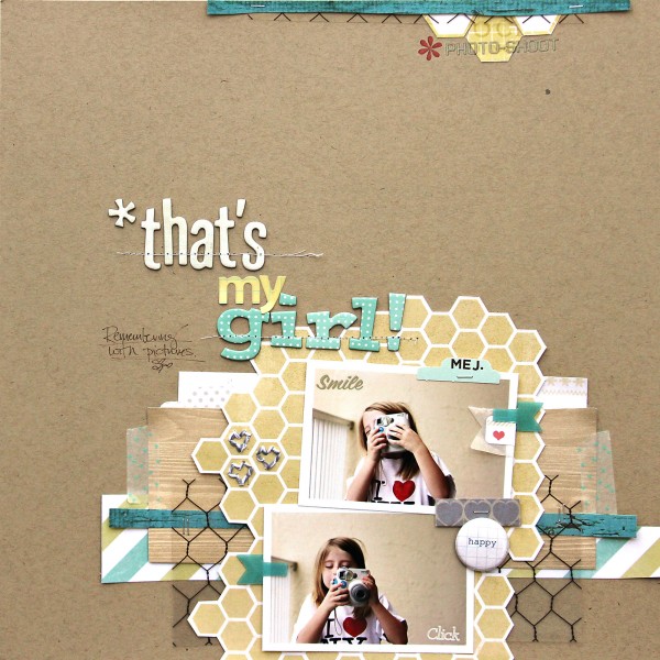
3. That’s My Girl by Corrie Jones | Supplies:Cardstock – American Crafts; Patterned Papers – My Minds Eye, Studio Calico; Transparency – Hambly; Clips – K & Company; Stapler – Tim Holtz; Flair – Hello Forever; Rub Ons – Martha Stewart, Studio Calico, My Minds Eye; Twine – The Twinery; Alphas – American Crafts, Sassafras Lass; Pen – Martha Stewart; Other – Dies Cuts, Washi Tape, Packaging materials
[current]

