by Debbie Hodge
[twocol_one]
What entertains you? You can use those entertainments to inspire scrapbook page motifs, colors, and composition–whether on a page about that entertainment or something completely different.
Movies, television shows, books, music and games all offer inspiration from the packaging to the actual content of the entertainment. Movie posters and albums are great for study because they convey subject, set tone and often even convey era through styling, image, and color.
When you’re taking in entertainment, look at color schemes, graphic elements, title treatments, setting and costumes. Board and video games both offer richly rendered experiences built from shape and color that can inspire. Movies, books, and songs can trigger the actual content you decide to scrapbook. As you do whatever it is that you do for fun, stay alert for inspiration sources.
[/twocol_one]
[twocol_one_last]
Here are a few links to get you thinking.
[/twocol_one_last]
[hr]
Board games and toys | Music | Television and movies | Books | Live shows and events | Video games and apps
Entertaining Board Games and Toys
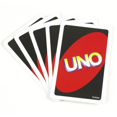
Kiki Kougioumtzi says, “For this layout I took my inspiration from two sources. The design of the page came from the back side of Uno playing cards, a game we play all the time in our home. For the title I borrowed Lightning McQueen’s motto: “Speed! I am speed!” from the movie Cars, a favorite of ours.
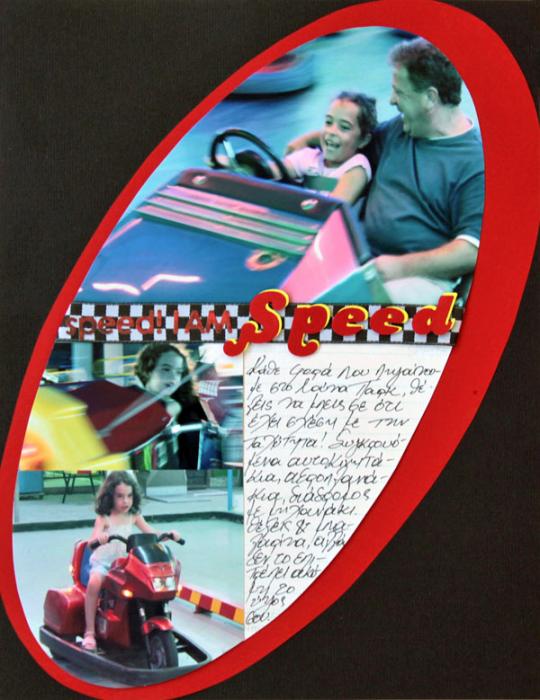
I Am Speed by Kiki Kougioutzi | Supplies: Patterned paper: Pink Paislee; Cardstock:American Crafts, Canson; Alphas: QuicKutz, Basic Grey; Ribbon:Prima.
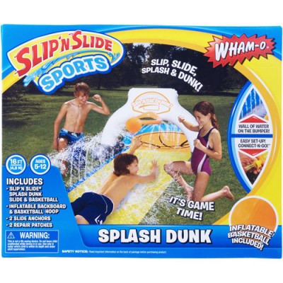
Michelle Houghton says, “My first thoughts when I decided to scrap these photos was the song ‘Slip Slidin’ Away’ so I hurried to look up the album cover. The photo of Paul Simon was not quite the inspiration I was looking for so I went back for the obvious, the box of the Slip and Slide itself. I loved the sweep of yellow framing three sides of the page and the bright colors so I used both and the song title to complete my layout. And if you are wondering, yes that is my husband on the Slip and Slide.”
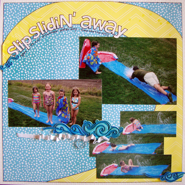
Slip N’ Slide Away by Michelle Houghton | Supplies:Cardstock – Bazzill Swiss Dots; Patterned paper and foamies – American Crafts; Acrylic Tag – Tim Holtz; Letters – Doodlebug Designs; Ink – Copics and Sharpie marker
Entertaining Music
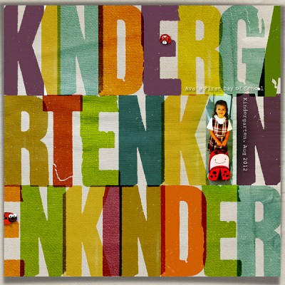
Chris Asbury was inspired by an album cover with a large graphic alpha design, “One Two Cha Cha Cha Time” by Paquitin Lara and his Latin American Orchestra. Chris says, “I tried to recreate it with the ‘KINDERGARTEN’ alpha. I included a photo of my granddaughter (on her first day of school) in the ‘I’ spot and placed a few ladybugs on the layout to repeat her ladybug backpack theme.”
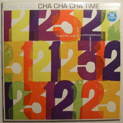
Inspiration Source: Paquitin Lara and His Latin American Orchestra – One Two Cha Cha Cha Time [Vinyl Record]
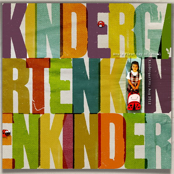
Kindergarten by Chris Asbury | Supplies:Anna Aspnes Designs:
Festive Moments Collaboration Kit (from PenScrappers),ArtPlay Palette Autumn Haze, WarmGlows No. 3; Kitty Designs: Buggy Bug; Fonts: Mr. Black, Rough Typewriter
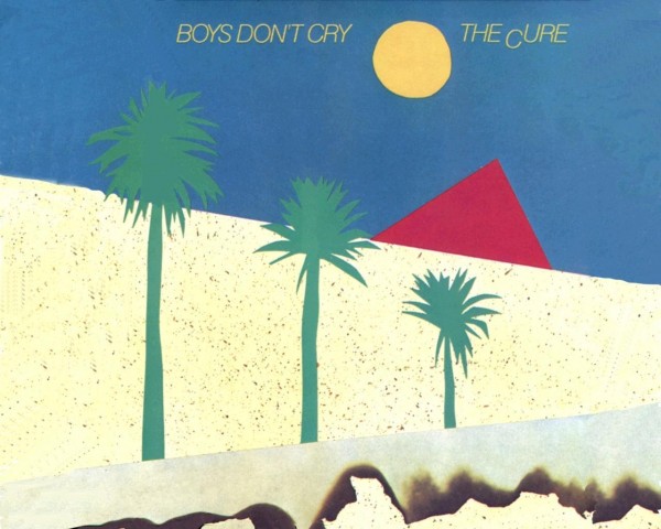
Amy Kingsford says, “Both the page design and title of ‘Boy’s Don’t Lie’ were inspired by the cover art from The Cure’s Boy’s Don’t Cry album. The basic geometric design of this cover art made it simple yet fun to break down and interpret in my own page. You can see that many aspects of this cover art’s design are echoed in my scrapbook page including the diagonal lines that divide the page, the proportions of the focal points in relation to one another as well as the overall placement of the key elements.”
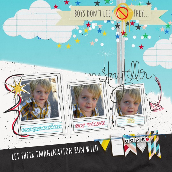
Boys Don’t Lie by Amy Kingsford | Supplies: Not Pictured by Allison Pennington, Dandy: Papers and Random Bits by Allison Pennington, Sketch Pad Papers by Sahlin Studio and Narrative by One Little Bird Designs.
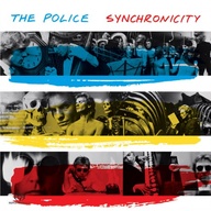
Summer Fullerton was digging through old CDs and came across one of her all-time favorite albums from childhood, Synchronicity. She says, “This little bit of nostalgia just screamed to me scrapbook layout. I am a linear scrapbooker, so this piece really spoke to my design aesthetic.”
“I was immediately drawn to the color blocking and black and white photos on the album cover and reproduced the same feel on my layout using slightly different colors. I used the horizontal lines in my layout almost as if they were pockets for the photos and embellishments. Taking my inspiration straight from the image I flanked the color blocked areas with white topping them off with my title and journaling.”
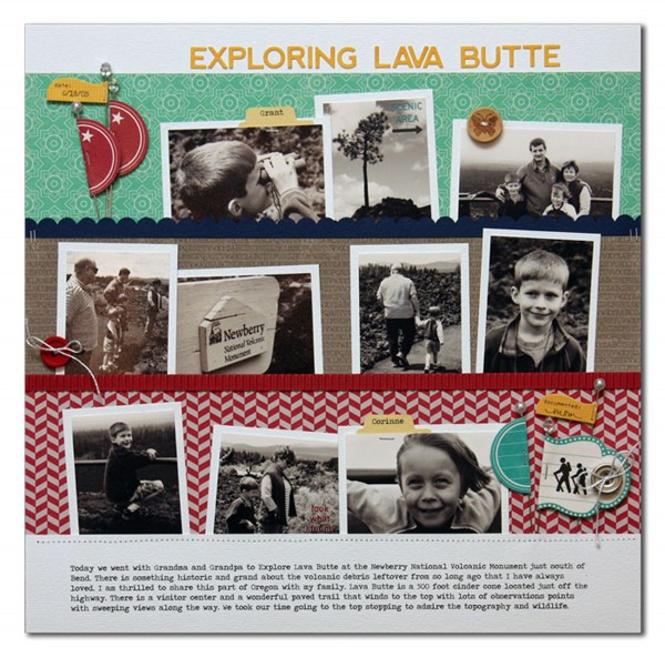
Exploring Lava Butte by Summer Fullerton | Supplies Used: Cardstock from Bazzill, Jillibean Soup Patterned Paper/Alphas/Diecuts/Stickers/Corrugated paper/buttons, Rubons from October Afternoon, Floral Stick Pins from JoAnn’s, White DMC Floss, Stampin Up Scallop Punch, Tab Punch from Fiskars, Tiny Attacher Tim Holtz, and font Traveling Typewriter downloaded from the internet
Entertaining television and movies
Vicki Walters says, “When I think of Entertainment, the first thing that comes to mind is comedy, laughter, something that can really take your mind off the everyday. Boston Legal was my favorite comedy and everyone here at my house so enjoyed it! The house frame is representative of that.”
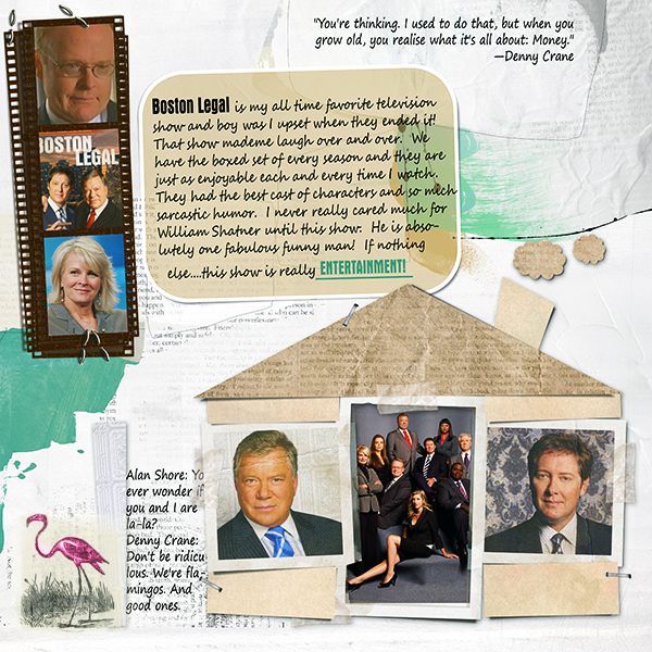
Boston Legal by Vicki Walters | Supplies: Anna Aspnes
BirdTransfers no 1, ArtPlay Palette Friends; Joanne Brisebois:
Centerpieces Vol. I; Font: Segoe Print
Debbie Hodge‘s youngest son is a self-proclaimed Brony (a guy, usually 13 to 30 years old, who is a fan of the new version of the show My Little Pony) by taking inspiration from the Hasbro site for it. This includes colors, typeface (Celestia font), and motifs like the clouds and pennants on Sparkle Castle.
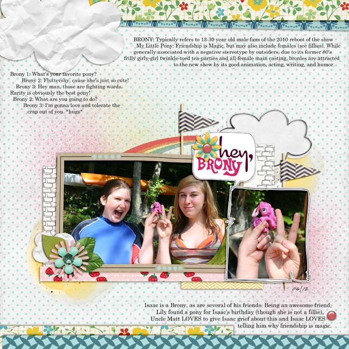
Hey, Brony by Debbie Hodge | Supplies: Comic by Enkay; Fresh by One Little Bird and Sahlin Studio; Art Play Play Out by Anna Aspnes; Never Forget by Erica Zane; Country Fair by Dani Mogstead; Reminisce by Leora Sanford; Seas the Day by Julianna Kneipp; True Colors by J Labre; Courier, Celestia, Cocktail fonts
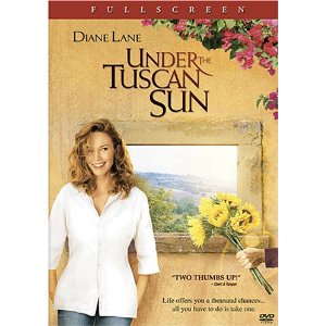
Looking for inspiration for ‘Battle of Wills,’ Erin Clayton went to her stash of DVDs and pulled out a movie she loves: Under the Tuscan Sun. She says, “Within 20 minutes I had the bones of the page put together. It took me a bit longer to add my journaling and do my title work but all in all it flowed really easily. From the piece I took the rectangular shape of the cover to make my cluster of title work, photo and journaling and I took the flowers coming from the top corner and used that.
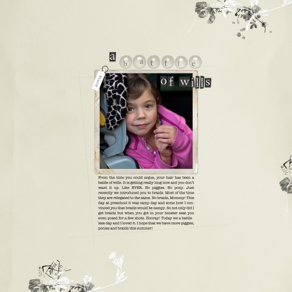
A battle of wills by Erin Clayton | Supplies: Katie Pertiet: Letterbox Seamstress Kit, Little Bits black, Vintage Frames No 7, Anna Aspnes: Swim Swim Kit, ArtPlay Palette 6, ArtPlay Palette Epic. Inspiration Source: Under the Tuscan Sun [DVD Cover
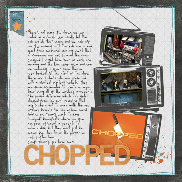
Chopped | Supplies: Watching You Layered Template, From my Bookshelf Solid Neutrals, Splatters No. 03 Brushes and Stamps, Ticketed Dates, Basic Paper Alpha Yellow (recolored), and Clean Stitched Borders (Teal) by Katie Pertiet, Enamel Stars by Pattie Knox, Just Tonals No 4 by Michelle Martin. All from Designerdigitals.com
Entertaining books
Sara Gleason scrapbooked her love of the Harry Potter books. She says, “I used a long, thin block of journaling to reinforce the imagery of books on a shelf. The font is similar to the one in the books themselves. And I chose elements that complemented the subject matter: Harry Potter books. I wanted to keep the photo itself as the focal point so I used the elements to small scale and used the color yellow (in the lightning bolt and the wee flowers) to frame the image with a subtle visual triangle. The red ribbon on the wand naturally draws the eye to the photos.”

HP nerd by Sara Gleason | Supplies: Platform 9 3/4 by Emily Merritt and Valorie Wibbens; pea green boat by Kaye Winiecki; font: High Tower Text
Paula Gilarde documented her reading material one week–including the things her children were reading. Looking at the layout now she can see that the books show what she was focusing on at the time: book group readings, parenting books and organizational material. The book and magazine covers that she’s incorporated make the record especially rich. Paula says, “I made this layout in 2010, and I remember how worried I was about my son and his anxiety. One year and one awesome teacher later, I have a different kid. I plan on repeating this layout every year to see how my reading habits change.”
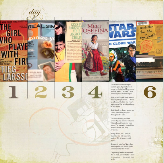
123 by Paula Gilarde | Supplies: Supplies: Pieces Of Life Layered Template and Memory Lifelines by Ali Edwards, Backyard Expedition Kit by Lynn Grieveson all from Designer Digitals. ArtPlay Palette Ex Libris ValueSet by Anna Aspnes (Oscraps).
Entertaining live shows and events
Debbie Hodge scrapbooked seeing the broadway show Wicked using memorabilia and elements from the internet to get a look evocative of the show. A seating chart of the Boston Opera House and photos and an image from the show poster are accompanied by a couple of small phone photoss. Collaged with these images are bits of lyrics from several of the songs in the show.
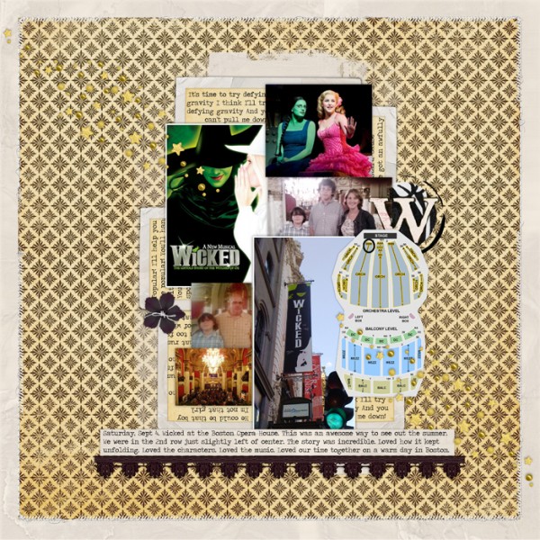
Wicked by Debbie Hodge | Supplies: Bead Scatterings No 3, Little Vintage Frames Curled and Flat by Katie Pertiet; Folie by Lynn Grieveson; Stitched by Anna Threaded, Layered Tissue Neutral Paperie, Layered FotoBlendz Clipping Masks No. 06, Stitched by Anna Borders No. 02, AAM WordSpheres No. 01 ElementSet by Anna Aspnes; poster, stage photo & lobby are from Boston Opera House website
To record her son’s trip to Boston with friends on the train (sans parents for the first time), Debbie Hodge had only a couple of photos taken at the train station when the boys arrived back at night. To get a sense of the event she used the show poster, pulling reds and greens from it for the page and laying the page out like a comic book.
Boston Comic Con by Debbie Hodge | Supplies: Comic Splatz, Inky Dink Page Borders, Rocket to Mars Kit by Lynn Grieveson
Entertaining apps and video games
Katie Scott has been totally addicted to Instagram lately. She says, “I love it because there is sharing but there isn’t all the “noise” you find on Facebook, and it’s all about ME as opposed to Pinterest which is mostly about other people’s pictures and ideas. I also love that I can take a screen shot and put that in my Instragram as well as photos and a series of photos (top right) to spell things (love, love, love). I made that Love collage in Instagram while I was on a walk around my neighborhood. I printed my Instagram photos at home via the Picasa collage maker and added a few bits of patterned paper and pinked circle embellishments to keep the page simple.”

Live Your Life by Katie Scott | Supplies: Designs by Reminisce; KI Memories; Quickutz; American Crafts; Spellbinders Nestabilities.
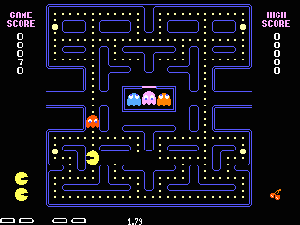
Ashley Horton‘s 3-year-old has a huge video game addiction. She says, “He is constantly playing on the computer or on our phones. I love snapping pictures of him playing, because he always has such a look of concentration on his face. For this layout, I took inspiration from one of my favorite video games when I was younger, Pacman. I used my Cricut Expression to die cut my Pacman and the little ghost for my page. I also love the little yellow dot trail that you follow on the Pacman game, and I incorporated it by punching circles with my 1/4 inch punch.”

Game Boy by Ashley Horton | Supplies – Patterned Paper: My Mind’s Eye & Crate Paper; Wood Veneers & Spray Mist: Studio Calico; Thickers: American Crafts; Punches: EK Success & Marvy; Brads: The Paper Studio; Button: Stampin’ Up; Font: CK Matrix
Debbie Hodge scrapbooked attending the midnight release for the video game Halo Reach using low-quality phone photos and elements from the internet to get a look similar to the game cover. She says, “I also found digital products that helped with the look. Cloud brushes and a vintage journal were perfect complements.”
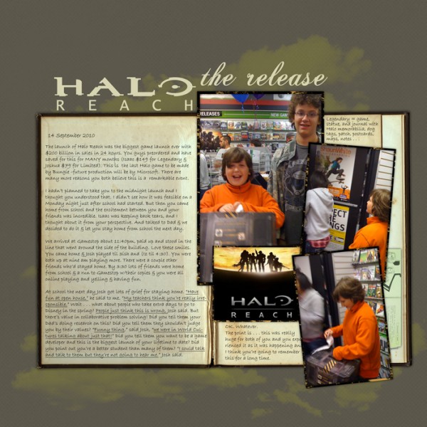
Halo the Release by Debbie Hodge | Supplies: Clouds No. 02 BrushSet by Anna Aspnes; Glorious Days Solids Paper Pack by Maplebrook Studio; Transparency Frames No 6, Vintage Journals No. 02 by Katie Pertiet Halo Font; Halo image from Bungie website
When Debbie Hodge’s sons taught her mom to play Angry Birds, she scrapbooked the event using elements and a design inspired by the game, itself. Birds, clouds and a pig were all it took.
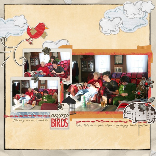
Angry Birds by Debbie Hodge | Supplies: From My Bookshelf Cardstock, Framed With Tape #2, Big Tags Boys, On the Edge Grunge No 1, Tag Frames No. 01, Flossy Stitches: Red, Flossy Stitches No. 02, Little Fly Aways Stickers, Junkyard Garden: Blooms, Grunged Up Alphabet No. 02 Brushes and Stamps, Brushed Alphabet No. 03 by Katie Pertiet; 12×12 Distressed Edges #9 by Anna Aspnes; Smallest Airman Kit, Farmer Joe Mini Kit, Forecast Kit by Lynn Grieveson; Felt Board Friends: Tot Transport No. 01, Brad Bonanza No. 01: Digital Fasteners, Felt Board Friends: Cagey Little Birds by Pattie Knox
Stefanie Semple says, “My second son loves soccer, and spends as many hours per day as I will allow on his computer playing Fifa 2012. I should be happy that it is something age appropriate and that I know where he is during the day, but I miss that soccer used to be a sport played outside getting exercise and fresh air.”
“I used the grey woodgrain to highlight the gloomy choice of being inside and the smaller canvas within the background denotes how his world has shrunk. The photos of him are a typical view of him as I walk past. The choice of red and blue elements highlight his favourite team (Chelsea) and their nemesis (Manchester United). The compact and constrained design denote his love of controlling the outcome of his games, so much better than allowing his team to lose, like they may in real life.”
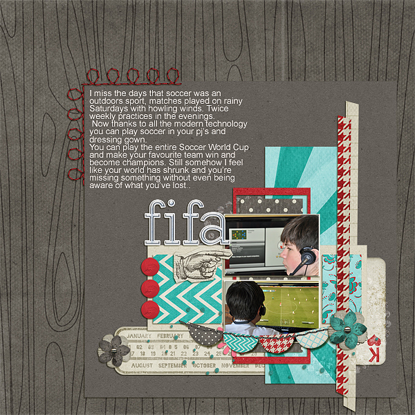
FIFA by Stefanie Semple | Supplies: GeniaBeana: Lotsa Layers v3 Template; BZB Designs: A Good Thing; Clever Monkey Graphics: Chrome Alpha and Paper Alpha; Elise’s Pieces Designs: Stitchies-August.
[getinspired]

