by Debbie Hodge
Titles can do more than label a page. They can cue the page subject, enhance page design, draw the viewer right on into the journaling, and just plain dazzle.
Take a look at long titles on the pages below for the way they enrich the stories being told and for their support of page design by adding repetitions, flow, emphasis and interest.
“It’s the boy who doesn’t play sports. Shooting hoops.”
Emily Pitts likes to blur the line between title and journaling, often leading from one into the other or even sandwiching the title between journaling. Her title here begins with bold black alphas in all upper-case and flows in a downward diagonal to the turquoise “Shooting hoops.” From there the viewer moves into the journaling, though the title already cues us in to much of the story.
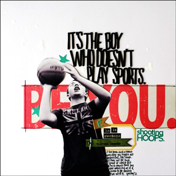
“It’s the boy who doesn’t play sports. Shooting hoops.” by Emily Pitts | Supplies: Cardstock: Bazzill, Patterned paper: Fancy Pants, Alphabet: American Crafts (black), Jillibean Soup (turquoise), Label: Heidi Swapp; Word Stickers: Prima, Wood flag: Prima, Kraft flag: Maya Road, Stars: Jillibean Soup, Twine: My Mind’s Eye, Paint: Liquitex, Pen: EK Success Thread: Coats and Clark
“Would you prefer to ride a bus or have class in your pajamas?”
Christy Strickler says, “People always tell me I am crazy to home-school my son. I tend to answer them with the question I used for the title: Would you prefer to ride a bus or have class in your pajamas?” That one question immediately conveys the subject and her attitude about it.
Christy used the same alpha stickers for the complete title, subbing in a button for an “o” and a chipboard bus for the word “bus,” both of which add fun and interest to the titlework.
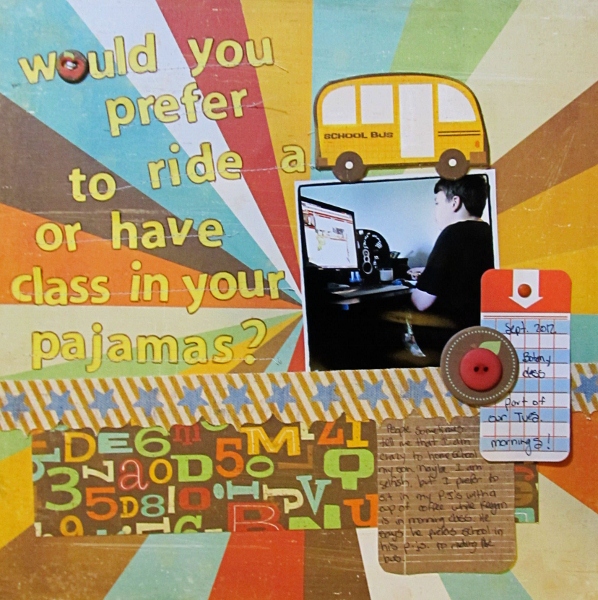
Would You Prefer to Ride a School Bus or Have Class in Your Pajamas? by Christy Strickler Supplies| Patterned Paper: Basic Grey, Crate Paper; Alphas: Sassafrass; Chipboard: Basic Grey; Canvas Border; Pink Paislee; Die Cut: Studio Calico
“Ava and the Ladybug Go to School.”
Chris Asbury scrapbooked her granddaughter’s first day of kindergarten with a long title that’s reminiscent of the title on a picture book for children: “Ava and the Ladybug Go to School.” We understand that Ava’s starting school with a cute ladybug backpack. The long title tells us so much, that very little journaling is needed.
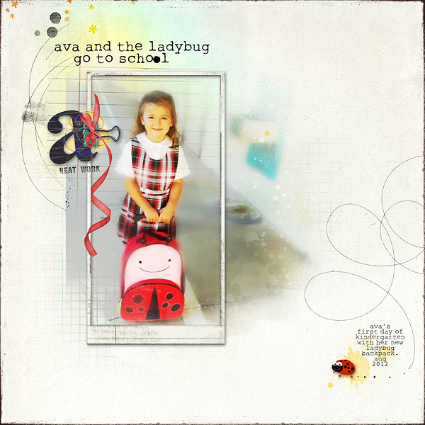
Ava and the Ladybug Go to School by Chris Asbury | Supplies: Anna Aspnes Designs: ArtPlay Palette Scholarly, ArtPlay Palette Easter Bunny ArtPlay Palette Viaggio, Different Strokes No. 8, LoopDaLoop Sketchy No. 2, WarmGlows No. 3; Kitty Designs: Buggy Bugs; Oscraps Collab: Life (ribbon)
“Grandpa Allen documented everyday life long before it was trendy.”
When Katie Scott recently went through a box of photos from her grandparents, she says, “What struck me most was that the bulk of the my grandfather took were of my grandma and everyday life – so Project Life, right? Except he did this in 1970 something–long before digital cameras and long before people took photos of the fireplace, the table setting and a person reading the paper or clipping coupons.”
The long title, “Grandpa Allen documented everyday life long before it was trendy,” put the emphasis right were Katie wanted it — on how remarkable (and currently valued) his approach to memory keeping was. Katie cut the larger letters with her Quikutz, emphasizing “everyday life” and “trendy,” and then got the rest of the words on with small stickers.

Grandpa Allen Documented Everyday Life Long Before It Was Trendy by Katie Scott | Supplies by Jenni Bowlin Studio, Cosmo Cricket and Quickutz.
“Creating is great. Getting praised is awesome.”
Marie-Pierre Capistran‘s “Creating is great. Getting praised is awesome.” features a collection of the comments she received on her work in a class with Heidi Swapp. Marie-Pierre says, “The praise in class made me feel special, and it lifted me up and brought me to a new level of scrapbooking.”
Marie Pierre hand wrote “great” and “awesome” with her iPad and then cut them with a digital cutter. She added lines of stitching to the words to unite them. She says, “I added journaling, but I think the long title tells the story and is the focal point of of the page.”
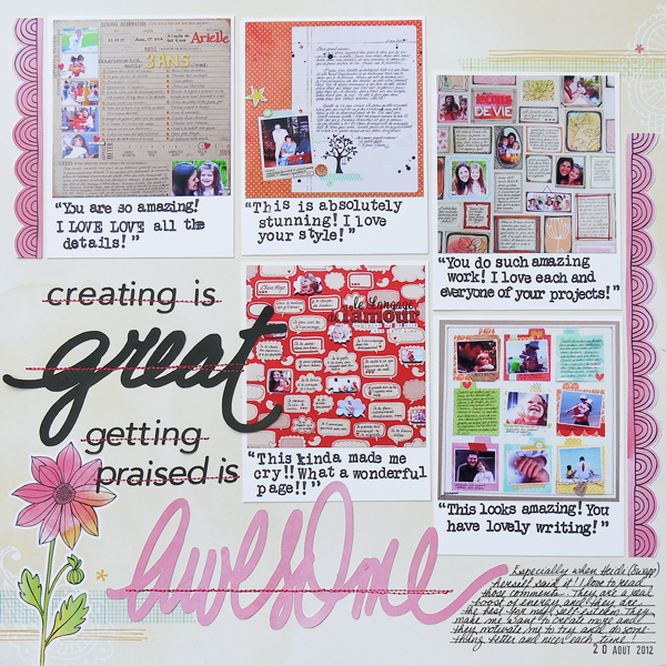
Creating is great by Marie-Pierre Capistran | Supplies: paper: Amy Tangerine; stamps: inkadinkadoo; ink: Memento.
“Sunday evening. Ice cream. Mint oreo. Phil’s cherry. A favorite summer tradition.”
Sue Althouse‘s title is a list that describes a summer Sunday tradition, incorporating the time, flavors, and the mention that it is a summer tradition. She arranged alphas, photo, and a border strip for a look like the currently trendy subway poster art.
Sue likes long titles for three reasons:
- They become a major design element on the page
- They can take the place of some or even all of the journaling
- They help use up my alphabet stash!
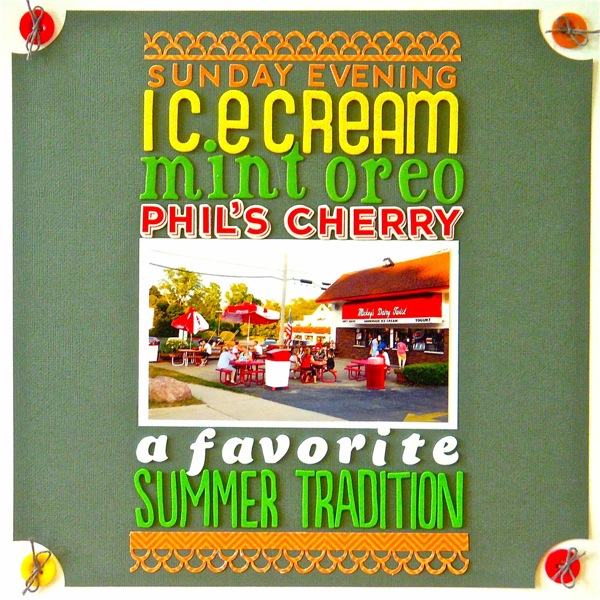
Sunday Evening Ice Cream…by Sue Althouse | Supplies: Cardstock: Bazzill; Patterned Paper: Echo Park; Border Punch: Martha Stewart; Alphabets: American Crafts, Jillibean Soup; Buttons: October Afternoon; Floss: We R Memory Keepers; Tools: Fiskars Circle Punch
“An Extra Ordinary Boy on a Beautiful Ordinary Day”
Amy Kingsford says, ” I love this everyday photo of my son, especially the way the light hits his face and reflects off of his hair. The long title here expresses that beautifully.”
“When I use longer titles I like to break them with a variety of alphas, fonts, and word art. I used a glitter alpha to highlight the word “boy” and to echo the light in the photo. I paired it with a basic tile alpha sticker and word art. The result is a collection of different shapes, colors and mediums that add visual interest.”
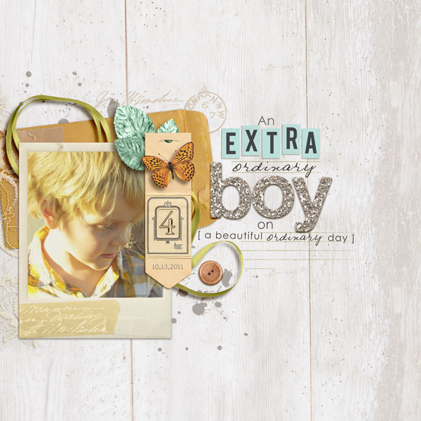
An Extraordinary Boy on an Ordinary Day by Amy Kingsford | Supplies: Sahlin Studio: A Spring Day Kit, Ephemera Stacks, Sweet Storytelling, Kitschy Kitchen Alphas, Key to My Heart Elements; Kristen Rice: Stitched Alpha Black; Anna Aspnes: Sliver Glitter Alpha
“The time to relax is when you don’t have time for it.”
Kiki Kougioumtzi used a quote from Sydney J.Harris for scrapbooking her much-needed summer vacation: “The time to relax is when you don’t have time for it.” She used a bright epoxy alpha for the words she wanted to emphasize and small alpha “bits” for the rest.
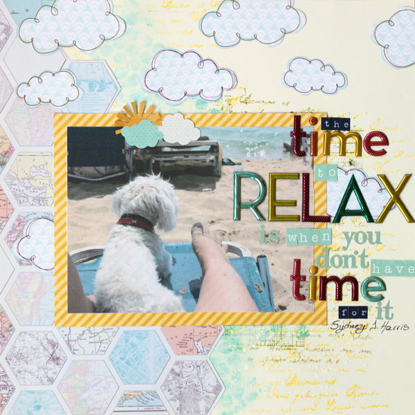
The Time to Relax is When You Don’t Have the Time by Kiki Kougioumtzi | Supplies: Cardstock:Canson; Pattern paper: Mel Stampz freebie, American Crafts, My Mind’s Eye, Echo Park; Stamps:Kaisercraft, Viva Decor; Alphas:Making Memories, Webster’s Pages, Authentique, Echo Park; Other: Gesso Liquitex, Sticky back canvas and Distress inks Ranger.
“The proof and joy of progress.”
Karen Grunberg scrapbooked her weight-loss journey with a long title. She could have stopped with “The proof of progress,” but adding in two more words–“and joy”–conveys her emotions about the subject. “Proof” is rendered in a turquoise matching the dressform and her skirt in the photo which creates a back-and-forth tension between the title grouping and the photo cluster.
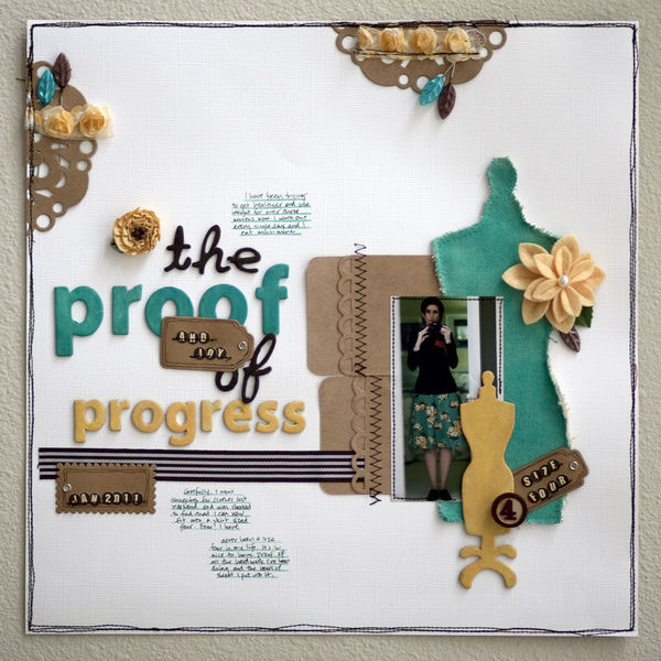
The Proof and the joy of Progress by Karen Grunberg | Supplies: Little stickers: Jenni Bowlin, Cardstock: Bazzill, All other products: Maya Road
Give a long title a try on your next scrapbook page using these ideas or ideas of your own. And then . . . just to mix it up . . . try a short title–we’ve got ideas for those, too.
[current]

