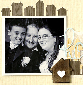
The house motif in its most basic form–a square with a triangular roof on top and maybe a chimney and a door–is prevalent in folk art, primitive home decor, crafts, cards, and scrapbook pages.
It’s easy to render, and it can represent family, home, shelter, and community, topics that are frequently the reason for a scrapbook page. The ideas that follow range from the addition of a small die-cut house as an accent to the framing of your photos with a house-shaped foundation.
Make pieced houses.
Leah Farquharson‘s page about home decorating is embellished with a row of primitive-styled houses made from a modern and vintage papers and ephemera for a one-of-a-kind look. Leah says, “After living in my house for 10 years, I’m finally decorating it and it was fun to add the simple houses made from patterned paper and ephemera to this layout, creating a shelf that mimics the one in my photo.”
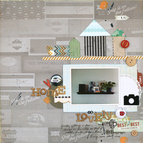
Home is Lovely by Leah Farquharson | Supplies: Patterned paper: Basic Grey, American Crafts. Stickers: Basic Grey. Doily dicut: GCD Studios.Wooden Buttons:American Crafts, Maya Road. Bingo Number: Maya Road. Canvas Camera, wooden heart: Studio Calico. Stitched button: Bluebird Chic. Flair Button: Ormolu. Letter Stickers: Jenni Bowlin. Chipboard Letter: AMerican Crafts. Washi Tape: My Mind’s Eye. Paint: Jenni Bowlin. Ink: Ranger, Studio Calico.
Ashley Horton created a “homey” feel by adding hand-decorated details to a house shaped die cut. The base is woodgrain patterned paper. Lace and scalloped paper create the eaves and a heart makes a window.
Ashley says, “This page tells the story of why my Grandparents house was my home away from home. I added the die cut of the house to reinforce how special this home was to me. I added the heart to symbolize love, and the scalloped trim and pom pom trim to show that this was a warm and comfortable place for me to be.”
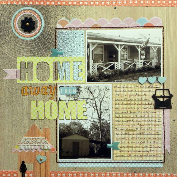
Home Away from Home by Ashley Horton | Supplies – Patterned Paper, Alpha Stickers, Wood Veeners, Mister Huey’s Circle Mask, Mister Huey’s Spray MIst: Studio Calico; SMASH Clips: K&Company; Ribbon: Webster’s Pages; Pearls; Kaisercraft; Font: Arial Black
The pieced houses on Barb Brookbank‘s “Our Home” are from a digital kit. They’re detailed with wood-pieced doors, eaves, and windows. Barb paired black-and-white photos of her family with a vibrant colored photo of her home. She’s also clipped a colorful patterned paper to the word “home” in her title.
Barb’s choice of where to use color supports the idea behind the beautiful poem that she chose for her journaling–that a family is what makes a home. Barb says, “This poem has always ‘spoken’ to me. It really sums it all up!”
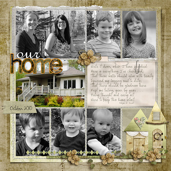
Our Home by Barb Brookbank | Supplies: Papers: Lift of Project Life; House Accent, Alpha, Flower Clusters: A View From the Top by DBDesigns; Paper Clip: May 2010 Premier ‘Boys and Toys’ by Digital Scrapper Designs; File Card: May 2011 Premier ‘Recollection’ by Joanne Brisebois; Envelope: May 2011 Premier ‘Recollection’ by Joanne Brisebois; Font – CK Ali’s Hand
Doris Sander pieced together a house, complete with a chimney, door, and windows from leftover patterned papers. She made a backdrop for the house accent with patterned papers: a cloud-print on top, a small-scale green print on the bottom, and a floral print sprouting out in the middle.
Doris says, “These photos of my son playing house with his little ‘girlfriend’ when he was three have always made me laugh. I’ve tried to scrapbook them before, but couldn’t seem to find the right inspiration. Using a paper pieced house with a quilted look proved to be exactly right. These photos are older and a bit on the dark side, so they didn’t make for a strong focal point. The cute little house provides a nice focal point that fits in well with the theme of the layout.”
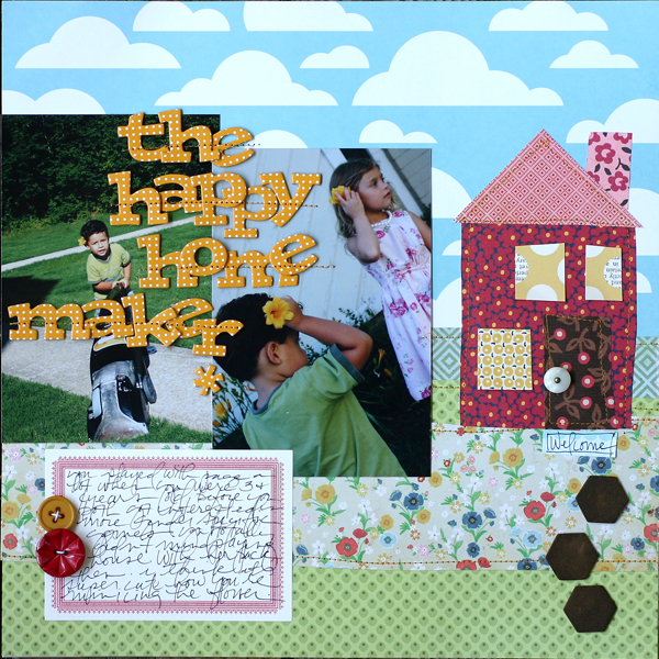
The Happy Home Maker by Doris Sander | Supplies: patterned paper – American Crafts, Jenni Bowlin Studio, Basic Grey, Amy Butler, Crate Paper, chipboard alphabet – American Crafts, chipboard hexagons – Jenni Bowlin Studio, buttons – Jenni Bowlin Studio, vintage, label sticker – Paper Source
Doodle a house.
Celeste Smith colored in a doodled house from a digital kit as the primary image on her page “Home Improvement Angst.” She didn’t have any photos of the improvements yet and she wanted the emphasis to be on the page journaling.
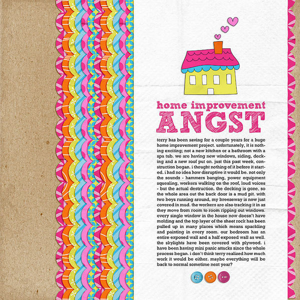
Home Improvement Angst by Celeste Smith | Supplies: kit: Home is Where the Heart Is by Michelle Underwood at Two Peas in a Bucket, fonts: Sketch Rockwell, Rockwell.
By creating a no photo page, the focus really becomes the journaling on this page. The lack of photos tells the viewer read this, it’s important! Be sure to use a clear readable font in a point size greater than 12 so the viewer has no excuse not to read!
Use the silhouette of a house.
Amanda Jones cut a house border from woodgrain patterned paper with her personal cutting machine. This double border compliments her soft, muted color scheme while bracketing her photo and pointing the viewer’s eye inward. She added texture with her fence border layered over tissue paper and the chipboard house accent.
Amanda says, “I wanted to make sure I documented the fact that we’ve lived in a number of different houses in our time as a family, and when I found this border of little houses in the Silhouette store I knew I had to incorporate it into my page.”
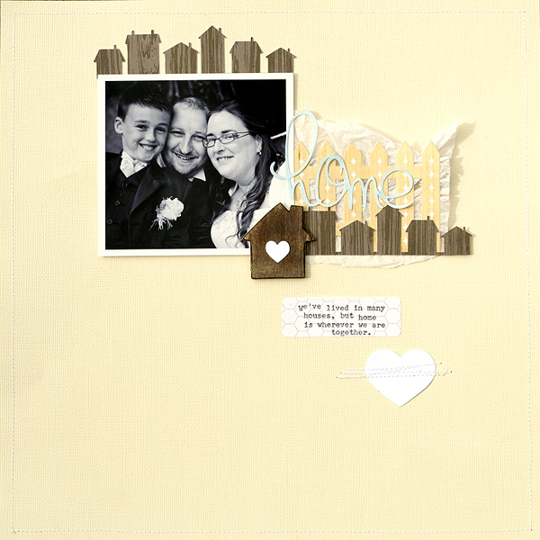
Home by Amanda Jones | Supplies: White and cream cardstock – Bazzill Basics; Woodgrain paper – Crate Paper; Label sticker – Freckled Fawn; Fence sticker – Echo Park; House and heart die-cuts – Silhouette; Other – Silhouette Cameo, Sewing machine & thread, tissue paper, wooden house embellishment.
Doris Sander ‘s use of the house motif in her page “Behind the House” is slight but impactful. Here she has punctuated her title containing the word “house” with a small chipboard die cut in the shape of a house and covered it with a red patterned paper. This is one of only a few pops of red used on the page–therefore the viewer is sure to notice it. This design choice created a symbiotic relationship in which the house accent adds to the meaning of the title while the color choice gives this house more visual weight on the page.
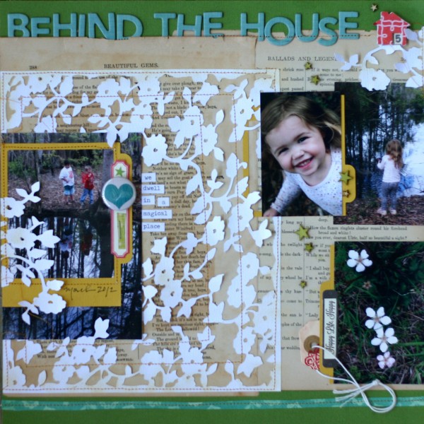
Behind the House by Doris Sander | Supplies: cardstock – Bazzill, pattern paper – Crate Paper, chipboard letters – American Crafts, flair – A Flair for Buttons, frames – Silhouette, label stickers – Jillibean Soup, floral diecut – Jenni Bowlin for Silhouette, wood veneer stars – Studio Calico, chipboard house – Jenni Bowlin Studio, ink – Jenni Bowlin for Ranger, tag – Avery, word stickers – Tim Holtz, book pages – vintage
Mark locations on photos or maps with houses.
On this page documenting her relationships with neighbors, Stefanie Semple paired street-view photos with house stickers to pinpoint the locations of her neighbors’ homes. You could do the same with a map.
Stefanie says, ” I chose my title from an Australian soap opera called ‘Neighbours’–whose jingle was Everybody loves good neighbours. My design is simple, yet the title has string woven through it to add interest and a paper plane to direct movement. The back ground paper is green with a blue cloudy paper masked in to add texture and colour. And the sticker clouds behind the houses add a little more charm to the scenes the homes create.”

Good Neighbours by Stefanie Semple | Supplies: Elise’s Pieces: Blue Skies Ahead; Stolen Moments Designs : yours Truly Template No. 1; Paper Garden Projects: Family (stickers).
Replace the word “home” or “house” with a house motif.
Sue Althouse used a famous quote by Benjamin Franklin as the title of this page in which she documents changes that she and her husband have made to their home since they’ve become “empty nesters.” She cleverly replaced the word house with a colorful die-cut house. It’s a fun way to break up a long title and it strengthens the meaning of the quote by visually illustrating the difference between “house” and “home.”
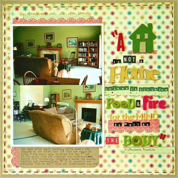
A Home… by Sue Althouse | Supplies: Cardstock: Bazzill; Patterned Paper: My Mind’s Eye Nostalgia (12×12 and 6×6); Alphabets: American Crafts, Cosmo Cricket, Jillibean Soup, October Afternoon; Border Punches: Martha Stewart, Fiskars; Die Cuts: Slice Elite; Buttons: misc; Floss: We Are Memory Keepers
Use a house-shaped stamp as your photo mat.
Amy Kingsford used a stamped house accent as the backdrop for her photo. This helps the black-and-white photo stand out and creates the feeling of her son and husband being inside the home in this playful photo. The stitched flowers and tree accent create a scene in which this stamped house feels “right at home.”
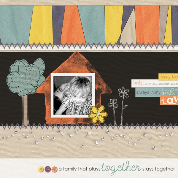
A Family That Plays Together by Amy Kingsford | Supplies Biografitti: Ohana Kit, Ohana Wordstrips, Creative Juices Template; Additional elements from Aja Abney, Anna Aspnes and Shabby Princess.
Make a house-shaped tag.
Punch a hole in your house embellishment and turn it into a tag as Debbie Hodge has done here on this page about how her mom fixes the satellite dish when it’s covered with snow. She fills a super-soaker squirt gun with warm water and sprays it off.
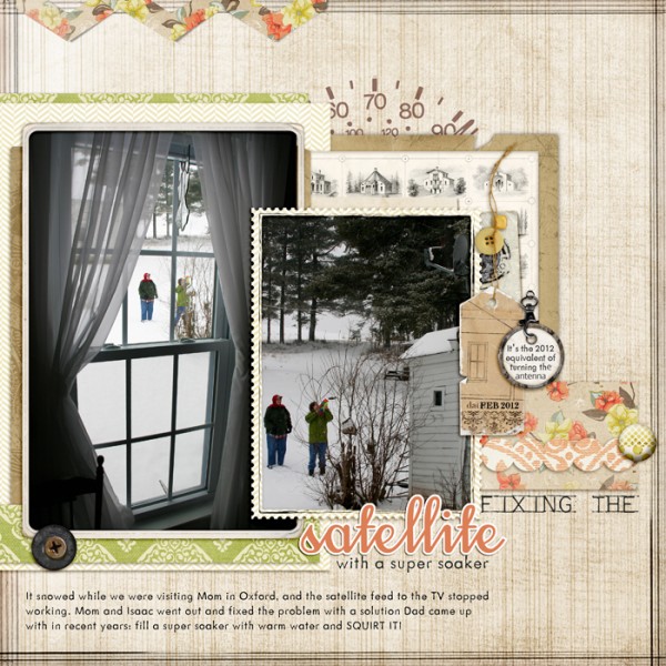
Fixing the Satellite by Debbie Hodge | Supplies: Relocate, Gearhead by ViVa Artistry, Scissored Chevron, Artplay Palette Sweet Baby Chevron by Anna Aspnes; 11am by Amy Wolff; Vintage Frames No 26, Posted Frames by Katie Pertiet; Treehouse, AL Uncle Charles, Mechanical Fun fonts.
Create a house-shaped photo collage.
Inspired by an infographic that outlined the psychology of colors in the home, Amy Kingsford made a digital photo collage in the shape of a house. She framed the photo collage with a woodgrain paper and used charming vintage papers and ephemera to complete the look. The journaling reads: “A house is more than four walls and a roof–a house is built from the love and memories that lives within its family’s heart” .
You can get this photo collage template as a freebie on Amy’s blog to use on personal pages and projects. Click here to download both the layered and printable templates.
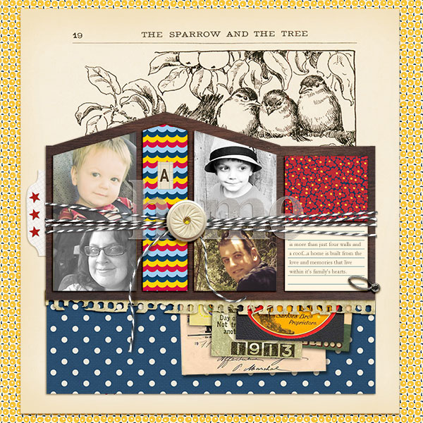
A Home by Amy Kingsford | Supplies: Jenni Bowlin Studios Digital Shoppe: Play Date Collection, Red and Black Extension, Trendy Collection and Rhinestone Buttons and Bows; Paislee Press: Photobooth; Gennifer Bursett: When Skies Are Grey; Sahlin Studio: Art and Soul; Anna Aspnes: Hummingbird Art Play Palette and Vellum Alpha; Mye De Leon: Ephemera Clusters; Ju Kniepp: Far From Here.
Include photos of houses.
Chris Asbury paired several pictures of her home in various stages of being built with seasonal accents to help set the scene for her story. The different colored leaves she’s embellished with provide also provide the viewer with the sense of passing time.
Chris says, “We enjoyed watching the progress of our home as it was being built. We stopped by the construction site every day and would imagine the day we would move into our new home. After just six months our new house was complete and we were home at last.”
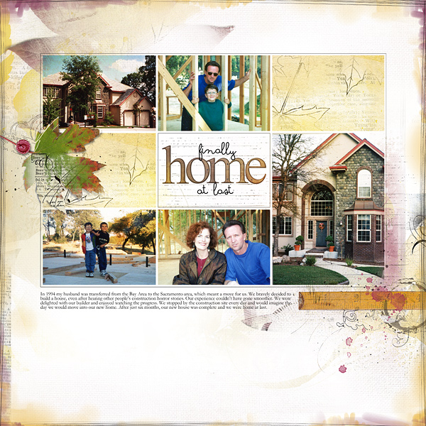
Finally Home At Last by Chris Asbury | Supplies: Anna Aspnes
365 Layered Template No 3 MultiMedia Leaves No 2, ArtPlay Palette Fall No 1 (button) ArtPlay Palette Fall No 2 (overlay)
Wood Shop AlphaNumber Set No 1, Scanty Journal Lines No 5; Katie Pertiet: Home & Garden (ruler); Fonts: Soymilk, Garamond
Katie Scott scrapbooked her great-great-grandparents historical home using memorabilia and vintage home-themed ephemera on her page including a home-inspired tag and a sample of wallpaper border with colonial-style houses on it.
Katie says, “For this page I used the 1900 Census and looked up where my great-great grandparents lived and with the magic of Google Maps, I was able to both make the map and I could see a photo of the house and get the specs–learning that this house was built in 1889, so when my great-grandparents lived here in 1890, it was a new house.”
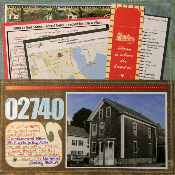
02740 by Katie Scott | Supplies: Copic Markers (to alter the white letter stickers – I purposefully did them all gloopy so that they looked sort of like water); Cosmo Cricket circa 1934 papers and embellishments; I think the big whale is Sassafrass (maybe?).
How have you used the house motif on your pages? And what kinds of pages have you used this motif on?
[akingsford]
[designclass]

