 About Green | Green Dominating | Green Drawing the Eye | Green Guiding the Eye | Green Accenting
About the Color Green
Color conveys meanings or evokes feelings in three chief ways. See the resulting associations with green for each trigger.
1. PHYSIOLOGICAL RESPONSE: Green is refreshing, quiet, natural and calming. That’s why they have “green” rooms at TV studios for performers to wait in.
2. IN NATURE: Green is the color of grass, leaves and vegetables and is therefore associated with those things in nature that we find refreshing and associate with growth and fertility.
3. PSYCHOLOGICAL SYMBOLISM (associations with the viewer’s own psychological symbolism):*
- Western: greed and jealousy
- Eastern: fertility and hope
- India: virtue, harvest and new beginnings
- Saudia Arabia: wealth and prestige
- Middle East: color of Islam
- China: disgrace and infidelity
- Japan: eternal life and youth
- Indonesia: a forbidden color
* SOURCE: Cutural Color
Green Dominating
Amy Kingsford says, “I love the color green. I am drawn to the sight of it and when I wear it I feel full of life and energy. Because green is my favorite color it was a natural choice for this page about my house and my five pets. The color green is prevalent in my home. We have a green parakeet who sheds its beautiful green feathers all about. I used a variety of greens and yellow-greens and added in pops of bright orange for intensity. A house with five pets is a lively one with plenty of tension and that’s the feeling I wanted to create here with my color choices. Unfortunately my pets are a little camera shy and I don’t get too many photos, so I used products to capture their essence rather than photos.”
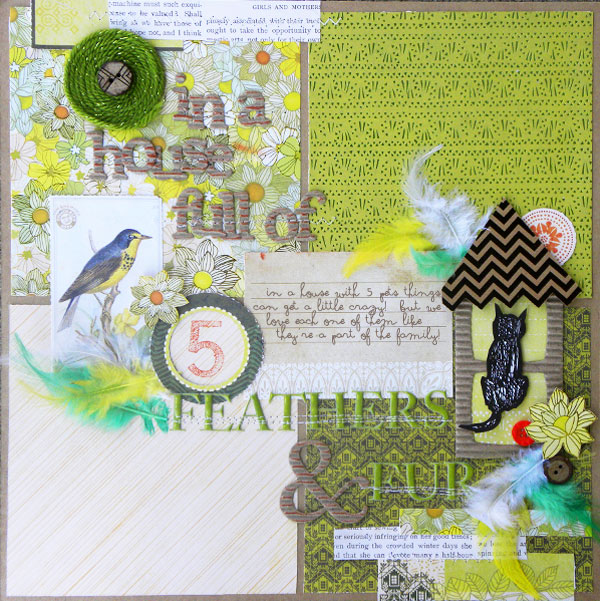
In A House Full of Feathers and Fur | Supplies: SEI: Entrada Collection; Field Notes Postcard, Salem Heights Sticker Sheet, Corrugate Cardboard Alpha and Frame, Feather Pack, Puff Alphas Green; 3 M Foam Squares; Ink Pad: Ranger by Tim Holtz; Other Supplies: Yarn, Misc. Buttons, Kraft Cardstock.
Vicki Walters says, “Green is a fresh and happy color and not usually used for a beach page, but here it is. The fun sprinkles and elements add to the fun of the idea of a vacation in a lovely green house at the beach. Green represents how refreshed we were after that wonderful vacation. Instead of framing the photo, I framed my title instead.”
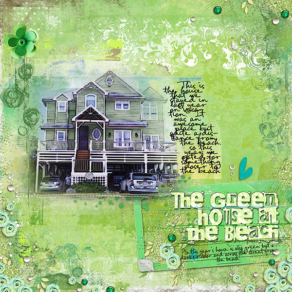
The Green House on the Beach | Supplies: Anna Apsnes:
ArtPlay Palette no 2: Kitty Designs: Magic Swirls no 6, Emerald Flakes, Linou, Painted Wishes; Fonts: FG Rebecca Script and 215000E
Katie Scott says, “Green is associated with Ireland and I’ve been researching my family’s history. The photo is of my great-great-grandparent’s family. I recently learned of a paper called “The Boston Pilot,” which was like the Irish Facebook of the 1800s since it was the tool Irish immigrants used to find their families in America. I printed out “Information Wanted” pages from it, and they were perfect for a pocket page. I used random green papers and embellishments and an old pre-made tag “Birds of a Feather.” While the tag seems seriously out of date (in a scrapbooking way), it’s perfect for the theme of the Irish immigrants flocking to their families and keeping together in a neighborhood.”
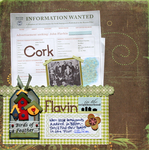
Cork by Katie Scott | Supplies: October Afternoon and K&Company patterned papers; KI Memories letter stickers; handmade tag
Kiki Kougioumtzi says, “For this page I used an earthy palette with green as my background color and bits of yellow-green on my embellishments. Branches at diagonal corners ground the block of photos to the canvas.”
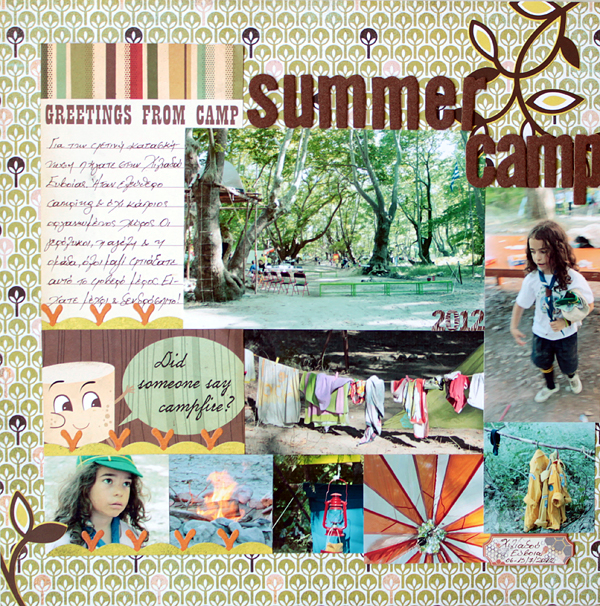
Summer Camp by Kiki Kougioumtzi | Supplies: Patterned paper:Basic Grey, Cosmo Cricket; Journaling card:Cosmo Cricket; Stickers:Basic Grey; Chipboard:My Mind’s Eye; Alphas: My Mind’s Eye, Basic Grey.
Green Drawing the Eye
Marie-Pierre Capistran says, “I made this layout for my daughter, Maya. It’s the story of how we chose her name. To make the long story short, we liked the name Maya a lot, but in Quebec it’s related to the cartoon character Maya the bee so we weren’t sure we should choose it.”
“Design wise, I could have used any photo of my daughter Maya, obviously, but instead I went with a picture of the little bee Maya that I found on internet. I paired it with cartoon-like letters and placed everything on top of oversized grass that I painted myself on water colour paper. Rather than making the grass a darker green, I kept a tint of yellow-green for a happy and vibrant feeling–like the bee and like my daughter’s personality. I added water droplets with a clear glossy accent and framed the piece with black stitching.”
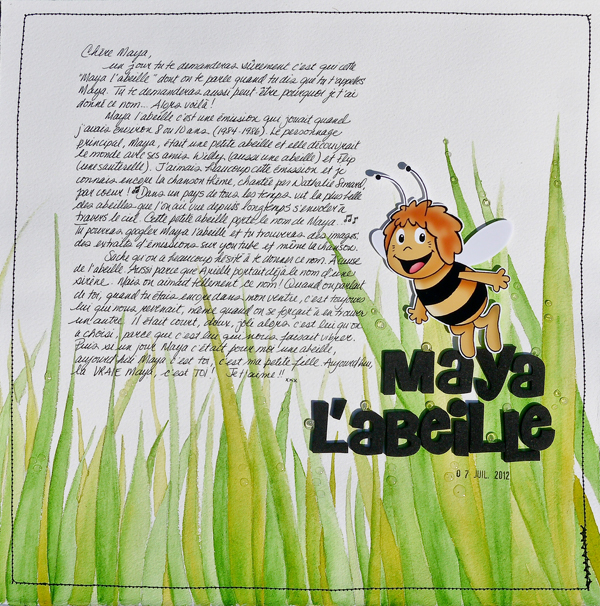
Maya L’abielle (Maya the Bee) by Marie-Pierre Capistran | Supplies: watercolour paper and watercolour; AC Thickers: Daydream; black thread and sewing machine; glossy accent; date stamp.
Terri Billman says, “I’m an outdoor kind of girl. I love being outside whether it is golfing, hiking, attending sports events, or playing with my granddaughters. Since green represents nature, I naturally go to green whenever I’m scrapping outdoor activities. These photographs of my granddaughter and me were taken at the pool.”
“I wanted to focus on her adorable little face, her excitement and not so much on the splashes in the pool. Since her bathing suit was pink and white, I chose a soft green with very subtle shades of pink to give the layout a calm and refreshing feeling. The white chevron background paper represents the wave action of the water. The green embellishments at the top left, middle of the page, and the button on the bottom provide movement through all of the photos. The green and white lace placed vertically and the wire heart brings focus to the strip of photos and particularly her adorable little face.”
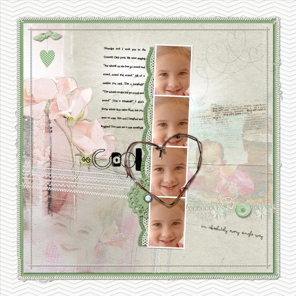
So Cool by Terry Billman | Supplies: Katie Pertiet: Classic Embossed Chevron, Cold Springs, Simply Botanicals No. 1, Hushabye Ribbon Ties; Anna Aspnes: Art Play Solids Storm, Art Play Sweet Pea, Art Play Adventure, Heart Loopdaloop 2, Fotoglows 4, Stitched by Anna Frame Stitches, 12 x 12 Stitched by Anna White, Artsy Layered Template No. 61; Michelle Martin: Stems of Three Hearts
Ashley Horton‘s page shows her little guy being followed by a line of Seagulls, who were after his Cheetos. Ashley says, “I wanted to use green to create a fun scene. I love the pattern on the Green paper at the bottom of my page, because it resembles blades of grass and, also, cute little birdie tracks. I used the green paper to create the effect of grass at the bottom of the page and balanced it out with the blue wood grain at the top for my sky.”

Have Cheetos? by Ashley Horton | Supplies – Patterned Paper & Chipboard: Bella Blvd.; Thickers: American Crafts; Brads: The Paper Studio; Punch: EK Success; Font: Brush Script & Gill Sans;
The focal point on Corrie Jones‘ “Laughing” is the photo of her daughter. The bright green in the photo grabs the eye. Corrie framed this fun photo by drawing lines with the tubes on her mists. She says, “I used all the bright colors in my stash, letting the lines be imperfect and splattered. Once I had a colorful frame, I added doodle stickers and a banner.”
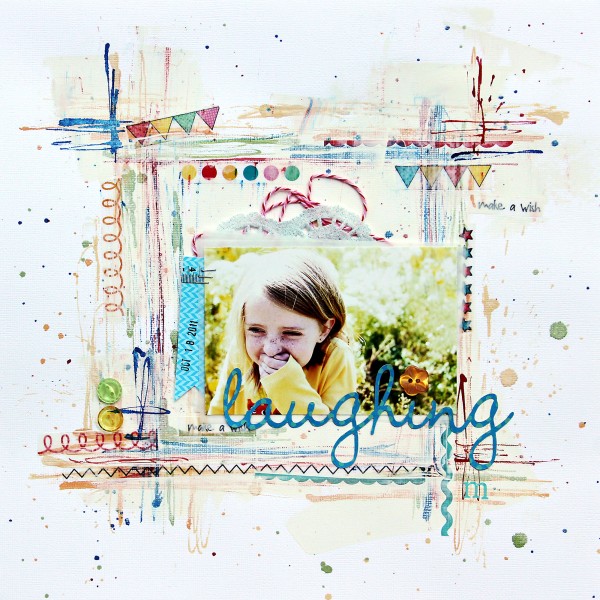
Laughing by Corrie Jones | Supplies:Cardstock – American Crafts; Stickers – SRM Stickers; Tag – Elle’s Studio; Buttons: Doodlebug; Twine – Jillibean Soup; Rub On – Jenni Bowlin; Mists – Studio Calico, October Afternoon; Other – Patterned Paper, Doily, Gesso
Green Guiding the Eye
The title on Doris Sander‘s “Your Tears Pierce My Heart” is key to our understanding of and entry into this page and their bright green color grabs the eye and moves it from top to bottom.
Doris tells the story of the photo: “When Gabriel was three, my niece got married and asked him to be her ring-bearer and me to photograph the wedding. My mom, dad, sister, and brother-in-law were, of course, all part of the wedding party. My other niece was the maid of honor and her mom, my other sister, had to help all the girls get ready. Since it was a destination wedding, the only other family member there was my other brother-in-law. He then ended up with the duty of escorting the ring-bearer. You can see from these photos how impressed my little guy was with that idea. It broke my heart to see him cry, but what could I do? He got lots of mommy hugs throughout the reception and recovered enough to hit the dance floor with the flower girl.”
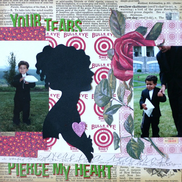
Your Tears Pierce My Heart by Doris Sander | Supplies: pattern paper, stickers, chipboard heart – Jenni Bowlin Studio, cardstock – Bazzill, Silhouette – Jenni Bowlin for Silhouette, other – glitter
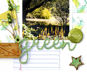
Amanda Jones says, “One thing I love about the area I live in is the lush green countryside. I wanted to scrapbook this picture as a reminder to always be grateful for small blessings like lush green trees.”
“I built my page on white cardstock with green accents so that it wasn’t too overwhelmingly green. I used embellishments that reinforce my theme and clustered pins and flag together beside the photo to look a little like a spray of grass. The most fun part of the page was creating the little feather pieces for the background. I cut several “Robin Hood” style arrows with my Silhouette and trimmed them down so I was left with just the feather part. I then drizzled them with Twinkling H2O watercolour paints in various shades of green before stitching them left to right on my background cardstock.”
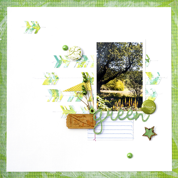
Green by Amanda Jones | Supplies: White cardstock – Bazzill Basics; Patterned paper – Crate Paper, Echo Park; Flair – American Crafts; Flag – Pebbles, inc.; Resin flower and wooden ticket – Prima; Star – Basic Grey; Journaling tag – Studio Calico; Green bling – K&Company; Die-cutting machine – Silhouette; Cameo; Twinkling H2O paints – Luminarte; Other: Gesso, decorative pins
Debbie Hodge’s “Hot Saturday Afternoon” includes several busy photos of friends on and around the river. The long photo at lower right grabs the eye first with its bright values. The greens in it are echoed in the other photos — but Debbie also included three green embellishment points to keep the eye moving around the page.
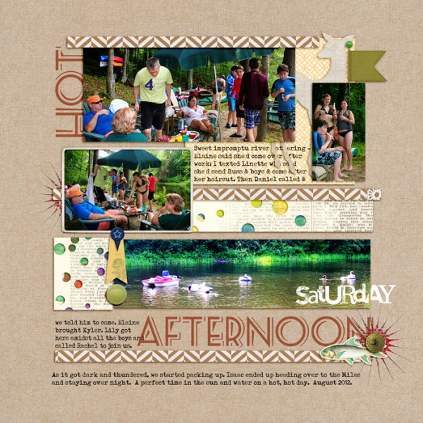
Hot Saturday Afternoon by Debbie Hodge | Supplies: Are We There Yet by Britt-ish Designs; Vintage Frames No 26, Krafty Canvas No 1 by Katie Pertiet; Rainbow Bites by Sissy Sparrows; Travel Notes by Maya deGroot; Smart Cookie, Pelican Lake by Lynn Grieveson; Strike a Pose by Little Butterfly Wings; Arplay Palette 2 by Ana Aspnes; A Mixed Up Alpha by Lisa Sisneros; Seaside Resort font;
Green Accenting
“Surf Soul” is a beach themed page by Kim Watson who made sure to play up her theme of water and waves by including ruffled “wave-like” paper, a fringe of blue beneath the photo and blue sprays radiating out from the photo. In the midst of all this color and detail are bright green accents in the title work and pennants.
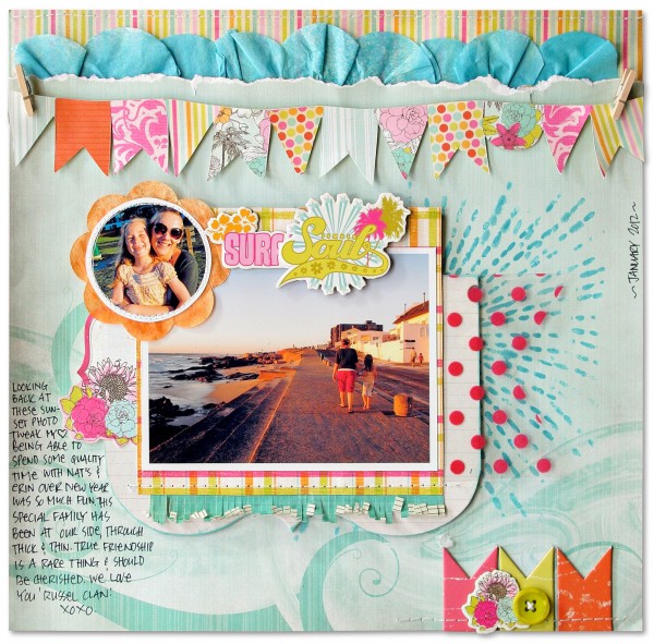
Surf Soul | Supplies: Patterned paper, Printed accents, Chipboard, Paper filters, Transparency, Buttons: Fancy Pants Designs; Blue, Orange mist: Studio Calico; Mini pegs: 7 Gypsies; Pen: Sakura; Stencils: Crafters Cottage; Other: Thread
Amber Ries made a mosaic of hand-trimmed blocks cut from photos and a variety of papers on “Star Cake.” Bright bits of green papers and candy sprinkles are scattered around page center.
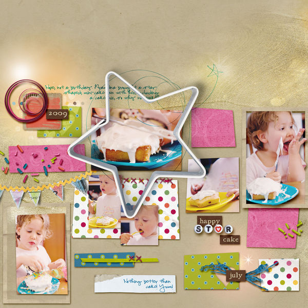
Happy Star Cake by Amber Ries | Supplies: Karah Fredricks: Bring on the Cake | Valorie Wibbens: Topography No. 9 | Micheline Martin: Bead Factory | Anna Aspnes: loopdaloops star, gold paint overlays & warmglows
[current]

