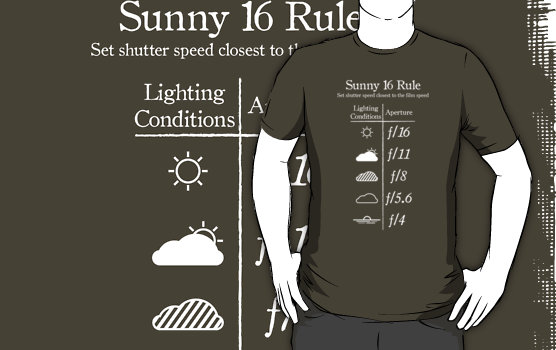
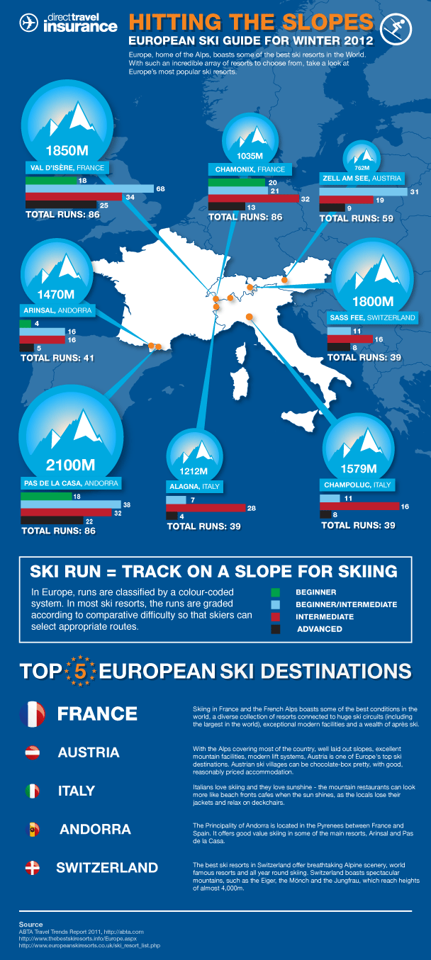
The Infographic is a response to today’s information-packed world. What is the infographic? An infographic combines images and numbers and a few words to convey information on a very focused topic.
An infographic can be a great inspiration piece for a scrapbook page. You could lift any of the following from an infographic
- color
- image
- layout
- type
- story approaches
- page subject
Grab a line
Leah Farquharson used her infographic inspiration piece to inspire page design and title. She repeated the “T” created by vertical and horizontal lines meeting.
Leah says, “We took a few fun shots on a recent sunny afternoon at the beach as we were working on our tans. We came home with lots of smiles and maybe a bit of a sunburn!”
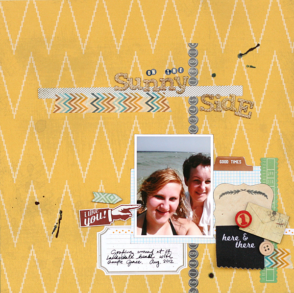
On the Sunny Side by Leah Farquharson | Supplies: patterned paper: My Mind’s Eye, Basic Grey. Stickers: Basic Grey, Crate Paper. Tape: My Mind’s Eye. Bingo Number: Maya Road. Wooden envelope: Basic Grey. Fabric Tag: Ormolu. Letter Stickers: Jenni Bowlin.Chipboard letters: American Crats. Wooden Button: American Crafts. Ink: Ranger.
Connect the dots
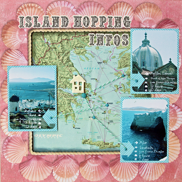
Kiki Kougioumtzi was inspired by an infographic that showed ski slopes on a map. Those map spots were connected to expanded details on each via lines radiating out from a map. On ‘Island Hopping’ Kiki she’s connected islands on a map to photos and details her her visits to those locations.
Kiki sayd, “I used a map from an airline brochure and mounted a frame around it with foamboard to raise it (and the photos) from the background. I inked the edges of the map in black for more shadow. The house is also from foamboard that’s been heat embossed twice (with white and clear embossing powders).”
She also added legends to each photo that detail: island name, the place the photo is taken, the nautical miles from our town’s port, the hours they sailed and the days they stayed. Kiki says, “I also repeated the framing of the layout to the photos for a more cohesive look.”
“Info-graph” your online life
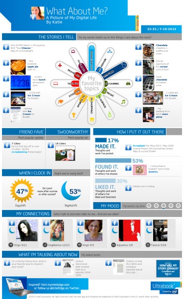
Katie Scott made her own “Online Me” infographic by linking up with her Facebook account with the “What About Me?” service.
Katie says, “It did all the work for me and revealed, that (by a landslide) I tell stories about art and food. It also found my most “swoon-worthy” picture on Facebook and other interesting and random tid bits. For years I have wanted to capture my content on Facebook for my scrapbooks but have never found a great way to do it until now.”
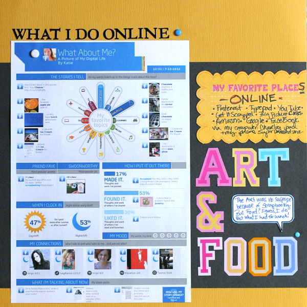
Art & Food by Katie Scott | Supplies: KI Memories letter stickers; DCWV thought bubble; K&Company journaling spot; Sharpie, cardstock , brads.
Tell a story in numbers
Barb Brookbank‘s ‘30,000 Cups of Coffee’ takes a look at how many cups of coffee she drinks a day, a week, a month, and a year! Numbered coffee cups set the theme and a graph made with striped papers presents the results.

Instant Human Just Add Coffee by Barb Brookbank | Supplies: Kit: Coffee Klatch by Patti Knox; Font: LD Shelley Print
Get ideas for personal information to collect
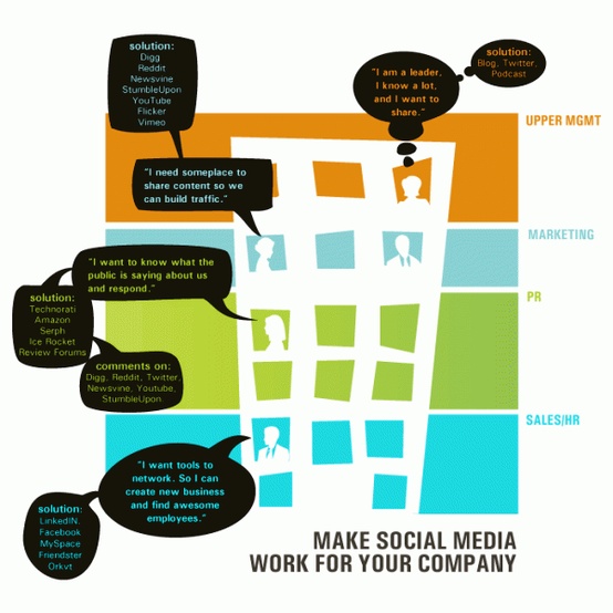
This particular social media infographic provided Christy Strickler with layout inspiration, but the process of looking at inforgraphics, gave her many other ideas –ideas about information she should collect and document about here family right now.
Christy says, “I started by creating this page about the words my son currently uses the most . I chose this particular infographic because I liked the bold colors. The speech bubbles were the perfect way to list and discuss how my son is using these words right now. I am not good at drawing, so I simplified the silhouettes of the people in the building.”
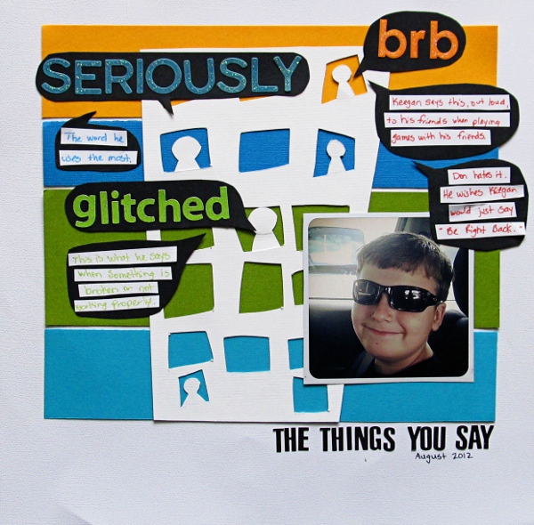
The Things You Say by Christy Strickler | Supplies: Cardstock: Colorbok; Alphas: 7 Gypsies,My Little Shoebox, Sassafrass; Glitter Glue: Ranger; Other: cardstock
Tell a story with a color legend
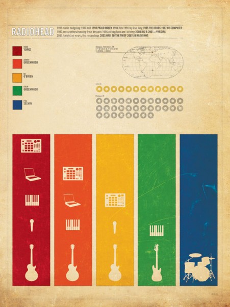
Amy Kingsford says, I’ve taken details like the color blocking, pictograms and color legend from this Radiohead infographic and applied them to my own design to tell the story of my honeymoon in Seattle. I also used this inspiration piece as the perfect opportunity to indulge in my love of fonts.
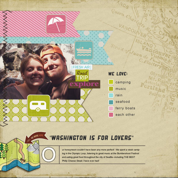
Washington For Lovers by Amy Kingsford | Supplies: Sahlin Studio: Summer Camp, Recreation Icons, Summer Camp Snippets, June Freebie Template, Vintage Vogue Papers; Anna Aspnes: Travel Americas No. 2, Textured Overlays No. 7; Fonts: Ranger and Arial.
Get a new color approach
Brenda Becknell was inspired by the colorblocked squares and vari-toned letters on the True Colors infographic.
Brenda says, “I cut 2″ squares of various red cardstocks for the background and matted them with navy cardstock. I diecut the heart out of the same four cardstocks, then layered the hearts, cut them apart, and pieced them together to make a tag. The title alphas were diecut from three different cream patterned papers, then cut each letter in half and pieced them together.”
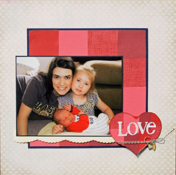
Love by Brenda Becknell | Supplies: Patterned paper: Pink Paislee
Cardstock: DCWV, Bazzill, C’oredinations; Martha Stewart border punch; Cricut cartridges: George (heart) and A Child’s Year (alphas); Misc: baker’s twine and heart charms;
Document the life of an item you use every day
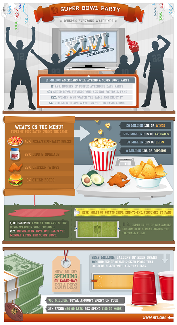
Terry Billman documented the life of a pair of cleats in one year of use by her son. Terry says, “Each year my son played football he would say, ‘Mom, I need new cleats. Do you know what these cleats have gone through?'”
The middle section of this infographic inspired her layout. Terry says, “Since the school colors are orange and white, I chose an orange solid color background paper. I blended several different football photographs into the background, some of which are action shots to signify the “work” these shoes have gone through. I showcased the picture of the shoes in black and white and matted on a black mat with a white border. I used paint splatters and different brushes to give the layout a grungy, sweaty, football feel. The list of information includes the different drills he did at practice and journaling at the bottom lists the number of games and practices during one season.”
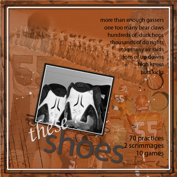
These Shoes by Terry Billman | Supplies: Maplebrook Studios: Just Linens No. 29, Just Linens 37; Anna Aspnes: Art Play Palette Scholarly, Art Play Palette 9, Fotoblendz Clipping Mask 1, Abstract Fotoblendz 5, Art Play 1, Art Play Special 1, Art Play Red, White, Blue, Artist Edge 2.
Document details “in the round”
Audrey Tan a color-wheel inspired layout that documented aspects of colors and her relationship to them in infographic style. Audrey says, “I knew I wanted to do a page about colours and what they represent. With a lot of blending and erasing, I managed to convey the nuances of colours and journaled about how I felt about colours. I even portrayed myself in my favourite colour, red.”

Mood Swings by Audrey Tan | Supplies: Ju Kniepp Designs & Tangie Baxter: Creative Felicity; Anna Aspnes: 12×12 Sand Scratched Overlays No1, Flutterby Foto Blendz No3; Tangie Baxter: Cart Set 32 Color Wheel, AJC11 Parcel 30; Fonts: Legion Slab, Duval Outline & Larger Mime
Document travels by the numbers
Marie-Pierre Capistran says, “This layout is called: crazy about cruising and it’s meant to sort through all the cruises we’ve done until now using an infographic-inspired approach.”
“I numbered every cruise we’ve taken and wrote the date, the name of the ship, and the islands visited. I used just ONE picture from each cruise that represents the whole cruise fairly well. That was the hardest part. I placed the whole 8 pictures in two 6″ columns. To add more quick information, I printed a small map of the Caribbean and glued a small rhinestone on every island we visited.”
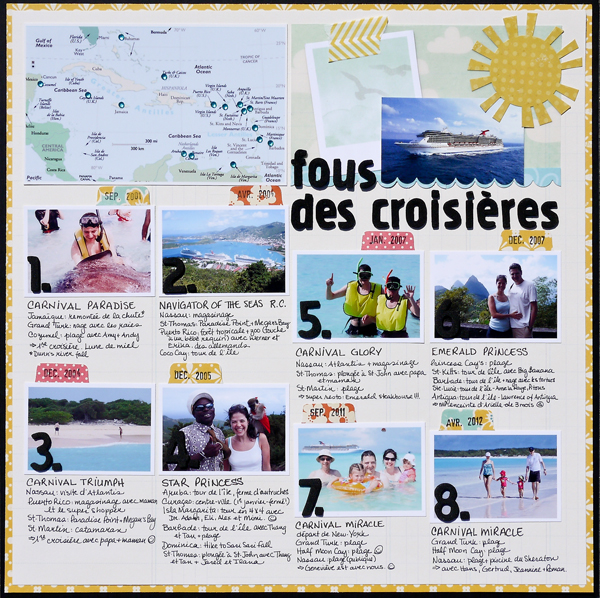
Fous Des Croisieres (Crazy and Cruising) by Marie-Pierre Capistran | Supplies: Paper: SU!, October Afternoon, Pebble, AC Dear Lizzy; Card stock: Bazzill; Vellum paper: AC Dear Lizzy; Stickers: Simple Stories; Punches: SU! scalloped border punch and tab punch; Thickers: AC Wonder; Washi tape: Bella Blvd.; Rhinestones: from stash.
[msdfree]


