by Debbie Hodge
“Faux bois” is the French term for false wood.
Faux bois (or wood grain) patterns have shown up in fabrics for fabric and home decor, wallpaper, and surface designs. They are on laptop sleeves, lampshades, floors, and throw pillows.
Using faux bois prints lets you get a natural “eco” look without cutting down a tree. Three-dimensional faux bois techniques originated in 19th century France, when stone workers made furniture, planters and decorative structures with a wood grain look out of rebar, wire mesh frames and cement.
1. Faux bois for texture
Jen Matott says, “I am loving all the woodgrain patterned papers lately! I have been a great lover of Kraft cardstock but this gives me a different option for a somewhat neutral background! I love the implied texture it lends to the pages without adding bulk.”
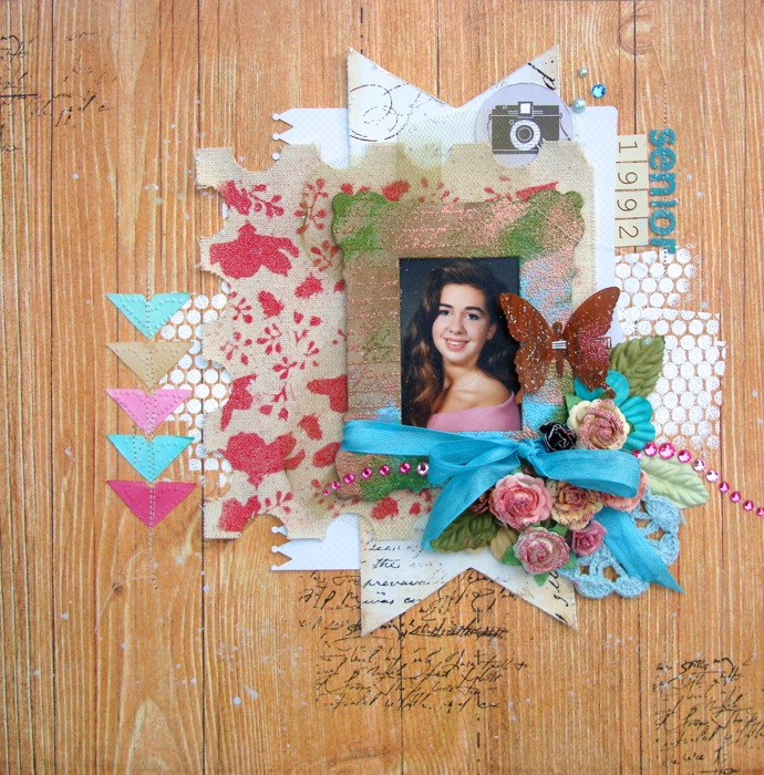
Senior 1992 by Jennifer Matott | Supplies: Patterned papers: Sassafras Lass for Studio Calico; Packaging from Prima Marketing; Donna Downey Stencil; Basically Bare (Oh So Mini in Stamp & Frame); Letters, bling, photo corners, butterfly, and flowers: Prima Marketing; Seam Binding, Tulle, Helmar 450 Quick Dry Adhesive; Embossing Powder: Suzy West WOW Bubble Gum, Cotton Candy, Earthtone Olive, Bright White, Angel Wings Glitter, Copper Metallic; “Call Me” Stamps- WOW
2. Faux bois to echo the furniture and walls in your photos
Tara McKernin says, “I love Tiffany Tillman’s digital template with the bold white frames, and this dark wood grain print from Paislee Press’ Weekender it was a good high-background for them. Normally I don’t do dark backgrounds but I have found that woodgrain papers are more like neutrals than dark solids. The wood grain print echoes the wood floors my son is playing on, which ties it all in together.”

Child’s Work by Tara McKernin | Supplies: Weekender kit from Paislee Press, Gallery template #3 From Simply Tiffany Studios
Stephanie Semple says, “I used woodgrain patterned paper to highlight the dark wood of my bedroom furniture in these photos. My two cats are watching each other, one from inside and the other from outside. The pink and green papers pick out colors from my bedding. Flowers and greenery are a nod to the outdoors and they anchor the smaller photos.”
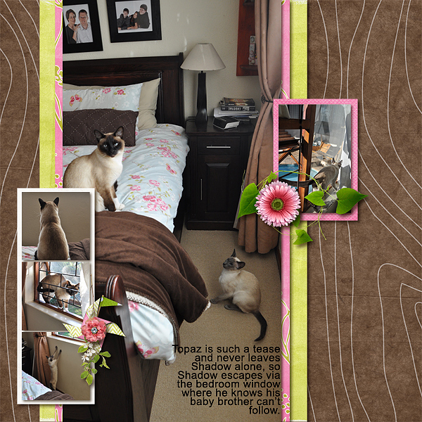
Untitled by Stefanie Semple | Supplies: Gimme layers vol 32 Template from Cluster Queen Creations, Candy Floss and Lemon Drops by Siamese Studio, Down by the River by Mye De Leon
3. Faux bois for a camping theme
Christy Strickler used a wood-grain print as the base for a story about “camping out” in the living room when one of the air conditioner units fails. She says, “When one of our units wasn’t working, we moved into the living room to sleep in cooled air. My son said we were camping out in our living room. I chose a wood grain paper along with camping themed embellishments to support the story.”
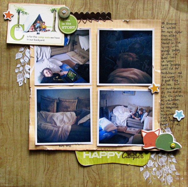
Happy Camper by Christy Strickler | Supplies: Patterned Paper: Bobunny, October Afternoon; Chipboard, Die Cut and Stickers: October Afternoon; Buttons: Basic Grey; Ink: Clearsnap; Ribbon: Cosmo Crocket; Modeling Paste: Liquitex; Stencil: Crafter’s Workshop; other: DMC floss
4. Faux bois for a masculine tone
Ashley Horton says, “I love the different feelings wood grain can evoke. I chose a dark wood grain to go with photos of my son on ‘100% Boy.’ I wanted to focus on the boy theme, and the wood grain is great for evoking a masculine tone. I also love that it reflects the outdoor setting of my photos.”
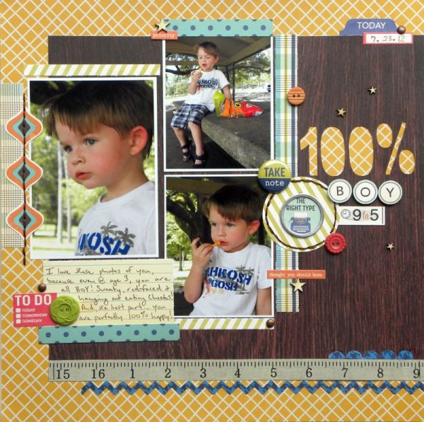
100% Boy by Ashley Horton | Supplies – Patterned Paper: October Afternoon & Recollections; Tin Pin, Buttons, Stickers: October Afternoon; Wood Veneers: Studio Calico; Brads: The Paper Studio; Punches: Marvy & EK Success; Font: Arial; Other: Washi Tape
5. Faux boix for outdoor themes
Brenda Becknell wanted to emphasize the farm aspect of these photos from a local fall farm festival. Brenda says, “I cut strips of woodgrain paper in varying widths and lengths, distressed and inked the edges, and then adhered them to kraft cardstock to mimic barn siding. I added sticker “nails” but you could also use brads. The photos and the banner flags are adhered with thin foam adhesive dots to add dimension.”
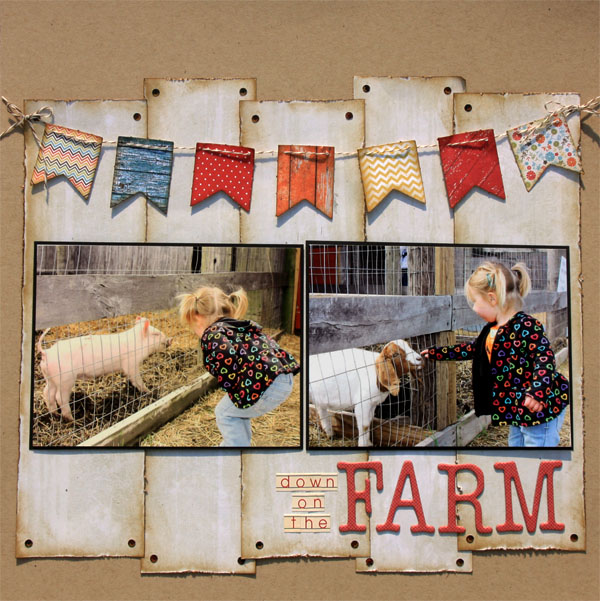
Down On the Farm by Brenda Becknell | Supplies: Cardstock: Bazzill; Patterned paper & die cut banners: My Mind’s Eye; Alpha stickers: Jenni Bowlin; Chipboard alphas: Heidi Grace for Fiskars; Gathered Twigs Distress Ink by Ranger; Bakers twine
Amy Kingsford says, “This is a photo of my son during his first experience with the grass in our front yard. His senses were flooded as he took it all in. I wanted to create a similar feeling by using texture. I love the texture that rustic wood frames add to this page. They work well with the beach wood papers in the background, but also stand out–drawing the focus in toward my photos while adding depth.”
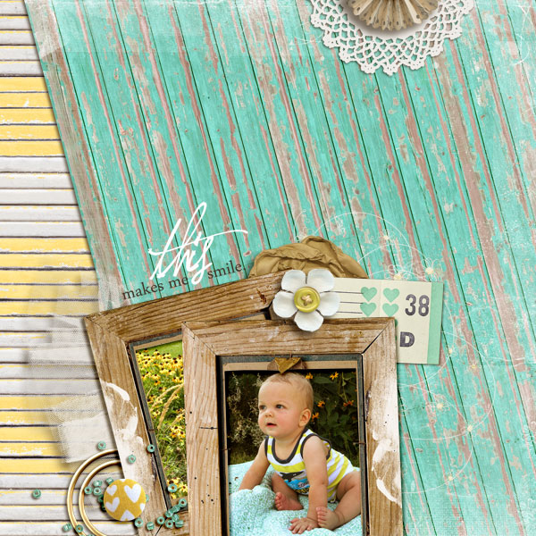
This Makes Me Smile by Amy Kingsford | Supplies: Beach Wood Papers by Krista Sahlin, Button Up: Fresh by Sahlin Studio, Treasured Moments by Sahlin Studio & SugarPlum Paperie, Worn by One Little Bird and Sahlin Studio, A Spring Day by Sahlin Studio, This Makes Me Smile Word Art by Sahlin Studio, SaltyLiving Art Play Palette by Anna Aspnes, Textured Overlays No. 7 by Anna Aspnes.
Debbie Hodge used mist with a wood grain stencil on “Clever Pose” to establish the foundation for a photo of teens in a light-hearted woodland pose. The woodgrain echoes the tree the kids are posed around.
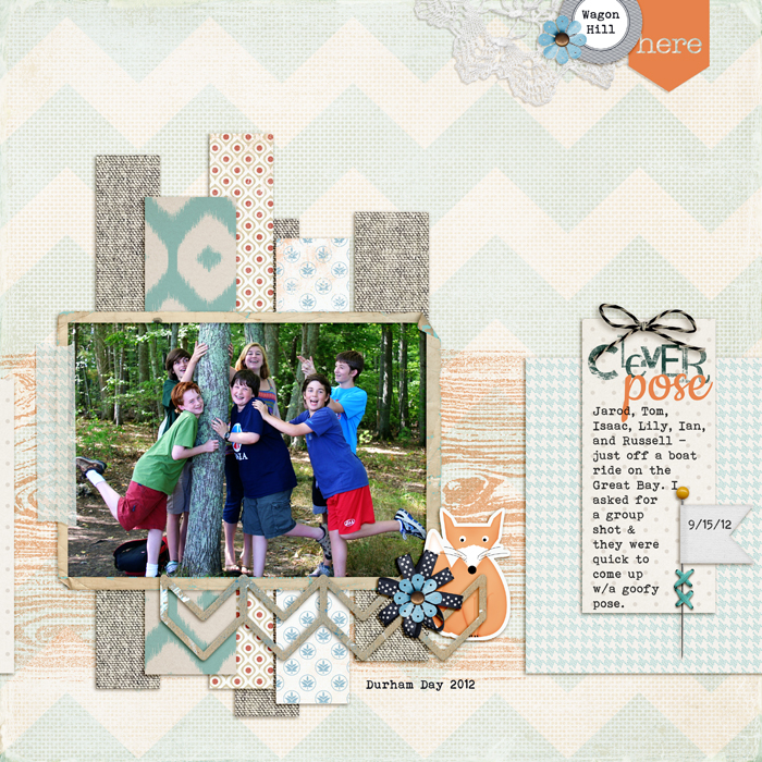
Clever Pose by Debbie Hodge | Supplies: Hello My Name is by Leora Sanford and Paislee Press; Fred the Fox, In Distress Textured 1 by Lynn Grieveson; Are We There Yet by Britt-ish Designs; You are Here by Allison Pennington; Bittersweet by Amy Wolff; A Simple Mix Up Alpha by Lisa Sisneros; Woodgrain Knockouts by Splendid Fiins; Bohemian Typewriter, Cookie fonts.
6. Faux bois for a playtime theme
Kim Watson‘s son loves to build with his toys. Kim says, “My little guy loves the mental stimulation of building, constructing and problem solving, especially when disasters are threatening to crush mini cities every day.” She combined a schematic print with woodgrain to support her theme.
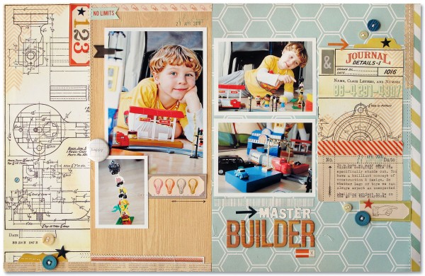
Supply list: Patterned paper: Heidi Swapp, Studio Calico, Simple Stories, Cosmo Cricket; Die Cuts & Woograin Alphas: Studio Calico, Buttons: October Afternoon, My Minds Eye; Arrows & Stamp: Smash; Ink: Close to my Heart; Stickers: Cosmo Cricket; Other: Sewing machine.
7. Faux bois (Scrabble tiles) for a vintage look
Katie Scott‘s “Fenderson” is a heritage layout about a story she found about Ivory Fenderson and Jean Flahive’s book “The Galloping Horses of Willowbrook.” The title was long and, Katie says, “I went looking for smaller letters and came across Scrabble wood letters which seemed perfect since they looked old–and since researching family history is like a game, putting all those pieces from the past together to find stories that people will want to hear.”
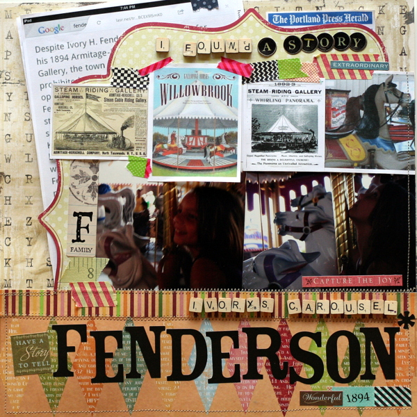
Ivory Fenderson’s Carousel by Katie Scott | Supplies: Papers: Scenic Route & Making Memories; letter stickers: American Crafts; Scrabble Tiles.
8. Faux bois for a trendy look
For her self-portrait, Meghann Andrew used a woodgrain print that’s made modern with an overlaid decorative pattern in white and accent colors of tomato-red, yellow and light teal. The woodgrain, or faux bois, alphas in a sans serif typeface are tall and modern also. Current decorating styles make this old print newly trendy.
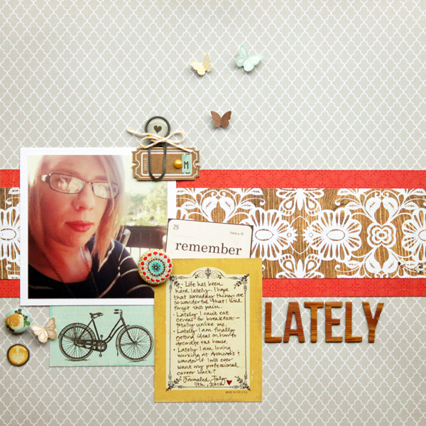
Lately by Meghann Andrew | Supplies: Cardstock: American Crafts
Patterned paper: Studio Calico (grey, floral woodgrain), Crate Paper (red, yellow card, bicycle card), Echo Park (‘remember’); Cardstock ticket: Maya Road; Chipboard alphabet: American Crafts; Paperclip: My Mind’s Eye
Badge: Basic Grey; Brads: Crate Paper (rose), My Mind’s Eye (yellow chandelier); Twine: Divine Twine; Pearl: Kaiser Craft; Cardstock letter stickers: Studio Calico (‘M’ and butterflies)
[ontrend]

