 A good title connects your photos to their story. One-word titles are clear and direct, often labeling your topic and even pointing the way to deeper meaning. What’s more, they offer great design opportunities.
Nouns
Use a noun to label an element in your photos, a place, or even a personality trait.
Contradictions
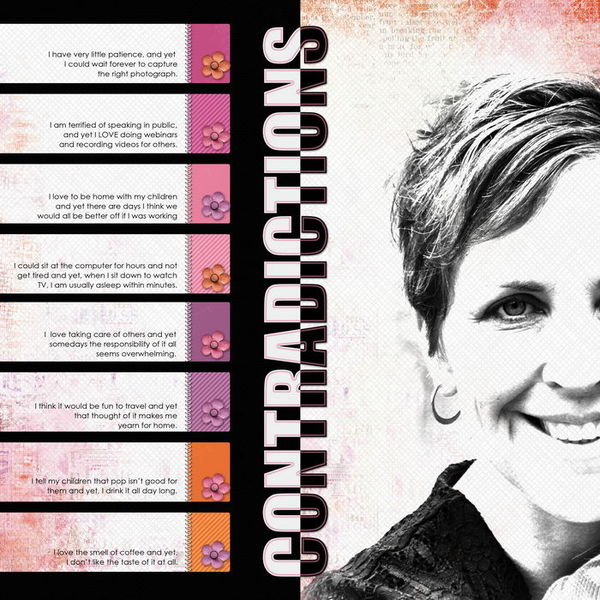
Jana Morton’s “Contradictions” is a list of the contradictions in her own personality–noting things like her overall lack of patience and, yet, willingness to wait forever to capture the right photograph.
One word says it all for a title, and Jana has rendered that one word to reinforce the idea of contradictions, with the top half of the letters in white and the bottom in black. Notice that the white parts of the letters sit on a black background with the black parts of the letters sit on a brighter paper. The title is rotated 90 degrees counterclockwise and spans the canvas height. In addition to being title, it is also a border between the journaling and photo.
Contradictions by Jana Morton | Supplies: Katie Pertiet: Artistry d’ Amour, Sweet Cakes Kit, Classic Cardstock: Into the Night
Change
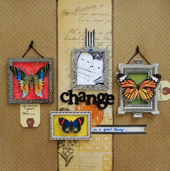
Of “Change,” Amy Kingsford says, “Before starting this page I studied this photo that I took of my two boys just after my second son was born and searched for one word to help guide me as approached my page. There are probably a number of words I could have chosen to represent this photo, but at the time I was really caught up in how different having two children was from having just the one.”
The title letters are a corrugated cardboard sprayed (digitally) with black mist, and they stand out, making a strong statement. Title placement at horizontal center and a bit below vertical center adds to their impact.
Amy says, “Choosing this single word as my title made my product choices and journaling that much easier because I knew I wanted them all to lead back to the word “change”. As a result I chose butterflies and a clock to embellish my page with and added a few words to describe how I felt about this new ‘change’ in my life.”
Change by Amy Kingsford | Supplies: Field Noted Collection by SEI (papers, embellishments, tags, etc.), Corrugate Cardboard Alpha by SEI and Tumble Dye Black by SEI
Summertime
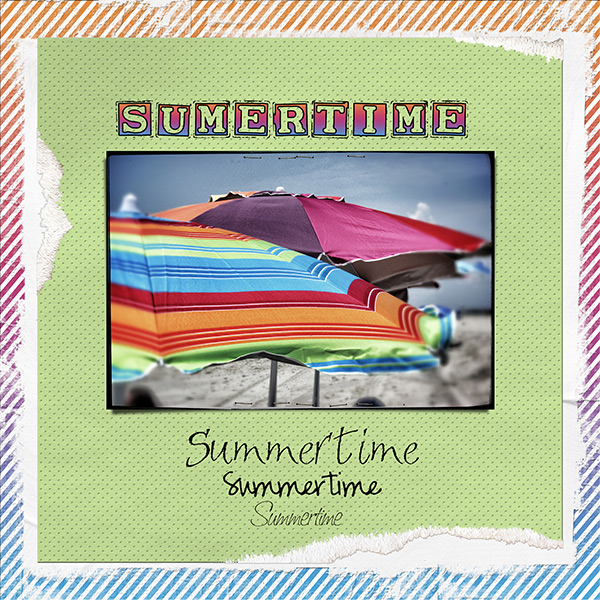
Vicki Walters repeated her one word title on “Summertime,” choosing it to go with a photo of beach umbrellas because they symbolize summertime for her. The first rendering of “Summertime” is done with the Smargana font, a negative-space font. Vicki sampled colors from the umbrella and recolored the borders of the letters with a gradient that matches her photo.
Summertime by Vicki Walters | Supplies: by Anna Aspnes @ Oscraps: PotPourri Paperie no 7, 12×12 Striped Edge Overlays no 1, TornNTattered Layered Templates no 7, fotoBoost Layered Templates no 2; Fonts: Smargana, Sandals, Pea Hannah Vanilla, and Saginaw
Family
Tanyia Deskins wanted to showcase her beautiful daughters and the importance of them having each other. She says, “The one word title perfect for this is ‘Family.’ I used a distressed font to match the layout style and placed it on the photo, itself, so it would stand out and emphasize that this photo is of family.”
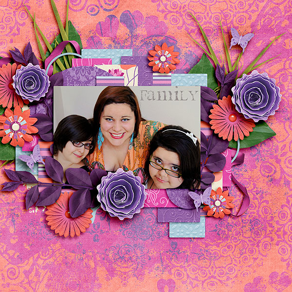
Family by Tanyia Deskins | Supplies: Big Enough by Cornelia Designs, Butterfly Dance Stains, Butterfly Dance Papers,
Butterfly Dance Papers 2, Butterfly Dance Elements
Keys
Katie Scott used one word from a quote by Plato in which he says that the patterns in music and all of the arts are the keys for learning to title this page.
Katie says, “The word “keys” was especially relevant since my husband plays the keyboards and my son is playing his own keyboards in the top right photo. I colored white letter stickers with a blue copic marker since the white didn’t stand out enough on the checkerboards; but then the light blue didn’t stand out enough so I outlined the letters with a fine tip dark blue sharpie.”
Katie asked her husband and son to fill out Smash Journaling tags with their favorite music. She says, “My son had to swoosh me away from hen-pecking while he did his saying ‘I’m not a baby anymore, I know how to fill out the blanks and I can spell just fine Mom.’ (I didn’t point out that he misspelled “Michael Jackson”). My daughter was upset that she didn’t get a tag so she made my husband cross out “Etta James” as his favorite female musician and write in her name. This page was a family effort.”
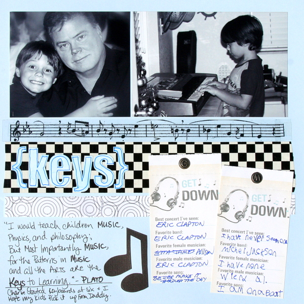
Keys by Katie Scott | Supplies: Tapes, duct tape, transparency, cardstock, Smash journaling tags, handcut notes (at the bottom); white letter stickers {keys} colored blue with Copic markers and outlined in sharpies.
Ingenuity
The clever rendering of Emily Pitts‘ one word title on “Ingenuity,” echoes the word’s meaning – it’s ingenious in how it fits into the page. Using BIG alphas, she incorporated the title into a grid of handcut circles. By turning some of the letters and even dropping the y down into another row of the grid, the letters become pieces of the grid in addition to being the letters of the title.
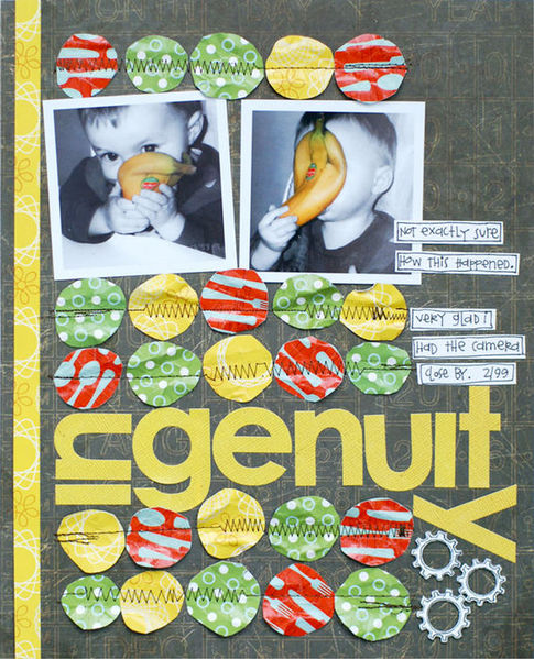
Ingenuity by Emily Pitts | Supplies: Patterned Papers: Collage Press (brown), Studio Calico (green, yellow, and red); Alphabet: Sassafras Lass; Chipboard Cogs: Maya Road; Pen: Micron.
Snapshot
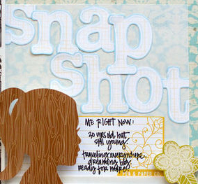
Kelly Purkey scrapbooked a recent photobooth strip, and jot down a few notes and thoughts about herself at that moment. The title “snapshot” has both obvious and deeper meaning. These are, indeed, photo snapshots, but, with the addition of jouranling, the whole page is a “snapshot” of Kelly in this moment. Kelly says, “These are the kinds of pages that I really enjoy looking back on – ones with notes about what is happening at the time because they really reflect me best.”
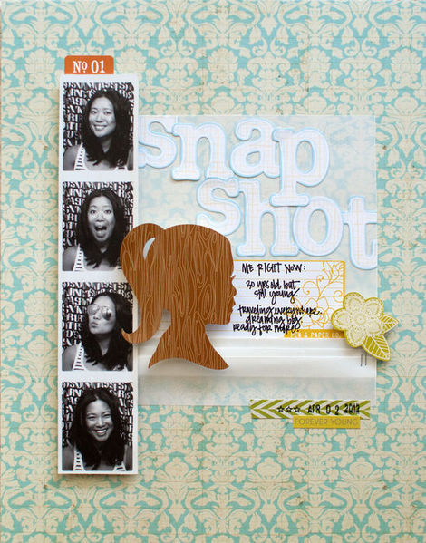
Snapshot by Kelly Purkey | Supplies: Paper: Crate Paper; Stickers: Sassafras, American Crafts; Pen: American Crafts; Date Stamp: American Crafts
Vellum: Paper Source; Stapler: Tim Holtz for Ranger
Adjectives
Adjectives let you describe your subject — in both obvious and not-so-obvious ways.
Precious
Sue Althouse often pulls her title from her journaling, and in this case the word she chose has a double meaning. Sue says, “While many of the pieces in my glass collection are precious in terms of monetary value, even more precious to me are the memories associated with them. These pieces all have a personal story to tell, so I love their history as much as I admire their beauty.”
Sue used large alphas in a bright color and bold value and fit them in a compartment of her blocked design.
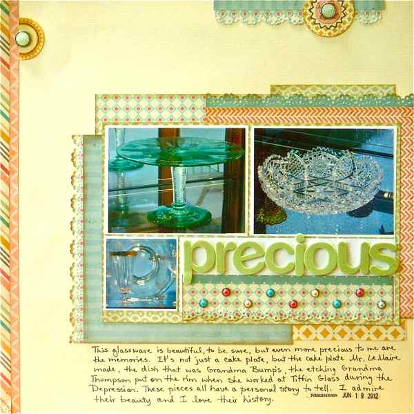
Precious by Sue Althouse | Supplies: Cardstock: American Crafts
Patterned Paper, Brads: My Mind’s Eye Alphabets: American Crafts
Stamps: American Crafts Date Stamp Inks: Hero Arts, Tim Holtz
Tools: Martha Stewart, EK Success
Majestic
Terry Billman says, “When I saw the Tetons I immediately thought they were majestic. I wanted the photos to tell the story with no distractions, so the only embellishment I used was the date tag. The smaller framed photo gives the viewer a close-up of the mountains. The one word title–majestic–is all that is needed to describe the beauty of the Grand Tetons.”

Majestic by Terry Billman | Supplies: Anna Aspnes: Art Play Great Outdoors; Lynn Grieveson: Inky Dink page borders; Patti Knox:
Staple Its Clusters; Katie Pertiet: Banner Safety Tags No. 2
Greetings, commands, and advice
Hello, wait, listen. Use one word that sends a message.
Hello
Christy Strickler titled “Hello” with a greeting because the page is about the introduction of a new kitten into her home and the first meeting of this kitten and her dog. Christy says, “The quality of the photos is poor, but this was one of those moments that won’t be repeated ever again.
Christy says, “When I printed out the photos, I kept thinking of that Beatles song, ” Hello Goodbye” and I stenciled ” hello, hello” with white paint all over the page. I like the way the patterned paper shows through the paint a bit. I used black pen and a button to highlight one of the words, thus creating a title. I chose pastel colors and hearts to emphasize the theme of having a new baby and friendship.”
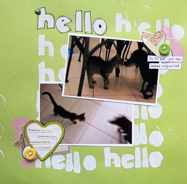
Hello by Christy Strickler | Supplies: patterned paper: Die Cuts With a View; paint: Claudine Hellmuth; die cuts: The Girl’s Paperie; button and stickers: October Afternoon; other: die cuts, acrylic paint, stencil
Verbs
So just what are your subjects doing? And how does that resonate with deeper meaning? Look for a one word verb that works for your page.
Docking
Debbie Hodge’s “Docking” features photos of her sons with friends at a recent party as they were coming in from the river. The page is about more than them docking, though, it’s about them growing up and doing so many of the things on their own that just a year ago they wouldn’t have (like getting several kids in and out of a canoe without tipping!). The use of a verb as the title, reinforces the idea of “doing.”
The one word is rendered with Scribble Box font, big and dark and tucked just a bit behind the block of photos.
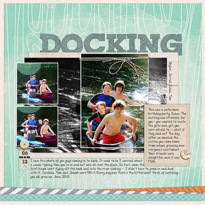
Docking by Debbie Hodge | Geek Like Me by Little Butterfly Wings; Rhinestone Buttons and Bows by Jenni Bowlin; Check It Cards, Retrospective Kit, For the Record Kit, Still Life Kit by One Little Bird; Bakers Twine, Banner Safety Tags by Katie Pertiet; Fotoblendz Clipping Masks 5 by Anna Aspnes; Fresh by Sahlin Studio; Scribble Box, Andrea’s Script Upright
[designclass]

