A successful scrapbook page captures the viewer’s attention, controls the eye’s movement, conveys information, and evokes emotion.
That first task–capturing the eye’s attention–is the work of making a focal point. Photos are most often the focal points on scrapbook pages. They don’t have to be, though. Depending upon your story and the materials you’re working with you could make a title, journaling, or embellishments the focal point of a page.
Embellishments as focal point
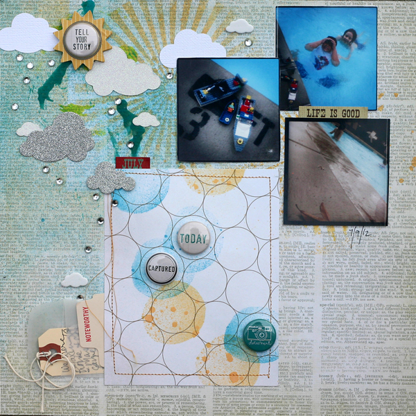
Doris Sander says, “Instagram photos are all the rage these days and I have enjoyed jumping on the trend. My phone is pretty much always at hand, so I’ve been able to capture more of life’s little moments like this day that we swam in the pool in the rain. While instagram photos are fun and more readily available than photos from the ‘good camera,’ the quality isn’t always there. So while I normally embellish close to my photos to enhance them rather than to detract from them, in this case I made my embellishments the focal point. Since the raindrops aren’t readily visible in the photos, I recreated the sunshine in the rain scene with my embellishments.”

Life is Good by Doris Sander | Supplies: stencil – Crafter’s Workshop, vellum envelope – Jillibean Soup, flair – A Flair for Buttons, clouds – Silhouette, glitter paper – American Crafts, mist – Maya Road, patterned paper – Studio Calico, Simple Stories, stickers – Simple Stories, tag – Avery, sun – My Mind’s Eye, other – rhinestones
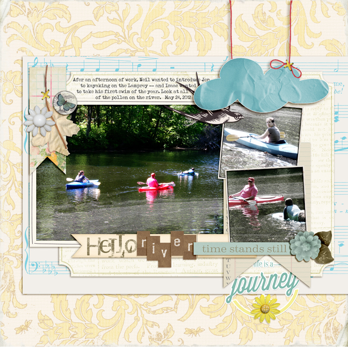
The photos on Debbie Hodge‘s “Hello, River” are taken from back a distance and include lots of river and trees and small subjects. They aren’t stunning to look at but they do have the details that tell the page’s story–of the first day of the year out on the river. Her son Isaac is always the first to swim each year.
Debbie says, “Photos like this provide the perfect opportunity to play with and emphasize products I love — like this suspended cloud from a kit by digital designer Ardent Sparrow. Topping it off with textured paint gave it even more emphasis. Along with two other clusters, it’s a part of a visual triangle that guides the eye around the photos.”

Hello River by Debbie Hodge | In Spring Distressed Paper by Lynn Grieveson; Tangerine Dream Collection by Jenni Bowlin; White Paint 1 by Anna Aspnes; Still Life, Tidbits Alpha by One Little Bird; A Simple Mixup Alpha by Lisa Sisneros; Wesley by Ardent Sparrow; Vintage Ledger Banner Journal Cards by Robyn Meierotto; A Wonderful Day; Buttoned Up Vintage, Rimmed framers by Katie Pertiet; So Far Away by Little Butterfly Wings; Retro Spring by Reverie Atelier
Title as focal point
Katie Scott had a series of photos of her son demonstrating how he could easily climb the fence–and he just happened to be in his karate uniform. Katie says, “He’s had a challenging time with karate, but we are committed to having him complete the program until he earns his black belt – this is more of our choice than his – but he is proud of his accomplishments and he is now one belt level away.”
“None of the photos in this series included his face so I wanted the focal point of this page to be the title ‘Karate Kid’ chosen for the obvious reason that I was journaling about his experience, but also because, if I remember correctly, Ralph Macchicio was a bit of a reluctant learner in karate – he had his issues with the coach and training; so that feeling was important in this page. I used the backsides of the coordinations “magic” cardstock for the title and bordered each of the 2 inch photos with a topper and bottomer of the cooridinations paper with the increasing belt levels from yellow to orange to green to blue to purple to red.”

Karate Kid by Katie Scott | Supplies: Coordinations paper (torn at edges) and Die Cut into the title with Quickuts Metro font. Cardstock, black sharpie, machine stitching.
Title as focal point (with journaling a close second)
Amy Kingsford says, This ‘Elf Search’ was an impromptu event that my family and I happened to catch when visiting the Gardinar Village Shoppes in Salt Lake City. I didn’t have my camera along, but we took home our checklist which I scanned and added to my page along with a camera phone photo my husband snapped.”
The dark title with its contrasting and elaborate fonts catches the eye first. Because it’s placed with the journaling and because both are surrounded by isolating white space, the grouping becomes the page focal point.

Santa’s Little Helper by Amy Kingsford | Supplies: Star On Top Template No. 2 by One Little Bird and Amy Martin, Art Play Palette Santa’s Elf by Anna Aspnes andArt Play Palette Sophistica by Anna Aspnes
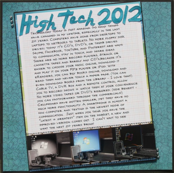
Brenda Becknell says, “The other night I was on the desktop downloading library books to my Nook, my son was on his iPhone, and we were also watching a movie we had DVR’d. It made me stop and think about how much we use technology and how much things have changed in the last few years, and how much more they’ll change in the next few years.”
Brenda journaled about this technology and how much it’s changed over the years, grouping some of her techno gadgets together for a photo. She printed the same shot three times: one in black and white, one in color, and one edited with the “glowing edges” filter in PSE. Her oversized handcut title is the page focal point leading right into the journaling with comes in a close second for attention-grabbing power.

High Tech 2012 by Brenda Becknell | Supplies: Digital paper: K. Pertiet Notebook Paper Pack #6, Patterned paper: Echo Park and SEI, Cardstock: Bazzill and DCWV, Tim Holtz filmstrip ribbon, Die cut alphas: Cricut “Nifty Fifties” cartridge, Tumbled Glass distress ink, Glossy Accents, Misc: silver brads
Journaling as focal point
Sara Gleason says, “Journaling is something I really love and so working journal prompts is a natural part of my storytelling and memory keeping process. I love the process of writing to a specific topic and building a page around a prompt. This page is the fruit of that process. I was inspired by a journal prompt that called me to consider the power of accountability in my marriage. It was a challenging prompt. Because it called for introspection and an honest reflection.”
Sara journaled as if writing a letter to her husband. She kept the design simple because she wanted to keep the words central in hopes of reflecting their earnestness. The journaling is framed with clean and linear lines and takes center stage.
Art taking the place of photos as focal point
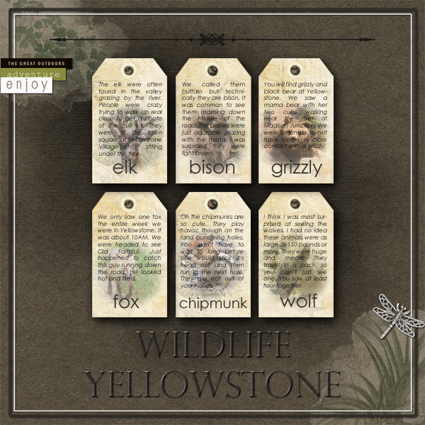
The grouping of tags with images and journaling is the focal point on Terry Billman‘s “Wildlife Yellowstone.”
Terry says, “I wanted to focus on the story of where and when we saw different animals at Yellowstone. To showcase each story, I used journaling tags for each animal with the photo behind the journaling, lowering the opacity of the photo.”
“I chose the brown background paper, highlighted with a couple of Katie Pertiet’s Vintage Blendables because it reminded me of the terrain at Yellowstone. I added a dramatic drop shadow to the tags to add emphasis. Anna’s Canvas textures were used behind the tags to add a little bit of texture. I kept the title fairly neutral, almost the color of the background paper, to not take away from the focal point—the tags and journaling. The white framing adds dimension as a finishing touch.”

Wildlife Yellowstone by Terry Billman | Supplies: Anna Aspnes:
Art Play Great Outdoors, Canvas Textures 1, Fotoblendz Clipping Mask 1; Katie Pertiet: Vintage Blendables No. 9, Letterbox Naturalist Tag, Hinge Pack; Jesse Edwards: Title Lines 6.
Memorabilia as focal point
Kiki Kougioumtzi‘s photos from a 3D viewing of a Harry Potter movie were taken with a camera phone and not of good quality. Kiki says, “I had lots of ephemera, and still wanted to tell the story on a scrapbook page. I made the 3D glasses the page focal point, keeping the page simple and giving the ephemera more space on the page than the photos which play a secondary role.”
[current]


