At Masterful Scrapbook Design we recently tackled the topic of inspiration–finding it and applying it. (We actually covered TEN sources for scrapbook page inspiration and you can check them all out in this video tutorial that’s an excerpt of the seminar.)
I’ve always believed that inspiration is a personal part of the creative process, and this month’s seminar confirms this for me. It was refreshing to see so many different sources, approaches, and applications of inspiration all in one place.
Below are a few of the inspiration sources and layouts our guest teachers made along with my own take on each–proving that no two people use inspiration in exactly the same way.
While Dina circled, I burst
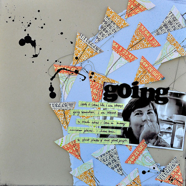
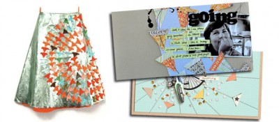
Dina Wakley used the design of a skirt by one of her favorite artists, Allison Willoughby, as the foundation for her design on “Going,” repeating the circular motion from the original piece.
 Source: Kite Skirt by Allison Willoughby |
I also used the fun design in the skirt above to establish a page foundation. I’ve translated the triangular design more loosely, though, and used it in a way that emphasizes my focal point while creating a whimsical feel. My triangles sit on lines radiating out from my focal point in a burst of energy rather than on lines flowing around it.

Cyclist in Training by Amy Kingsford | Supplies: Pedal Pusher by One Little Bird Designs, For the Record Collab by One Little Bird and Paislee Press, Build It Up by Agnes Biro, Oh Happy Day Collab by Erica Zane and Jenn Barrette, Simple Stitches by Karen Funk.
While Summer organized photos I organized patterns
Summer Fullerton used the color-blocked design on the cover art of The Police’s Synchronicity album as a blueprint for organizing photos, elements and words. The result is a page that tells the story of their family trip to Lava Butte in a way that is easy for the viewer to take in.
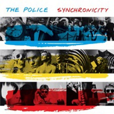 Source: Synchronicity by The Police |
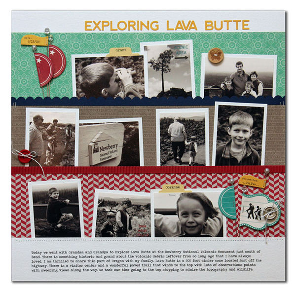 Exploring Lava Butte by Summer Fullerton | Supplies Used: Cardstock from Bazzill, Jillibean Soup Patterned Paper/Alphas/Diecuts/Stickers/Corrugated paper/buttons, Rubons from October Afternoon, Floral Stick Pins from JoAnn’s, White DMC Floss, Stampin Up Scallop Punch, Tab Punch from Fiskars, Tiny Attacher Tim Holtz, and font Traveling Typewriter |
I used the same blocked design of rows as my page foundation, but, with only one photo on the page, I used the foundation to mix a variety of patterns in a way that doesn’t feel chaotic or overwhelming.
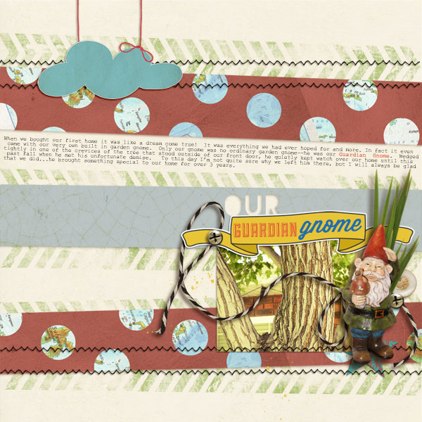
Our Guardian Gnome by Amy Kingsford | Supplies: All Shaped Up – Stars No. 2 Templates by Amy Martin, Wesley by Ardent Sparrow, Hummingbird Art Play Palette by Anna Aspnes.
While Betsy took inspiration from one piece, I used both that piece and her inspired page
Inspired by a Joao Gilberto album cover, Betsy Sammarco made a page with a similar layout and incorporation of typography. She used her own phrase but replicated the variations in color and offset alignment. Betsy made this design her own with journaling in place of the red line and a row of buttons for dimension on an otherwise graphic and flat page.
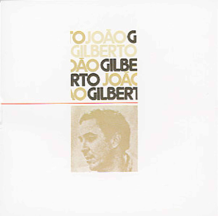 Source: Joao Gilberto cover |
I drew my inspiration for “The Time is Now” both from the original source and from Betsy’s page. I created a small rectangular foundation of text and a single photo and isolated it with white space. I chose not to recreate the typography but, still, to highlight my title through my choice of fonts and alphas. The stitched down strip of patterned paper on the left was inspired by Betsy’s row of buttons.

The Time is Now by Amy Kingsford } Supplies: Penelope by Ardent Sparrow, Simple Stitches by Karen Funk, Typeset Alpha No.2 by Sahlin Studio and Layered Edge Overlays No. 2 by Anna Aspnes.
While Lynnette took compositional cues, I took flow cues
Lynette replicated the overall placement of circles in the art print that inspired her page. Additionally, she introduced a mixture of color and pattern and shape (adding in squares) while creating a layered look.
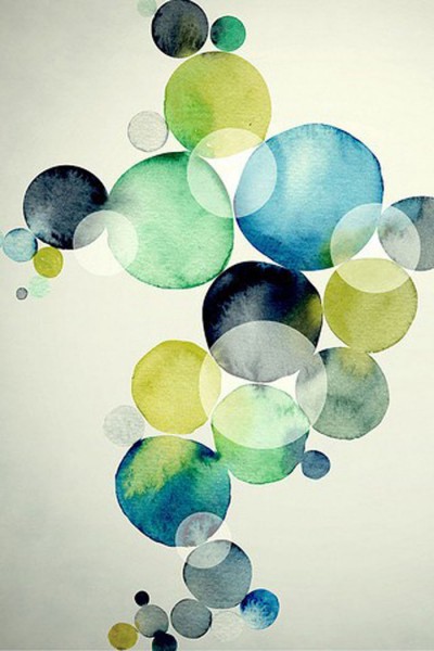 Source: Bubbles Illustration |
My approach to using the inspiration piece was less about replicating placement and more about creating the feeling of lightness and flow in the print. As a result, I used circle stitching and radial brushes paired with more sporadic circular elements and die cuts. I also used the positioning of my key elements including my photos, title and journaling to help establish that same “slowly trickling downward” type of flow.
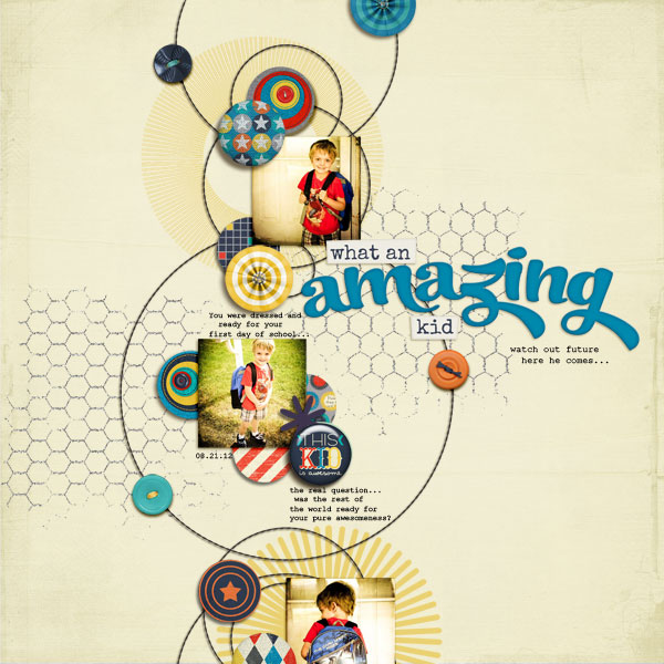
What an Amazing Kid by Amy Kingsford | Supplies: Amazed by You by Traci Reed and Julie Billingsley, Middle of Summer Templates by Amy Martin; Radial Brushes, Textured Overlays No. 6 and Stitched by Anna Overlays No. 3 by Anna Aspnes.
Now it’s your turn
Do any of the inspiration pieces above strike your fancy? Give it a go and share a link to your page in the comments below.
[akingsford]
[getinspired]

