 Misty looks include a few random splatters, a filled a block or canvas, or the outline of masked-off letters or details.
Paper Pages with Misting
Splatters
Meghann Andrew made this layout about her grandmother’s new experiences in her old age and how lucky she feels to be here to experience those moments with her.
Meghann says, “I really love using spray ink on a layout that needs a little something on all of that negative space, and I prefer ‘blotches’ of ink, rather than a mist. To accomplish this, I shake the bottle, then unscrew the spray top and hold the tube over my layout. Holding with my thumb & middle finger, I then tap the top quickly with my index finger, which makes a splatter of ink land on the page. It may take a bit longer to accomplish this look, but I love the result!”
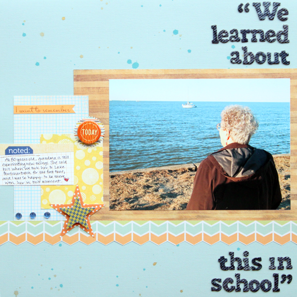
We Learned About This In School by Meghann Andrew | Supplies:
all supplies from the Studio Calico Elmwood Park kit & Twisty Slide add-on; Cardstock: Bazzill Basics; Patterned paper: Echo Park, Basic Grey; Chipboard alphabet: American Crafts; Cardstock shapes: October Afternoon; Rhinestones: Queen & Co; Badge: Studio Calico; Journaling tag: Elle’s Studio; Spray ink: Studio Calico
Fine-mist foundation
Katie Scott‘s “8” is a scraplift of a digital page by Celeste Smith, Hoy. Katie says, “I made my own mist paint by mixing equal parts of acrylic craft paint and water in a spray bottle. I used paint on a pencil eraser to get the aqua colored dots and a foam rubber stamp with paint for the 8.”
The misting is in pinks and greens with the pinks heavier and with all of the misting heavier directly under the cluster of elements and thinning out as it spreads away from them.
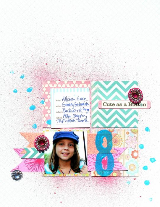
8 by Katie Scott | Supplies: Basic Grey & Heidi Swapp & Amy Tangerine 6×6 patterned papers; do dads, paints, DIY mist, and a square punch for making the cuts into the three paper ribbons at the bottom.
Masked background
Adriana Puckett says, “Misting with masks allows you to create cool backgrounds for your layouts. Here I misted over a mask and then removed it. I added rub-on doodled flowers and rhinestones to add a fun, whimsical touch. I wanted to create the look of depth so I pop-dotted the photo and journaling spot to raise them above the base layer.”
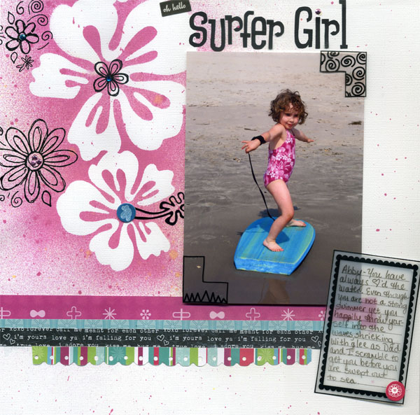
Surfer Girl by Adriana Puckett | Supplies: Heidi Swapp Hibiscus mask; Tattered Angels Glitter mist; maya roads sheer, transparency, Maisy Mo Doodle Black rub-ons, Mod Techno Pop paper; Silhouette design for title.
Filled rays and wedges
Kim Watson’s page was sparked by seeing a little compass/clock her youngest contstructed from magnets on the fridge. It got her thinking about direction and arrows. The result was a ‘sunburst’ of different color mists, with alternating rays filled with misty color.
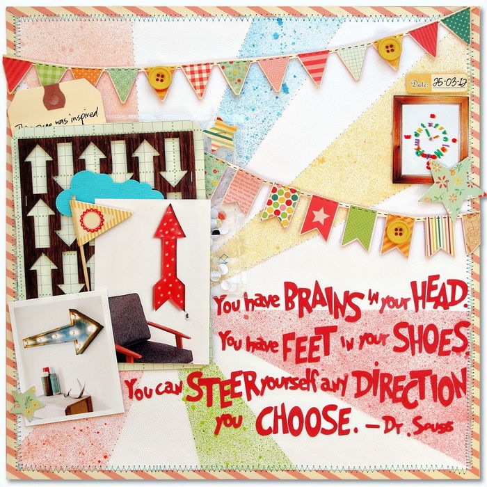
Supply list: Cardstock: Bazzill; Patterned paper: October Afternoon; Mist & Stickers: October Afternoon; Buttons: My Minds Eye; Die cuts: Silhouette SD, Tag: Staples
Adriana Puckett made this page to group recurring summer activities together to show their repetition in her life–especially activities like swimming, eating, and playing.
Adriana says, “Instead of just using mist to doctor a page background, I used mist to create a pie chart accent. I used a white paper filter embellishement as the base and then made simple masks from scrap paper in wedge shapes. Then I sprayed each section a different color, leaving one blank. I also sprayed a smaller coordinating filter as well.”
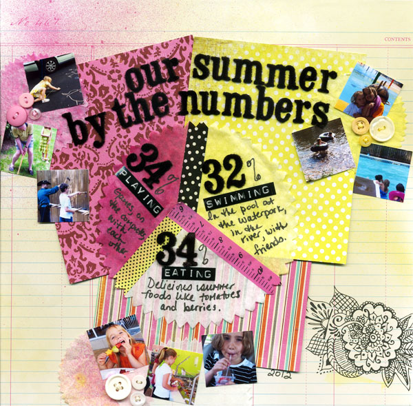
Our Summer by the Numbers by Adriana Puckett | Supplies – Mist: Tattered Angels Glimmer Mist in Marigold and Party Pink; Filter paper embellishments by Fancy Pants design; Tape: Bazzill Basics Paper Tape and Smashbook Tape; Assorted buttons from stash; DMC embroidery thread; AC Thickers; Dymo labeler; Paper: American Crafts Sketchbook line and scraps from stash.
Drips
Jennifer Matott laid feathers over Kraft cardstock and sprayed with Tattered Angels Glimmer mist in Crocheted Doily and Rolling Tide. Jennifer says, “I made the Rolling Tide heavier at the top so I could tip the page and allow it to drip after removing the feathers. Once dried, I stamped the hexagon stamp and pieced the papers on. I love using found objects as masks rather than rely on the same shapes you see out there.”
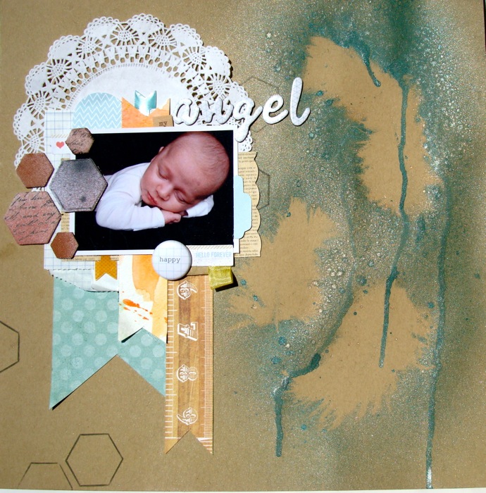
My Angel by Jennifer Matott | Supplies: All papers and embellishments from Studio Calico’s June kit; Cardstock: Bazzill; Papers: Echo Park, My Mind’s Eye, and Studio Calico; Stamp: Studio Calico; Tattered Angels Glimmer Mist: Crocheted Doily, Rolling Tide, Tarnished Silver, and Aged Brick (from the Basically Bare collections); Faber- Castell PITT Artist Big Brush Marker in cold grey VI 235; Feathers as masks; Doily; American Crafts Thickers Muse; Making Memories “my” sticker
Digital Pages with Misting
If a lack of digital misting brushes has kept you from trying digital misting, grab free digital misting brushes and instructions for installing them at Melissa Shanhun’s DIgital Scrapbookin HQ.
Mist + texture
Amy Kingsford misted brush around masked butterflies on it to create the misted background on “Sweet Feet.” Laying diaganal bands over the background creates a burst of rays alternating between patterned paper and misted canvas.
Amy says, “Because the background paper I used had a linen texture I wanted the brush to appear as though the color was actually bleeding into the fabric, so I applied a Linear Burn blending mode to the layer and then dialed the opacity back just a bit to maintain the muted tone of my blue mist.”
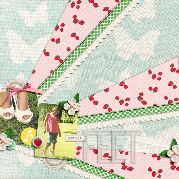
Sweet Feet by Amy Kingsford | Fresh by Sahlin Studio and One Little Bird Designs, Plastic Alpha by Sahlin Studio, Butterflies Spritzed and Drawn Bundle by Sahlin Studio, Moving Through Template No. 8 by Amy Martin.
Masked shapes
Audrey Tan misted around hearts and numbers on this page. She says, “I re-coloured them and changed the opacity to match the colours used on my page. I made use of a quote to replace any journaling as the photo used is my best friend’s baby. Tip: if you have nothing to journal, use a quote instead.”
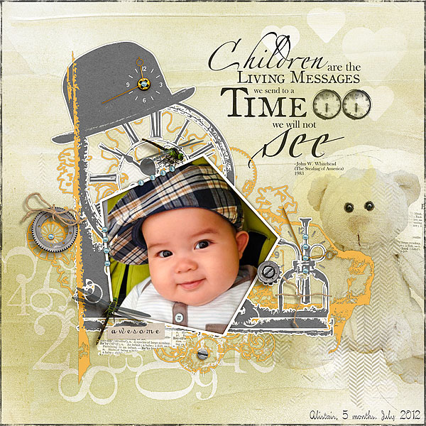
Awesome Baby by Audrey Tam | Supplies: Anna Aspnes: ArtPlay Palette Sweet Baby, Children Quotes No1, 12×12 Edge Overlay No5; Dido Designs: Notions Set; Gennifer Bursett: Toolbox Mist V5
Mye de Leon: Mists; Font: Kelly
With digital, reverse the mask
With a digital page you can select the “mask” and either apply mist around it or just where it sits. Tanyia Deskins sprayed a thick mist to the area defined by a doily. She says, “I love this messy misty spray of paint here that was used over a doily to give shape and texture to the background of the layout. I think it also brings in pops of pink without being to harsh and opaque. Also, the messy beauty of the misted paint for me really reflects the quote that I have used.”
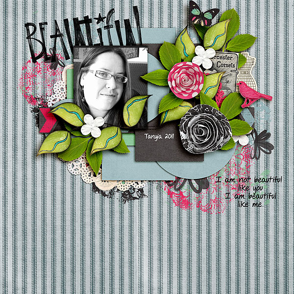
Beautiful by Tanyia Deskins | Supplies: Belle Ame by Snips n Snails, Be Bold by River Rose, Sew Happy River Rose, Sand and Sea River Rose, May Flowers by River Rose and Just Jaimee,
Markerific alpha by CD Mmuckosky
djb Veronica font by Darcy Baldwin
Masked titles
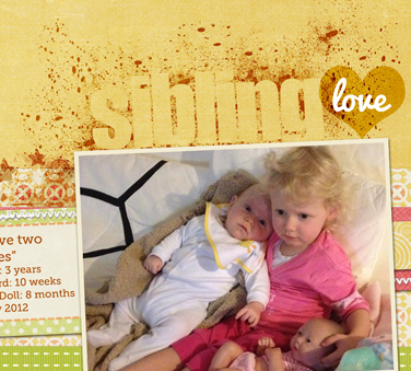
Melissa Shanhun used an alpha as a mask and misted using free spray paint photoshop brushes. She kept the misting scattered and light. She didn’t need to explicitly define all edges of the letter shapes–we understand and can read it with what’s there.
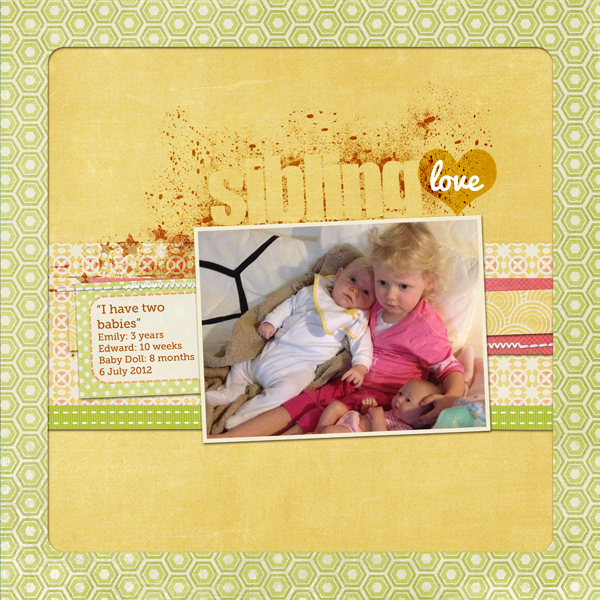
Sibling Love by Melissa Shanhun | Supplies: Silly Billy, Word Art Bits 1, Life is Good; Stitch Mania by by Karen Lewis Designz; Fonts: MuseoSlab-500,Pacifico-Regular
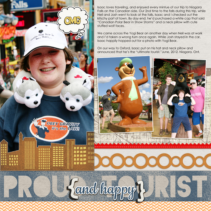
On Debbie Hodge’s “Proud and Happy Tourist,” Debbie used heavier mist for a more defined masked title.

