 When you’re working with three photos there are some basic choices you make again and again:
- same size or create emphasis with a larger photo?
- same orientation? and, thus, stacked or side-by-side?
- all different sizes and orientations?
Here are 5 approaches that work with those basic combinations when you’re scrapbooking three photos:
- side-by-side
- stacked
- 1 larger with 2 accenting
- blocked
- clustered
1. Side-by-side
When your photos are of similar size and the same orientation, the “three-in-a-row” or “side-by-side” approach is a quick way to get started. You can do many things to “shake it up” and keep this configuration from looking the same all the time: tilt a photo or two, take things off center, or stagger photos to begin with.
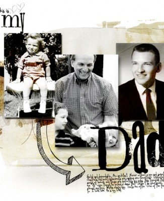
Adryane Driscoll says, “These are photos of my father. I think the three photo design works well to show a span of time: childhood to present. I put the current photo in the middle because it shows both an age progression and a change to a grandfather. My dad is simplicity and details, so I didn’t use a lot of extras on this page. I focused on some doodling because as a kid, no matter where we went, he had a pen to quickly draw a picture of whatever he was talking about.”
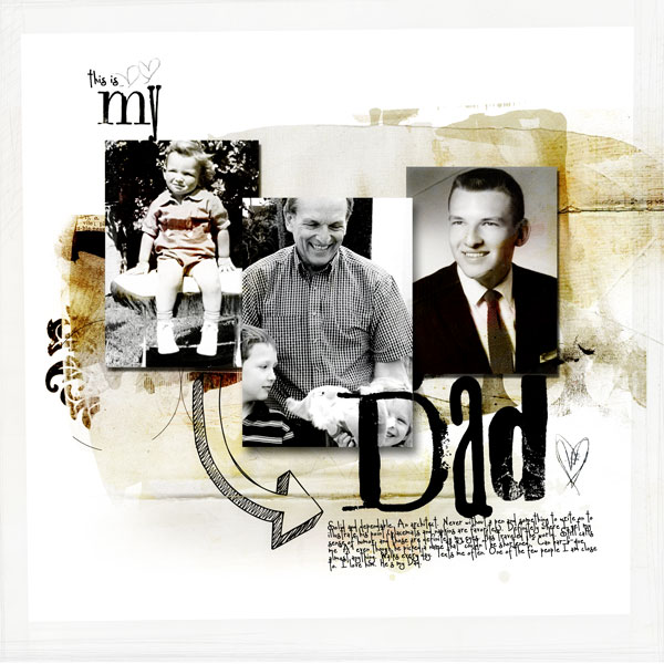
My Dad by Adryane Driscoll | Supplies: Anna Aspnes: KreasedTransfers No.2, ArtPlay Palette Sophistica (transfers), ArtPlay Palette Wild (creased transfer), ArtPlay Palette Everyday (transfers), ArtPlay Palette Why Not? (large doodled heart), ArtPlay Palette Sweet Baby (small doodled hearts); Holliewood Studios – Art Journaling No.2 (arrow); Ali Edwards – Mixed Stamped Titles (altered)
Kiki Kougioumtzi says, ” The inspiration for this page came from the main photo and the expression my daughter has. We don’t have Halloween celebrations in Greece but we have Mardi Gras. She’s always been choosing between a witch or a fairy costume for the last 3 years. She ended up dress like a pirate, but that’s a whole other story…”
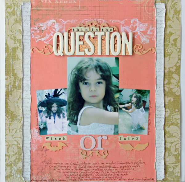
Witch or Fairy? by Kiki Kougioumtzi | Supplies: Patterned paper: Bo Bunny, Prima, K&Co; Cardstock:Canson; Alphas: Tattered Angels, Making Memories, Cosmo Cricket; Chipboard shapes: Advantus Ideaology; Other: Sizzix die, Plaid acrylic paints, Viva Decor crackle paint.
Lynnette Penacho used a school-themed kit to represent a trip to Harry Potter world, lining up snapshots of herself and two friends in a row. Lynnette says, “I used a Harry Potter-style font to add a little HP to one of the felt apples from the kit. It’s a subtle touch but it brings the whole theme together.”
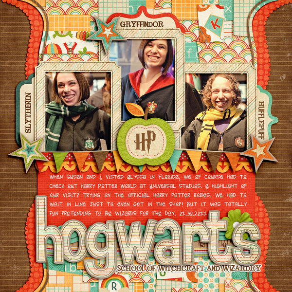
Hogwarts by Lynnette Penacho | Supplies: School Days by Zoe Pearn, Take Out Tuesday 4/5 Blocked Background freebie by Meghan Mullens, Fonts are DJB Brewhaus Special, Jailbird Jenna and Harry P. Inspiration Source: Harry Potter logo.
Amber Ries used three photos of her daughter in a school outfit to talk about how being imperfect is okay. Amber says, “My daughter suffered from the harsh words of bullies earlier this year, partly because she is different: über-sensitive, tall, and bi-lingual. She survived, but I’m afraid it won’t be the last time. I want her to know that she is wonderful as she is, strong and beautiful and perfectly imperfect.”
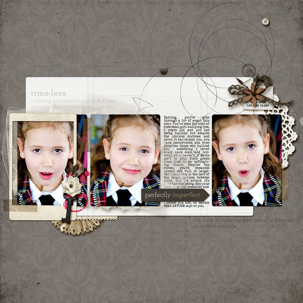
Perfectly Imperfect by Amber Ries | Supplies: Worn Collaboration by One Little Bird & Sahlin Studio; LoopDaLoop Arrows No. 2 by Anna Aspnes
Dina Wakley‘s “Big” was inspired by a painting by Jylian Gustlin (see here). Dina says, “I love the circles and the textures of Jylian’s artwork. I copied the circles and even the colors a bit. I used an orangey title to contrast against the blue in the circles. A series of three black-and-white photos sit atop the art-inspired base.”
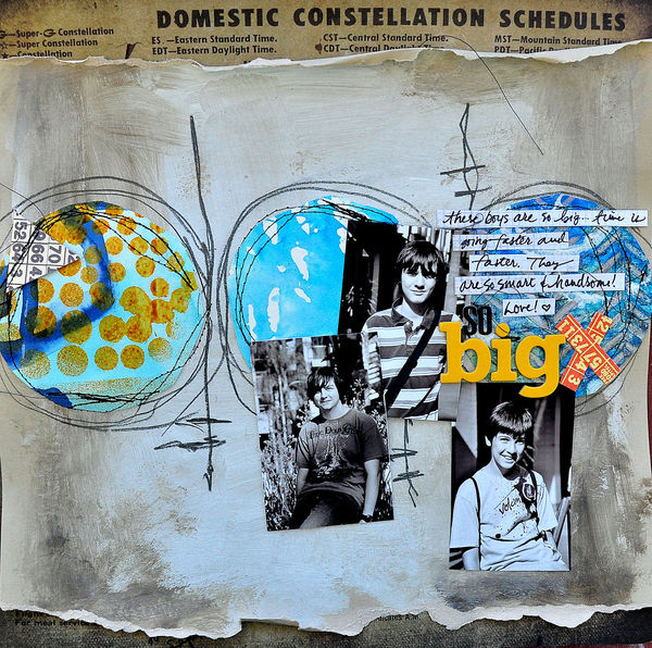
Big by Dina Wakley | Supplies: Ink: Dylusions by Ranger, Paint: Golden, Alphabet: Thickers by American Crafts, 7 Gypsies, Pencil: Ebony by General, Paper: Tim Holtz. Inspiration Source: Painting by Jylian Gustlin.
2. Stacked
With three landscape-oriented photos, rotate the “three-in-a-row” composition for a stacked variation.
Katie Scott used a vertical series of three photo to capture her daughter’s beautiful eyes over time. Katie says, “The first photo in this series was taken when Allison was just shy of 6 months (I make big babies). I have brown/green eyes but always wanted blue eyes so when my daughter was born with blue eyes like my husband’s I was so thrilled and hoped that they’d stick (because there’s something about babies eyes changing initially right?) and they did. Allison isn’t always cooperative in the picture taking department, so when she does allow me to take a close up of her eyes, I always take a picture or two.”
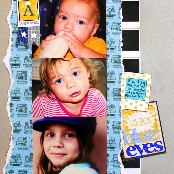
Blue Eyes by Katie Scott | Supplies: DCWV “The Snapshot Stack”; Copic Marker; American Crafts cardstock, machine stitching,
Debbie Hodge‘s Cupcakes and Nail Polish was inspired by the packaging for spices (see inspiration here). In place of the tall bottle on the packaging, she substituted a tall block: perfect for holding three landscape-oriented photos. The photos are from a day that her husband and a PhD student filmed part of an online class, tackling “production possibilities.”
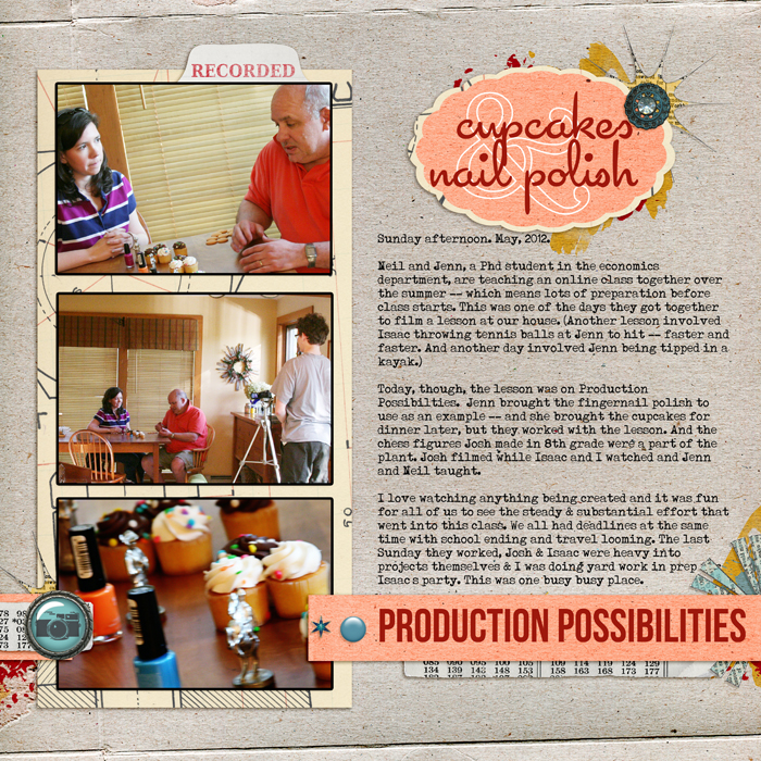
Cupcakes & Nailpolish by Debbie Hodge | Supplies: Strike a Pose by Amy Wolff and Little Butterfly Wings; Nuts and Bolts by Maya DeGroot; Double Decker Element Set by Katie Pertiet; Star Brad by Pattie Knox; Typenoksidi, Cocktail, Fling LET, Bebe Neues fonts
3. One larger photo with two accenting
Emphasize one photo and use two smaller photos to support your story, to accent and provide context
Meghann Andrew combined a band of patterned papers with “burst” stitching to make a foundation for three photos. A larger, color photo is the focal point of the page and two smaller black-and-white photos support the page.

Relax by Meghann Andrew | Supplies: Cardstock: Bazzill Basics; Patterned paper: Dear Lizzy by American Crafts (teal dot), Crate Paper (pink & woodgrain); Journaling/date tags: Elle’s Studio; Die cut shape: Studio Calico; Alphabet stickers: American Crafts; Butterfly cardstock stickers: Sassafras Lass for Studio Calico; Badge: Hello Forever by Marcy Penner; Pen: Stampin’ Up!; Mistable ink: Studio Calico; Other: Thread & sewing machine
Deborah Wagner sized one of her photos to fill the height of the canvas. Deborah says, “The focal photo of my daughter has been duplicated and blended (from the techniques I learned in Jana Morton’s Creative Composite Class) to look as if it’s a series of action shots. Then I desaturated my other two photos, framed them with postage stamp frames and made them a part of a cluster including my title.”
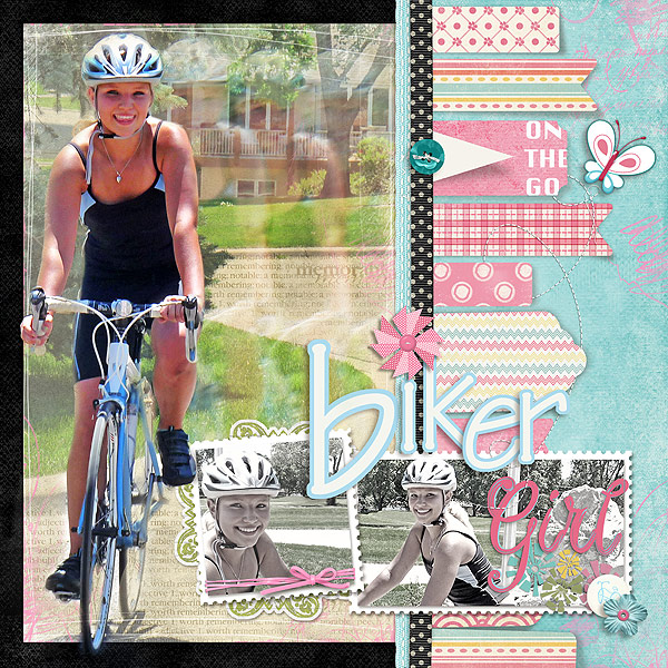
Biker Girl by Deborah Wagner | Supplies: Katie Pertiet – Scribbled and Scratched Photo Frames, Pinwheel Flowers, Halloween Memories Kit, Tag Masks No. 1, Clean Stitched Banners White No.1, Whimsy Wings Kit, Letter Box Overlays No. 5, Photo Wraps No. 3, Brushed Alpha No. 4, Twisted Stitched No. 2, Postage Photo Mats, Lynn Grieveson – Wild Weekend Kit, Rosalie Kit, Raspberry Sundae Kit; Michelle Martin – Ingrid Kit; Bergen Dusk Paper; Cassie Jones – How did they do that? Bending Shadows; One Little Bird – Vagabond Kit
Christy Strickler says, “For a while now, I have been wanting to use more 8.5″ x 11″ photos. I was playing with a new camera when I took these pictures. I took the large photo as we drove on the highway to the Kennedy space center. It’s grainy, and there was a lot of open space filled only with sky and water. I chose to use it as a background picture rather than the main focal point. I placed two wallet size photos and page elements in the photo’s open spaces.”

KSC by Christy Strickler | Supplies: Cardstock:Bazzill; patterned paper: October Afternoon; buttons: Basic Grey; ribbon: Maya Road; twine: twinery; other: alphas,sequins, jeweled stars
Stefanie Semple says, “To me, one of the big advantages of digital scrapping over paper scrapping is the ability to make one photo big enough to almost play a background paper role. I loved that my main photo had both my hubby and son in focus and the three photos together tell the story of that moment. Son was rowing, Dad was directing from behind. Son got frustrated and chucked Dad off. Dad took it like a man and walked back to shore giggling all the way. Such a reversal of roles. I had fun playing with the title as well, this budget getaway was called Frog Mountain.”
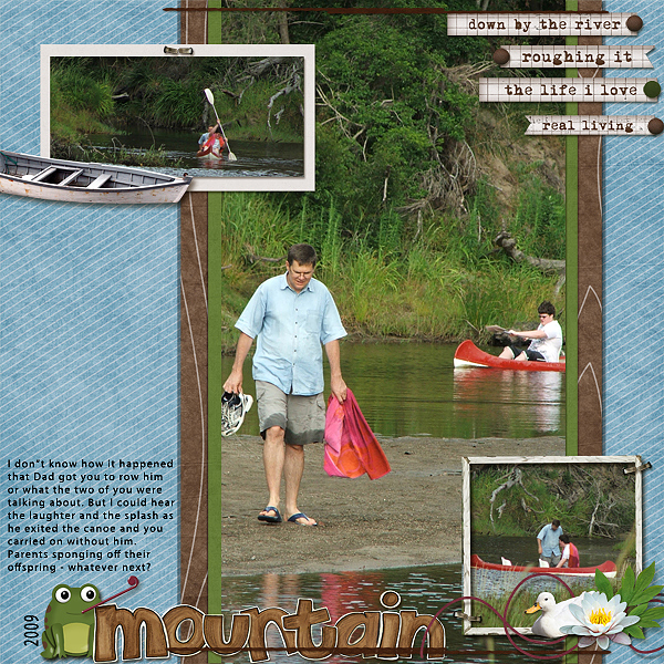
Frog Mountain by Stefanie Semple | Supplies: Gimme layers template #26 from Cluster Queen Creations, Down by the River by Mye De Leon and Summer Camp Alpha by Kate Hadfield
4. Blocked
This works with a variety of photo sizes and orientations. Place your photos and then add journaling, paper bits, embellishments, and title building a blocked arrangement.
Erin Bassett says, “My niece loves to play with sidewalk chalk and she just looks so darn cute doing it that I had to capture the moment!” Erin combined one larger photo with two smaller shots, placing them in a blocked arrangement.
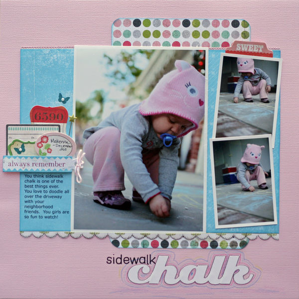
Sidewalk Chalk by Erin Bassett | Supplies: Cardstock – American Crafts, Patterned Paper – Basic Grey, Rub-On Butterflies – Jenni Bowlin, Rub-On , Letters – American Crafts, Sticker Letters – American Crafts, Twine – The Twinery, Pin – Maya Road, Pearls – Basic Grey, Colored Pencils – FaberCastell, Labels – Crate Paper, Basic Grey
Amy Kingsford blocked out the entire canvas and house each of her three photos in a compartment. Amy says, “My second son looks so much like my husband its not even funny! They share many traits and they even share the exact same initials. I wanted to highlight their similarities so used three photos arranged in a visual triangle. The focal photo is one of my favorite photos of my son Jasper and emphasizes his beautiful eyes and smile as well as his happy personality. I used photos taken on the same day as smaller detail shots, to emphasize his curled toes on the bottom and his widow’s peak in the top photo. The title is inspired by my husband’s screen name, and I played on the ‘techie’ aspect of it and dubbed my son ‘Version 2.0.'”
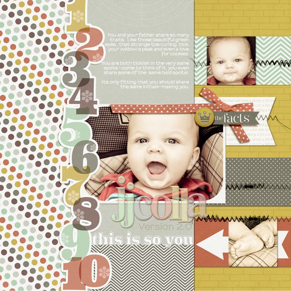
JJCOLLA Version 2.0 | Supplies: Narrative by One Little Bird Designs, Acrylic Alpha and Number Set by Anna Aspnes, A Wonderful Day (stitching) by Sahlin Studio, Template from Simple Scrapper’s Premium Collection
Debbie Hodge scrapbooked three very similar shots of herself with her youngest son, liking the way they reveal how they interact. She had extensive journaling to include and place bits of the journaling and each of the photos in a “compartment” of a blocked design.
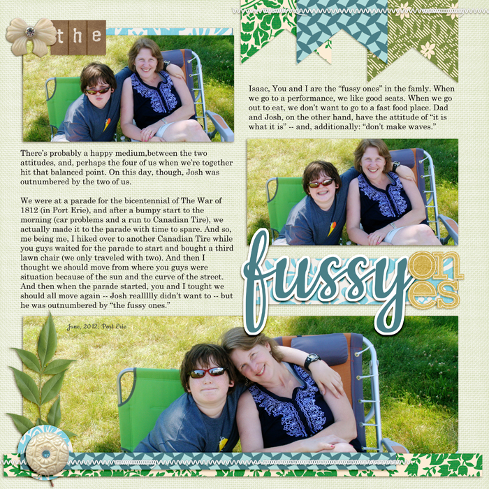
The Fussy Ones by Debbie Hodge | Supplies: Trendy, Beach Party, Rhinestone Buttons and Bows, Mercantile Mix 4 by Jenni Bowlin Digital; Just Linens by Michelle Martin; Tidbits by One Little Bird; Yellow Paper Alpha by Katie Pertiet; Wanderlust by Pink Reptile Designs; Cookie, Century Schoolbook fonts
5. Clustered
Overlap and cluster your three photos, adding tilts and staggers as needed.
Doris Sander arranged a triangle of blocks (two photos plus red patterned paper) with a long title and accented with three round elements to create a visual triangle around her photos.

You Worked So Hard to Get Here by Doris Sander | Supplies: patterned paper, wooden button, brad – Basic Grey, graph paper – Studio Calico, washi tape – Target, word stickers – Tim Holtz, mist – Maya Road, distress ink – Tim Holtz for Ranger, chipboard alphas – American Crafts, flair – Ormolu, ledger paper – vintage
Lisa Dickinson wanted to include a quote about the relationship between horse and man along with three photos on this page. Lisa says, “I arranged the quote it in a column down the left hand side of my page. I enlarged certain words (“horse” and “man”) to further reinforce the page theme. To keep the text from overwhelming the page, I applied a 50% brown tone just slightly darker than my background cardstock. It works similar to a watermark, being visible, but also blending in with the overall tones and colors of the page.” Her cluster of three photos, tilted and with narrow mats, sit alongside the quote, in a second column defined by striped patterned paper.
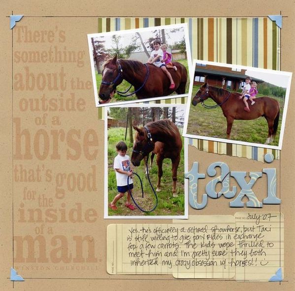
Taxi by Lisa Dickinson | Supplies: cardstock (Bazzill Basics) + patterned paper (KI Memories) + chipboard letters (Lil’ Davis) + journal tags, photo corners (Heidi Swapp) + pen (American Crafts) + font (Clarendon)
Michelle Houghton‘s three photos are in a cluster that “circles” her page. Michelle says, “I am going to give credit to my mother for this idea. She had the exact same photos and lined them up with a 2 3 4 next to the photo to count the people adding into the shot with our niece Camille. I loved the idea and decided to add my own twist. I swooped my numbers around the edge of a lage circle and wrapped the photos around the same edge. As I had hopedm the numbers lead the viewer’s eye around to all three photos not focusing in on one. I completed the circle with small rubon letters that say ‘Camille’s so cute we want some more!’ Don’t you just love how a baby pulls families into a photo?”
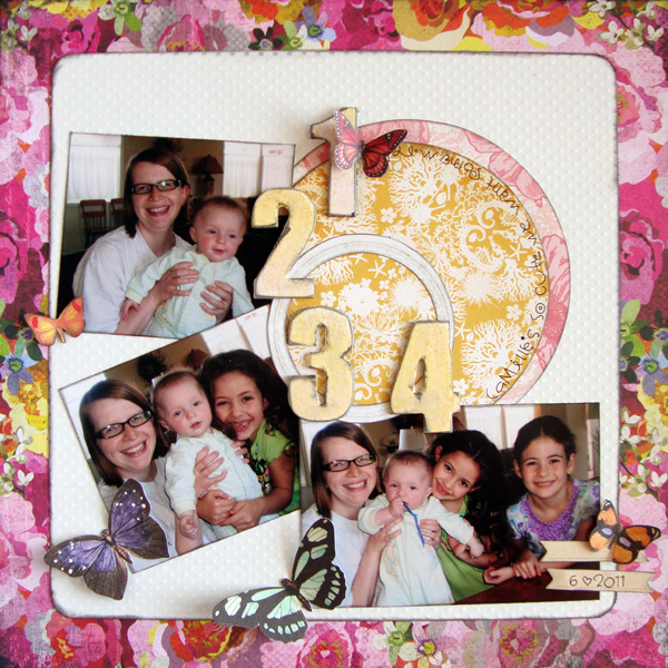
1..2..3..4 by Michelle Houghton | Supplies: Cardstock – Bazzill Swiss Dots Patterned paper – Basic Grey and Crate Paper Die cuts – S E I Chipboard numbers – Pink Paislee (painted with acrylic paint) Rub-on letters – Doodlebug Designs Ink – Tsukineko
Take a look at 3-photo pages you’ve made in the past. Do you have a typical approach or have you used one or more of these? Next time you’re ready to scrapbook 3 photos, consider: side-by-side, stacked, one featured with two supporting, blocked, and clustered designs.
[designclass]

