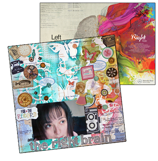
A Mercedes Benz ad illustrating the left and right brain not only inspired Kiki’s design, but her topic, too. See complete details below.
Magazine covers and advertisements are designed to not only catch the viewer’s eye but to pull them in and guide them to view the smaller details. They are, thus, great models for laying out your scrapbook pages.
Ways to use the inspiration piece include:
- to define how you lay out photos, title, journaling, and embellishments on the canvas
- to inspire your choice of color and pattern
- to inspire your typeface choice
- to inspire your journaling treatment
- to inspire your titlework and even the actual title
- to inspire the topic of your page
Paula Gilarde runs a weekly inspiration series in which she shares an inspiration piece and her take on applying it to a scrapbook page. Quite often her inspiration pieces are from print media.
“Let’s Ride Again” was inspired by the first page of a magazine article Paula ripped out a couple of years ago. “I was drawn to the pretty background with the open book with the different objects placed on the canvas,” says Paula. An “open book” digital template let her get the right effect for her focal point.
“I wanted to mimic the bold and vibrant background of my inspiration piece. That’s a bit of a departure for me, I tend to stick with a plain or neutral canvas for my layouts. I really wanted to add some dimensional accents but couldn’t find anything that worked for me, so I went with the yarn and extra photos.”
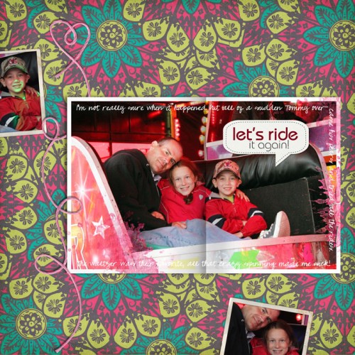
Let’s Ride It Again by Paula Gilarde | Supplies: Open Book Layered Template No. 01, Crowning Affair: Vibrant Kit, Yarn Swirls: Love by Katie Pertiet; Amuse Me Kit by Pattie Knox
Kiki Kougioumtzi‘s inspiration comes from a beautifully illustrated ad for Mercedes Benz. Kiki says, “I liked the idea of left VS right brain, the journaling, and the neutral VS vivid colors. Those are the elements I took from the advertisment and translated to meet my needs. I printed and cut our digital elements for my embellishments.
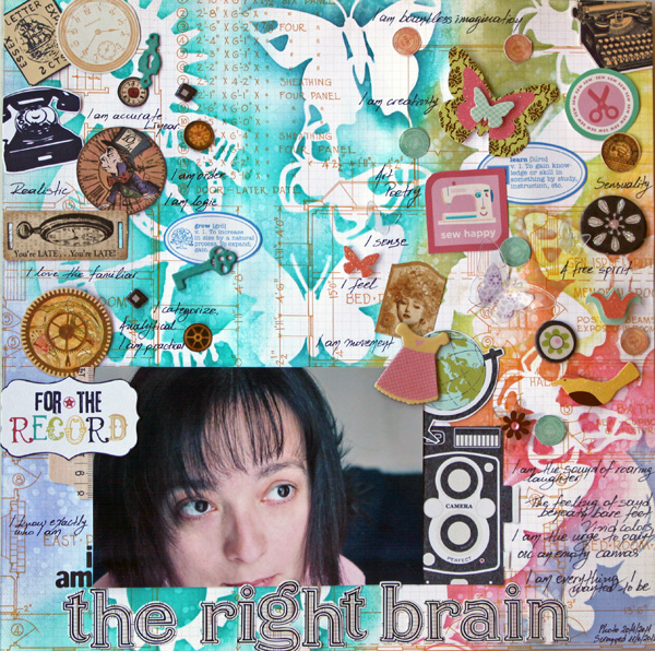
The Right Brain by Kiki Kougioumtzi | Supplies:Pattern paper:Studio Calico; Masks:Tim Holtz for Advantus, Heidi Swapp;Ink:Ranger Distress;Die cuts:K&Co, Crate Paper, Echo Park Digital, Cosmo Cricket Digital, Jenni Bowlin Digital, Graphic45, Tim Holtz Grungeboard for Advantus, Heidi Swapp; Stickers:American Crafts; Alphas:Basic Grey, Jenni Bowlin.
Amy Kingsford says, “Several aspects of Popsicle Diet were inspired by vintage coke ads. My son is going through a Popsicle craze right now–it’s the only thing I can get him to eat. I wanted to capture this fad in our memories and have fun with it. I searched for and found a variety of vintage Coke and Diet Coke Ads using Google. On my page, I incorporated the selective coloring from this ad. I also incorporated motifs and fonts that were similar to those used in the branding of Diet Coke throughout the years. Finally, I went with an “ad-style” approach in my journaling.”
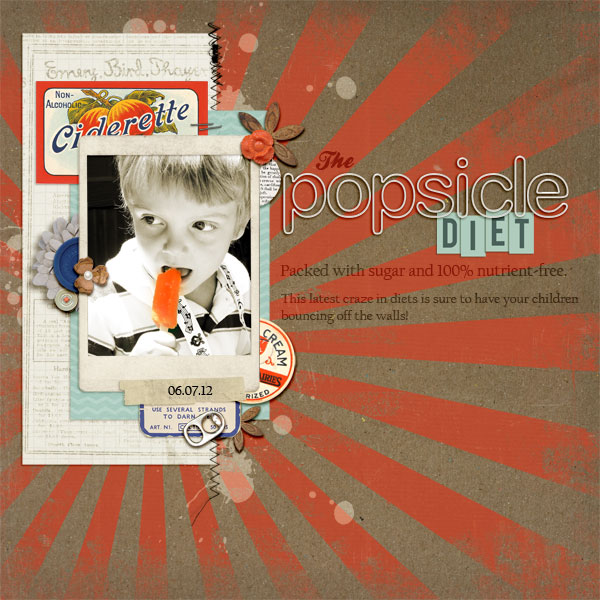
The Popsicle Diet by Amy Kingsford | Supplies: Vintage Carousel by Sahlin Studio and Jenn Barrette, Vintage Labels: Sweet Sips, Layered Ephemera Stacks, Typeset Alpha No. 2, Soft Rimmed Plastic Alpha, Precocious Flowers, Country Fair Picnic Elements, Vintage Vogue Elements, Key to My Heart Elements, by Sahlin Studio,Worn by Sahlin Studio and One Little Bird Designs, Forget Me Not Art Play Palette by Anna Aspnes, Moving Through Template No. 5 by Amy Martin
Vicki Walters says, “My inspiration for this page came from the MiniBoden Spring Catalog. There were pages of little shorts, shirts, and skirts in which three or four pieces were placed on a white background, overlapping just a little with a few words at the bottom of the page. The bold colors stood out, and I loved the clean look. So this is what I came up with!”
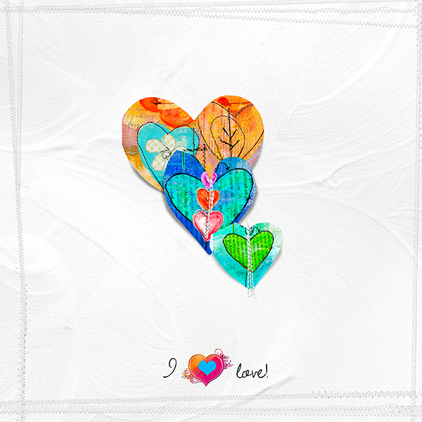
I Love by Vicki Walters | Supplies: Font Dawning of a New Day; Anna Aspnes: PotPourri Paperie no 7 background, ScissoredHearts no 1 ScissoredHearts no 2, KrissKross Stitches Overlays no 1 edge; Nancy Rowe Janitz: Collage Spring *patterned paper, Certified Organic 2 *mask.
Christy Strickler used the simple arrangement of a Macy’s ad she found on the Scrapbook Expressions forum to make a quick page. Christy says, “I wanted a little more dimension on my page than I saw in the inspiration piece, so I added brads and jewels to the pattern paper block as well as to the badge and ribbon. Glossy accents helped keep the title alphas in place while adding dimension. I often scrap with brown when I scrap about my pets. The soft pink and blue accent the brown nicely and add to the theme of my pets sleeping together peacefully.”
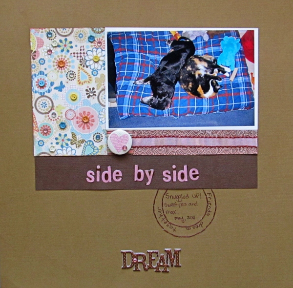
Side by Side by Christy Strickler | Supplies: cardstock: Die Cuts With a View; patterned paper: Basic Grey;alphas: Paper Trunk; brads: Making Memories; ribbon: Basic Grey; badge: Pink Paislee; sticker: Momenta; other: jewels, DMC floss,glossy accents
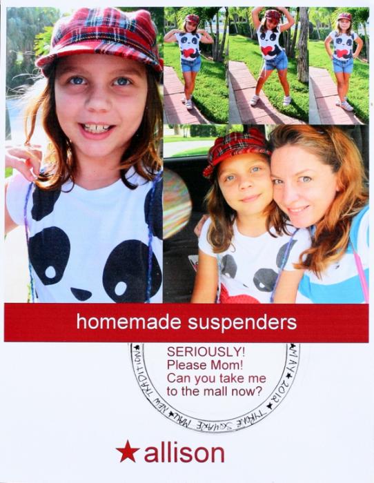
Katie Scott saw the ad Christy was using and decided to use it herself. Katie says, “I loved the full bleed of the layout and the Macy’s ad reminded me of a recent and rare trip to the mall with my daughter.”
M”y daughter had been wanting a pair of suspenders for a couple of months; I’m not a fan of going to the mall and Target didn’t have any suspenders, so my daughter made herself some homemade suspenders with yarn. She was a good sport about not going to the mall until finally, she got me on a weak day and I caved and we hit the mall and headed straight for Claire’s, an accessory store, and she found some very ’80s checkerboard suspenders.”
“I arranged the photo block in Picasa and printed it out. I added the a circle using a nesting die. I traced it and then handwrote journaling in the inside of the circle.”
Terry Billman used a Father’s Day ad from Kohl’s department stores. Terry says, “As soon as I saw this ad, I knew the exact photo I wanted to scrapbook. The ad lends itself to one large vertical photo. I wanted to capture the emotion of my son after his team lost in the third round of the play offs and the emotion of his father comforting home. This was a moment to be treasured, and the younger father and son image inspired my treatment.”
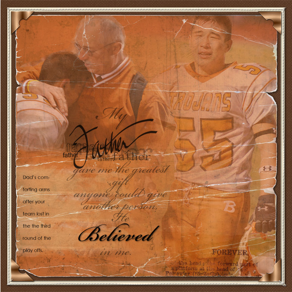
Father by Terri Billman | Supplies: Katie Pertiet: Classic Cardstock My Peony, Naturally Krafty, Roughed Up Solids Hereford; Anna Aspnes: Masking Gradient Canvas, Label Transfers No. 3; Family Word Transfers No. 1, Stitched by Anna Cream; Patti Knox: CornerIts; M. Wise: Double Take Boy.
Barb Brookbank‘s “Summer Days” was inspired by the email inspiration challenge at Designer Digitals featuring this Garnet Hill screenshot.
Barb says, “We were having a campfire and eating s’mores and my granddaughter was totally enjoying it! She gave it all a ‘thumbs up!” Barb used a template made by Katie Pertiet based upon the challenge, adding frames to draw the eye to her focal point and add dimension. Her journaling is a poem by blogger Gregory K that’s an ode to s’mores.”
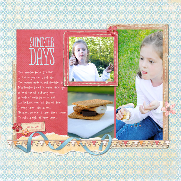
Summer Days by Barb Brookbank | Supplies: Ad inspiration and template: Katie Pertiet at Designer Digitals I chose a kit by Lynn Grieveson that had similar tones to my photos – soft peach and blue. Custom shadow work, and ribbon woven around the banner by me. Font: My Mood Ring Says Blah by Darcy Baldwin (Sweet Shoppe Designs).
Audrey Tan was inspired by the newspaper print in a political advertisement that appeared in print and even on billboards. Audrey says, “I was inpsired by the newprint in the advert and used it as a base for my layout. The digital paper I used was quite dark, so I applied a blending technique to lighten it. A quote replaced the need for journaling.”
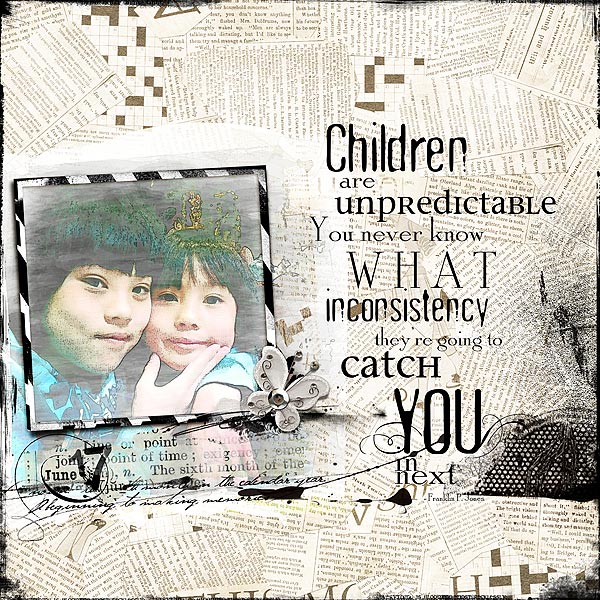
Children by Audrey Tan | Supplies: Joanne Brisebois: Papier Mache
Anna Aspnes: ArtPlay Palette Great Outdoors, 12×12 Edge Overlay No5, Children Quotes Word Art No1, Rock Star Frames No1 & Multi Media FlutterBys No2.
Debbie Hodge used a travel magazine ad she saw on Paula Gilarde’s blog as the model for the left side of her 2-page spread “Quiz Bowl.” When you’ve got a lot of journaling, consider using an ad to inspire one side of the layout and filling the other side with journaling. Debbie pulled this journaling from a blog post.
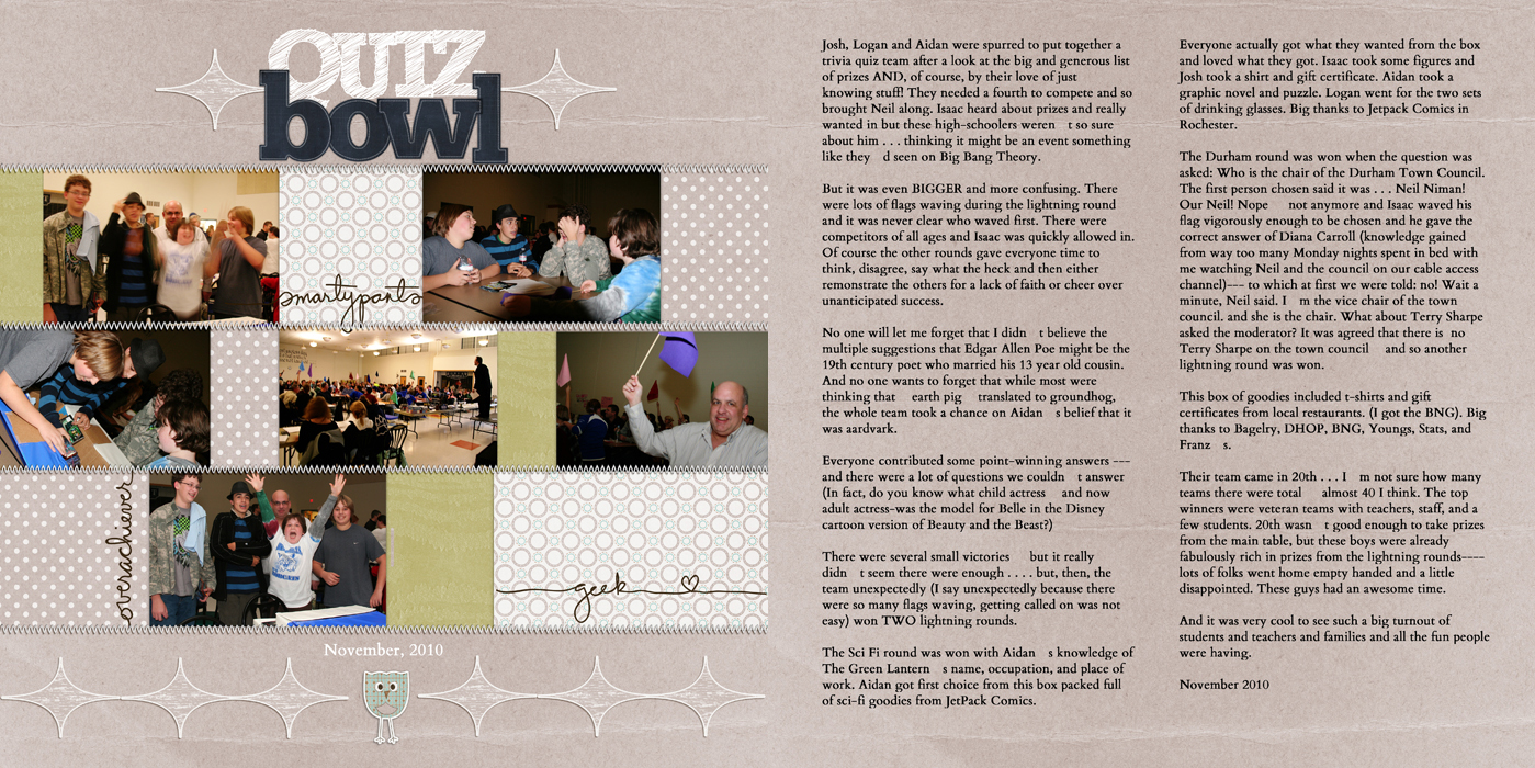
Layout by Debbie Hodge | Supplies: Appletree by Sara Gleason/Zinnias and Swallowtails; Stitched by Anna White No 1 by Anna Aspnes; Between the Lines Alpha No 1 by Katie Pertiet; Westover by One Little Bird.
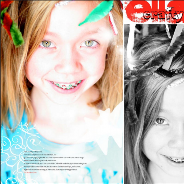
Anna Aspnes says, “While many of my layouts are very artsy and involve digital collage techniques, I am also attracted to the simplicity of the clean and graphic way magazines are laid out. There is something very direct and to the point about using simple photos and words in scrapbook layouts, not to mention the time-saving benefits gleaned from this practice. I used an advertisement from a Real Simple magazine demonstrating a split page design with same title placement to create “Crafty Ella” in less than 15 minutes. The second photo took the place of the ad text and was converted to black and white to provide visual separation from the focal image.”
Christy Strickler says “I like to create pages inspired by ads–I especially love to use book covers and music albums covers.” Christy googled album covers and chose the following album art as design inspiration for her page “Volts,” which is about her son’s favorite new video game. She also embellished her page with a fussy-cut image of the video game’s character that she found online.
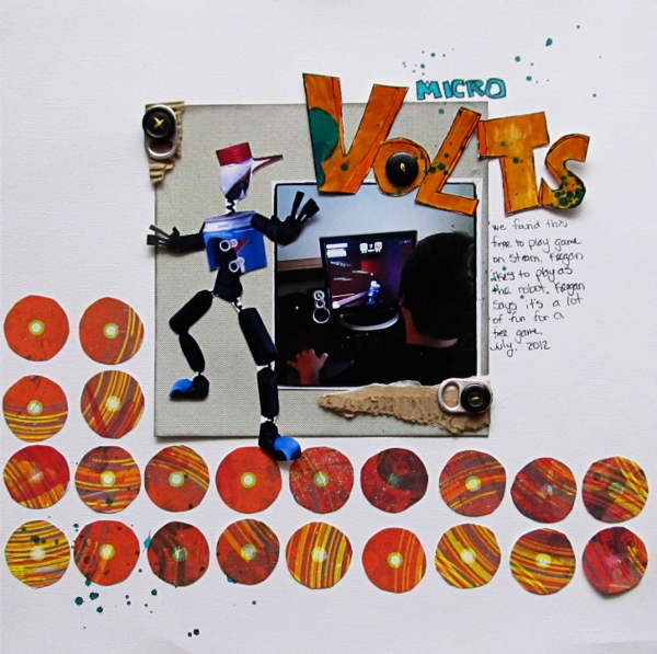
MicroVolts by Christy Strickler | Supplies: Cardstock: Colorbok; patterned paper: Basic Grey; markers: Ranger, Bic Mark it; mist: Ranger; other: buttons, soda can tabs, cardboard, photo paper
[getinspired]

