Chronicling your travels on scrapbook pages allows you to relive the trip even when you’re back home. City visits yield lots of photos and stories. Read on for ideas for scrapbooking your travels to cities.
1. Combine nighttime and daytime scenes.
Audrey Tan says, “Singapore is a very small but busy and densely populated city. Hence, the ‘busy-ness’ of my page. I’ve included night scenes as the city is as vibrant at night as it is in the day. The ‘merlion’ at the top right is a prominent feature on the waterfront. It’s situated at the corner, and, as it pours out water, it showcases the other areas of the city; eg. outdoor swimming pools, Sentosa, Universal Studios and food centres. Each time I visit the city, these are the places I frequent with my boys.”
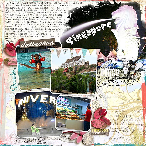
Singapore by Audrey Tan | Supplies: Anna Aspnes: ArtPlay Palette Ablaze, Frame Exhibits No1, Hipster Plumes No5, Travel Word Mix No1, Cool Glows No1, Vacation Word Transfers No1, Multi Media FlutterBys No1; Maya de Groot: Travelers Treasure Box; Julianna Kniepp Designs: Hello Beautiful; Fonts: Singapore & Sharks In The Water
2. Show city streets with your loved ones walking them.
Christy Strickler says, “My husband works for the theme park and resort industry, and he occasionally has a business trip to a wonderful locale. This time, he had a conference in San Juan,Puerto Rico. On the day shown here, we wandered up and down the streets of Old San Juan. I wanted to capture the narrow cobblestone street lined with cars and colorful houses. So I stepped back, as my husband and son continued walking, to snap this photo.”
“When I sat down to scrap this page, I knew I wanted to use this journal sticker by American Crafts. The colorful buildings, palm trees, and sunshine reminded me of San Juan. Since I don’t own anything else from this particular paper line, I had to get creative. I used a journal stencil to draw lines on the page and then painted them with acrylic paint to form a background. The bright flowers are reminiscent of those I saw in the city. Everything about this page reminds me of the sights we saw and the fun we had that day.”
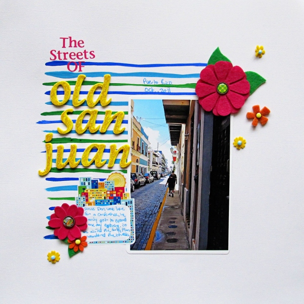
The Streets of Old San Juan by Christy Strickler | Supplies: cardstock: Colorbok; alphas: Pink Paislee,Creative Memories; glitter glue: Ranger/stickles; sticker: American Crafts; brads: Basic Grey; flowers: Maya Road,Fancy Pants, and Jillibean Soup; other: acrylic paint,glass beads
3. Scrapbook your city during special events.
Stefanie Semple says, “Cape Town put on colorful finery for the Soccer World Cup, and I wanted to showcase photos from the event. We walked around taking in the sights weeks after the event. My men folk had taken in some games but the sounds of the vuvuzelas put me off. This was a perfect day; the weather was amazing; the city was quiet on that Sunday morning, and we ambled around taking in the sights and appreciating the natural beauty that our hometown has to offer.”
“I chose a kit with bright happy colours and the freebie soccer mini was just perfect, too. The chalked alpha was in the main kit and the paper behind the title looked slightly like a soccer net so I recoloured it – making it darker to show off the title better.”
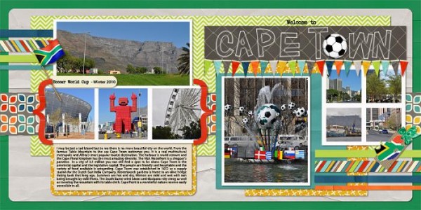
Welcome to Capetown by Stefanie Semple | Supplies: Doubled Over 2v2 Template by Little Green Frog Designs, South Africa Ayoba Freebie by Chaos Lounge, Freestyle by Sarah Jones Designs.
Audrey Tan embellished her focal point photo on “Meet Up” with a cluster of feathers tied and topped with a silk flower.
The subject of the page is a real-life meetup of online friends on Jubilee day in London. Audrey says, “The few of us that met up came from various countries–Australia, Singapore, Netherlands and United Kingdom–and we couldn’t have chosen a better day. Hence, I wanted my page to reflect the special moment. I used feathers in three colours–white, blue and red–to represent the colours of the British flag. They were great embellishments for a page was made to reflect the Jubilee moment and the excitement of meeting up with online friends.”
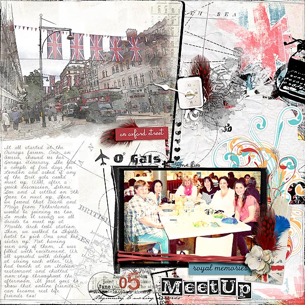
O’Gals by Audrey Tan | Supplies: Anna Aspnes: ArtPlay Palette GlobeTrotter, ArtPlay Palette Concerto, Distressed Dates No1, Month Word Transfers No1, Travel Europe No1, Globe Trotter No1, Loop Da Loop Travel No1, Warm Glows No1, Distressed Frames No4, Artsy Clocks No4, 12×12 Edge Overlays No5; Katie Pertiet: Double Decker; Tangie Baxter: Flora Finery; Pink Reptile Designs: Noted; Fonts: LD Shelly Script, VTKS News Label & LD Letterpress Inverted.
4. Scrapbook an iconic sight and journal about your visit to it.
Cloud Gate in Chicago is referred to as “The Bean” by locals and it’s a must-see sight for tourists. It reflects Chicago’s famous skyline and the clouds above. While Debbie took many photos of the sculpture, she chose one shot of it to feature on this page. A small square close-up of her sons at the spot reminds her of how old they were at the time — and triggers other memories of the day.
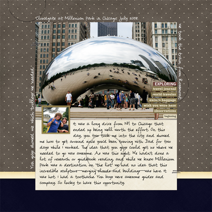
Cloudgate, Chicago by Debbie Hodge | Ali Edwards Layered Template No 13;
Pina kit by Andrea Victoria; Pea Shirley font
5. Scrapbook the wide-angle view of a city.
Sue Althouse says, “We had only one evening to spend in Kansas city, but made the most of it. After a delicious meal we drove around and found an excellent spot for my husband to get good shots of the city. This visit was too brief – we would love to come back sometime for a longer stay! To make this layout, I took my cue from the photo and went with a more muted and neutral color palette, so my product choices would not overpower the picture.”

K.C. (Kansas City) by Sue Althouse | Supplies: ardstock: American Crafts; Patterned Paper: Echo Park, Studio Calico; Alphabets: Pink Paislee; Stamps: American Crafts Date Stamp; Inks, Mists: Hero Arts; Tools: Creative Memories Hexagon Punch; Die Cuts: Studio Calico; Brads: Marcy Penner; Other: washi tape, Hambly transparency, Heidi Swapp Memory File
6. Use a few random shots to record a day in a frequently-visited city.
If there’s a city you visit frequently, you’ve probably already scrapbooked the iconic images. Record the day by taking a few shots with your camera phone and including them on a page with journaling that tells about the day.
Debbie did this on “Boston” with shots she took on a walk after seeing a play. The bears in the store window were odd; Newbury Comics is a favorite stop for her sons; and West Side Story was the play they saw that day. A casual blocked design with bits of patterned papers and stamped words pulls helps create an eclectic look that goes with the eclectic collection of photos.
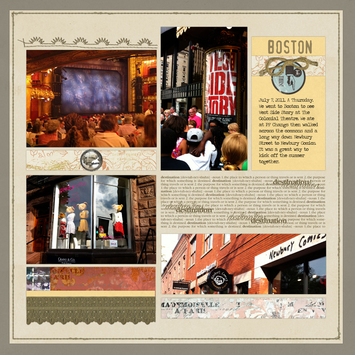
Boston by Debbie Hodge | Oiselet Rouge Kit, Oiselet Bleu Kit, Stamped Stitches No. 08 Brushes and Stamps by Katie Pertiet; Foto BradPack No. 01 ElementSet, Stitched by Anna Borders No. 03 by Anna Aspnes; Really Retro Labels, Totally Trashed and Vandalized Paper Pack by Lynn Grieveson; Hootie and Traveling Typewriter fonts
7. Evoke the sense of a city with your product choices.
Deborah Wagner says, “When I think of cities, the first one that comes to mind is Paris. I haven’t been there in eight years, but its charm and beauty are still fresh in my memory. I cannot wait to return. I tried to create a page that had the shabby chic feel of many of the boutiques we visited during our stay, using supplies that reflect all the hidden trinkets waiting to be discovered around every corner. Also, I added a layer above my photo, and used a soft brush to color the sky and my jacket to complement the colors on my page. I set the blending mode to soft light.”
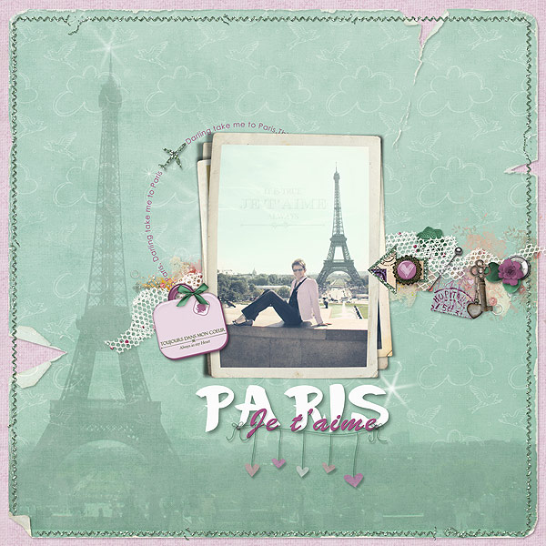
Je t’aime Paris by Deborah Wagner | Supplies by Designer Digitals: Lynn Grieveson – Belle Francaise element pack, Petit Jacques Kit, My Wonderful Adventure Kit, Worn Page Edges No. 5; Katie Pertiet – Messy Stitched Borders White No.2 (added a glitter action), Crowning Affairs Vibrant Solids, Little Prince Kit, Artistry d’Amour Kit, Hanging by a Thread, Stacked Vintage Photo Frames No. 2, Forever LT, Star Glows No. 1, Sun Porch Kit, Sun Porch Clusters
8. Merge shots of a city with digital photo masks.
Chris Asbury says, “This was a special vacation we took to Puerto Vallarta, Mexico in the early 1990s. We spent hours wandering the charming plazas, enjoying the beautiful beaches, and soaking up the fabulous history of this mystic city, also home to Casa Kimberley, the one time residence of Elizabeth Taylor and Richard Burton.”
“To create this page I began with Anna Aspnes’ Artsy Layered Template No 50. I replicated and clipped the photo layer to each mask layer of the template causing the varying photo opacities. Most of the elements are part of the template. To increase the ‘sunlight glows,’ I added more FotoGlows and placed them on the buildings and trees so your eye would wander up the street. The colors of the sky were achieved with masks and clipped paper adding to the mystic feel of Puerto Vallarta.”
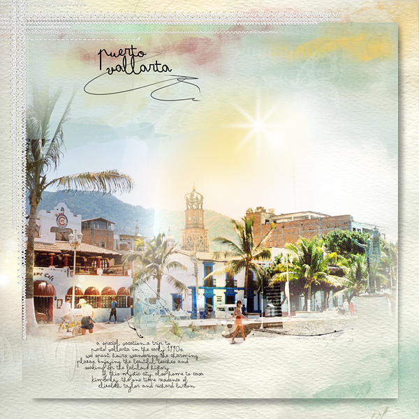
Puerto Vallarta by Chris Asbury | Supplies by Anna Aspnes Designs: Artsy Layered Template No.50 (page template), Artsy Layered Template No.15 (masks for sky), ArtPlay Palette Seafoam (paper, transfer), MonoBlendz Cayenne (clipped to mask), Pumpkin Spice MonoBlendz (clipped to mask), ArtPlay Scholarly_Solid Paper (clipped to mask), CoolGlows No.1, WarmGlows No.1, Bokeh No.1 BrushSet, Different Strokes No.1, WarpingFrames2_7 (drop shadow), KrissKrossStitchedOverlays1_1; Font: Arsenale White
9. Use one shot to tell the story of a city outing.
Amy Kingsford says, “This page was about a trip to Salt Lake City that my husband I took to celebrate our anniversary. We attended a music festival–it was an outdoor venue smack-dab in the middle of the city. The skyscrapers made for an awesome atmosphere for the great music we heard all day long. Because of the venue I wasn’t able to take my camera so this shot was taken with my cell phone. It was pretty chilly most of the day–but the sun came out for a little while and looked beautiful bouncing off the glass buildings that surrounded us.”
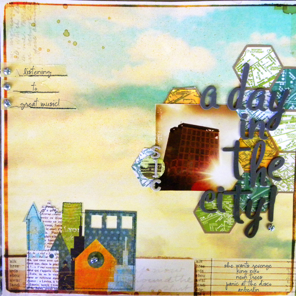
A Day in the City (SLC) by Amy Kingsford | Supplies: Studio Calico Kits: Boardwalk and Metropolitan, American Craft Thickers Foam-Grey, Adirondack Ink Pad Butterscotch by Ranger, Masking Tape, Screws.
10. Collect pictures of signs from the city you visited on one page.
Whether you took photos of building and street signs purposefully or have them in the backgrounds of posed photos, crop and combine to combine them to paint an overall picture of the city. Debbie chose one photo to highlight from her NYC trip — from Grand Central Station — and collaged the rest. Don’t worry about photo sizes: you can fill in the spots with strips of paper and embellishments.
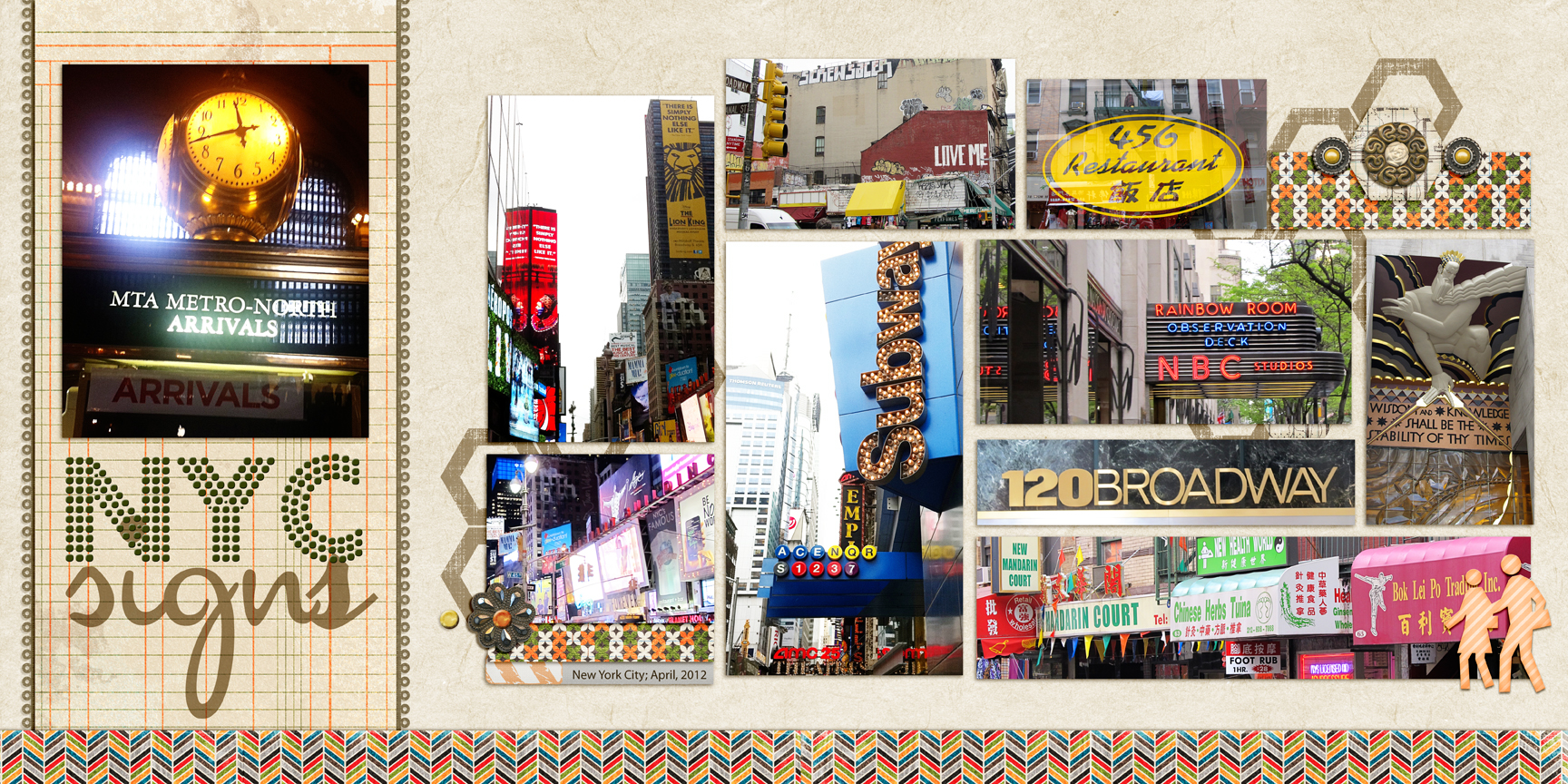
NYC Signs by Debbie Hodge | Supplies: The Traveler by River Rose; 11:30am by Amy Wolff; Thankful for You by Jenn Barrette; Artplay Concerto by Anna Aspnes; Master Gardener Borders by Jesse Edwards; Fortuna Dot, Cocktail Script fonts
11. Scrapbook a city with Instagram-styled photos.
Kelly Purkey used three Instagram-styled shots of Chicago, her favorite city. Kelly says, “They were easily incorporated into the page using travel-themed supplies – map, paper, and map stamps. I love doing travel layouts because it’s so easy to find great supplies that will work with your photos and really compliment them.”
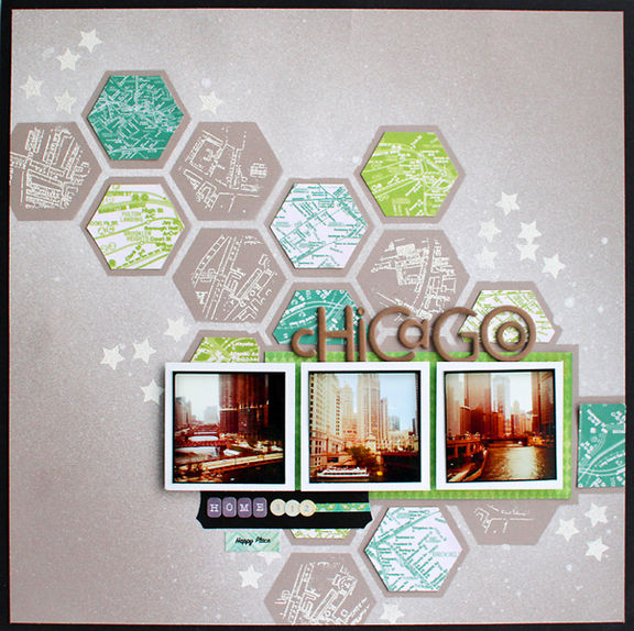
Chicago by by Kelly Purkey; Patterned Paper: Studio Calico, Crate Paper; Letters: Studio Calico; Stickers: Cosmo Cricket; Stamp: Smash, Studio Calico; Mist: Studio Calico
12. Scrapbook souvenir shopping in the city.
The shops in NYC’s Chinatown are rich in color, texture and detail. Debbie took candid shots of this shopping outing with friends on a spring-break trip to NYC making sure to step back and include the details in around them. A themed digital kit provided the right accents for the page. With a cluster of four busy photos, she kept the accents minimal, using two strips of patterned paper and a couple of embellishments. The embellishment cluster is balanced by the titlework with repetitions of yellow in each.
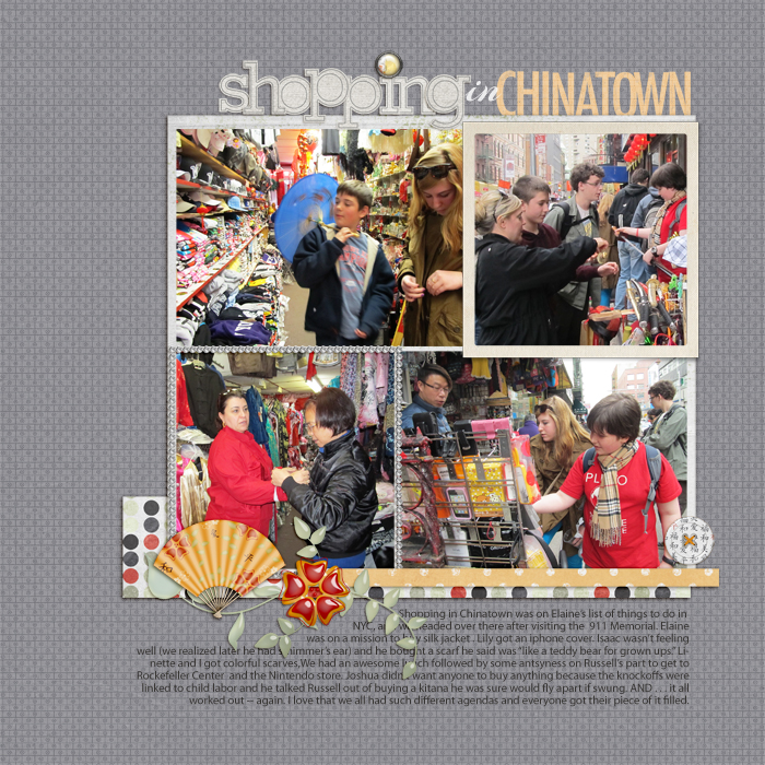
Shopping in Chinatown by Debbie Hodge | Supplies: Fortune Panda by Ziggle Designs; Paper Alpha White, Grunged Up Alpha No 2 by Katie Pertiet; Vitality, Bling in Chic Frames by Anna Aspnes; For the Record by Paislee Press; Arizonia, Myria Pro fonts.
[current]

