Punches and die cuts originally entered the crafter’s toolkit for making positive shapes: for punching out circles and tags and alphas.
Lately, though, scrapbookers have been purchasing electronic die-cutting machines that make the creation of custom punched shapes possible. Combine easier and more complex die-cutting tools with the popularity of mists and paints, and you see scrapbookers inspired to make their own stencils, as well page accents that make use of negative space.
Take a look at ideas for scrapbook page canvases, mats, and accents made with the space left by a punch or die-cut.
Simple shapes
Lisa Dickinson punched a butterfly from a patterned paper block on “Too Fun.” The block fills a compartment in her grid design, with the background canvas revealed.
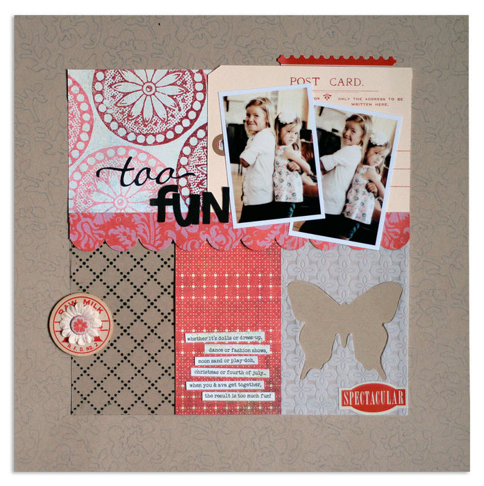
Too Fun | supplies: kit (Jenni Bowlin Mercantile, August 2011) + cardstock (Bazzill Basics) + patterned paper (Basic Grey, Fancy Pants) + decorative papers (Fancy Pants, Bazzill Basics) + tag (American Tag) + stamp, ink (Jenni Bowlin Studio) + letter stickers (Prima) + stickers (Studio Calico) + flower, chipboard (Fancy Pants) + punch (EK Success) + die cut machine (Silhouette by QuicKutz) + acrylic template (Jenni Bowlin Mercantile) + pen (Staedtler)
Sue Althouse used her Cuttlebug and Pinking Circles dies in two sizes. Sue says, “I first cut white cardstock with a smaller die, yellow polka dot patterned paper with a larger die, put the negative space squares together and backed them with a light blue stripe. Paired with the orange squares, I had colorful little compartments to house my photos, words and embellishments.”
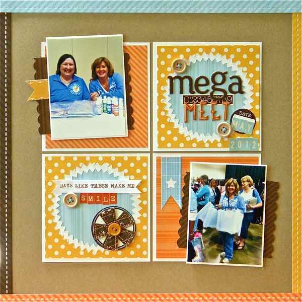
Mega Meet by Sue Althouse | Supplies: Cardstock: Bazzill; Patterned Paper: Echo Park; Alphabets: American Crafts, October Afternoon; Stamps: Technique Tuesday; Inks, Mists: Colorbox; Tools: Cuttlebug, Nestabilities Small pinking Circles, Fiskars Border Punches; Stickers/Tags: Echo Park, Jillibean Soup; Ribbon/Twine: We Are Memory Keepers; Other: Basic Grey flower
Frames and rings
Leah Farquharson says, “It’s a little hard to see, but ‘I Have Discovered the Key’ is filled with negatives! I seriously cracked up when the boys that normally run from the camera were all over it when they were able to goof off in front of it themselves clicking away with a remote.”
“I made the photo strip frame by cutting a rectangle, and punching three smaller rectangles from it. I cut the photos smaller than the frame openings, and, to give them some pop, I lifted them up with pop dots.”
“To create the rings, I first punched circles, then cut around the openings left by the punches with a scissors.”
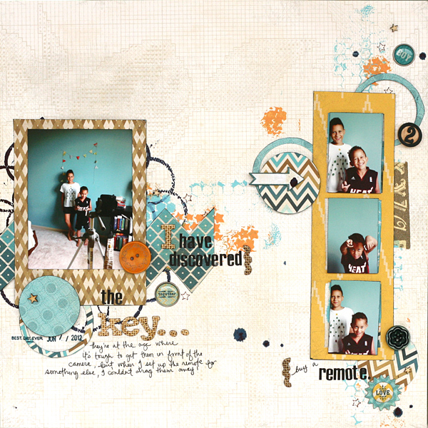
The Key by Leah Farquharson | Supplies: patterned papers, brads, chipboard: My Mind’s Eye. Masks: Crafter’s Workshop, Pink Paislee. Bingo number: Maya road. wooden stars: Studio Calico. chipboard letters: American Crafts. letter stickers: 7Gypsies. inks: Ranger, American Crafts. Paints: Jenni Bowlin. stamp: American Crafts. Pens: Martha Stewart, Signo Uniball.
Welded frames
Amanda Jones combined a digital heart and a digital frame to cut “welded” frames with her Cameo. The title was also cut with her Cameo. Check out the details on her blog. Amanda says, “I finished off the frames with tiny punched hearts and Prima pearls.
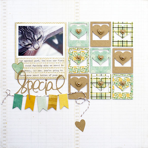
Special by Amanda Jones | Supplies: Papers – This and That Charming, Echo Park.; Twine – The Twinery; Pearls – Prima; Cardstock – Bazzill, kraft and smooth white; Silhouette Cameo; Small heart punch; Vintage typewriter for journaling
Titles
Jennifer Matott used the Home Decor cartridge from her Cricut Expression to cut the word “grow” from a patterned paper band and a flower from a kraft tag. She layered these to reveal the background woodgrain paper.
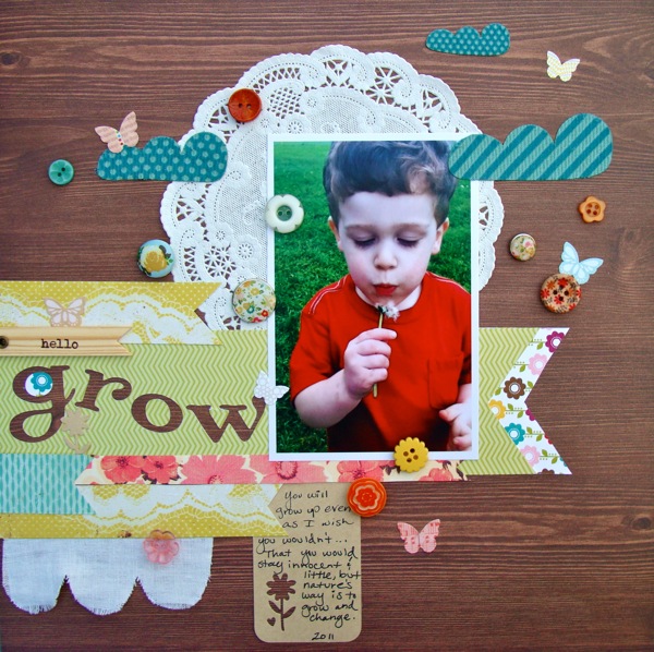
Grow by Jen Matott | Supplies: Studio Calico kit, Pink Paislee Mistables, Crate Paper buttons, Doily, Tag, Buzz & Bloom clouds
Pen: Faber Castell PITT artist pen
Debbie Hodge cut her title from the photo on ‘jammin’.” She layered the cutwork over a detailed brush on her canvas. This is a digital page. To make the “punch,” she selected the area filled by the titlework, then targeted the photo layer and pressed DELete. Adding drop shadows is key to getting a realistically diecut look on digital pages.
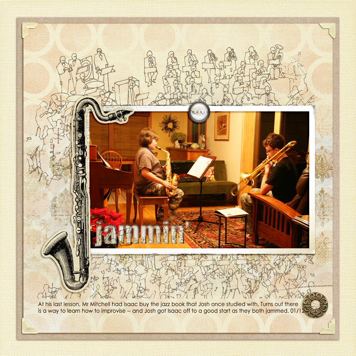
Artplay Palette Concerto, Vintage Fotokorners by Anna Aspnes; Just Hint At It Brushes No 6 by Lynn Grieveson; Krafty Canvas No 1 by Katie Pertiet; Just Linens No 1 by Maplebrook Studios. Century Gothic, Impact fonts.
Subway art
Adriana Puckett says, “This is simple layout that showcases my feelings for my husband. I cut out a subway art design of “I love you” in several languages from pink cardstock. I purchased the subway art cut from the Silhouette store. I backed the “I Love You” in mint green to make it stand out from the rest of the languages, which are laid over the white cardstock canvas.
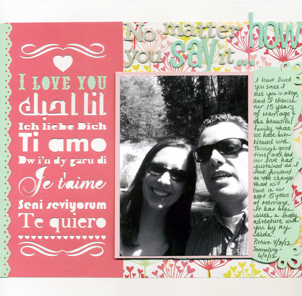
No Matter How You Say It by Adriana Puckett | Supplies: Love Subway Art design and decorative bracket from the Silhouette store; We R Memory Keepers cardstock and patterned paper, Be My Valentine Line; American Crafts Thickers (2 types) for title; American Crafts Memory Marker for journaling; Stampin’ Up border punch.
Use the positive and the negative
On this digital page, Debbie Hodge used the floral design on Jenni Bowlin patterned paper to create her “punching” shape. She selected the shape and “cut” it from white paper. The cut piece is layered to the right of the vertical band, and the surrounding area is the mat extending to the left of the band.
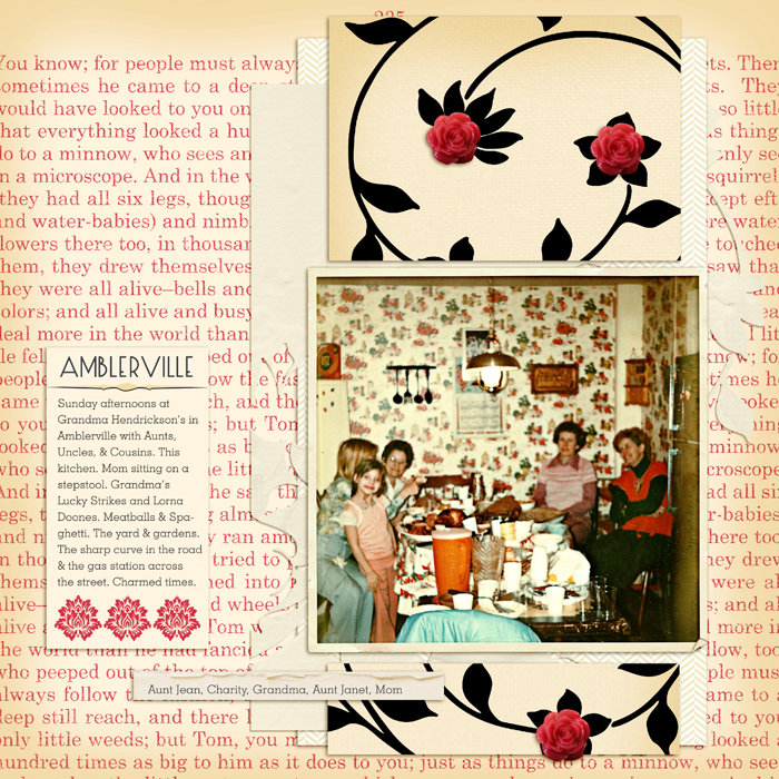
Amblerville by Debbie Hodge | Supplies: Vintage Red Collection and Journalers by Jenni Bowlin; Potpourri Easter Bunny, Artplay Chevron Sweet Baby, Torn N Tattered Scalloped Strips by Anna Aspnes; She’s a Doll by Vinnie Pearce; Vintage Frames Large by Katie Pertiet; Cumulus, Geoslab 713, Designer Mixed fonts
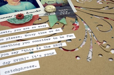
Amanda Jones says, “I used my Cameo to cut the flourish aperture from kraft cardstock which I layered over a pretty floral print.” She also cut extra flourishes from the same print and embellished over the kraft with them. See more details here.
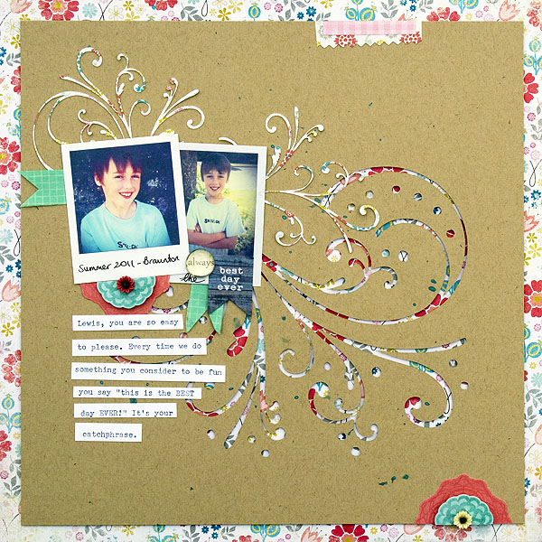
Best Day Ever by Amanda Jones | Supplies: Papers and stickers – My Mind’s Eye, Miss Caroline; Glass and resin embellishments – Prima Paper tape – American Crafts; Cardstock – Bazzill, kraft and smooth white; Mist – Tattered Angels Glimmer Mist, Riptide; Silhouette Cameo; Vintage typewriter for journaling
Layered canvas
Sara Gleason digitally punched a sprinkling of leaves from kraft cardstock — positioned to extend and echo the tree embellishments. Digital drop shadowing completes the effect.
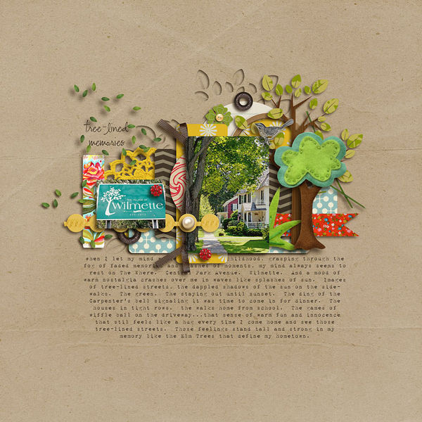
Tree Lined by Sara Gleason | Supplies used: Grandma’s Dresser and Whispers: Nature by Sahlin Studio; Build Your Own Tree by Amy Wolff; Walk With Me by Kaye Winiecki; fonts: 1942 Report and CK Ali’s Hand
Debbie Hodge made a small geo-tag icon for embellishing the title on “Right Here.” She duplicated and enlarged the shape then used it to punch from the canvas, layering it over subtle yellow-on-white patterned paper and adding drop shadows.
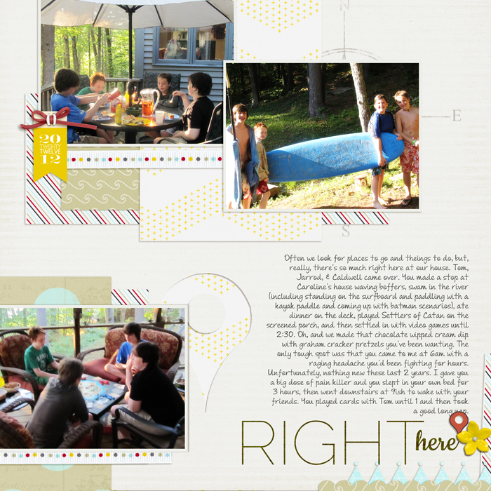
Right Here by Debbie Hodge | Supplies: Maritime by One Little Bird; Classic Border Shapes by Jenni Bowlin; Wander by Anna Aspnes; Double Decker Elements by Katie Pertiet; Everyday Life by Cinzia; Raleway Thin, Andrea’s Script Upright, Cookie Fonts.
So the next time you’re making a scrapbook page, go ahead and “take a punch.”
[current]

