Scrapbooking a beach outing? Take a look at these pages from our creative team and MSD teachers, and pay attention to:
- colors
- products
- photo crops
- layout design, and
- embellishment
And then check out embellishing quotes and beach fonts in our Quickstart Series.
On “The Most Beautiful Beach in The World,” Marie-Pierre Capistran created a small scene with Silhouette die cuts, torn kraft card stock, and ruffled ribbon for scrapbooking this photo of her family on the beach. The ruffled ribbon mimics the waves of the water.

La Plus Belle Plage au Monde (The Most Beautiful Beach in The World) by Marie-Pierre Capistran | Supplies: cardstock: Bazzill white, Stampin’Up! Crumb cake, Stampin’Up! whisper white; paper: Amy Tangerine; Thickers: AC Reindeer; die cuts: Silhouette sea shapes, my own handwriting; punch: Stampin’Up!; Ribbon: Martha Stewart; Rhinestones: Queen&co. Turquoise; Stickles: star dust; stamp: date stamp; embossing powder: Stampin’Up!; ink: distress ink tea dye, Stampin’Up! Pumpkin pie, Groovy Guava, Pink Pirouette, Creamy Caramel, Espresso, Versamark ink , Versafine black; other: Ranger ink blender tool, sewing machine, foam dots, glue dots.
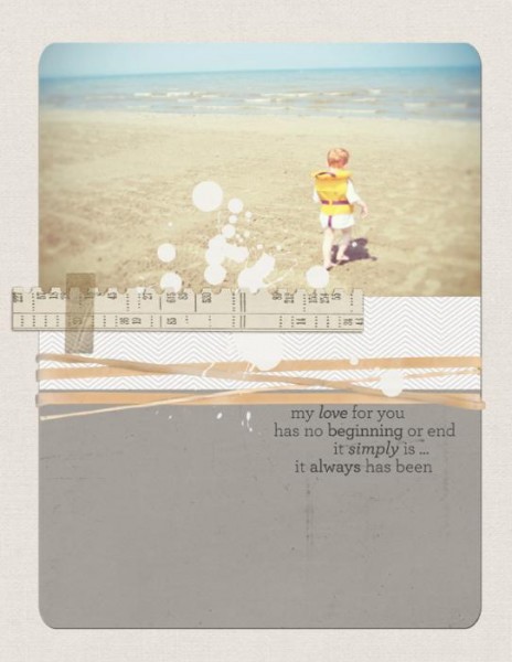
Tara McKernin‘s ‘My Love For You’ shows her son on his first ever trip to the beach. Tara says, “I could have scrapped this in a traditional ‘we-went-to-the-beach-for-the-first-time’ way, but instead I focused on the emotion this photo (from back in 2004) evokes. When I look at this photo, I feel overwhelmed with love for my son, and that’s the approach I decided to go with here. Like this huge beach and even larger body of water, my love for him is endless.”
Debbie Hodge takes lots of beach photos (everything looks like it should be recorded), but, quite often, there is no bigger story to tell. She usually breaks one beach trip into a few layouts, grouping photos together logically. On “Great Memories,” she cropped 4 photos to 4″ x 6″ with portrait orientation (even though) most of them were taken as “landscapes.” She arranged the 4 in a staggered band across the page.
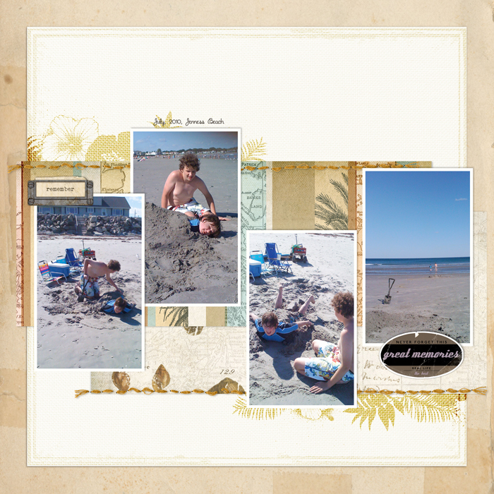
Great Memories by Debbie Hodge | Coastal Papers No 1, Bookplate Notes, Flossy Stitches No. 02, Tropical Clusters Brushes and Stamps, Spiral Bound Paper Pack No. 01 by Katie Pertiet; Really Retro Labels, Inky Dink Page Borders by Lynn Grieveson; Just Linens Paper Pack No. 01 by Maplebrook Studios
It took Francine Clouden over six months to use this much loved photo on “You are My Sunshine” on a scrapbook page. Francine says, “I printed it out in January and made this page in late August. It just goes to show! The photo was taken in Grenada, my childhood home and it was the first time that Kieran had been to my favourite beach. The title says it all. I added the pennant banner as a fun embellishment to balance the “sun” shape placed above as well as to lead the eye from the title into the journaling section.”
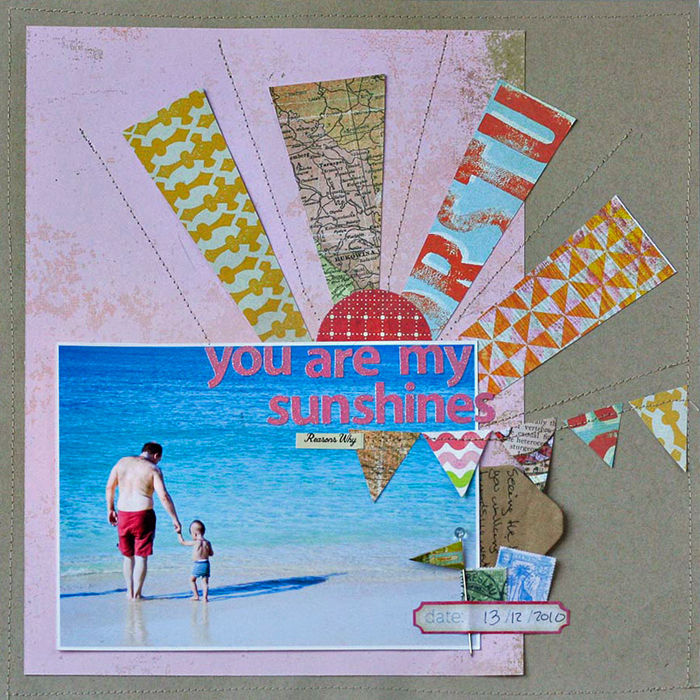
You Are My Sunshine by Francine Clouden | Supplies: Cardstock: Bazzill Basics Paper, Patterned papers: Crate Paper, BasicGrey, Sassafras Lass, Studio Calico, letter stickers: Sassafras Lass, label sticker: My Mind’s Eye, Miscellaneous: flag pin, stamp ephemera, envelope
Adryane Driscoll edited her single photo, lightening it up substantially and emphasizing the blues. She added brushwork in blues and teals along with a digital frame, single brad, and water droplets which add a bit of dimension.
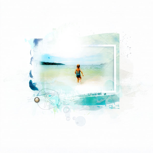
The Beach by Adryane Driscoll | Supplies: Anna Aspnes: ArtPlay Palette Seafoam, ArtPlay Palette Adventure, ArtPlay Palette Wander, ArtPlay Palette Vitality, ArtPlay Palette Friends (brad), Warping Frames No.2, FotoGlows No.4, WaterDrops No.4.
Leah Farquharson is always looking for ways to document regular trips to the beach. On this page she wanted to make note of one of her youngest son’s quirks: he hates the salty sea water so he ends up dashing around the edges of the waves, and only trusts his daddy to take him in where it’s very deep at all.”
Leah says, “This page actually came together very quickly. The middle, light blue, piece comes as a part of a 12″x12″ sheet of patterned paper, so I just cut it out. The foam letters matched the printed title perfectly, and the rest was easy!”
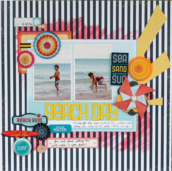
Beach Day by Leah Farquharson | Supplies: All supplies are from the American Crafts “shoreline” collection. Watercolor: generic art supplies.
Jana Morton likes using repeated and/or sequential photos on her pages for several reasons: here to capture the energy of the day. She used brown tones as the perfect complement to the sandy beach.
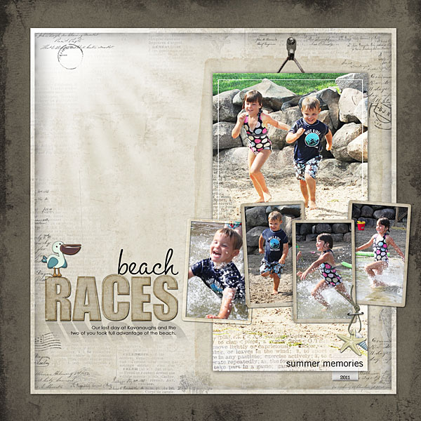
Beach Races by Jana Morton | Supplies : All Designer Digitals: Katie Pertiet: Atlantic Kit, Naturally Krafty No. 13, Grunge Overlays, From My Bookshelf Solids Neutrals, Letterbox Overlays No. 2, Star Glows No. 2, Hung Up Frames No. 7, Pelican Park, Dictionary Blendables: Summer, Selvage Frames, Summer Memories Word Art, Loosely Labeled Dates No. 4, Gingerbread Runaway Kit; Lynn Grieveson: Today Alpha
Vicki Walters says, “The beach means relaxation and taking life easy. The sights, smells, the waves and gulls: they are all relaxing and take me away from everyday life. Sunrises and sunsets are so beautiful over the water!. This layout is a sunset on the beach and uses all the beautiful colors of the beach and the mood. The elements added are little accents of love, peace and the happiness that the beach brings me. The layering in the background is representative of the erosion and weathered effects that are so beautiful to me.”
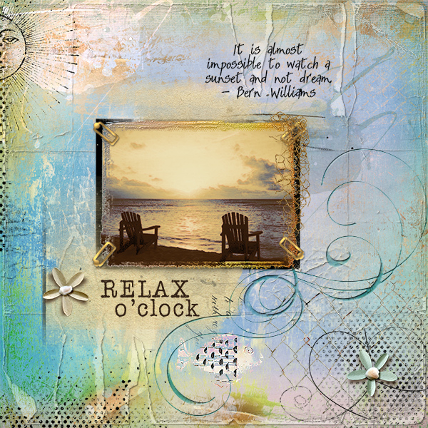
Relax O’Clock by Vicki Walters | Supplies: Font Sandals; Anna Aspnes: ArtPlay Palette Sunshine Bouquet, DistressedEdge 4×6 FotoFrames no 2, Distressed ToolSet no 10, Dotted Korners N Edges no 2, Hipster Plumes Mega Pak no 2, LabelTransfers ElementSet no 3, SkribblePeace no 1, Sun and Moon no 1 Brushset; Creashens: Newport (flowers); Catherine Designs: By the Sea (fish and net); Lynn Grieveson: Worn Page Edges no 4; Nancy Rowe Janitz: Polaroid Transfer Masks; Pink Lottie Designs: Sea Blue Paper Pack.
The story on “For Love” is of a Labor Day at the beach when Debbie’s family and friends pitched in alongside other beachgoers to help dig a wedding proposal in the sand. The photos are kept zoomed out. They don’t focus on the details, but, rather, on the big scene. The real story is told in the journaling, and the cue to that story is the title, which also happens to be the page focal point. Both the title and the journaling on the open space of an enlarged photo. Beach photos, with their expanses of sand and sky, often provide this kind of usable open space.
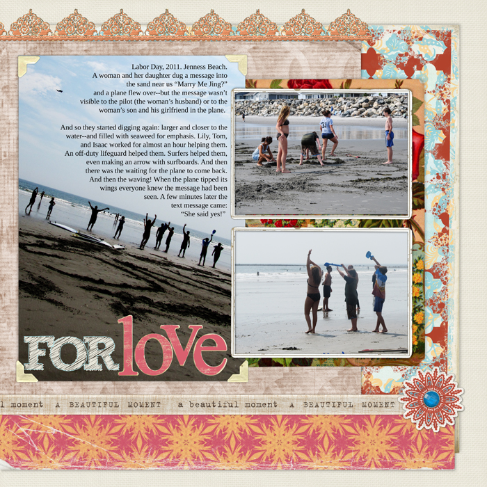
For Love by Debbie Hodge | Supplies: Colbie Solids by Maplebrook Studios; Collageables No 4, Between the Lines Alpha 5 by Katie Pertiet; Summer Sunset Kit, Summer Sunset Distressed Papers by Lynn Grieveson; Spray Paint Brush, Vintage FotoKorners by Anna Aspnes; Taste of Morocco Kit by Sahlin Studios
Tanyia Deskins loves these pictures of her youngest daughter. Tanyia says, “I know it might be traditional to scrap beach photos with bright beautiful pictures, but I love that a high contrast black-and-white enables me to focus on her and her expressions of joy instead of the beach itself.”
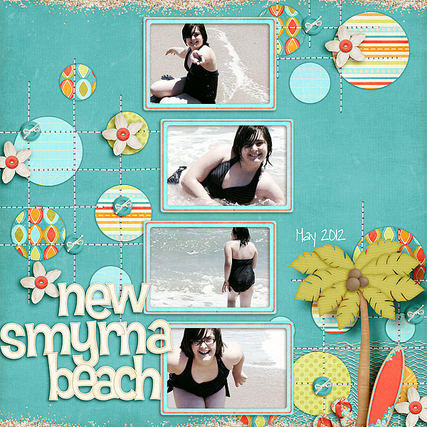
New Smyrna Beach by Tanyia Deskins | Supplies: Kona Coast by Julie Billingsley and Blissful Stitching – Straight by Traci Reed
Katie Scott says, “This page title is a quote from the movie ‘Soul Surfer,’ a story about a girl who lost her arm to a shark and kept on surfing and maintained her positive attitude. That story of overcoming obstacles and making the best of things, and being brave and happy in the process, is one of my very favorite types of stories. These photos are from our 2011 trip to Cocoa Beach and my 1st attempt at surfing.”
“Often times when I start journaling I have an inkling of what I want to say but I don’t plan it out, I just start writing and I don’t worry about my long run-on sentences. After I’m finished journaling, I often pick some of the words to write over again so that they stand out. On this page, I highlighted ‘soul surfer,’ ‘positive attitude,’ ‘brave,’ ‘happy,’ and ‘Cocoa Beach.'”

I Don’t Need Easy… by Kate Scott | Supplies: Cardstock, bits of patterned paper, Quickutz Metro alpha dies, sharpie fine tip.
Ashley Horton likes to create a scene on her beach pages. Ashley says, “It is a great way to take your memory back to the experiences you encounter at the beach…sunshine, fluffy clouds, water and waves, sand, etc.! To create the waves on this layout, Ashley fussy cut pieces from an 8″x8” patterned paper and layered them under my photos. I added some pop dots to the center wave, to give it a little more dimension. For the sun, I just cut several strips of paper and placed them under the edge of my first photo. I added a sticker and button for the center of the sun and a little bit of hand stitching for texture. I hand drew the cloud with a pencil and then used a fine point Zig adhesive pen around the edges and glued down the baker’s twine.

Beachy Keen by Ashley Horton | Supplies: Patterned Paper: October Afternoon & Bella Blvd.; Buttons, Mini Market Stickers & Stickers: October Afternoon; Baker’s Twine: The Twinery: Embroidery Floss: Janlynn; Thickers: American Crafts; Other: Toothpick & Brad; Pen: Sharpie
Katie Scott lives in Florida and has made lots and lots of layouts about the beach. “Rather than making another layout about being at the beach,” said Katie, “I thought about what goes through my mind when I think about the beach. Two thoughts came to mind: 1. We live less than 5 minutes from St. Pete Beach where people from all over the world travel for vacation so we should really make the very short trip more often; 2. I shouldn’t let the dreaded “post-beach car” full of sand, beach toys and damp beach towels stop me from getting to the beach more often.”
Katie took the photo on “Beach Trunk” after a trip to Treasure Island Beach with four children. Katie says, “We had a sand castle building contest, and the kids still talk about that day as being completely awesome.” Scrapbooking this photo is a perfect reminder to myself that “Beach Trunk” is just part of a day at the beach. This is a 9″x9″ layout that will live in my ‘Let’s Go!’ minialbum which is full of pages about vacations and about the travels to and from them.”
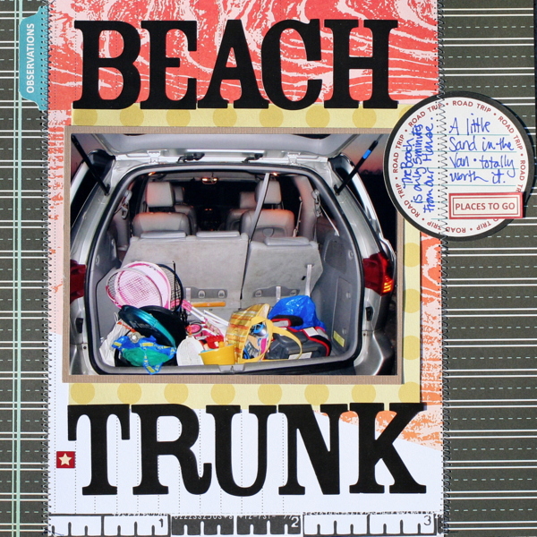
Beach Trunk by Katie Scott | Supplies: Supplies: Cosmo Cricket Paper; Me and My Big Ideas Paper, October Afternoon Stickers, American Crafts Letter Stickers.
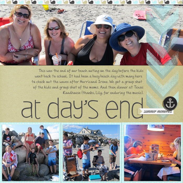
Debbie’s “At Day’s End” includes the photos she took at the end of a long day at the beach. Debbie says, “I often try to get a posed group shot at the end of the day of the gang — and I love it when I get a shot of we moms. I scrapbooked this page with a clean blocked design in order to get multiple photos and journaling fit in.”

