In hands-on artistic works, a mask is a protective shield that keeps an area from being affected by an appplied medium.
For digital creations, that “shield” can end up being the very shape to which a medium is applied. What’s more that medium can be your photo.
See how to use a clipping and examples of pages made with clipping masks.
How to clip a photo to a mask
[hr]
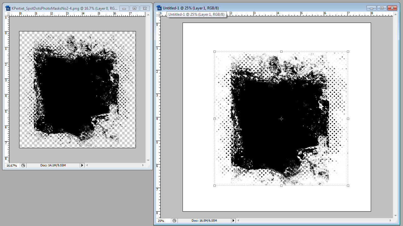
1. Katie Pertiet’s Spot Dots Photo Masks 2 are a collection of .png files with “masked” areas. In other words, a portion of the image is filled while the surrounding area is empty or transparent. Open a mask file and then drag the mask onto your canvas.
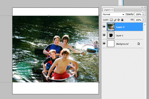
[hr] 2. Drag a photo onto your canvas — on the layer ABOVE the layer holding the mask.
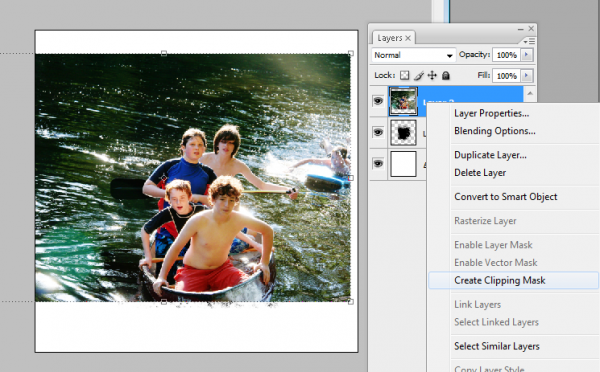
[hr] 3. “Clip” the photo to the mask. Right+Click on the layer thumbnail for the photo and select “Create Clipping
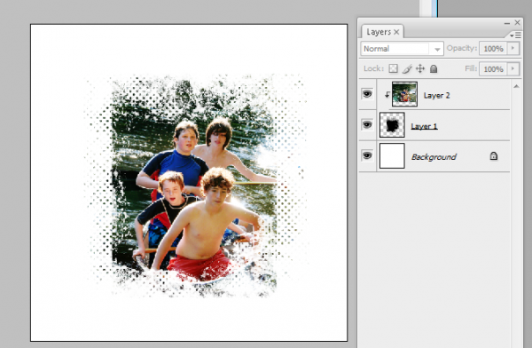
[hr] 4. Now the photo only shows up in the areas filled by the mask.
Barb Brookbank says, “I love photographing flowers and bugs and get pretty excited whenever I capture both of them together! Julie Mead’s ‘Summertime’ photo mask was perfect for this summertime photo. Because I wanted my layout to look light and airy, I chose a background overlay with a hint of green in the bottom right corner.
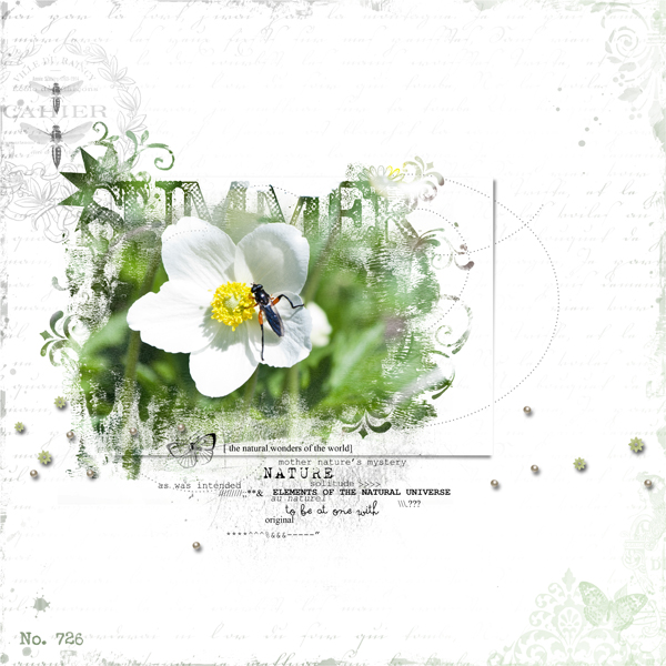
Summer by Barb Brookbank | Supplies: Joanne Brisebois: Flower1-70 Recollection, 12×12 Overlay Recollection; Julie Mead: Mask: Summertime Photo Masks; Anna Aspnes: AASPN_GardenWordMix1_Nature, AASPN_ArtPlayPaletteFamily_MiniPearl, AASPN_DottedLoopDaLoops2_1
Deborah Wagner captured her kids jumping on her husband’s lap to give him a group hug.
Deborah says, “It was a poor quality photo, yet I wanted it to be the focal point of my page. To get the look she wanted, Deborah:
- duplicated the photo onto 2 layers.
- applied a sepia effect to the top photo.
- clipped each photo to a different mask.
- reduced the opacity of the mask of the sepia layer to let a little color show through.
She also used several masks for the overlays, glitter, and text. Deborah says, “I just love the expression on my youngest son’s face!”
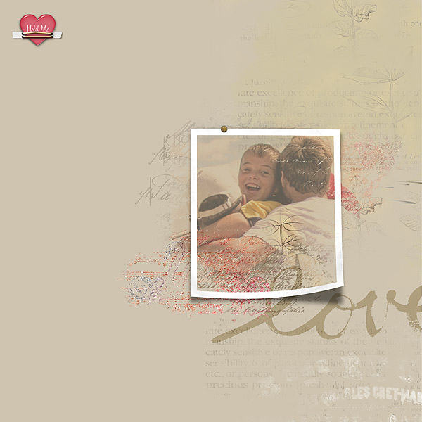
Hold Me by Deborah Wagner | Supplies from Designer Digitals: Katie Pertiet – Letter Box Photo Masks, Lovely Photo Masks No. 3, Textbook Blendables, Defined Blocks Brushes and Stamps No. 1, Heart Pebbles No. 3, Artistry d’amour Kit, Bradded Photo Frames No. 1; Ali Edwards – Painted Word Brushes; Patty Knox – Fasten Its!
Chris Asbury has found that any digital element can become a clipping mask for a photo, with an exciting variety of results. (Check out her Tutorial: Using Textured Brushes as Masks).
Chris says, “On this page I clipped my photo to an opaque brush (Anna Aspnes’ ArtPlay Palette Great Outdoors_Brush 7) that resembled ridged cardboard, causing the ridges of the brush to appear in the photo. I adjusted the shape of the brush to better fit the photo. I also added two layers of Anna’s Great Outdoors_Brush 6 under the clipping mask to add more depth to the photo. Then I used FotoGlows to add light and color to create a sunrise scene.”
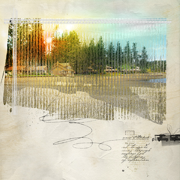
Sunrise at Alderbrook by Chris Asbury: Supplies by Anna Aspnes Designs: ArtsyBlendzOrigins, ArtPlay Palette Great Outdoors, LoopDaLoop Travel No.1, StraightLine Stitched White No.3, Outdoors WordTransfers No.1, WarmGlows No1, WarmGlows No.2, CoolGlows No.1; Font: P22 Cezanne
Debbie Hodge often clips papers to photo masks and uses them as foundations–especially when her elements sit on busy patterned papers. On “Living Large,” she clipped a chevron print paper to a photo mask and used it between the soda water patterned paper and bold journaling block.
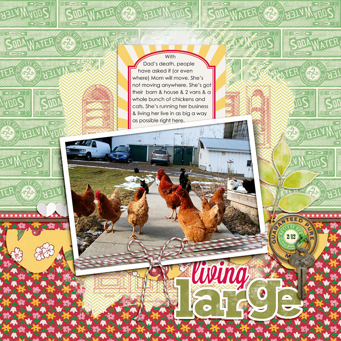
Living Large by Debbie Hodge | Supplies: Homespun Papers, Homespun Journaling Cards, Soda Water Papers by Jenni Bowlin; Relocate by ViVa Artistry; Bakers’ Twine 2 Katie Pertiet; Architectural Brushes by Artypants; Mod Grunge Fotoblendz, White Paint, Scissored Hearts 2, Scissored Scallops, Artplay Chevron Girl Craze by Anna Aspnes; Flair Box 3 by Paula Kesselring; Expedition by Lynn Grieveson; Key to My Heart by Sahlin Studio; Lavanderia, Rockwell fonts
Vicki Walters used a solid background as the base for “Girl.” The striped paper and the photo are each clipped to different masks. Vicking likes to add drop-shadow and embossing layer styles to her masks for texture.
Vicki says, “I used the Peace Forever font –a freebie dingbat with all kinds of neat peace symbols, slogans, and signs–and some other outlined fonts to create a stenciled-look in the words and symbols.”
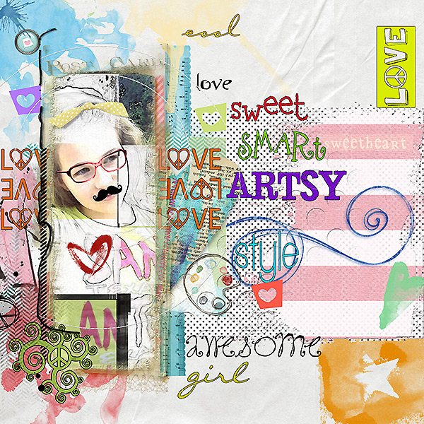
Girl by Vicki Walters | Supplies: Anna Aspnes at Oscraps: Stitched by Anna Circles no 1, FotoBlendz Clipping Masks no 9, ArtPlay, Palette Girl Craze FotoBlendz clipping Makss no 12; Sarah Barber at Digiridoo Scraps: ATC Mixed Bag v 1; Fruit Loop Sally @ the Lillypad,Cozy in Love element set; CD MucLusky @ the Lilipad, Positive Painter and Journal Junkie 2
Terri Billman made a quick and stunning page featuring a favorite photo with large digital photo masks that span the width of her canvas. When you clip photos and papers to ready-made masks, you get a custom-blended look easily. See detailed how-to for this page.
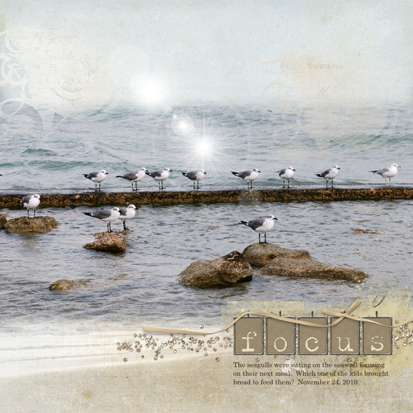
Focus by Terri Billman | Supplies: Katie Pertiet: Destination Seaside, Alandia Noces, Conifere Kit; Anna Aspnes: 12 x 12 Fotoblendz Clippink Mask, Hipster Plume Paper Masks 1, Magic Flares 1, Label Transfer 2
Chris Asbury extended a digitally masked photo outside the borders of her frame. The result is added depth, a softening of borders, and an artsy feel. See detailed how-to for this page.
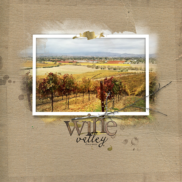
Wine Valley by Chris Asbury | Supplies by Anna Aspnes Designs: ArtPlay Palette Jardinier Warping Frames No.2 Abstract FotoBlendz No.1 Gold Paint No.1 Warm Glows No.2 ArtPlay Palette Family_Branch Dripped Stains No.5 Wood Shop Alpha No.1 (Font: CK Romance)
[learndigi]

