When you want to show both the details and the context of a situation or when you want to reveal different angles of a subject, use the same (or very similar photos) with different crops.
Jana Morton used two shots of her son at bat and cropped each differently. The result is that they show his intensity and create a sense of action on the page. In the larger photo, her son has cocked the bat back—it’s the moment before the swing shown in the next photo. The photos are positioned so that one flows into the other. Jana added even more dimension and energy to the photos by extracting the bat so that it extends outside the frame of the photo.
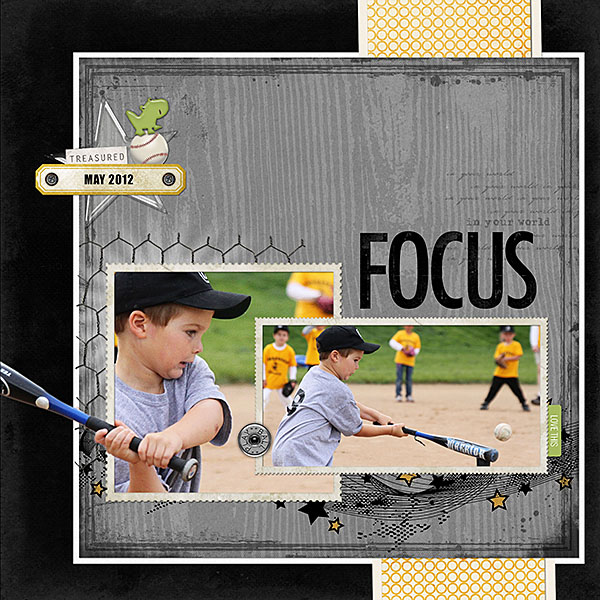
Focus by Jana Morton | Supplies: All Designer Digitals; Katie Pertiet: Hinge Pack, Labeled Journalers No. 5, Loosely Labeled No. 2, Flagged Sentiments, Farm Fresh Collection, Grunged Up Alpha, Star Glows No. 2, Worth Repeating Expressions 2, Edge Overlays No. 4, Graphic Pop Borders, Krafty Woods, Grunge Overlay, Classic Cardstock: Into the Night, Letters Home; Pattie Knox: Batter Up Kit, Absolutely Acrylic Elements; Lynn Grieveson: Inky Dink Borders, Wild Weekend
Of “Love,” Stefanie Semple says, “This child of mine often sneaks away from family action and noise to sit and think. I love that he and I are similar. He was all alone and content, so I took this of this picture of him sitting on a rock. I included a close-up crop because I love faces and capturing my children’s right now. Too soon he will grow up and his little boy face will elongate and become a man’s face.”
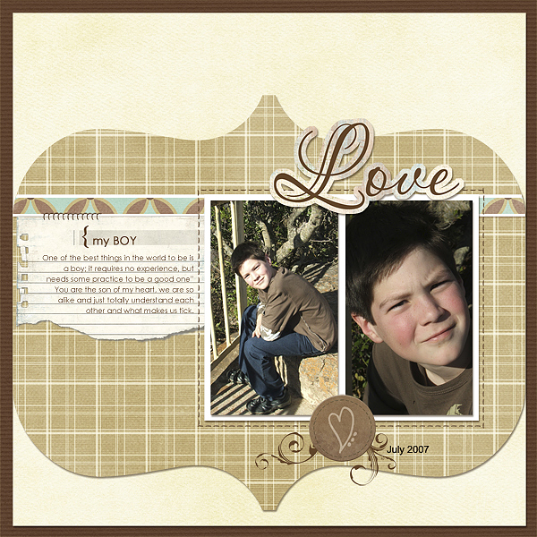
My Boy by Stefanie Semple | Supplies: Brown-Eyed Girl Collab by SrapMatters Design Team and Jessica Sprague’s Template 1-05.
Brenda Becknell took the photos of her daughter and granddaughter on “Ready to Explore” as they hiked with her along Exit Glacier near Seward, Alaska. Brenda says, “I wanted a shot of them with the scenic background, but I also wanted a closeup of my granddaughter wearing her sunbonnet and looking so comfy in the backpack.”
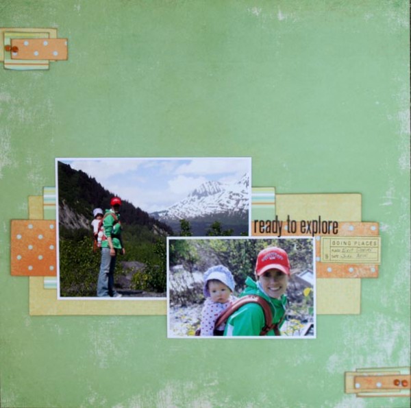
Ready to Explore by Brenda Becknell | Supplies: PP: Fancy Pants, Alpha stickers: Lily Bee, Stamp: Hero Arts, Quick Quotes chalk ink and Brushed Cordury Distress Ink
Misc. brads
Doris Sander says, “When I first started scrapbooking I worked hard to improve my photography skills. Part of that learning curve at the time was taking great close-up shots.” “While looking through old photos of my childhood and admiring the background details in them, I realized that I was missing those very details in my current life by taking only close-ups. Since then I’ve learned to step closer for details and then step back for more details. Scrapping two photos on a page is my absolute favorite number to do. I love the perspective given from two views of the same scene, and that’s what I’ve done on ‘Hotel zs’. I printed one of the photos in black-and-white and the other in color because I think it adds more emotion and drama to the scene.”
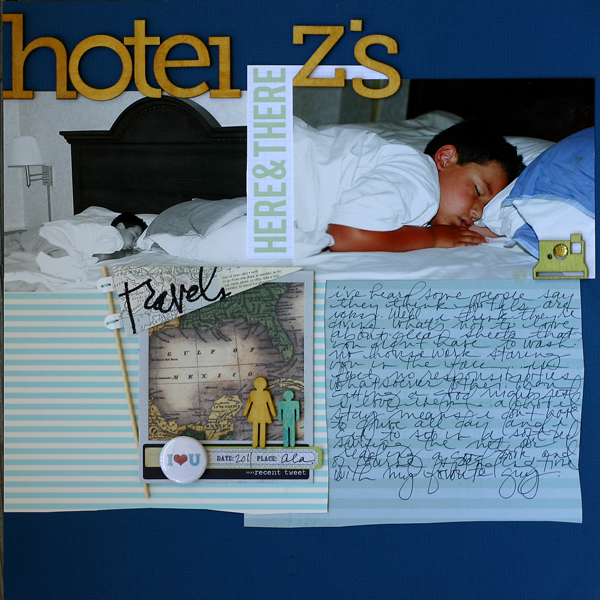
Hotel Z’s by Doris Sander | Supplies: alphabet – Pink Paislee, patterned paper – Canvas Corp, My Mind’s Eye, 7 Gypsies, journaling card, flair – Marcy Penner, wooden icons – Studio Calico, pennant, frame – Heidi Swapp, label stickers – My Mind’s Eye, Jillibean Soup, bling – Queen & Co., inks – Jenni Bowlin for Ranger
Terry Billman says, “On this page, I used two photos taken at different angles when Alex was feeding. I love the look on his face as I was snapping away. In the close-up you can see all the details of his head, particularly the little hairs around his nostrils and chin.”
“I love the look of mixing black-and-white photos and using selective coloring to focus on the main subject. For the background photo here, I rendered the background in grays while keeping Alex in color while in the second photo I left all color because the green leaves add interest. When using this method, I generally keep the page fairly simple and use a monochromatic color scheme so the photos can tell the story.”
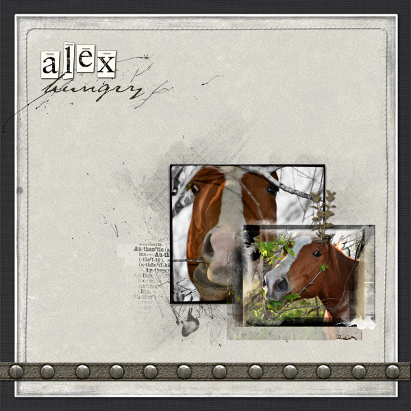
Hungry Alex by Terry Billman | Supplies: Katie Pertiet: Alandia Rancheros, Little Bits Alpha; Anna Aspnes: Different Strokes 8
Genuine Word Transfers 1, Tartan Textures 1, Foto Boost Template No. 3, Foto Blendz Clipping Mask 9, Frame Transfer Layered Template, Stitch By Anna Border 1, 12 X 12 Sand Scratched Overlay 1; Maplebrook Studios: Just Linens No 20
Because she wanted to focus on the things her son does with his hands on this page, Adryane Driscoll included a close-in crop of his hands. The larger photo provides the context and shows her son’s intensity as he creates.
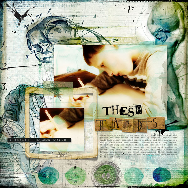
These Hands by Adryane Driscoll | Supplies: Anna Aspnes: ArtPlay Solids Gather, 12×12 ScriptTease Overlays, Layered Edge Overlays No.2, FotoGlows No.2, Sketchy LoopdaLoops, Different Strokes No.4, Dripped Stains No.1, ArtPlay Palette Scholarly, ArtPlay Palette Metro Graffiti, KreasedTransfers No.1; Holliwood Sudios:
Art Journaling Nos. 2 and 3; Christina Renee: Hide and Seek
Katie Scott took two photos of her of daughter with her handmade shell tombstone for her pet hamster. One photo focused on the shell and the other on her face. Katie says, “She was so serious – which is funny since she was also ready to go swimming so she’s got on goggles, a swimsuit and an inner tube. This is also how she looked during the impromptu funeral service in the backyard during which she gave a very sincere speech about hamsters and God and the universe; minutes later she was splashing in the pool. The shell reads ‘Alli was my best friend as a pet. She was a sweet hamster. RIP.’ (My daughter, Allison, named her hamster after herself!)”
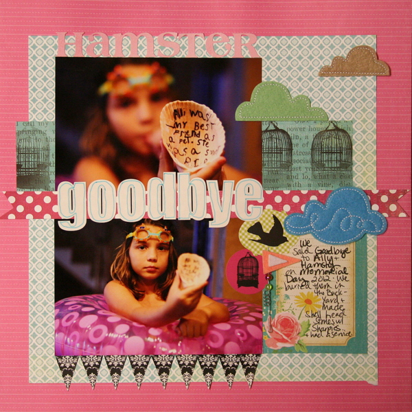
Goodbye by Katie Scott | Supplies: Lilly Bee patterned paper and stickers; Basic Grey stickers and felt cloud embellishments; pink cardstock.
Tanyia Deskins cropped the same photo three different ways to give a close up and then a “closer up” view of her daughter and her face, especially the eyes. Tanyia says, “I feel like this photo portrays the seriousness, or importance, of the quote I used on this page.”

Define the Moment by Tanyia Deskins | Supplies: Family Circle by Studio Basic Designs and Amy Martin, Hello Goodbye by Traci Reed
DJB Bailey font by Darcy Baldwin.
Amy Kingsford wanted to make a page that documented all of the nicknames her family has for her youngest son. “We’re big on nicknames in my family,” says Amy. “I took a ‘mugshot approach’ and used a variety of crops and angles to create a parallel between his many names and his many ‘angles’ or faces.”

Japper Jones by Amy Kingsford | Supplies: Template from Simple Scrapper’s Premium Collection (Jun 2012, Single 3), Precocious Papers by Sahlin Studio, Country Fair Picnic Elements by Sahlin Studio, Key to My Heart Papers and Elements by Sahlin Studio, Skinny Lined Overlays by Anna Aspnes, Sophistica Art Play Palette by Anna Aspnes, Narrative by One Little Bird and Acrylic Alpha and Turner by Pattie Knox.
Katie Scott took two photos of “Spot, the friendly Night Heron” in her pool. Katie says, “My father-in-law, who lives next door, feeds this bird every day so it’s not at all afraid of me taking its picture. I wanted to show the details of how its wings were positioned and the context and setting in which this bird practices its own version of yoga, so taking two photos of one subject worked.”
“I used Picasa’s photo collage and text features to add journaling and put the two photos into one frame. I made the background with strips of pink paper to create a sunburst and counterbalanced it with the blue patterned paper strip on the left. The center of the burst radiates from the bird in the close-up to call attention to him.”
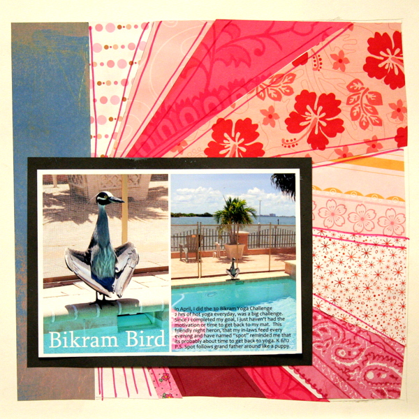
Bikram Bird by Katie Scott | Supplies: Old scraps of patterned paper handcut into a starburst; papers from Die Cuts With a View; white and black cardstock.
Krista Sahlin paired a two enlarged photos: one a close-up photo and one taken farther back. Digital word art and a dimensional embellishment finish this striking page.
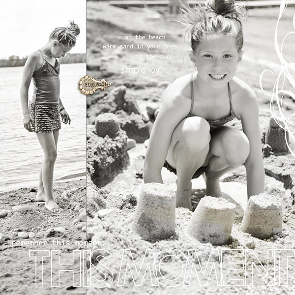
This Moment by Krista Sahlin | Supplies: Tell the story word art by Sahlin Studio; Taste of France & Italy by Sahlin Studio- compose button; Swirl – unknown
The story on Debbie Hodge’s “Hey, Brony” concerns the small pony he received on his birthday from a friend. The one photo she has is a busy one with leaves and swimsuits and big smiles. She used a second copy of the photo and cropped in close on her son holding the pony and his friend making a peace sign with her fingers. The detail in the small shot is shown much larger than in the original.
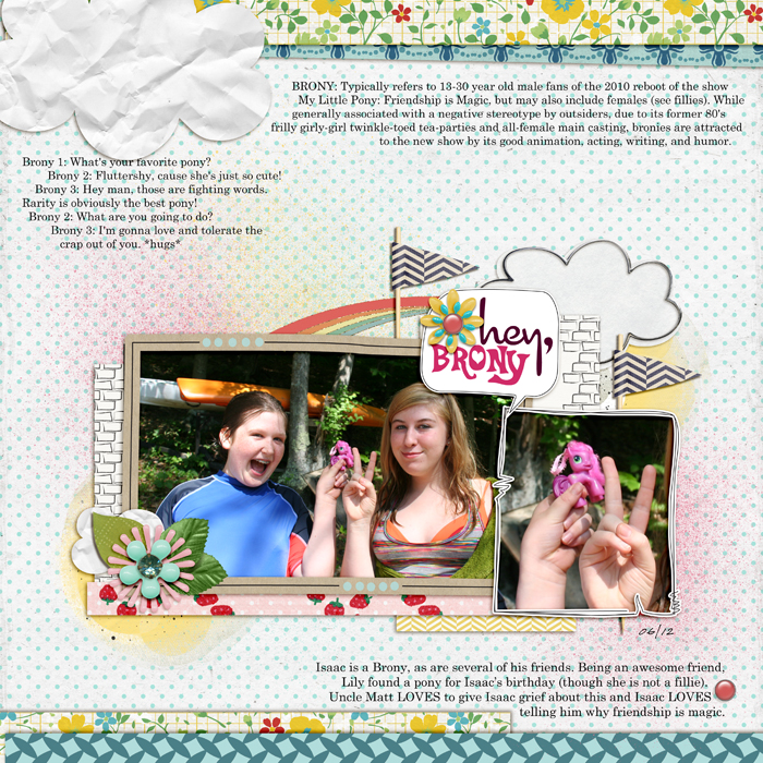
Hey, Brony by Debbie Hodge | Supplies: Comic by Enkay; Fresh by One Little Bird and Sahlin Studio; Art Play Play Out by Anna Aspnes; Never Forget by Erica Zane; Country Fair by Dani Mogstead; Reminisce by Leora Sanford; Seas the Day by Julianna Kneipp; True Colors by J Labre; Courier, Celestia, Cocktail fonts
[designclass]

