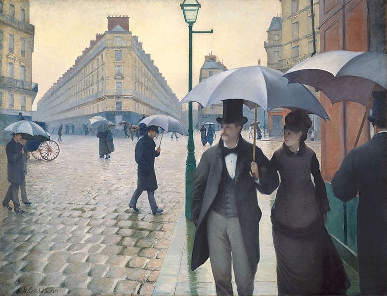
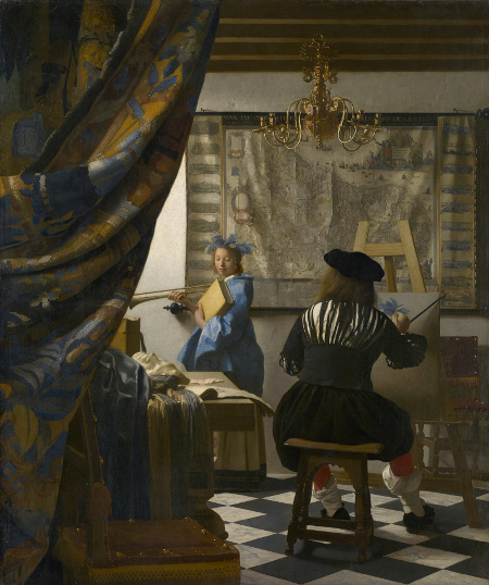
Repoussoir is a figure or object in the extreme foreground of a composition. It’s used to create contrast and to increase a sense of depth.
See how this art technique inspired our creative team and consider how you can use it on your next scrapbook or art journaling page.
In two-dimensional works of art, like painting or photography, the repoussoir is an object along the right or left foreground that moves the viewer’s eye into the composition by framing the edge.
The man on the right with the tilted umbrella in Gustave Caillebotte’s Paris Street; Rainy Day is an example of a repoussoir figure pushing viewer’s eye into the composition.
In Vermeer’s “Art of Painting” the large foreground curtain appears to have been drawn back to let the viewer enter the space. The curtain’s warm tone and the heavy impasto paint application make it appear even nearer to the viewer.
Michelle Houghton says, “I always love a good challenge and trying repoussoir for the first time purposefully has been a fun one. I had this photo my father took of my husband and I on the beach for a family vacation.”
“The waves felt like an obvious choice to ‘weight’ my corner not only because of the theme of the page but because of the movement they create by themselves. The waves were created using spray mist on kraft and white cardstock, brushing silver and white ink pads over the blue and finally cutting two waves and 3 foam segments to paper piece together.”
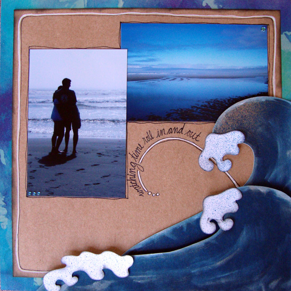
Watching Time by Michelle Houghton | Supplies: Supplies: Cardstock – Kraft Patterned paper – Basic Grey Ink – Tattered Angles and Tsukineko Pens – Sharpie Drops – Mark Richards
On “Sunlight on Water,” Doris Sander employed two repoussoir techniques.
- The photo was taken using the repoussoir technique of putting the viewer behind the objects in the image. Doris did this by framing the two children between the legs of the pier. This framing of the subject gives the appearance of the viewer being in a separate room from the subjects.
- In the layout design itself, Doris employed the repoussoir technique of having “people or animals looking in a certain direction,” only instead of people or animals she used arrows.
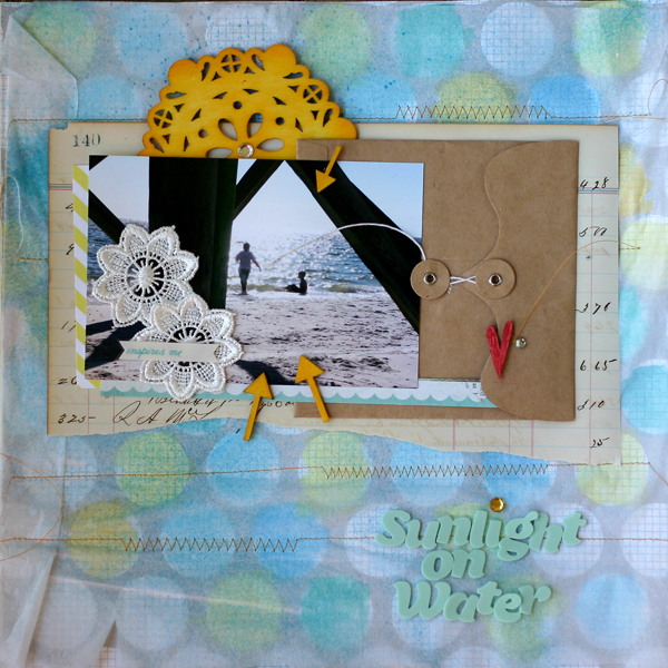
Sunlight on the Water by Doris Sander | Supplies: (JBS Mercantile June Mini-album Kit) ledger paper – vintage, pp – Amy Tan for American Crafts and Studio Calico, wooden arrows and heart – Studio Calico, overlay – Hambly, Lemon Drops and Cough Syrup ink pads – Jenni Bowlin for Ranger, lace flower, kraft envelope, wooden doily, mist – Maya Road, foam Thickers – American Crafts, other – rhinestones, tissue paper
Amy Kingsford used a few repoussoir techniques to establish focus and emphasis on ” My No. 2.”
- First she established a sense of direction in the design by using the misted sunburst foundation, which leads the eye in toward the photo.
- Then she used a high-contrast black and white photo which creates the feeling of heavy shadows and highlights for a spotlight effect on the photo.
- And, finally, she used a cardboard scrap to house her title and focal element which brings this cluster of items to the extreme foreground of the page and thereby creates a sense of depth that leads the viewer’s eye into the page.
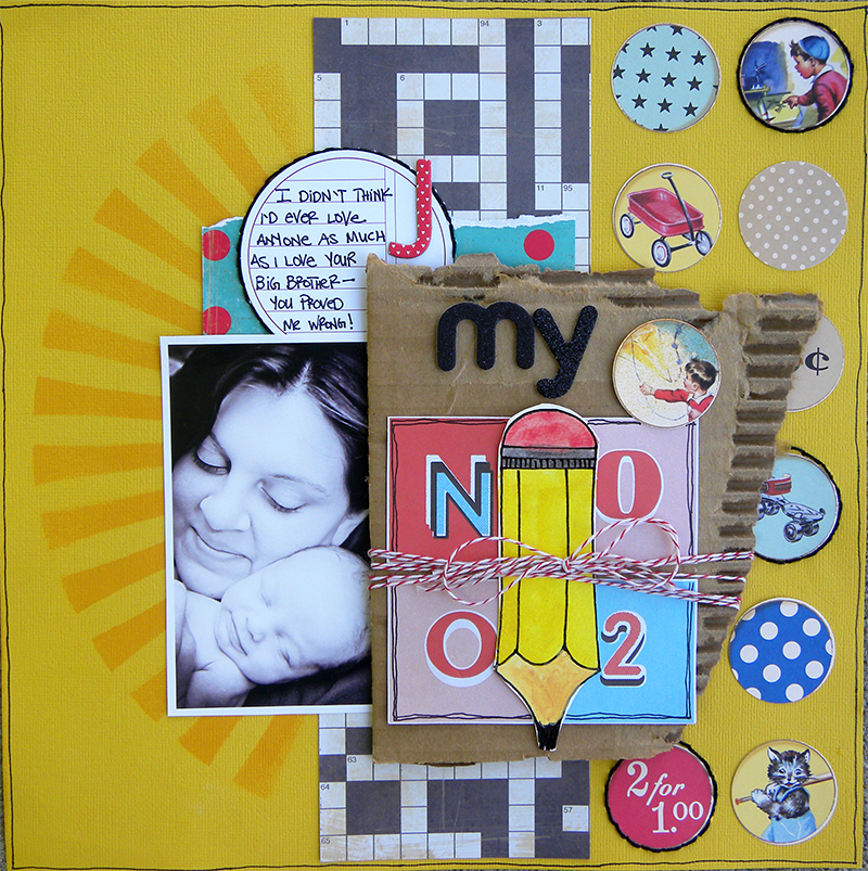
My No. 2 by Amy Kingsford | Supplies: Kreatorville Kraft July Kit, Studio Calico Paper Moon Kit, 12×12 Starburst Stencil by Crafter’s Workshop, Adirondack Mist Butterscotch by Ranger Ink, Journaler by JBS Mercantile.
Jana Morton says, “I really like to create depth on my pages because it’s a great way to really engage the viewer.”
The repoussoir on “In This Moment” is an extracted figure of her son. Jana says, “The large image of my son immediately captures the viewer’s attention. Then, as they look ‘into’ the page, they will notice the other photos and details that support the focal photo.”
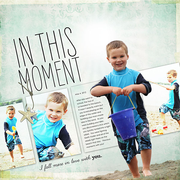
In This Moment by Jana Morton | Supplies :All Designer Digitals Katie Pertiet: Atlantic Kit, Edge Overlays No. 2, Fineline Borderline Brushes No. 9, Fineline Page Titles No. 7, Taped Together Overlays No. 1, Star Glows No. 2.
On “Joy,” Doris Sander used the repoussoir technique of getting the viewer involved in the action shown in the work.
To do this, she designed the page from the perspective of one of the tiny insects being viewed by her son in the photos.
Doris says, “I cut grass out of tissue paper and stitched it to the foreground of the scene in front of the row of photos. I then pop dotted a butterfly onto the scene. As it hovers there above the page it makes the viewer feel that she is a part of the scene depicted.”
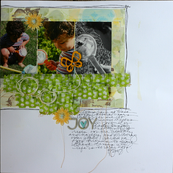
Joy by Doris Sander | Supplies: tissue paper – Pink Paislee, Thickers, wooden butterfly and heart – Studio Calico, Lemon Drops ink pad, Brown Sugar ink pad, Stick Candy paint dabber, Speckled Egg paint dabber, Lemon Drops paint dabber – Jenni Bowlin for Ranger, doily flowers – Jenni Bowlin Studio, stamp – JBS Mercantile Exclusive, other – rhinestone, thread
How can you use this idea of a figure or object in the foreground of your photos or pages to push the viewer’s eye and engage their mind?

