 Using fonts to make titles on paper and digital scrapbook pages can be a time- and money-saver. While tracking down and using new and interesting fonts can be a fun and effective approach, there’s more you can do with the fonts you already love. Take a look at these ideas for getting creative with fonts on your scrapbook pages.
Many of these ideas use digital product and techniques–but keep in mind that with printing and cutting, many will work on both digital and paper pages.
1. Clip digital paper to a font
Tanyia Deskins‘ “Memorial Day” records the holiday BBQ that’s been a 20-year tradition for her friends and family.
Tanyia wanted to bring in more green and incorporate a bit of pattern so “clipped” a digital paper to the title (which uses Showcard Gothic) font. (Layer the paper above the font in Photoshop, RIGHT + CLICK on the paper layer and select “Create Clipping Mask.”)
To make the title stand out a little more from the background Tanyia added a white stroke with Photoshop layer styles.
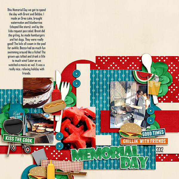
Memorial Day by Tanyia Deskins | Supplies: Summer Staycation Collection: At the BBQ by Traci Reed and Meghan Mullens, Holiday Cheermeister by Jeanye Labaya Designs, Agency FB font for journaling and date, Shadowcard Gothic font for title
2. Outline a font
The title on Stefanie Semple‘s “Hotdogs” was created with an outline font. Steelfish comes with regular or outline option. Stefanie chose the outline version because her teenaged son seems long, thin, and empty inside when it comes to eating. As she noted in the journaling, “He thinks four hotdogs is a single serving size.”
When you don’t have an outline font, you can get the same effect with Photoshop. Here are two ways to go about it:
- How To Add an Outline to Type with Layer Styles in Photoshop 6 and up
- How To Outline Adobe Photoshop Fonts
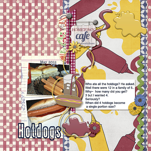
Hot Dogs by Stefanie Semple | Supplies: 123Scrap Template No. 2 by by keepscrappin and Hometown Café Collab by the Cluster Queen and Amy Stoffel.
3. Give a font a “sticker” look
Adding a white stroke to a font and a bevel/emboss layer style creates the look of a “sticker” alphabet. Debbie rendered the “large” in “Living Large” using Rockwell font. She put each letter on its own layer, clipped paper to each letter, and then created the sticker effect as follows: 1) select the area filled by a letter, 2) expand the selection, 3) create a new layer below the letter, 4) fill with white, 5) add bevel/emboss style.
Check out more details on the process here: Making an Alpha out of a Font.
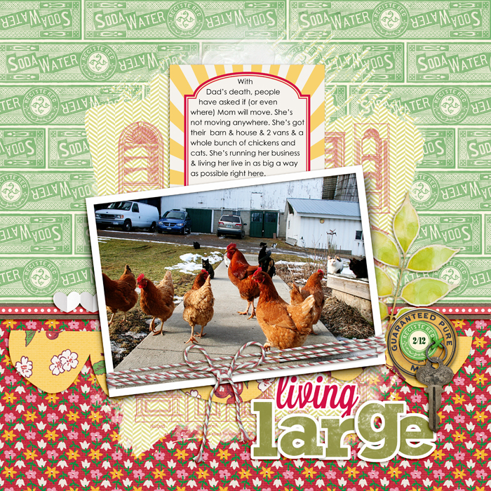
Living Large by Debbie Hodge | Homespun Papers, Homespun Journaling Cards, Soda Water Papers by Jenni Bowlin; Relocate by ViVa Artistry; Bakers’ Twine 2 Katie Pertiet; Architectural Brushes by Artypants; Mod Grunge Fotoblendz, White Paint, Scissored Hearts 2, Scissored Scallops, Artplay Chevron Girl Craze by Anna Aspnes; Flair Box 3 by Paula Kesselring; Expedition by Lynn Grieveson; Key to My Heart by Sahlin Studio; Lavanderia, Rockwell fonts
4. Combine multiple fonts
The “Winter” in Debbie’s “Winter Views” was created with 6 fonts. She adjusted the font sizes of each letter to get the right look. Notice “views.” That was made by clipping glitter paper to the word with Fairfax Station font and then adding a “sticker” effect as described in 3 above.
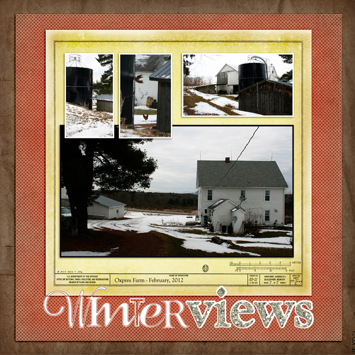
Winter Views by Debbie Hodge | Supplies: Relocate by ViVa Artistry; Heartfelt by Scrapbook Graphics; Lavanderia, The Maple Origins, Goudy Old Style, Fairfax Station, Treehouse, Odstemplik fonts
5. Cut the title’s shape from an image
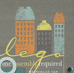
Tiffany Tillman cut the shape of the word “lego” from the buildings above it. To do this, CTRL + CLICK on the layer thumbnail for the type layer to select the area it fills. Expand the selection (>Select >Expand >10 pixels). Target the layer you want to cut from (here the buildings) and press DEL to cut away the selected area.
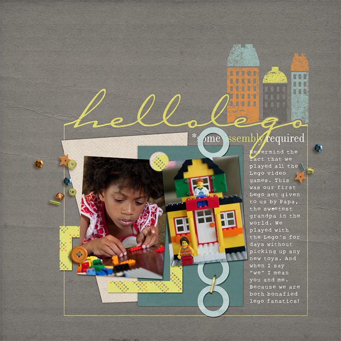
Hello Lego by Tiffany Tillman | Supplies: Digital Goodies: Creator by One Little Bird Designs. Page Template: Stuffy no. 1 by Simply Tiffany Studios.
6. Get a watermarked look
Amy Kingsford paired her favorite block font–Old Block–with her favorite blending mode–Soft Light–to get the watermarked effect for the titlework on “Plaid Shirts and Blue Jeans.”
For a darker tone, try typing in black. For a bleached or resist effect, try typing in white. Apply the Soft Light blending mode to your text layer to watch your text bleed into your background–creating either a lighter or darker tone-on-tone effect.
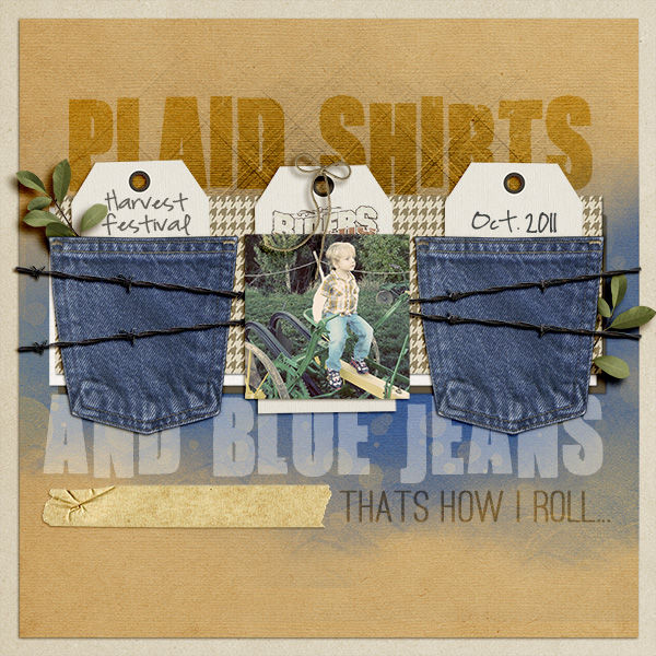
Plaid Shirts and Blue Jeans by Amy Kingsford | Supplies: Template from Simple Scrapper’s Premium Collection, Generations by One Little Bird, Paislee Press and Traci Murphy, Sorriso by Paislee Press, Denim Pocket and Wild Horses Element Pack by Katie Pertiet, Apple Orchard by Krista Sahlin; Tartan Textures and Sophistica Art Play Palette by Anna Aspnes. Fonts: Ostrich Sans Rounded, Highland Perk and You Are Loved
7. Laser cut title from a page element
Debbie used a chunky font (impact) for her title on “jammin’.” To get the laser-cut look, CTRL + click on the layer thumbnail for the type layer to select the area it fills. Target the layer to cut from (here the photo). Press DEL to delete that part of the element. Hide or delete the layer with the type. Add drop shadow to element from which you cut the title.
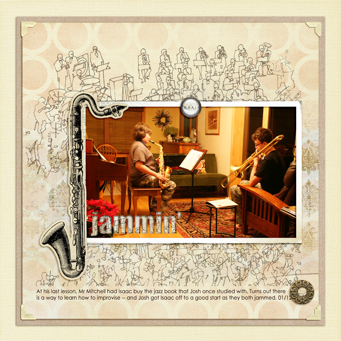
Jammin’ by Debbie Hodge | Supplies: Artplay Palette Concerto, Vintage Fotokorners by Anna Aspnes; Just Hint At It Brushes No 6 by Lynn Grieveson; Krafty Canvas No 1 by Katie Pertiet; Just Linens No 1 by Maplebrook Studios. Century Gothic, Impact fonts.
[current]

