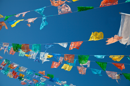
 The making of banners is an ancient craft.
Banners are mentioned in the Old Testament. They were used to keep order among those traveling to the promised land with Moses. Heraldic banners were used in Medieval Times for personal identification. Sashimono banners were worn by warriors in feudal Japan to distinguish enemies during battles. Airplanes started pulling advertising banners in the mid 1900s.
In recent times they’ve appeared in homes across a mantle or doorway, at weddings, even on top of wedding cakes.
A string of banners can do a whole bunch of things for scrapbook page design from adding repetitions of color and shape to guiding the eye. Take a look at 4 ways to use banners on scrapbook pages.
1. Swoops
Arrange a string of banners with a “dip” swooping across all or part of a page.
The mix of triangles and banner flags arranged in two swoops on Kim Watson‘s “Direction You Choose” sets a festive tone and adds repetitions of shape and color
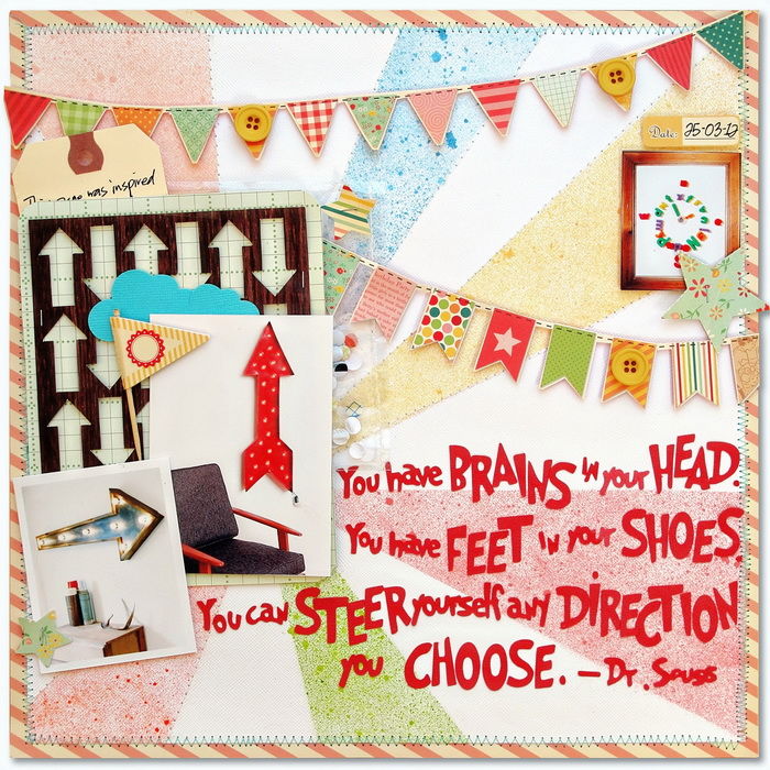
Direction You Choose by Kim Watson | Supplies: Supply list: Cardstock: Bazzill; Patterned paper: October Afternoon; Mist & Stickers: October Afternoon; Buttons: My Minds Eye; Die cuts: Silhouette SD, Tag: Staples
Tanyia Deskins added 4 banners swooping halfway across the page at top and bottom.
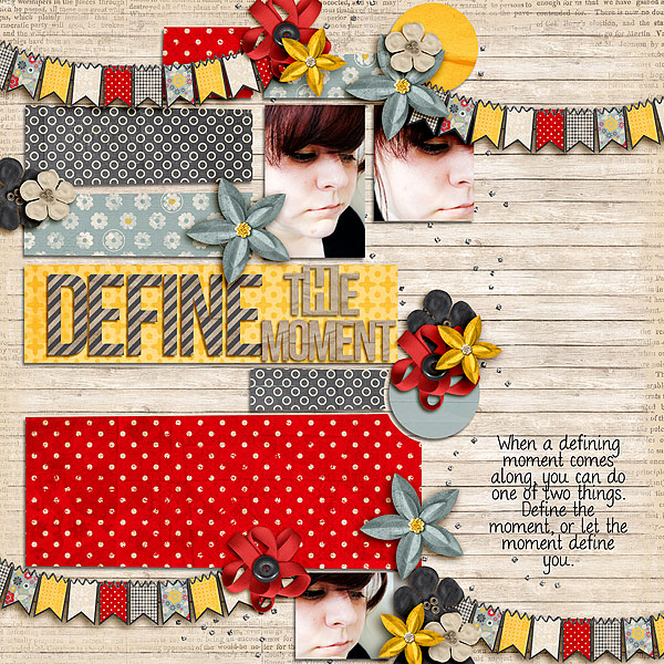
Define the Moment by Tanyia Deskins | Supplies: Family Circle by Studio Basic Designs and Amy Martin. Hello Goodbye by Traci Reed DJB Bailey font by Darcy Baldwin
Michelle Houghton made a swooping banner by misting over triangles, which she then removed. She outlined the triangles, filled two with patterned paper, and added twine along the top.
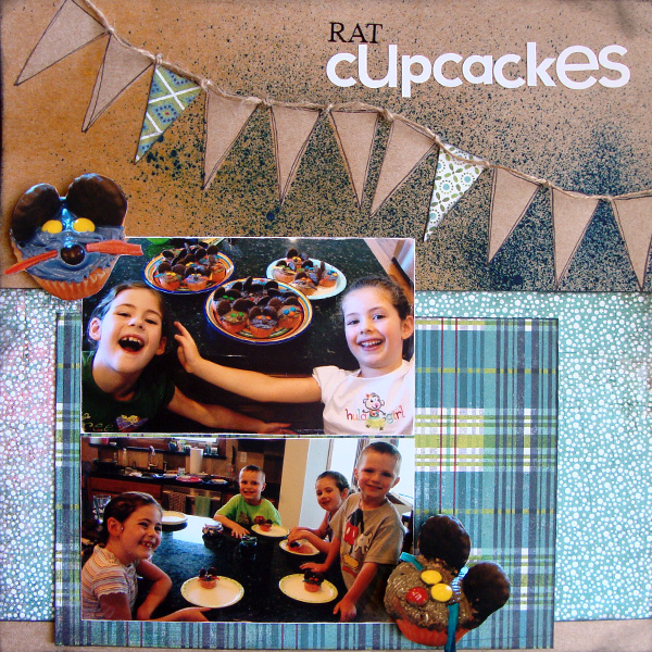
Rat Cupcakes by Michelle Houghton | Supplies : Cardstock – Kraft, patterned paper – Basic Grey, ink – Tattered Angles and Tuskineko, lettering – Pioneer and American Crafts, sketch pen – Sharpie, twine.
2. A Straight Line
Betsy Sammarco layered a series of pennants at the bottom edge of her photo. She left a bit of space between each one and had no need to add a string — the photo above ties them all together.
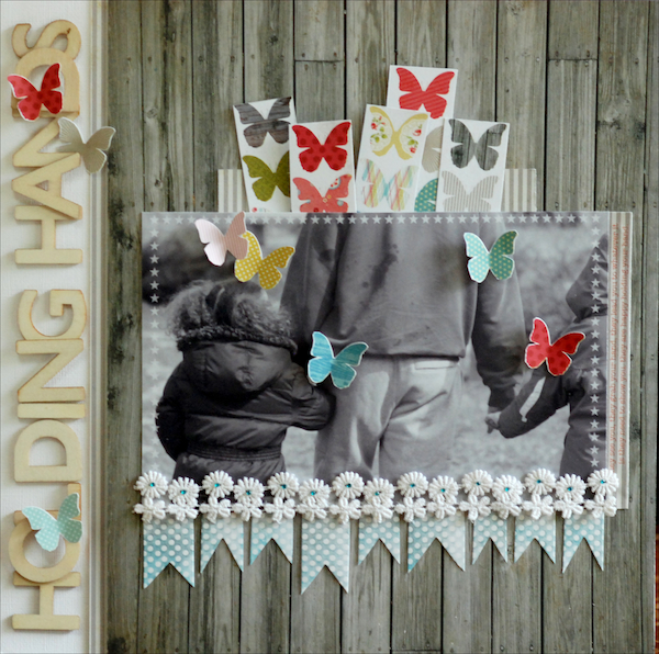
Holding Hands by Betsy Sammarco | Supplies: from May Jenni Bowlin Mercantile Kit; Patterned Paper by My Mind’s Eye (Day Butterflies, Day Worn); Heidi Swapp Color Magic Resist Banner Delights; Pink Paislee Wood Shop Alphabets; Vintage Trim, miscellaneous bling; Jenni Bowlin for Ranger Weathervane and Speckled Egg ink pad; Jenni Bowlin Digital Frame Rub-On kit
The pennants on Audrey Neal‘s “School Spirit” are a repetition of sports pennants and a fitting embellishment for this page about Audrey’s feeling for her school at a time when the community is celebrating basketball success. She alternated between patterned paper and white pennants.
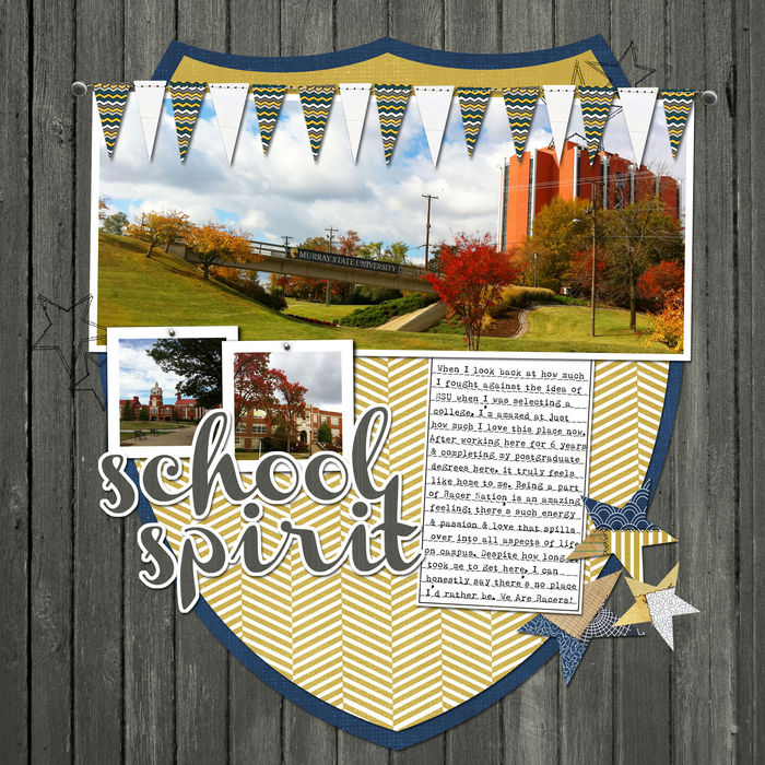
School Spirit by Audrey Neal | Supplies: Gennifer Bursett: Up to Date (woodgrain paper, multicolored chevron paper, metal brads), Design House Digital, Robyn Meierotto: Cut It Out Clipping Masks (triangle pennants and stitches), Design House Digital, Audrey Neal: Currently (blue and gold papers, stitched stars, star elements, journaling tag), Design House Digital, Audrey Neal: Pinned (double photo frame), Design House Digital, fonts: Olivetti Type2, Channel
3. A Cluster
Jana Morton clustered several pennants at page top. Rather than being strung together, they are layered and tied with a string wrapped around them.
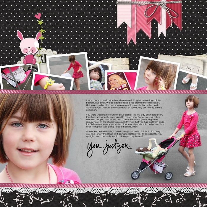
You Just You by Jana Morton | Supplies: Mindy Teresawa: Pretty in Black Kit Katie Pertiet: Stuff Your Edges No. 1, Love Grows No. 5, Sweet Cakes Kit, Clock Parts No. 7, Alandia Noces Kit, Loosely Labeled Dates, Bunny Trail Kit, Sweet St. Nicholas Kit, Stuff Your Edge Photo Frames No. 2 Studio DD: Readymade Banners
4. Title Home
Tami Taylor mixed triangles and banners in an upward curve across her page and leading to her focal point photo. She used each piece to hold the individual letters of her title.
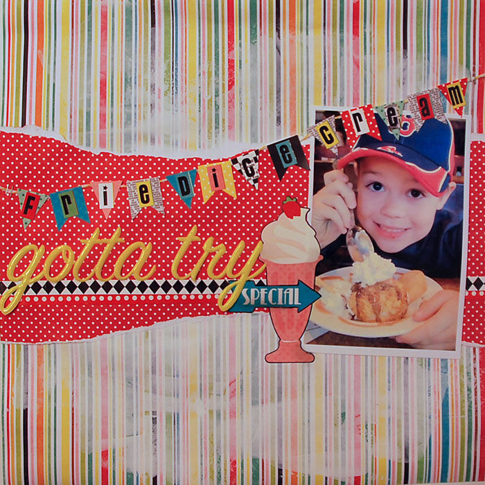
Gotta Try by Tami Taylor | Supplies: Paper – Echo Park. Embellishments – Echo Park. Alphas – Echo Park, American Crafts. Other – Dick Blick Gesso. Unknown-White Cardstock
Cindy Liebel strung hearts instead of pennants or banners and punched small holes at the tops. She threaded and twisted twine through them and added letter stickers for each letter of her title.
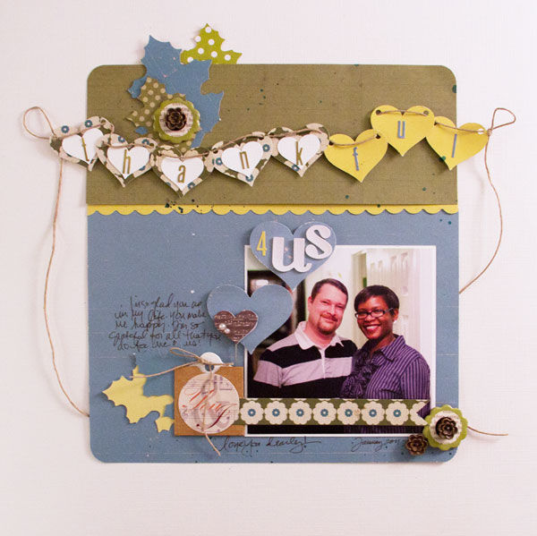
Thankful 4 Us by Cindy Liebel | Supplies: Lily Bee Design: Harvest Market Collection, Christmas Town Chipboard Stickers, Silhouette: Cameo, Fiskars: Heart Punches & Scallop Border Punch
5. Sideways
The placement of three triangles in a series — even when there is no tie — creates a recognizable pattern that triggers the viewer’s perception of them as part of a banner. Amy Kingsford placed them sideways along her element cluster — as if running up a flagpole.
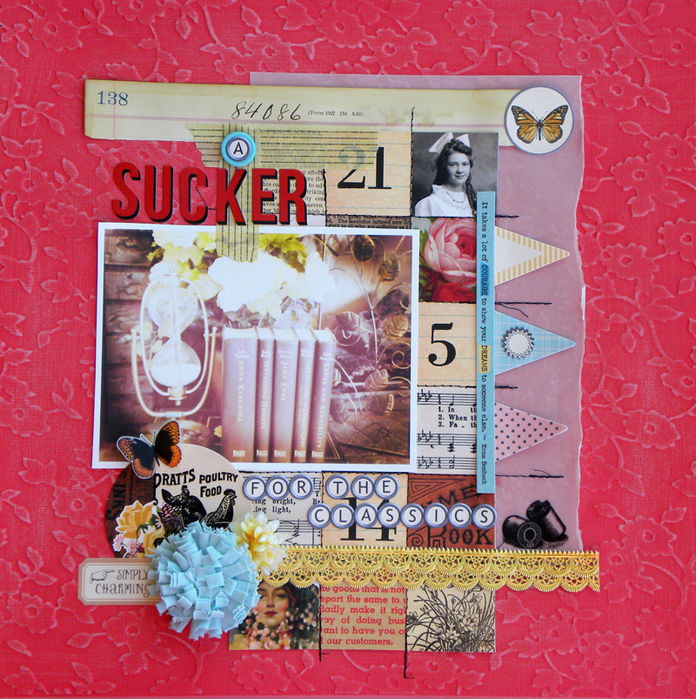
A Sucker for The Classics by Amy Kingsford| Supplies: JBS Mercantile December Papercrafting Kit + Artisan Add-on.
6. A banner of unexpected shapes
Lisa Dickinson created a banner from small tags topped with journaling strips and tied with white cord. Each “flag” on the banner delivers a different message that supports her page topic of “Just Be.”
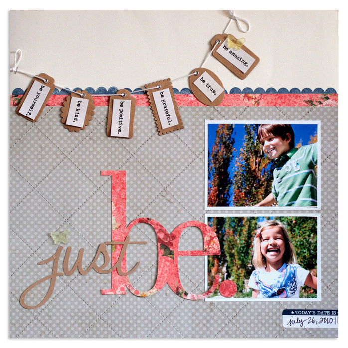
Just Be by Lisa Dickinson | Supplies: cardstock (Bazzill Basics) + patterned paper (Webster’s Pages – pink; Lily Bee Design – grey) + stamp, ink, label (Jenni Bowlin Studio) + tags, mist (Maya Road) + journal strips (Pink Paislee) + acrylic butterflies (John Allen) + fonts (Halo Handletter, Didot) + die cut machine (Silhouette by Quickutz) + pen (American Crafts)
Doris Sander made a banner of several rectangles — of tags and even product packaging — that she ran across “Happy Moment.” Each point on the banner provides a home for embellishments and/or journaling. The largest piece resembles an old-fashioned needlework sampler of the alphabet.
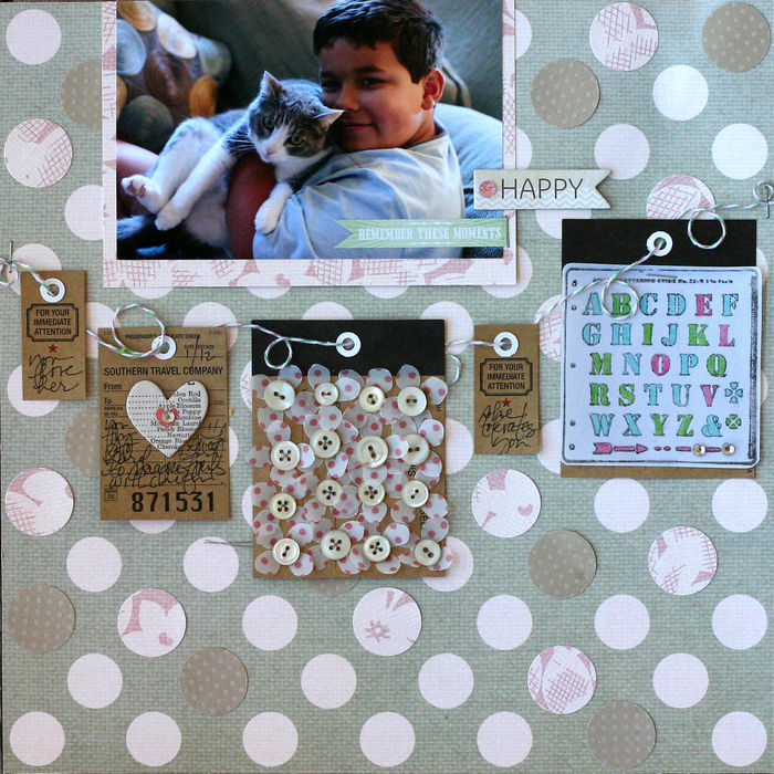
Happy Moments by Doris Sander | Supplies: tags, patterned paper, stamp – Jenni Bowlin, ink – Jenni Bowlin for Ranger, punch – Marth Stewart, jewels, twine – Queen & Co., Chipboard Dear Lizzy by American Crafts, cardstock – Bazzill, pens – Sharpie, buttons – vintage
How do you use banners on your pages? And what do you make them from? Try a new approach on your next pages.
[ontrend]

