by Debbie Hodge
While journaling is an important part of many scrapbook pages, there are times when minimal journaling works just fine. Here’s a look at 6 of those instances in which titles, design, lists, and photos do the work typically expected of scrapbook page journaling.
Short journaling works:
1. When a list does the job
There’s nothing like the clarity of a list of things that are important to your subject to cut through the clutter and make a portrait with very few words. Terri Davenport scrapbooked highlights of her son’s life at 13 doing just this.

Nate 13 by Terri Davenport | Supplies: Template and brush- Ali Edwards, Patterned and solid papers-Andrea Victoria, Font-Chunk Five.
2. When the photos are enough
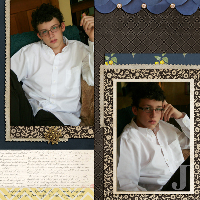
Love the photos? Just want them on the page to look at? That’s how I felt about these recent photos of my oldest son. The story I have isn’t so interesting that I want it interfering with these shots.

J by Debbie Hodge | Supplies: Findings by Jenn Allyson; Petals by Sara Gleason; Alpha Set 5, Burlap Scraps, ArtPlay Snow Fun by Anna Aspnes; Chasing Fireflies by Paislee Press; Bollywood Dreams by ViVa Artistry
3. When your title does the work
Lisa Dickinson scrapbooked a series of photo of suggling with her daughter and titled the page: “Above All Else, We Have Love.”
Enough said? Yep!

We Have Love by Lisa Dickinson | Supplies: cardstock (Bazzill Basics) + letters (Creative Cafe) + frames (Sassafras Lass) + stamps (Studio Calico) + ink (Stampin’ Up) + pen (American Crafts) + misc. button
4. When “who, what, when, and where” do the job
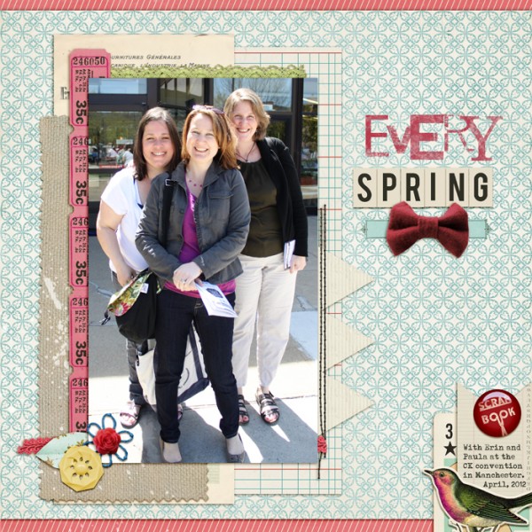
Posed shots at events are the kinds of one-off photos you want to get into your album even if there’s no story to tell. Get the basics: who, what, when and where, and you are good to go.

Every Spring by Debbie Hodge | Supplies: Mixed Up Alpha by Lisa Sisneros; Burlap Scraps No 1 by Anna Aspnes; Vintage Playing Cards, Typeset Alpha by Sahlin Studio; Wesley by Ardent Sparrow; Everyday Matters by T for Me; Stringbats by Kim Jensen; Love You More than Ice Cream by Jen Barrette; Far Away from Here by Juliana Kneipp; Bintage Ledger Journalers by Robyn Meierotto; She’s a Doll by Vinnie Pearce
5. When the visual design tells your story
Jana Morton used fall embellishments that repeat and reinforce the leaves in her photo. Additionally, she let the scene from the photo “spill” onto her page so that her son appears to be running into the distance, a reinforcement of the theme her photo caption sets: that life is certainly a race.

Life is Certainly a Race by Jana Morton | Supplies: Katie Pertiet: Watery Autumn Paper Pack, Selvage Edge Photo Frames No. 1, From My Bookshelf Blendables No. 2, Flourishing Leaves No. 1, Autumnal Artistry Kit, Alandia Paix Collection, 2011 Postmarks, Brushed Alphabet No.1. Studio DD: Fall Element Clusters. Pattie Knox: Fasten Its!
6. When short journaling makes the point loud and clear
Kelly Purkey tells about the emotions she had–good and bad–with just a few short words prompted by the journaler on “Hey, 30.” The photo, the title, and this brief journaling tell us all we need to know to understand the story of this page and this day in Kelly’s life.

Hey 30 | Supplies: Patterned Paper: Basic Grey, October Afternoon Journaling tag: Smash Stickers: Crate Paper, October Afternoon Paperclip: KI Memories Mist: Studio Calico Pen: American Crafts Other: Twine
There are many stories and photos that need and deserve extensive journaling — and then there are instances like those shown here when a sentence or two, a list, a well chosen title, or even design and photos make the page’s point well.
[lovejournaling]

