Grounding isn't just for tents and electricity. Make sure your page elements are grounded to one another and to your scrapbook page canvas.
by Debbie Hodge
Scrapbook pages hold a lot of elements: photos, journaling, title, embellishments, papers, even memorabilia. When you’re deciding how to arrange the parts of your page, strive to GROUND them, to be sure they are purposefully placed.
What does “purposefully placed” mean? It means that the parts of your layout don’t look like they are aimlessly scattered around or floating on the page. Everything is connected in some way to the background and/or another element.
Achieve purposeful and grounded placement with the following.
1. Alignment: Consciously think about the alignment of photo edges, of the beginning or ending of text, of embellishments. All of these things connect and ground.
2. Grouping: When elements are grouped together they are connected. Use common matting, positioning, alignment, and organizing white space (margins, gutters, borders).
3. Layering: Overlap elements to ground them to other elements and to the page background.
4. Repetition: Repeat design elements like color, shape, image, and patterns to build a feeling of connection throughout your visual design.
Take a look at grounding in action.
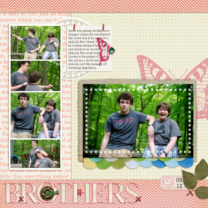
Brothers by Debbie Hodge | Supplies: Nantucket Papers by Pink Paislee; Tangerine Dream Collection, Butterfly Rubons, Printed Tickets Expressions, Mercantile Labels, JBS Rubon Frames by Jenni Bowlin; 11:30 am by Amy Wolff; Uncharted by Krystal Hartley; Flossy Stitches Red by Katie Pertiet; Burlap Scraps, Alpha Set 2, ArtPlay Snow Fun by Anna Aspnes; Reminisce by Leora Sanford; Petals by Sara Gleason; Shadow Like Me, Still Life by One Little Bird; RadLab by Totally Rad; Typenoksidi font
alignment: The series of small photos are aligned. The letters in the title are aligned along a common base and, since they are all uppercase, the tops are also aligned. Using lowercase alphas would have yielded a jagged edge here–and a different effect on the design. When I use lowercase letters for my titlework, I usually have it overlap other elements on the page rather than standing alone as it does here.
grouping: The series of small photos are grouped via alignments, common matting, and organizing white space (surrounding margins). The embellishment clusters are groupings, connected by placement and layering.
layering: The layering in embellishment clusters connects the items to one another, but it’s the smaller touches that ground the clusters to the canvas. Notice the gem and stitches on the journaling card and the stitches on the title and leaves. The large butterfly rub-on behind the focal point photo is what grounds this grouping to the page.
repetition: Stitching in red embroidery floss is repeated and used to ground title and both embellishment clusters. Green in the embellishment clusters and titlework (button) are repetitions that create a visual triangle. They also repeat the green in the photos. The leaf motif is found in photos and embellishments, and the butterfly motif is used in two sizes.
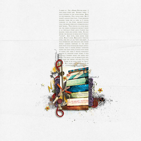
HP nerd by Sara Gleason | supplies used: Platform 9 3/4 by Emily Merritt and Valorie Wibbens; pea green boat by Kaye Winiecki; font: High Tower Text
alignment: Sara Gleason used full justification for her journaling to create strong lines around the journaling block. The photo sides are aligned with the journaling block sides to create well-defined cluster.
grouping: The photo and embellishments are grouped via layering, generous white space, and dark color value. The cluster has more visual weight than the journaling above and stands out amidst generous white space. While this cluster is a group, the cluster plus journaling are also a group because of shared alignments and proximity.
layering: Sara’s tight and detailed photo cluster is like an explosion of magical power on the white canvas — perfect for her topic. A few stray elements burst out — flowers and a star — but are united with the cluster because of proximity and the splatters that point out to them.
repetitions: Small bits of yellow are repeated throughout the cluster, and Sara used a font for the journaling that, rendered in all uppercase, adds a repetition of the book titles in the photo.
You Are by Kim Watson | Supply list: Patterned paper: American Crafts, Fancy Pants, Pink Paislee, Lilybee, Crate Paper; Chipboard, Brads, Alpha stickers & Stamp: American Crafts; Ink: Close to my Heart; Die Cutter & Dies: Spellbinder; Punches: Fiskars
In our Masterful Scrapbook Design interview with Kim Watson we talked about how she places elements in many spots on her page canvas and yet keeps a sense of unity – -of how her visual designs are complex and yet very accessible (you can hear this interview for free with a Sampler Membership at MSD). She uses several grounding techniques to make these designs.
grouping: We’re accustomed to seeing one cluster with lots of white space or three clusters that create a visual triangle, but Kim does the unaccustomed — and makes it work. She’s got 4 distinct clusters –or groupings” on this page. They are seen as groupings because of their overlapping (layered) elements and the white space that separates them from one another.
layering: each cluster is a lovely arrangement of elements in multiple sizes, patterns, and shapes that build up from the canvas, overlapping one another and topped off by small grounding elements (brads, flowers, buttons).
repetitions: Kim repeats patterns, colors, motifs, and stitching throughout the page.
alignments: While this page has a casual look it’s packed with purposeful alignments. Start with the blue flower at top right and follow a vertical line down through the circle of clustered circles to the edge of the patterned paper foundation for the focal point cluster. Take a look at the bottom of the focal-point cluster and notice how the journaling block bottom edge aligns with the striped circle bottom edge.
How do you ground your visual designs? Are you more likely to use some of these tools than others? Can you incorporate subtle repetitions and alignments that will add power to the next page you make?
[current]


