by Debbie Hodge
Titles are one of the basic parts of a scrapbook page, and we’ve shared lots of ideas and how-tos for scrapbook page titlework. Recently, we even talked about the work a title can (and should) do if it’s going to be included on the page. I’ve found myself recently forgoing a title altogether, but the ideas here are causing me to rethink (and perhaps even revisit) those titleless pages.
Read on to see several layouts with big titles that earn the real estate they take up because of how integral they are to telling the page’s story and creating a unified and appealing visual design.
These aren’t just big titles that say “SNOW.” They are titles that pull from popular culture and conversation. They are titles that, even when they are labels, go beyond the obvious.
1. Use your title to tell a story that diverges from the photos
Doris Sander took her title “Every Rose Has Its Thorns” from a song by the glam metal band Poison (and there was singing of it at the Masterful Scrapbook Design webinar in which Doris shared the page.)
It’s a perfect title for a page that’s a rumination and a message for Doris’s son on how relationships can be thorny and that there are benefits to finding a relationship worth working on, despite any thorns. This title let Doris use a photo of children at a wedding to do more than document the occasion. Doris emphasized the title with large alphas (that come with those awesome shadows) and centered placement.

Every Rose Has Its Thorns by Doris Sander | Supplies: stickers, stamp, stencil, patterned paper – Jenni Bowlin, ink – Jenni Bowlin for Ranger, transparency – Hambley, rose – vintage, embroidery floss – DMC, punch – Martha Stewart, masking tape
Krista Sahlin used a title to help tell a story that was different than what the photos showed.
Krista says, “We had a ‘dream’ family vacation to Disney a while back, and never thought we’d be able to go back again for a LONG time. By a small chance of luck we were able to, though, so I used a title that represents the classic Disney moment of “riding Dumbo at Magic Kingdom” and “believing in the Disney magic.” “Believe It” reflects that it was pure magic to have an opportunity to be there again.”
2. If you use a label make sure it goes beyond the obvious
The title on Audrey Neal‘s “School Spirit” appears at first to be a simple label for a page about the college Audrey attended and now works at.
When you read Audrey’s journaling, though, you find out that she’s celebrating her own new-found affection and spirit for the school she once tried to avoid. The entire page is an homage to the school and the idea of school spirit with shield and pennant motifs in school colors. The title is large and rendered in a retro font (Pacifico) with a white outline that makes it pop against the background.
In a recorded conversation with Audrey (which is a part of the free membership level at Masterful Scrapbook Design), she shared with us all she did to make this a page the celebrates this institution, explaining that she brings at-risk high school students to campus as a part of her work, and that she always wants them to see it in the fall and feel a sense of back-to-school exhilaration that will motivate them to go to college–and that she’s coming to terms, herself, with what a fine place she’s in.

School Spirit by Audrey Neal | Supplies: Gennifer Bursett: Up to Date (woodgrain paper, multicolored chevron paper, metal brads), Design House Digital, Robyn Meierotto: Cut It Out Clipping Masks (triangle pennants and stitches), Design House Digital, Audrey Neal: Currently (blue and gold papers, stitched stars, star elements, journaling tag), Design House Digital, Audrey Neal: Pinned (double photo frame), Design House Digital, fonts: Olivetti Type2, Channel
The title on Emily Pitts‘ “The Family Photo Bomber” is a label that’s a combination of charm and punch that perfectly complements a family portrait gone awry. The oversized alphas are as bold as Emily’s son’s face as he “bombs” the family photo.
Search for “photo bomber” online and you’ll find plenty of photos in which an individual “bombs” an otherwise traditional portrait with an unexpected look, pose, or action. Emily celebrated the current terminology and her son’s sense of humor with this page. Just in case you’re new to the term and don’t immediately see what’s going on, she’s turned the “t” in Photo into an arrow.

Family Photo Bomber by Emily Pitts | Supplies: Cardstock: Bazzill Basics, Patterned Paper: Pink Paislee, Crate Paper, Mist: Maya Road, Chipboard Alphabets: Maya Road, Sticker Alphabets: Jillibean Soup, Embossing Powder: American Crafts, Ink: Tsukeniko, Tag: Maya Road Twine: Maya Road, Measuring Tape: Maya Road, Ribbon: Maya Road, Staples: Tim Holtz Transparencies: Maya Road
3. Use repetitions and styling to strengthen title meaning
On this self-reflective page, Anna Aspnes takes on the topic of her need to always know “why,” appropriately titling it “Why” and using repetitions of the word to reinforce the topic. She even made her own typeface for the title word by overlapping letters from three fonts: Chopin Script, Paddy Wagon WF and Times New Roman.
Anna rasterized the text and erased bits from some letters. For example, the”w” is a combination of the “w” from both Chopin Script and Paddy Wagon WF. She filled the heart-shaped loops resulting from this combination with color gradients and used one to frame her own eye from a blended portrait in the background.
4. Have fun
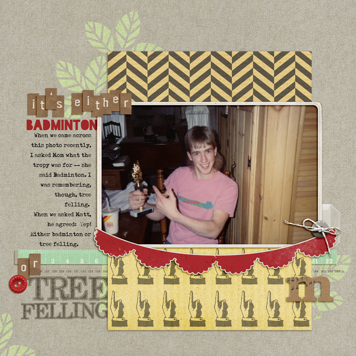
I was long gone from home when my youngest brother was in high school and won this trophy. When I recently found this photo, my mom said she thought the trophy was for badminton. Really? It seemed odd to me. I said I thought I remembered that he won a tree-felling competition. When we saw my brother later that night, he laughed. “Yep,” he said, “It was either badminton or tree felling. I know I won trophies for both.”
It’s just a silly bit of conversation, but it covers memory territory for all of us and it let’s me scrapbook an old photo for which I was lacking a story in a memorable way.

Layout by Debbie Hodge | Supplies: This Is My Story by Little Butterfly Wings; Daydreamer by Mari Kogelenberg; Storyteller Alpha by Amanda Heimann; Vintage Frames 26, Vintage Charm Chipboard Stickers, New Growth 5, Out of a Box ALpha, Academic Sanded ALpha by Katie Pertiet; Tidbits alpha by One Little Bird; Blackout font
5. Send a message
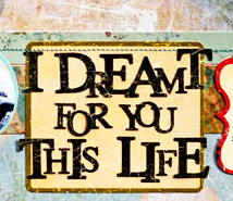
Of ‘I Dreamt For You This Life,’ Betsy Sammarco says, “The title is the focal point of this layout. I deliberately used tiny photos in order to get the sentiment of the layout across. There were so many parts and pieces to my boys’ lives, I didn’t want to focus on one photo. I rendered the photos in black-and-white and small to help keep initial focus off the photos and on the title.”
It’s a beautiful page that immediately triggers the viewer’s understanding of what a mother’s hopes and love aspire to.

I Dreamt for You This Life by Betsy Sammarco | Supplies: Patterned paper, die cuts, and letter stickers: Collage Press, Acrylic embellishment: Maya Road, Rubons: Pink Paislee, heart sequin, misc ribbon
So where do you come down on including titles, especially big ones? Try one of these ideas on your next scrapbook page.


