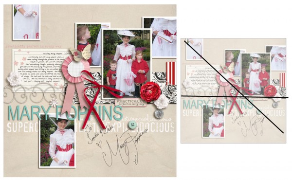
See the many lines leading to the centered focal point in this photo.
by Debbie Hodge
A focal point is the center of a design. It is the most important part (or parts) of a piece.
A scrapbook page benefits from having a focal point because Without some variation in emphasis among the elements on your page, everything takes on the same level of importance, and the viewer has to find some way into your page on their own.
- contrast
- appeal/engagement, and
- structure.
In this article we show you ways to use that third technique–structure–to create a scrapbook page focal point.
1. Use line to create a focal point
The eye will follow
- lines,
- a sequential pattern,
- the eyes of the people in your photos, and
- even implied motion in your photo.
Use one or more of these to guide the eye to your focal point.
On “Mary Poppins,” Krista Sahlin has placed embellishments and papers to create two strong lines that intersect at her focal point photo. It’s not just these lines, though, that draw the eye. The eye-catching content of the photo, its placement at a “sweet spot” (rule of thirds), and the embellishments grounding it all contribute to make the photo the place the viewer starts when taking in this Disney scrapboook page.
2. Use white space to create a focal point
Using white space is one of the simplest ways to draw the eye to specific area of the page without use of visible elements. Especially when your page is quite full, white space can isolate, and thus emphasize, an element.
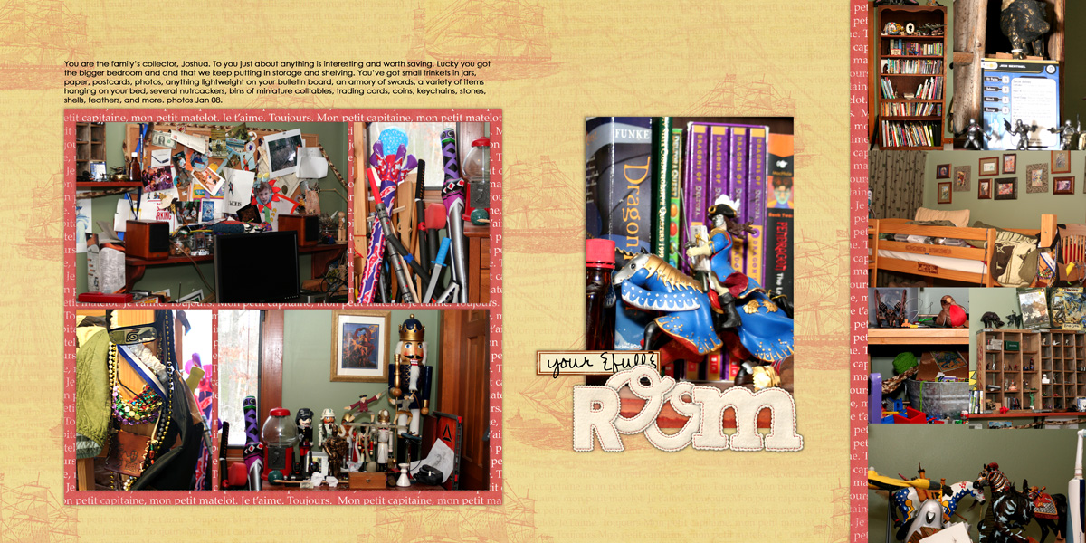
“Your Full Room” is a page with 11 photos. The white space surrounding the photo of a toy knight isn’t dramatic, but it’s enough to set the photo apart from the rest.

Layout by Debbie Hodge | Supplies: all from Designer Digitals (Lynn Grieveson, Katie Pertiet, Pattie Knox)
3. Use balance to create a focal point
Symmetry can strengthen a focal point, forcing the viewer’s eye to the center. An asymmetrical design can soften or muddy focalization.
On this symmetrical composition, Dina Wakley has placed her photo at page center AND at the intersection of vertical and horizontal bands of patterned paper–cementing its position as page focal point.

My 3 Fellas by Dina Wakley (Masterful Scrapbook Design Canvas Issue) | Supplies: Supply list: Patterned paper: Jenni Bowlin Paint: Liquitex Cardstock: Bazzill Journaling Card: Jenni Bowlin Alphabet: Jenni Bowlin
4. Use more than one technique
All of these “structural” approaches can be combined with one another and with the techniques of contrast and appeal to create strong focal points.
Of “Lucky,” Kelly Purkey said, “This is one of my favorite layouts, and it just came together so easily.” The focal point of the page is the circular photo placed at page center. A series of ever-larger circles frame the photo and lines radiate out, accented by stitches and airplanes. “I started with the background patterned paper,” says Kelly, “and let it inspire the design of the page, cropping my photo to a circle and placing it at page center. I worked my way out with other elements. Everything was added to reinforce the photo as focal point.”

Lucky by Kelly Purkey | Supplies: Cardstock - American Crafts. Patterned paper - Studio Calico, American Crafts. Stickers - My Mind's Eye, American Crafts. Buttons - Basic Grey. Pen - American Crafts. Punch - EK Success. Other - Thread
[designclass]


