by Debbie Hodge
Alignment refers to how text is arranged into blocks or columns with hard or soft edges. There are four basic approaches to alignment: 1) Left, 2) Right, 3) Centered, 4) Justified. Check them out below — as well as a fifth option.
Flush Left
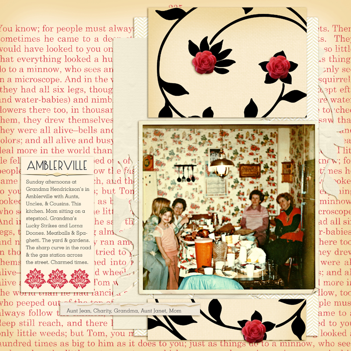
Type that is justified flush left is the easiest to read because it’s the form we read most often. The word and letter spacing are consistent.
The journaling on Amblerville sits on a traditional journaling card and is aligned flush left.

Amblerville by Debbie Hodge | Vintage Red Collection and Journalers by Jenni Bowlin; Potpourri Easter Bunny, Artplay Chevron Sweet Baby, Torn N Tattered Scalloped Strips by Anna Aspnes; She's a Doll by Vinnie Pearce; Vintage Frames Large by Katie Pertiet; Cumulus, Geoslab 713, Designer Mixed fonts
Flush Right
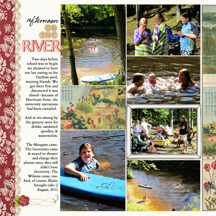
Flush right justified text is harder to read than flush left, but it keeps the word and letter spacing we’re accustomed to. On scrapbook pages, it can be the best choice for creating alignments with other page elements.
I chose to right align the title and journaling on “Afternoon on the River” because of the space it needed to fit into — and the location of that space relative to the large block of photos. If it had been left aligned, there would have been a column of uneven space between the journaling and the photo block. With right alignment, though, a straight and narrow gutter of white space is created — like the gutters in the photo block — and all of the elements are a unified whole.

Afternoon on the River by Debbie Hodge | Supplies: Interlude, Westover by One Little Bird; Just Juicy by Lynn Grieveson; Treasured Moments by Krista Sahlin & Sugarplum Paperie; Brushed Alpha No 3, Collageables No 4 by Katie Pertiet; Storyteller by One Little Bird and K Wilson
Justified
When it’s used well, full justified text can be crisp and elegant. It’s prone, though to “rivers” of white space running through the text, and it can be difficult to read.
Paula Gilarde spent a lot of time picking a font for this layout “because,” she says, “I wanted my journaling to look more like an object or block rather than text. I chose a handwritten font and fully justified my text so that the edges have clean lines.”

Read by Paula Gilarde | Supplies: Just Linens: Sorina Paper Pack by Maplebrook Studios, Round Robin Kit, Freeze Day Kit and Really Retro Dated by Lynn Grieveson, Painted Love No. 01, Colorful Watery Spots No. 02, Bakers Twine Assortment No. 01 and Loves Park Kit by Katie Pertiet, We Word Art Brushes and Stamps by Ali Edwards.
Centered
Centered text can work for menus or short pretty poems. It’s not good, however, for large blocks of text.
Emily Pitts center aligned her photo and her oversized title (which doubles as journaling) on “Happy Girls.” She stacked the title over the photo so that her daughter’s happy face was the focus. Emily says, “I could have just cropped her face and had a square photo above my title, but I love the feeling of overlapping that’s going on here.”

Happy Girls by Emily Pitts | Supplies: Patterned Paper: Simple Stories, Chipboard: Maya Road, Embossing Powder: American Crafts, Ink: Tsukeniko, Mist: Maya Road, Ribbon: Maya Road, Pearls: KaiserCraft, Twine: Maya Road, Thread: Coats and Clark
Centered text is a great choice when you’re fitting your type within a shape as Tiffany Tillman has done on “Shhhh…My baby’s sleeping.” Her short block of centered text fills a circle. Note — filling a circle with centered text results in smooth lines around the edges. Sometimes centered text can have a lot of variation in line length — which just might work for your design, or which might makes things difficult to read.

My Baby’s Sleeping by Tiffany Tillman | Supplies: Digital Papers & Elements: La Belle Vie by One Little Bird Designs. Page Template by Simply Tiffany Studios. Fonts: Dominique, Expressway, Futura Light.
No Alignment
Go ahead and break the rules. Place each line to begin and end as you like.
Amber Ries frequently uses this approach — as she’s done on “Frog.” She says that she likes doing this in order to avoid creating a rectangular block that needs to be incorporated into her freestyle and artsy designs.

Frog by Amber Ries | Supplies: By Anna Aspnes: Abstract Fotoblendz No. 06 | Annual Trash | ArtPlay Palette: Seafoam | Artplay Palette: Science | Reptiles No. 01 | Dotted Korners N Edges | Multicolor MagicFlares | Magic Flares No. 02 | Sketchy LoopDaLoop Hearts No. 02 | Mariska Alphabet (f) | Annablendz Harlequin | Metro Graffiti | Water Drops No. 03 | Flutterby Tattoo Transfers | Stitched by Anna Bitz No. 1 | Stitched by Anna Bitz No. 2 Wicked Alpha from the Lilypad, Textbytes by Pattie Knox

Want to learn more about “setting type” on scrapbook pages? Check out the Typography issue of Masterful Scrapbook Design.

