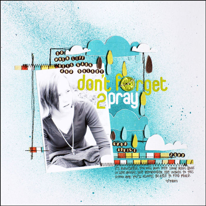
It’s the accumulation of well-chosen and carefully crafted details that create a masterful scrapbook page. Check out 5 details on “Don’t Forget to Pray” by Emily Pitts and see if one or two of them can inspire your next page.

1. Create page flow with misting.
The blue mist on Emily’s white canvas guides the eye from top left down through the elements at page center, and, finally, to her journaling.
2. “Bookend” your title with subtitling in smaller alphas.
Emily frequently uses small alphas to lead into her title — and then come back out the other side. It’s a way of making the title her journaling — or a part of it.
3. Emphasize a title word with negative space.
Emily misted around the alpha stickers for “pray” and then removed them — providing much needed contrast within her title (she’d originally rendered the title with all green stickers). Including a word rendered in “negative space” lightens things up while providing emphasis and repetitions of the white also in the clouds.
4. Embellish with patterned paper strips.
The narrow strips beneath the photo provide a shelf and a grounding element for the cluster of elements above. They work with the strip above the photo to emphasize the downward diagonal flow on the page. Cutting striped paper in strips (with the stripes running vertically) is a great way to get several colors onto the page and to add a little “vertical” energy to what might otherwise be a more restful (horizontal) element.
5. Pay attention to the weight of your journaling block.
You can affect the amount of visual weight of your journaling block not only with color and value, but also with leading (line spacing), alignments, and overall shape and size. Emily’s dark and dense block with strong alignments echoes the grouping of small circular alphas in front of her title. It balances these elements while contributing to page flow as a result of the repetition.

Don’t Forget to Pray by Emily Pitts | Supplies: Cardstock: Bazzill Basics, Patterned Paper: Cosmo Cricket, Button: Jillibean Soup, Alphabets: Jenni Bowlin Studios, American Crafts, Mist: Maya Road, Pen: EK Success
Emily Pitts writes two columns on scrapbooking: I Spy with Emily—on industry trends in Scrapbook and Cards Today, and Start Here—on design in Scrapbooks, ETC. She is part of the Write.Click.Scrapbook collective, designs for Simple Stories and Cocoa Daisy, and teaches frequently at Masterful Scrapbook Design. Follow Emily’s blog and keep up with her on twitter.

