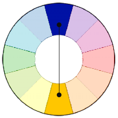
Pair blue and orange in bold hues for a bold scrapbook page with lots of energy.
A complementary color scheme uses colors opposite one another on the color wheel, for example red and green or blue and orange. This is the highest contrast color scheme. Use it with fully saturated colors, and you’ve got a strong, vibrant look.
If you don’t want an overpowering or jarring look, but still want to work with complementary colors, try the following:
- Use your complementary colors in small doses.
- Include a neutral color with your complementary colors.
- Choose a dominant color and use your secondary color in smaller amounts.
- Use less saturated colors.
- Don’t combine complementary colors for text (i.e., don’t put orange text on a blue ground).
Tami Taylor used bright tones of oranges and blue misted on a white canvas for a clean and energetic look on “Kyle.” The purple accents used in smaller doses add additional punch.
The photo is of a much darker value than the colors and stands out well against the canvas — the complementary colors don’t overpower it, but, rather, create a curvy line leading the eye right to it.
Kyle by Tami Taylor | Supplies: Paper- Bazzill. Spray Inks - Tim Holtz. Stencils/Cardboard - Unknown. Alphas/Wordstrips/Diecut - Jeni Bowlin.
Doris Sander began “Precious” with striking photos and the high-contrast image of silhouettes.
Doris says, “The photos and silhouette paper make a strong image together that is really quite breathtaking.” Using a complementary color scheme — with the color doled out in small doses and a dominating white canvas heightens the power of her design. “I have trouble pulling my eyes away from this layout,” says Doris, “and I think that’s as it should be.”
Precious by Doris Sander (Masterful Scrapbook Design Canvas Issue) | Supplies - patterned paper, stamp, paint, and ink by JBS, rub-on by Hambly, tags by Avery, flower by Bazzill, trim by May Arts, chipboard alphabet by American Crafts
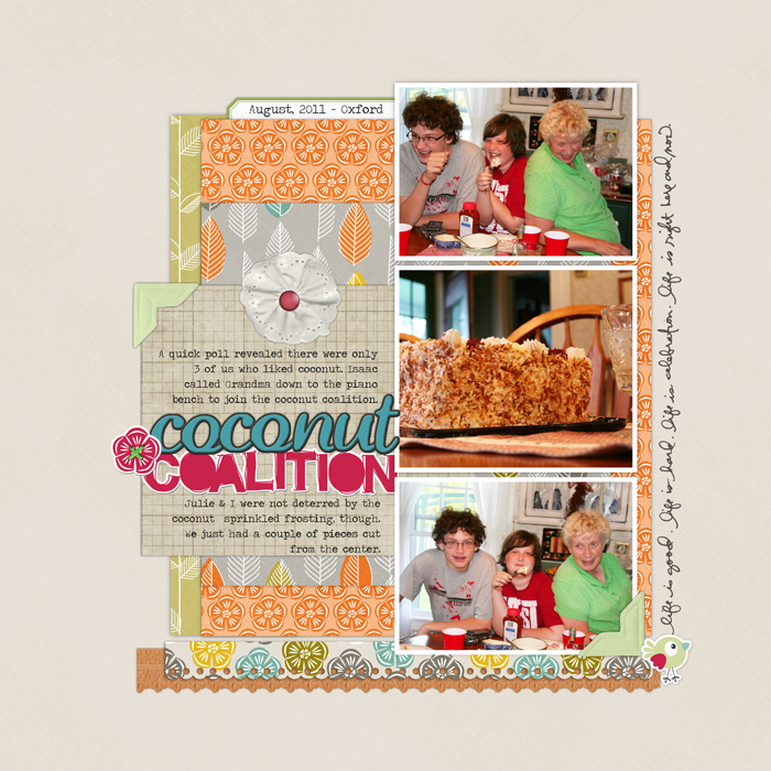
I used two pairs of complementary colors on “Coconut Coalition:” green and red (pink) with blue and orange. The colors come in small doses, though, and there’s a generous amount of neutral cream surrounding them so my photos aren’t overpowered. The result is a lively page that I hope echoes the lively play going on in the photos.
Coconut Coalition by Debbie Hodge | Supplies: Artistry de Blanco Element Pack, Rubber Alphabet No. 02, Flossy Stitches: Green, Photo Corner Colors No. 02, Notebook Paper Pack No. 03, Oiselet Rouge Element Pack, Scallop Strip Masks, Doodled Block Alpha Brushes and Stamps, Pick Me Up Rub Ons, Labelled Journalers No. 02 by Katie Pertiet; Brad Bonanza No. 03: Digital Fasteners by Pattie Knox; Everyday Sentiment Strips Brushes and Stamps by Ali Edwards
Lisa Dickinson wanted a bold scheme to go with this fun page of her son and used complementary red and green — with some yellow as accent. Lisa shows that you can use a large dose of bold color and still show off your photos. Narrow white mats on each make sure they stand out against bands of red, green, brown.
Laughter by Lisa Dickinson (Masterful Scrapbook Design Color Issue)


