 by Jana Morton
As the mother of three, I feel like I am constantly repeating myself. I repeat myself because I want to strengthen my message in hopes that one day the life lessons that I am trying to convey will sink in. Just like in parenting, repetition is a design tool that brings strength as well as cohesiveness to a scrapbook page. It allows the eye to travel seamlessly across the page and to look at the page as one unit. Repetition can be achieved in a number of ways including repetition of colors, elements, and photo size.
I have discovered that one of my favorite scrapbooking techniques is repetition of a photo. Yes, I mean using the same photo on a page more than once. People may wonder why someone would put the same photo on the page more than once when there never seems to be a shortage of photographs. I would like to show you some examples of how repetition of a photo can help strengthen your scrapbook page.
1) Creating a backdrop
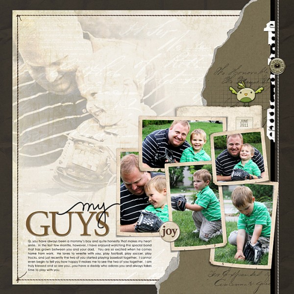
One of the fundamental aspects of scrapbooking is finding a background paper that will compliment your photos. If I have a photo that I love, I will often use the photo itself as my background. I love to use blending as a way of giving the same photo a different look. On “My Guys”, I duplicated my favorite photo of this sweet sequence between my husband and son. Then I blended the duplicate photo into the background and changed the blending mode to give it a soft and unique feel.
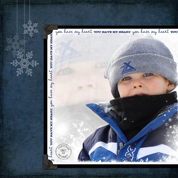
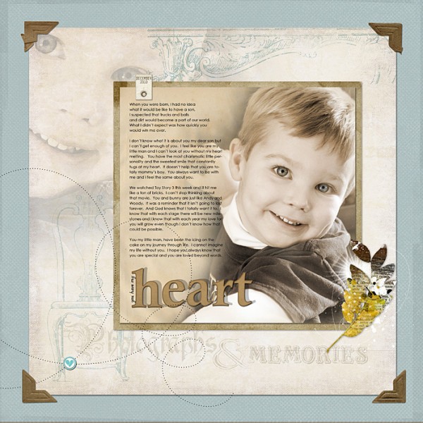
“You Have My Heart” is another example of creating a backdrop with the photo itself. Using a softer image behind the actual photo allows the image to “pop” right off of the page.
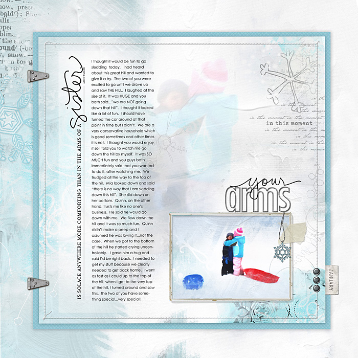
“Hug” is another example of this technique. I took the photo of my children from the top of a huge hill. I wanted to recreate how tiny they looked from the top of the hill but also wanted to see the details of this sweet transaction between the two of them. I duplicated the photo and made the duplicate image very large. I blended it into the background for a soft scene.
2) Creating Movement
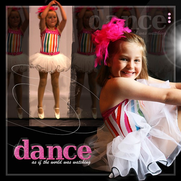
As a mom, I would say that movement is very much a part of our day. I have discovered that if I repeat a photo numerous times, I can give the photo a sense of “movement”. On “Dance” I wanted to show my daughter jumping during her dance recital. I duplicated the photo several times and positioned them across the page. I was able to make the one image standout from the rest by keeping it in full color, softening the duplicate images and then adding brushwork around her feet. I used the repetition of the softer images to convey her motion. I think this is such a fun technique to use.
3) Emphasizing a portion of your photo
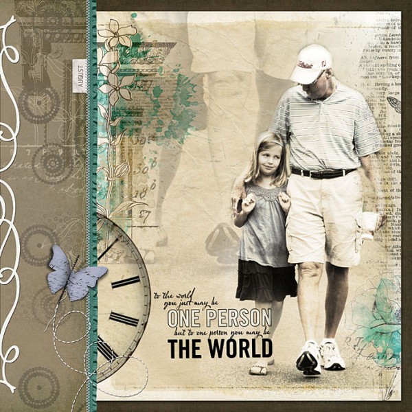
When I use a photo more than once on a page, I don’t always use the whole photo. I will duplicate a portion of the photo to emphasize my favorite aspect. On “One Person”, my favorite portion of the photo was having my daughter and her grandfather’s feet side by side as they strolled down the street. Once again, I duplicated the photo and used a blending mode to soften the background image of their feet. I then positioned the blended image at the top of the page to emphasize their feet. I think the repetition of the photo create a soft and yet powerful page.
My favorite aspect of the photo that I used in “You Have My Heart” is my son’s eyes. Once I duplicated the photo and changed the blending modes, I really zoomed in on the duplicate image to emphasize my son’s eyes.
4) Setting the Mood
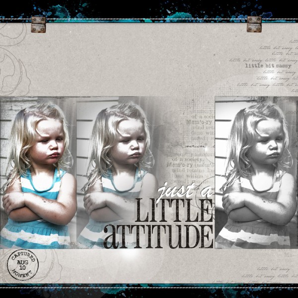
When I am working on a page, I immediately start thinking about what kind of mood I want the page to convey. On “Little Attitude”, I wanted this layout of my dear friend’s beautiful daughter to convey a sense of drama. When I started working with this photo, I made the photo appear like a sketch. I started altering the color opacity of the photo and honestly I couldn’t quite decide which one I liked best. I decided to use all three variations of this photo. These variations give the page some attitude and reinforce that her sweet, little attitude was reoccurring.
Photoshop is such an incredible tool. Each image that we use provides an abundance of possibilities that are waiting for us to explore. I have discovered that using a single photo in various ways can create a unique and powerful scrapbook page. I challenge you to give it a try. Find a photo that you love and try manipulating that photo in different ways utilizing some of the incredible tools that are available through your software. I would love to see what you come up with.
[jmorton]
Amp up your own digital photo art with the advanced blending, sequencing and motion techniques taught in Jana’s new class Creative Composites! This live workshop builds on the techniques shared in Jana’s core class Blending and Beyond and begins Jan. 9th at Creative Passion Classes–don’t miss out!

