 Parties come in many flavors: big, small, birthday, holiday, theme, family, friend, community, planned, for a reason or just because.
Making party layouts that convey the spirit of the party, as well as who was there and what went on is immensely rewarding. You get a chance to relive the event, to think back over what really stood out, and to provide family and friends with a tangible remembrance of the event.
With any event for which you have a substantial number of photos, the challenge is to convey what went on without overwhelming and crowding the page. Here are three approaches for organizing photos in order to get lots of them onto two-page spreads.
1. Organize photos logically
One way to bring order to a page with many photos is to organize the shots into logically related groups–which may all go on one page or on several pages. Try these approaches:
- group photos by category within an event. Separate out portraits of the people, activities that went on, food, decorations, and whatever makes sense for your event.
- group photos by different activities within the event: On a trip to the beach, activities in that one outing could include: castle building, wave surfing, and sunning. At a neighborhood picnic, activities could include: tending the grill, games, mingling. At a birthday party, consider grouping by: party games, cake time, gift opening.
- group photos by time/stage. When scrapbooking Easter, you could group by: • coloring Easter eggs, the egg hunt, and dinner. For a wedding, you could group by: rehearsal dinner, getting dressed, the wedding, the party. Again, each subgroup could go onto its own page or it could fill its own area of a page.
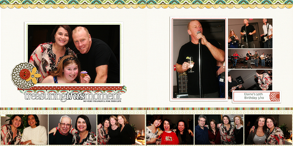
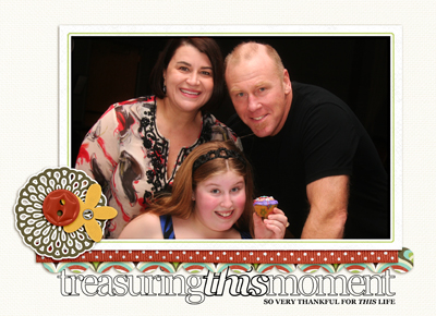
- One framed photo of the birthday party girl and her family is the page focal point.
- The photos running along the bottom of the spread are of the hostess with various friends who attended her party.
- A block of 4 photos on the right side of the spread show the entertainment, toasts, and birthday cake presentation.
2. Organize photos practically
Any time you can organize photos by common size or cropping potential (height, width, or total overall size), you can quickly get order on a page with many photos.
- photos of same height can be organized in a row
- photos of same width can be organized in a column
- photo of same size can make a block
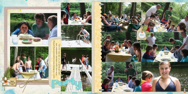
There are 3 practical photo groupings on “Party:”
- Two focal point photos are the same size and double matted on the left side of the spread.
- A series of 3 photos all trimmed to the same width are arranged in column.
- Six same-sized photos are arranged in a block that fills the right side of the layout.
Make groupings clear
You can establish that photos are related to each other logically with your design choices.
Location. Group related photos together in an obviously separate section of the page. In today’s layout there are 3 distinct sections or areas.
Common matting. Place related photos onto a shared mat. Another alternative is to free hand-draw or print a frame around the group.
Margins and gutters.Use common margins, same-sized gutters, and/or abutting edges to signal that photos are grouped together.
Size: As discussed in the previous section, cropping to same height, width, or • overall size can unite a group of photos.
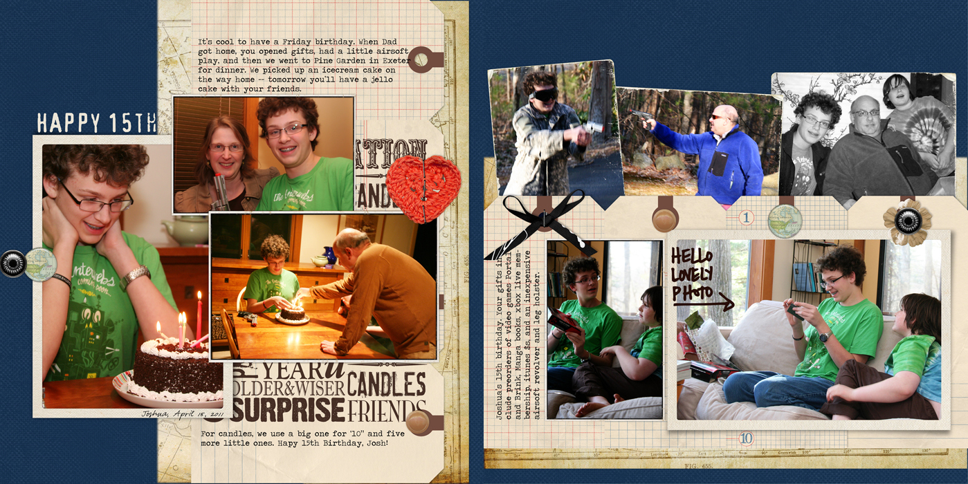
The photos on “Happy 15th are in logical groupings (as recommended in #1 above): cake photos are on the left, gift-opening photos are at bottom right, and hanging-out photos are at top right. The groupings are made clear with the following design choices:
- The cake photos on the left are clustered together, overlapping one another, but isolated from the other groups by space. They are all in color and framed.
- The gift-opening photos at bottom right share common matting, are of the same height, and aligned at top and bottom.
- The miscellaneous photos of playing with airsoft guns and going out to dinner are clustered at top right. They are tilted, touching on another, and bottom edges are tucked into the block of tags below. The edges of all three of these photos have been distresseed and these photos lack the green color so prominant in the other photos.
Now it’s time to pull out photos from a party you’ve photographed and make logical and practical groupings that will enable you to pack them onto the page and still keep the story of the event clear.
Want more ideas for scrapbooking events with analysis and creativity? Click here to check out the Events issue of Masterful Scrapbook Design today.
SUPPLIES
Treasuring this Moment by Debbie Hodge | Supplies: Noemi Kit, Just Linens 1 by Maplebrook Studio; Outlined Moments by Ali Edwards
Party by Debbie Hodge | Supplies: Flowering Clusters No 1 by Studio Double D; Alandia Tropics Element Pack, Digitally Pressed Petals Brushes and Stamps No. 02, Touches of Paint Paper Pack by Katie Pertiet; DIY Acrylic Alphabet No. 04 Brad Bonanza No. 03: Digital Fasteners by Pattie Knox; Layered Tissue Autumn Paperie (used with DIY alpha) by Anna Aspnes; Glorious Days Paper Pack, Just Linens Paper Pack No. 01, Just Linens Paper Pack No. 02 by Maplebrook Studios
Happy 15th by Debbie Hodge | Supplies: Buttoned Up Maps No. 01, All Mapped Out Paper Pack No. 01, Classic Cardstock: Authentic, Basic Tags No. 01, Vintage Photo Frames No. 24, Rimmed Framers No. 01, Birthday Blocks Brushes and Stamps by Katie Pertiet; ArtPlay Palette Easter Bunny, ArtPlay Palette WordPlay, ArtPlay Palette Fotographie by Anna Aspnes; Worn Photo Edges No. 04: Golden Years by Lynn Grieveson

