by Debbie Hodge
What do you do when you want to get lots of photos onto your single-page layout AND you’ve got a good bit of journaling to add? Here are 4 ideas for pulling it off –even when you think there isn’t any room.
1. Use longer text lines
Longer text lines can be harder for your viewer to read — but if you’ve got limited space and a story to tell, go ahead and fill a “strip” on your page with journaling.
In keeping with the shaped cluster design of “As Evening Touched the Leaves,” I tucked a strip of paper with journaling beneath the left edge of the cluster.

As Evening Touched the Leaves by Debbie Hodge | Supplies: Contessa Paper Pack by Jesse Edwards; Just Linens Paper Pack No. 01, Aaron Solids Paper Pack, Just Linens Paper Pack No. 02 by Maplebrook Studios; Filed Photo Frames No. 04, Nana’s Buttons No. 02 by Katie Pertiet; Today Mini Stitched Tags by Ali Edwards; Stitched by Anna White No. 01 by Anna Aspnes; Fasten Its! No. 03 by Pattie Knox; Worn Photo Edges. Worn Edges Mixed by Lynn Grieveson; Title is from poem by William Stafford
2. Use shorter text lines
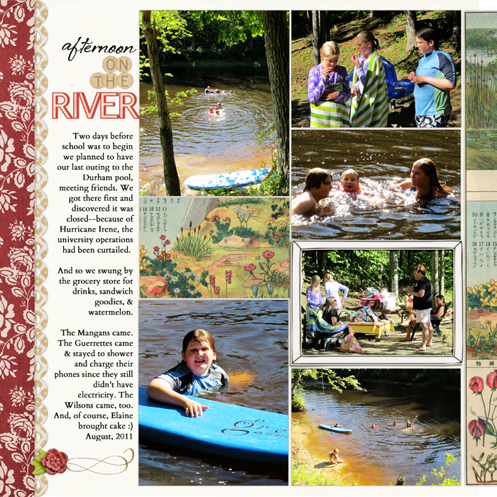
Got a border but don’t want to use long text lines? Don’t want to turn things 90 degrees? Use shorter text lines and fit it in.
Since the border that could house my journaling on “Afternoon on the River” sat to the left on my photoblock, I decided to right-align the journaling. This strengthened the line along the left side of the photoblock, and it avoided a very jagged and long piece of white space between journaling and photo block.

Afternoon on the River by Debbie Hodge | Supplies: Interlude, Westover by One Little Bird; Just Juicy by Lynn Grieveson; Treasured Moments by Krista Sahlin & Sugarplum Paperie; Brushed Alpha No 3, Collageables No 4 by Katie Pertiet; Storyteller by One Little Bird and K Wilson
3) Break it up and put it in multiple spots
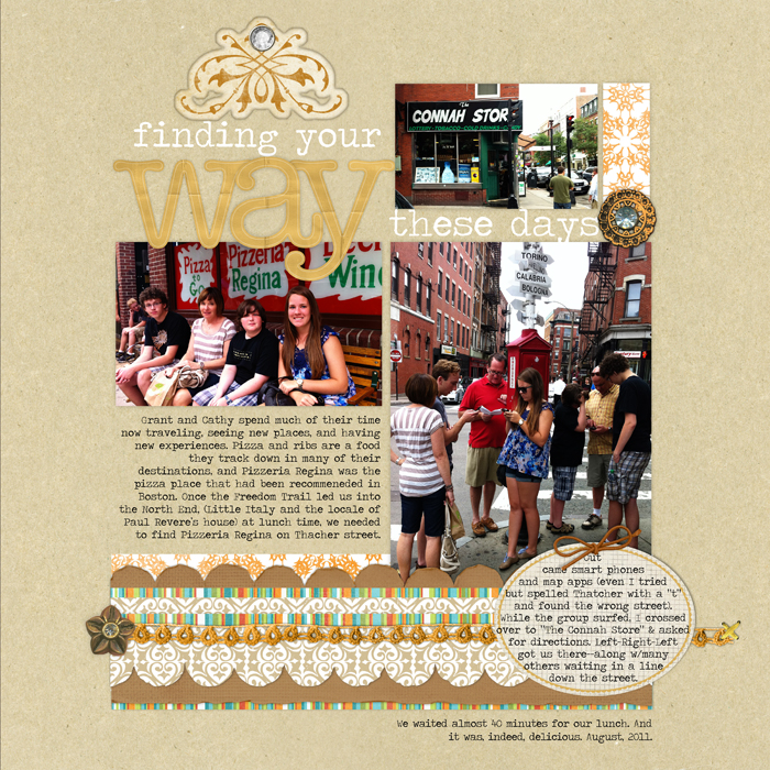
Journaling doesn’t have to sit in just one spot on your scrapbook page–and multiple journaling spots aren’t just for list journaling.
The story on “Finding Your Way” starts in a right-aligned block within this “casually blocked” design. It continues to an oval journaler and finishes at bottom right of the grouping. The western reader is accustomed to moving from left to right and from top to bottom on a page, and the organization of the three spots is consistent with this expectation.

Finding Your Way by Debbie Hodge | Supplies: Around the Corner Paper Pack by Jesse Edwards; Spiced Jewel Elements, Torn N Tattered Scallop Strips by Anna Aspnes; King Me Kit, Thankful Kit, Flossy Stitches Yellow, Cold Springs Element Pack, Double Decker Element Pack, Hung Up Journalers, Naturally Krafty, Art Time Elements, Basci Paper Alpha by Katie Pertiet; Oval Journal Spots by Ali Edwards
4) Put your journaling on a photo
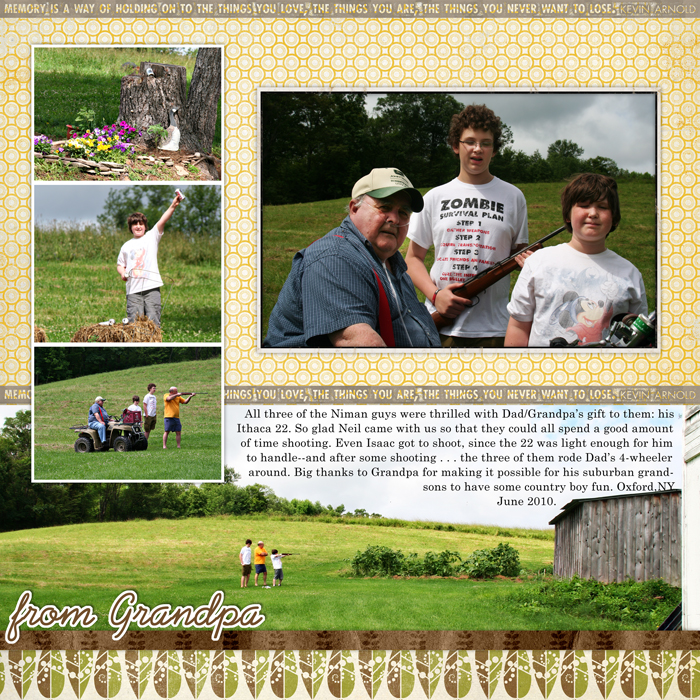
Think you don’t have room for your journaling? Look around — just maybe your photo has some empty space to accommodate that story.
The sky on my edge-to-edge photo provided that spot on “From Grandpa.”

From Grandpa by Debbie Hodge | Supplies: Rimmed Framers No. 01 by Katie Pertiet; Awanui Kit, Backyard Expedition Kit by Lynn Grieveson; Memory Grunge Strips by Ali Edwards; Prelude,Century Schoolbook fonts
[lovejournaling]

