by Debbie Hodge
A successful scrapbook page captures the viewer’s attention, controls the eye’s movement, conveys information, and evokes emotion.
That first task–capturing the eye’s attention–is the work of making a focal point.
About Focal Points
A focal point is the center of a design. It is the most important part (or parts) of a piece.
A scrapbook page benefits from having a focal point because Without some variation in emphasis among the elements on your page, everything takes on the same level of importance, and the viewer has to find some way into your page on their own.
When emphasis exists, though, the viewer’s eye is drawn to a starting point and then (with some good “flow management”) knows where to continue. The result is the viewer takes in your entire page and easily “gets” what it’s about.
And how to you create a focal point? There are three approaches to making something stand out and catch the eye.
1. Create a focal point with appeal
A subject making eye contact, a stunning floral arrangement, or a must-touch embellishment are the kinds of elements that not only catch the eye but involve the viewer in other ways. They evoke emotion or engage the viewer’s desire to touch.
Celeste Smith has a 1-2-punch of appeal on “Same” with her subject smiling into the camera and a large, touchable flower clustered next to the photo.
Same by Celeste Smith (Masterful Scrapbook Design Focal Points Issue) | Supplies: Digital Supplies: Cool Beans Mixed Buttons, Minestrone Paper Pack, Harvest Felt Flower,Red Polkas Canvas Flowers,Calendar Journaling Sprouts on White - Digital Sprout Pack #1 - all from Jillibean Soup; Font: Another Typewriter
2. Create a focal point with contrast
Contrast is one of the biggest draws of the human eye. By using it properly, it is the most effective way to create a focal point. Contrasts are all about differences — and the bigger the differences, the more noticable and eye-catching. Try contrasts in color, size and values (i.e., lightness or darkness of an element).
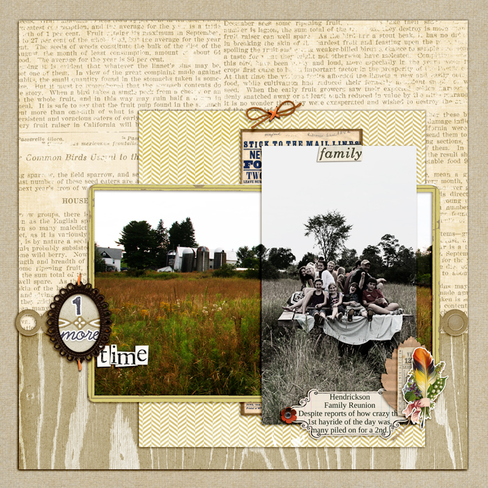
The black and white portrait-oriented photo layered over a color version stands out against the color photo and the tone-on-tone and cream-colored patterned papers.
1 More Time by Debbie Hodge | Supplies: Etc by Polka Dot Pixel; Krafty Cuts Leaves, Flossy Stitches Orange, Cold Spring Element Pack, Artistry Del Sol, Krafty Canvas No 1 by Katie Pertiet, Little Bits ALpha; Interlude by One Little Bird; The Daily Details by Digi Chick Collaborative; Metamorphosis by Leora Sanford; Ransom Words by Vicky Stegall; An Additional Very Small Alpha by Allison Pennington; Artplay Palette Chevron Sweet Baby by Anna Aspnes; Build Your Own Borders by Amy Wolff
The black alphas in the title on Kelly Purkey’s “The Beginning” contrast strongly with the light-colored background and immediately grab the eye. Their positioning at center and inside a frame of circles adds to their draw.
The Beginning by Kelly Purkey (Masterful Scrapbook Design Focal Points Issue) | Supplies: Cardstock - American Crafts; Patterned Paper - American Crafts, 7 Gypsies, Studio Calico, Little Yellow Bicycle; Stickers - American Crafts, Sassafras; Buttons - My Mind's Eye, Epiphany Crafts; Stamp - Studio Calico, K&Co; Embossing Powder - American Crafts; Pen - American Crafts; Punches - Fiskars
3. Create a focal point with structure
Another way of drawing the eye to a point is through structure. Specifically:
Line: The human eye (and mind) will follow the natural order of things. The eye will follow: a sequential pattern, the eyes of the people in your photos, a line of perspective, or implied motion in your photo.
White space: Using whitespace is one of the simplest ways to draw the eye to specific area of the page without use of visible elements. See Kelly’s “The Beginning” above. The generous white space surrounding the title contributes to its draw.
Balance: Symmetry can strengthen a focal point, forcing the viewer’s eye to the center. An asymmetrical design can soften or muddy focalization.
On this symmetrical composition, Dina Wakly has placed her photo at page center AND at the intersection of vertical and horizontal bands of patterned paper–cementing its position as page focal point.
My 3 Fellas by Dina Wakley (Masterful Scrapbook Design Canvas Issue) | Supplies: Supply list: Patterned paper: Jenni Bowlin Paint: Liquitex Cardstock: Bazzill Journaling Card: Jenni Bowlin Alphabet: Jenni Bowlin

Ideas and how-tos for making pages with strong and effective focal points from Noell Hymann, Kelly Purkey, Betsy Sammarco, Krista Sahlin, and Celeste Smith fill the Masterful Scrapbook Design Focal Points Issue. 5 webinars (with recordings), 30+ page pdf idea book, focused lessons, and annotated galleries. Click here.


