Design elements are the basic building blocks of visual design. Design principles are rules you can use to combine those blocks.
Eight design elements that will go a long way toward making pleasing pages are:
- Space
- Line
- Shape
- Size
- Pattern
- Texture
- Value
- Color
Space
“Space” is where your page elements coexist. Space is where images and type “play” together. How well they play and how you achieve harmony among them is up to you.
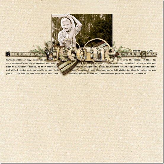
Peppermint Granberg’s “Become” incorporates generous white space setting off the cluster of photo, elements, title, and journaling
Layout by Peppermint Granberg from Masterful Scrapbook Design “Texture and Dimension” issue.
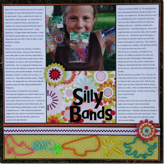
Sharyn Tormanen uses the space of her Silly Bands 12″ x 12″ canvas differently, filling the canvas with a blocked design.
Layout by Sharyn Tormanen from Masterful Scrapbook Design “Smorgasbord” Issue.
Line
A line is the extension of a point and the most basic element of visual communication: we use lines to symbolize and record ideas. Lines can be straight, curved, thick, thin, vertical, horizontal, diagonal, solid or broken. The rendering of a line can imply a mood or tone. Soft and curving lines signal tranquility. Jagged diagonals evoke a more jarring tone.
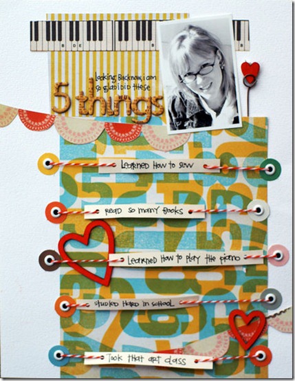
See if you can find the lines in Emily Pitts’ “5 Things.” Her foundation includes vertically striped patterned paper, and the journaling is mounted with horizontal lines of string repeated down the page.
Layout by Emily Pitts from Masterful Scrapbook Design “Stash Busting” issue.
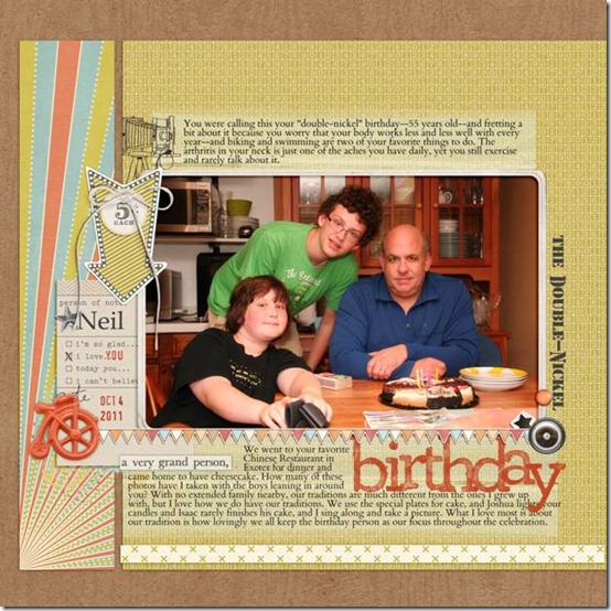
On “The Double Nickel Birthday,” Debbie Hodge used a band of paper with lines radiating from the bottom right corner. There are solid lines and dotted lines. The paper is positioned to guide the eye into her cluster of photo, journaling, and page elements.
Lemonade Stand by Taylor Made; Artplay Palette Rockstar by Anna Aspnes; Fall Fun Kit, Vintage Photo Frames No 26 by Katie Pertiet; Epic Kit by One Little Bird, Biograffiti, Paislee Press; Warm October Kit by Lynn Grieveson; Messy Slab Alpha by Cathy Zielske; Kreased Transfers by Anna Aspnes; La Belle Vie Kit, Westover Kit by One Little Bird; Photobooth Kit by Paislee Press; Rock the Shadows Styles by Tracy Stroud
Layout by Debbie Hodge from Masterful Scrapbook Design “Texture and Dimension” issue.
Shape
Understand that our minds recognize and make associations with familiar shapes. Squares are trusted shapes that connote stability, and circles–with their lack of a beginning or an end–are often thought to represent the eternal whole or the circle of life. Your canvas has a shape: probably square or rectangular, but die-cut papers in bracket and scallop shapes are possible canvas bases, too. Photos and blocks of type have shapes–again, frequently rectangular, but not necessarily.
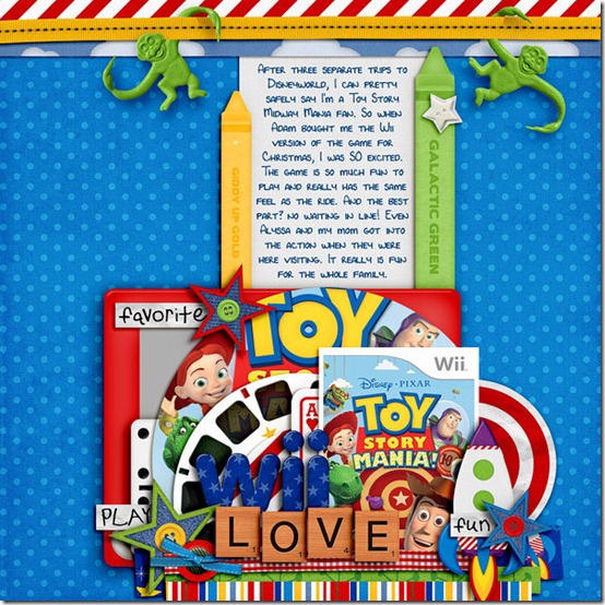
Lynnette Penacho built a base of rectangles on “Toy Story Mania” that she’s topped with a cluster of familiar and boldly delineated shapes: rectangles, circles, and stars. Even the shape of the monkey is familiar to the many of us who played with this linking toy as a child.
Layout by Lynnette Penacho from Masterful Scrapbook Design, “These Time” issue.
Size
Just how big will your photos (and other elements) be on the page? The more important question is: how big are your photos (and other elements) in relation to the other pieces of your design?
Size is a great tool for creating impact. This does not necessarily mean you need to use an oversized element. A very small element can also have power. The key is that there be a big difference in sizes. Don’t just make it “kind-of-sort-of” bigger (or smaller). Make it seriously, obviously bigger (or smaller).
You can use less drastic differences in size to incorporate variety. See how Cindy has used acrylic circles in several sizes to create the clusters of them “bubbling” from the photo. Without the variety of sizes this design wouldn’t have the appeal it does.
Supplies: Die-Cuts (Three Little Birds) by Lily Bee Designs, Rub-ons by Lily Bee Designs, Circle punch by Fiskars, Clear Acrylic Circles called Fragments by Tim Holtz, Swiss Dot Cardstock by Bazzill Basics
Layout by Cindy Liebel from Masterful Scrapbook Design “Texture and Dimension” issue.
Pattern
Patterns occur when elements are duplicated. The repeated ornament on wallpaper creates a pattern. The bullets preceding each item in a list create a pattern. A series of photos creates a pattern. Patterns create orderliness and familiarity. Patterns can guide the eye as it moves from one occurrence to the next. Patterns can define a line.
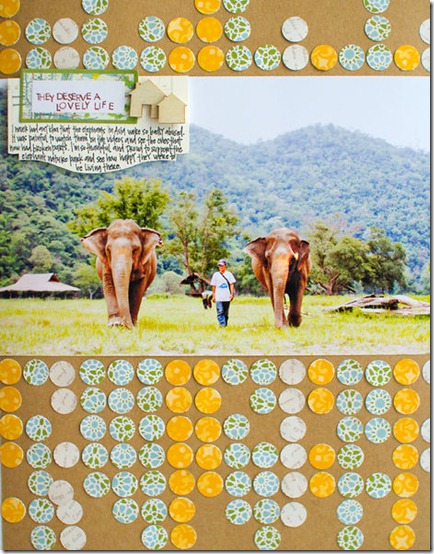
On “They Deserve a Lovely Life,” Kelly Purkey set up the expectation of a pattern (lines of circles) and then broke that pattern — which adds lots of interest to the page.
Supplies: Cardstock – American Crafts, Patterned paper – Studio Calico, Post-it – Studio Calico, Wood – Studio Calico, Stamps – Papertrey Ink, Ink – StazOn, Pen – American Crafts
Layout by Kelly Purkey from Masterful Scrapbook Design “These Times” issue.
Texture
Texture refers to the surface characteristics of a material. Is it rough or smooth? Plush or gritty? You can add real texture and/or the illusion of texture. Using lace, woodgrain, or fabric on a page adds real texture. Printed or digital elements that manipulate the patterns of dark and light on a surface provide the illusion of texture.
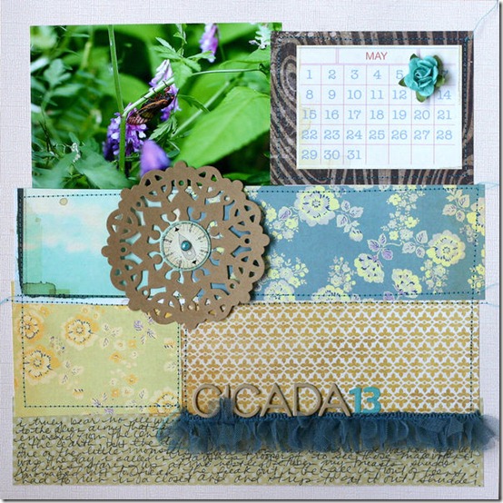
On “Cicadas,” Doris Sander used a strip of tulle, a fabric flower, stitching and textured cardstock to give the page touchable appeal. Her layering, used of deep elements (like the tulle) and the doily with its opening revealing lower layers add depth to the page.
Layout by Doris Sander from Masterful Scrapbook Design “Smorgasbord” issue.
Value
Value refers to the relative tones of light and dark. In between black and white there are a range of gray shades. Colors also have value. Use a range of values to create a sense of depth. Consider the shading on your subject’s face and the areas of light and dark that give it depth. Use value to emphasize or create a focal point: when you’ve got a light element on a dark background it will immediately stand out. Use similarities and differences in values to set tone, create overall unity, or add contrasts to a page.
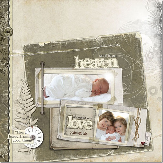
Jana Morton used values ranging from quite light to very dark — all in a variety of browns and creams to give this monochromatic page texture and depth.
Supplies: Katie Pertiet: Enveloped Frames No. 1, Alandia Collection, Totally Tied Up, Dirty SunPrints Kit, Loosely Labeled Dates, Lil Bit Tags Anna Aspnes: Magic Sparkles, FotoGlows 4, ArtPlay Palette No. 4, ArtPlay Palette No. 2, Fruehling Element Set, Hipster Plume Korners N Edges No. 4, Say YES PageSet. Pattie Knox: Fasten Its! Lynn Grieveson: Worn Page Edges. Studio DD: White Element Cluster
Layout by Jana Morton from Masterful Scrapbook Design “Texture and Design” issue.
Color
Understanding and thinking about how you use color on your scrapbook pages is important because, when used well, color can do many things, including: evoking feelings and emotions, triggering symbolic connections, catching and leading the eye, organizing elements, and more.
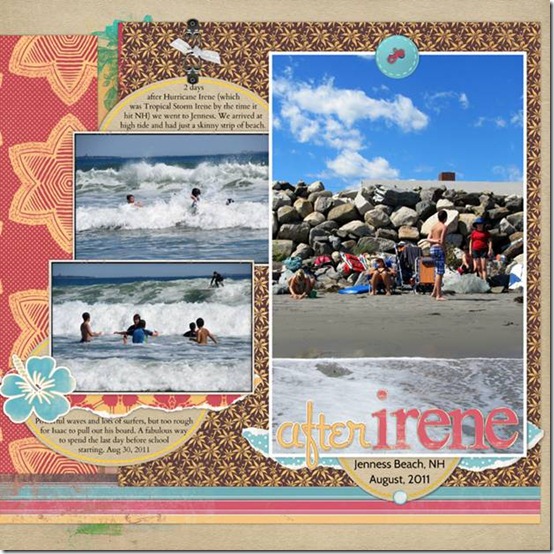
On “After Irene,” Debbie Hodge used the complementary colors orange and blue with bits of pink, green and yellow. The blue works well for her outdoor theme and the orange warms this summer page up. The contrasts give the page energy — just like the energy of the sea after a hurricane.
supplies: Summer Sunset Kit, Red Beach Kit, Just Juicy Kit by Lynn Grieveson; DIY Sticker Alphabet No. 02, Brad Bonanza No. 03: Digital Fasteners by Pattie Knox; Bread + Butter Elements: Oval Journal Tags by Ali Edwards; Tied Fasteners No. 04 by Katie Pertiet
Layout by Debbie Hodge
[current]

