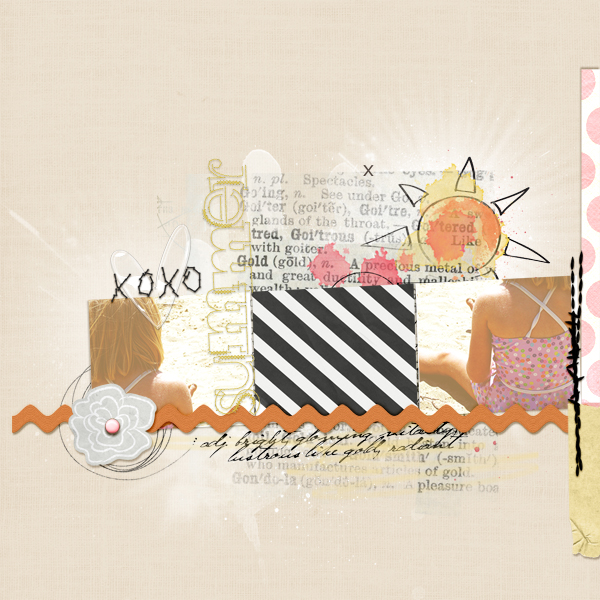
Whether you’ve dabbled in digital scrapbooking yourself or only just admired the look of others pages from afar–chances are that you’ve seen and appreciated a page that utilizes what digital scrapbookers call “brushes.” Digital Brushes are often used as a foundation to set a page’s inner canvas or focal elements apart from its background and to give pages a dynamic yet airy feel.
Once I started digital scrapbooking I was immediately drawn to the look of digital brushes. In fact, I was intrigued to the point that using them on my digital pages was no longer enough, and I began to search for ways to translate their look to my paper pages as well.
Suggestive layering is the key to re-creating this light and layered look in your paper pages. So what are suggestive layers you ask? Suggestive layers are produced by combining products and techniques that and allow the colors, patterns and textures of multiple layers to shine through without feeling bulky or overpowering.
Let’s take a look at a few of the ways to go about this with some of the paper supplies you may have on hand.
Start with an extravagant printed background.
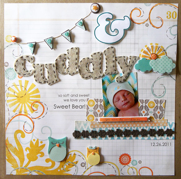
Printed backgrounds are a great place to start when looking to create the look of digital brushes in your paper pages. Whether you are going for a whimsical feel or a grungy graphic feel, there are thousands of papers out there that have done the work for you. All you have to do is layer your elements in a way that operates with in the boundaries of the scene that your printed background has created.
In this layout, I started with a background paper that already had a fun and whimsical foundation established. I used the brush-like flourishes of the paper to frame my inner canvas and direct the eye inward to my photo. The pairing of more dimensional accents with my catchy printed background helped the details layered on top really stand apart from the decorative background.
Utilize your transparencies in smaller pieces.
Transparencies can be another great way to re-create that “brushed” look because they allow the other layers on your layout to show through. This mimics the digi scrapper’s ability to change opacity and blending modes to maximize the wow factor of their layers. While transparencies often come in full sheets to used as more of an “overlay,” they can also be used in pieces to create emphasis and maximize their impact.
Keandra’s use of transparencies in the layout below is a perfect example of how smaller sections of transparencies can be used to create emphasis. When used as an overlay, transparencies lend a particular motif or feel to a layout–which is great! But when used in pieces, they act more like a digital brush, in that they can create a dynamic foundation for the important elements on our page, while still allowing the layers beneath to shine. These damask transparencies help to ground Keandra’s photos and title, without covering up all of the rich color, pattern and texture in the layers beneath.
Create a light and open feel with a little “fussy cutting”
Fussy cutting is the art of removing a pattern or image from a print with a craft knife or pair of scissors. And while it requires a bit more patience than some of the other techniques, it’s a great way to introduce an intricate pattern, while keeping the feeling of openness that many digi scrappers find so appealing in the digital brush.
I love the way that Lisa Dickinson has used this technique to create a sense of movement on her page that not only mimics the movement present in her photos, but that is also highly indicative of a digital brush. Because of their light and open feel, many digital scrappers use brushes to create a sense flow in their layouts, and Lisa has shown us how we as paper scrappers might achieve this very same effect in our paper pages with the help of a little fussy cutting.
Have some fun with paints, inks and mists.
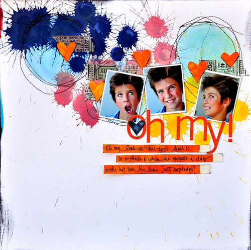
Some of my favorite brushes to use on my digital layouts are all of the splatters, strokes and stains that can make for a very fun and colorful foundation for my page. The great thing is that this look is just as accessible to paper scrapbookers if you’re willing to get your hands a little dirty!
This is one of hundreds of layouts in which Dina Wakley shows us that these beautiful splatters and stains are not out of reach to paper scrappers, they are merely a wrist flick away! Whether you use your paints, inks and mists to create bold foundations or to merely give your page that slightly distressed look–one thing is certain–you are going to have fun bringing the look of these types of digital brushes to life on paper.
Create interesting layers with stickers and rub-ons.
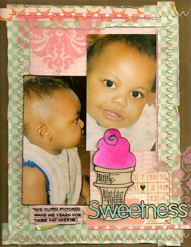
Layering your transparent stickers and rub-ons can be an excellent way for paper scrappers to combine motifs, while giving their layers the distressed or even blended look that can be achieved with digital brushes. Both of these can easily be layered over one another or over other suggestive layers, to create interesting accents and foundations for your paper pages.
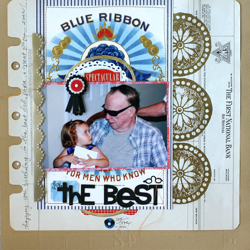
If you’re aiming to bring the look of graphic-style brushes to your paper pages then rub-ons and stickers may be the way to go. In the page below I used leftover rub-on alpha sheets to bring some bold and grungy layers to my page’s foundation. This created a one-of-a-kind photo mat, while adding a nice graphic touch that gave my layout a little bit of a boost in the masculinity department.
Build foundations using stamps, stencils and masks.
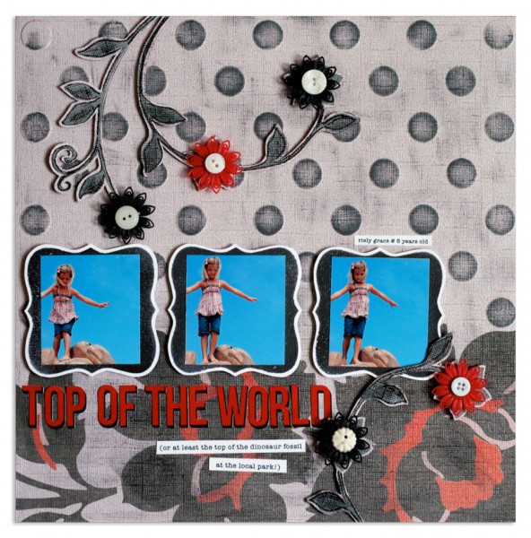
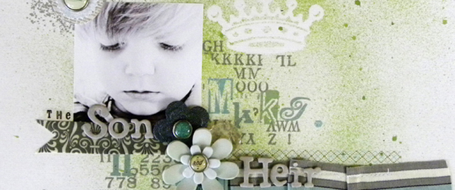
Digital brushes were made to mimic these very same products. As a result, stamps, stencils and masks can easily be used to achieve not only the look, but also to re-create many of the effects that are achieved with digital brushes–including fading, gradation, watermarking, and distressing. They also pose yet another way to create a fabulous foundation with lots of layers shining through.
This is a great example by Doris Sander of how a stamp can be used in the very same way a digital brush is used to build foundations, create interest and introduce variance. This series of stamps creates the perfect foundation for Doris’ inner canvas, while allowing the layers beneath to peek through. And though each stamp is the same image and color, there is still evidence of slight variations due the change in pressure in which each of these stamps was applied and embossed.
Print your digital brushes directly onto your paper pages.
This might be the simplest and easiest way to get exactly the look you are going for if you have even the slightest experience with digital scrapbooking. While it can be fun to experiment with different techniques, sometimes it can be just as satisfying to hit print and be on your merry way. Printing your digital brushes directly onto the foundation of your page saves you the guess work and effort of finding a suitable alternative and allows you to get on with the design of your layout.
In Betsy Sammarco’s page below, she printed this beautiful watery butterfly brush onto her cardstock and then layered dimensional accents over top. This helped her beautiful background to remain dynamic without overpowering her other elements, while establishing a clear sense of flow in her layout .
“Hand on Her Heart” by Betsy Sammarco
Whether you’re a paper scrapbooker or a digital scrapbooker or both, whether you’ve had the opportunity to work with digital brushes or have only admired their many wonders from afar, the fact remains that we all have so much to learn from each other :)
Amy Kingsford is a happy wife and blessed mother from Northern Utah. She teaches at Masterful Scrapbook Design, Creative Passion Classes and also shares ideas, inspiration and instruction on creative approaches to modern scrapbooking and papercrafting at her site AmyKingsford.com

