by Debbie Hodge
“In the groove” is a phrase we use when the work’s going well, when it’s moving forward in ways we like. The phrase comes from the concept of running accurately in a channel or a groove.

There is, however, another phrase with groove in it. “Stuck in the same old groove” is something we say when we’re repeating, like a broken record, not doing anything new or moving forward.
I’ve been both “stuck in a groove” and “in the groove” the last couple of weeks as I’ve reworked a design element over and over, each time with slightly different results—results I like.
Here’s an approach for finding your own groove with great results.
1. Find the groove
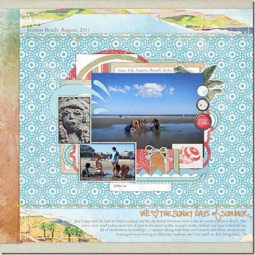
Set yourself a challenge to do something new. I began “We Love the Sunny Days of Summer” with the goal of making a page that had a cluster of photos and elements that left lots of white space around them and that had a patterned paper background.
When I was finished with the page, it was the background that I loved and wanted to work with on another page.
 supplies: Red Beach Kit, Totally Trashed and Windswept Paper Pack, Ashby Kit, Glitter Thread Stitches by Lynn Grieveson; Summer Rocks Brushes and Stamps by Ali Edwards; Artistry de Blanco Element Pack, Rimmed Framers No. 01, Flossy Stitches: White, Library Card Collection: Basics by Katie Pertiet; In the Swim Kit by Pattie Knox; Just Linens Paper Pack No. 01 by Maplebrook Studios
2. Understand the groove
When you’ve got a page with some element that you really love, it’s time to repeat it—and yet make it new. Rather than replicating what you like, break it down to its pieces and see how you can use them in a new way.
What was it about the background on the previous page that interested me and that appealed to me? It was the sense of two canvases – of a canvas on top of a canvas. It was also the unfamiliar, the things I hadn’t done before, the vertical band of paper on the left side, its size, how it abutted the patterned paper and bled off the side of the page.
3. Repeat
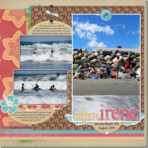
Understanding what it was that interested me about the background on the “The Sunny Days,” I began making “After Irene,” which is also a beach page and which also uses blues, browns, and reds.
See the similarities in the foundational papers: a large block of patterned paper sits to the right and a vertical band of highly contrasting paper sits to the left. The page has top and bottom margins that are similar to those on “Sunny Days.”
There are differences, too: The large block doesn’t bleed off the right edge and there is a half-inch gutter between it and the vertical band. The foreground elements fill a larger area of the canvas and spill off the larger block onto the vertical band. I’ve also added a horizontal strip to the foundational grouping.

supplies: Summer Sunset Kit, Red Beach Kit, Just Juicy Kit by Lynn Grieveson; DIY Sticker Alphabet No. 02, Brad Bonanza No. 03: Digital Fasteners by Pattie Knox; Bread + Butter Elements: Oval Journal Tags by Ali Edwards; Tied Fasteners No. 04 by Katie Pertiet
4. Repeat again and swap it up some more
When my youngest son loves something he says: “Again, again, again!” When you love some aspect of a design, do it yet again!
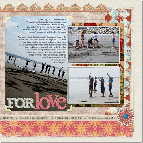
See the similarities and the differences on “For Love” to the previous page. The foundational pieces (which make my canvas within a canvas) are, again, three pieces of paper: a large, squarish block, a vertical band, and a horizontal strip. Now the vertical band is on the right side, and the entire group bleeds off the left side of the page.
Again, these are beach photos, and the colors are blues, reds, and browns.

supplies: Colbie Solids by Maplebrook Studios; Collageables No 4, Between the Lines Alpha 5 by Katie Pertiet; Summer Sunset Kit, Summer Sunset Distressed Papers by Lynn Grieveson; Spray Paint Brush, Vintage FotoKorners by Anna Aspnes; Taste of Morocco Kit by Sahlin Studios
5. Don’t stop now – go micro (or macro) with it
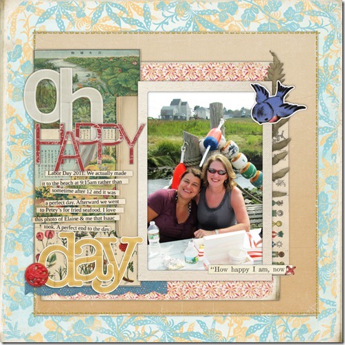
“Oh Happy Day” is yet another page with photos taken at the ocean and the colors of blue, red and brown.
This time the foundation, or “canvas-within-a-canvas” is a square piece of solid cardstock mounted in the center of the page. It’s within this area that I repeat elements from the previous pages: a square block of patterned paper and a vertical band back up my photo, title, and journaling. They are placed to the right within the brown square and bleed off the left edge.

supplies: Collageables No. 04 and No 1, Thin Chip Alphabet: Red, Basic Paper Alphabet: Beige, Basic Paper Alphabet: Yellow, Coastal Element Pack, Flossy Stitches: Red, Journaling Strip Masks, Vintage Photo Frames No. 24 by Katie Pertiet; Summer Sunset Distressed Add-on Paper Pack, Glitter Thread Stitches by Lynn Grieveson
What’s your groove?
Have you made a page you adore? Study it and see what it is that’s appealing to you and start grooving with it.
Are you in need of a page you adore? Set yourself the challenge of working with one or two design elements or principles and get scrapbooking.
Pages that result from play with design elements and principles are the focus of Masterful Scrapbook Design this month. Take a free peek.


