Unconventional product and design choices can yield scrapbook pages that grab the viewer’s eye and keep it.
Read on for rule-breaking ideas that will challenge the way you think about design, color, supplies and stories on your own scrapbook pages.
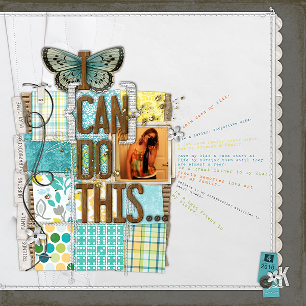
“I Can Do This“ by Kayleigh Wiles
1. Color outside the lines
Everything from color associations to your own color preferences can cause you to limit your color choices.
How many times have you thought to yourself: I can’t use pink on a boys’ page or those bold colors just won’t suit my vintage photos. Here are two layouts that go outside those color boundaries.
Debbie Hodge used soft pinks and yellows on “Discovering Newburyport,” a fall page with photos of her playful boys and their friends. While we don’t often associate “pink” with playful boys, these colors are echoed throughout the backgrounds of her photos: in the light red brick buildings, cobblestone roads, and golden leaves. Repeating these colors from the photos in her paper and element choices creates a soft and fluid background for the life in her photos to sound off of.
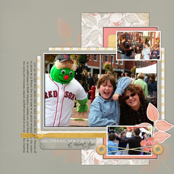
“Discovering Newburyport“ by Debbie Hodge
The conventional approach for scrapbooking heritage photos is to use soft, neutral colors.
Dina Wakley defies this convention on “My Heritage,” using bold, sassy colors with vintage black and white photos. Accompanying the flashes of color are elements that we expect on a vintage page: embossed floral paper, a crocheted flower, handwritten-patterned vellum and soft pink trim, The pinks and blues layered under and over her black and white photos keep them from blending into the background.
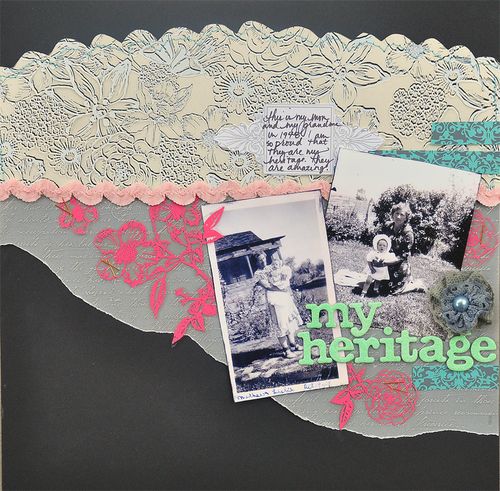
“My Heritage” by Dina Wakley
Now you try:
Next time you find yourself limiting your color choices by gender, era, or season, try to look past the obvious choice and open yourself up to have a bit of fun. Look to your photos or story for color cues–color is a great way to represent emotion, as well as draw attention to important details in your photos.
2. Push the (product) envelope
The list of products that scrapbookers have to choose from is continually growing and expanding. You are regularly presented with new and innovative items. What’s more, you rarely have to settle for using a product that doesn’t quite fit a theme if you don’t want to.
Let’s look to scrapbookers who successfully use their stash and even non-traditional scrapbook supplies to express emotion and symbolism on their pages for some more unconventional inspiration.
If you’re a mother of boys who finds it hard to use flowers on your scrapbook pages, Karen Grunberg will show you how. On “I love you madly, deeply, fully” she uses red rose trim and pushes the viewer to forget that flowers=girls, understanding, instead, that roses=love.
Karen goes a step farther, making an unexpected combination by pairing humble kraft envelopes with elegant roses. This simple design on a white canvas with its bold pops of red, layers, and textures makes this a rich and engaging page.
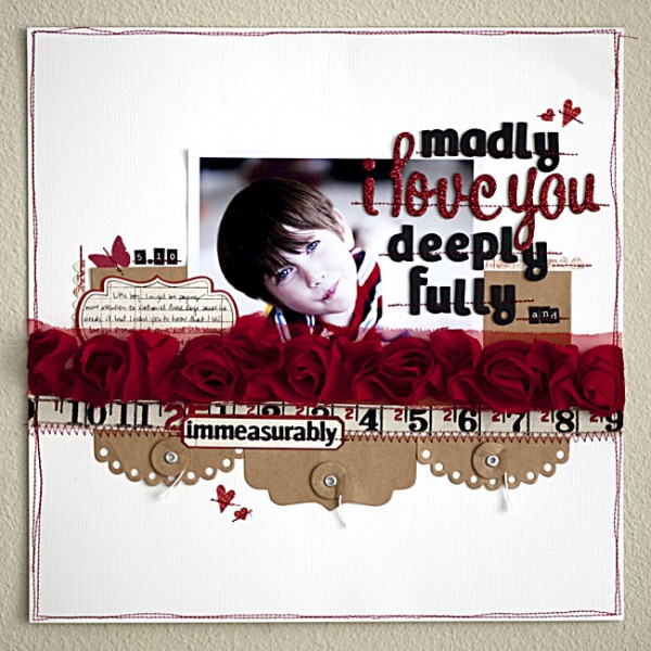
“Madly, Deeply, Fully…” by Karen Grunberg
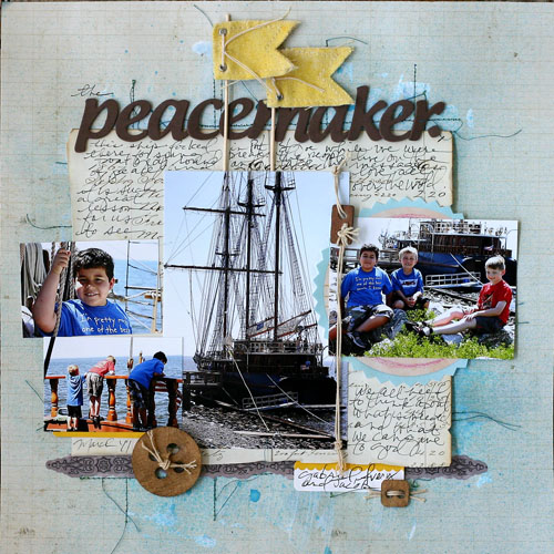
Doris Sander gets creative with scrapbook product and packaging from the get-go on “Peacemaker.”
She began with a textured background of gesso and then misted it creating an effect that mimics seafoam. The flag poles are small wooden dowels that were used to display a set of metal banners inside their packaging. These unique product choices contribute to the rugged theme of her layout while maintaining its organic feel.
Now you try:
Don’t be afraid to make a place for unconventional products on your pages. Think of all the fun to be had experimenting with unique products and associations on your pages. Remember there is always more than one use for any item. Challenge yourself to look past the obvious uses for supplies and make something extraordinary!
3. Scrapbook the parts of life that aren’t all sunshine and daisies
Few of us feel comfortable making “oh yes I did just go there” layouts.
If your scrapbooking is a record of your life, then failures and flaws are just as much a part of that life as triumphs and talents. If you’re questioning whether temper tantrums, heaps of laundry, unsavory or mundane details of life belong in your scrapbook albums, take a look at these two layouts for a few ideas on lightening the load when it comes to recording the not-so-happy memories.
Most mothers go through times when temper tantrums are an expected part of the day. On “I Need” I recorded this daily routine and an important turning point in our home: the point at which my two-year-old began acknowledging the difference between “want” and “need” and using this newfound knowledge to get what he wanted. While his ploys repeatedly failed, they always made things a little more interesting! The lyrics from one of my favorite Rolling Stones songs captured his reasoning while putting a fun spin on a very frustrating time for all of us!
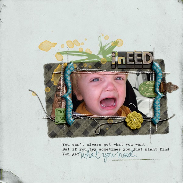
“I Need” by Amy Kingsford
In her layout “The Laundry Fairy,” Doris Sander explores the perpetual cycle that is the laundry pile. She shares her feelings of being frustrated and overwhelmed by this chore at the same time acknowledging that even in the face of pure chaos, the mundane details of life are to be cherished.
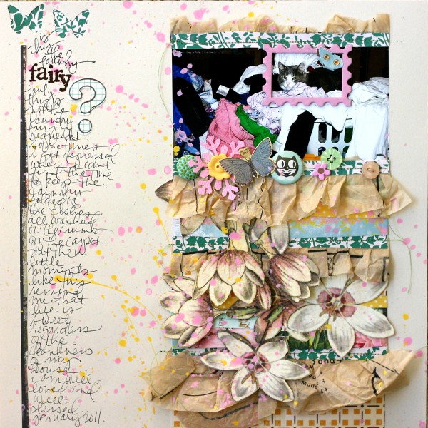
“Laundry Fairy“ by Doris Sander
Now you try:
Challenge yourself to scrapbook it all: the good, the bad and the ugly. Sometimes those “unconventional stories” are the ones we need to be reminded of most!
4. Think outside the (composition) block
It’s easy to get stuck in a design rut. There will always be page foundations that you are drawn to because of your style and preferences. Traditional page foundations become traditional because they work, and there’s nothing wrong with using them. However . . . if you are beginning to think all your pages look alike or just find yourself wanting to mix things up, take a look at these designs and consider ways to put a fresh spin on your favorite page foundations.
Kayleigh Wiles frequently makes beautifully embellished pages based on block and grid designs. In a recent interview at Masterful Scrapbook Design, Kayleigh talked about how these foundations accomodate lots of embellishments without looking overcrowded.
Kayleigh also knows how to manipulate her page foundations for a whole new look. On “No Day Like Today,” I immediately recognize the beautifully stitched compartments and wonderful embellishment clusters that are hallmarks of her pages. Kayleigh has giving this design a new twist, though, by rotating her block a few degrees to set things on an angle that produces a fresh and compelling design.
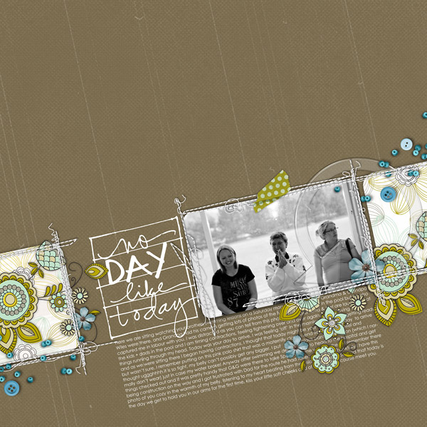
“No Day Like Today” by Kayleigh Wiles
I am a big fan of a “shelf” design, frequently making a horizontal shelf of ribbon, paper strips, and embellishments upon which my photos sit. On “Baby Cakes” I put a new spin on this design by creating a “vertical shelf” of sorts. I added a secondary, more basic horizontal shelf. The intersection of the two created the perfect eye-drawing spot for my focal-point photo as well as title and journaling.
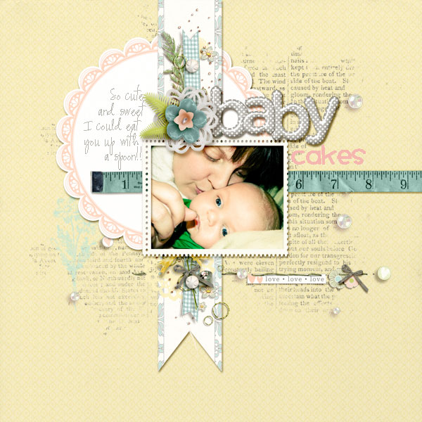
“Baby Cakes” by Amy Kingsford
Now you try:
You don’t have to re-invent the wheel: just give it a spin in a different direction. Try rotating, flipping, or manipulating one of your favorite page foundations to give your layouts a fresh look.
So how about it? Are you ready to try out something “unconventional” on your next layout?
[akingsford]

