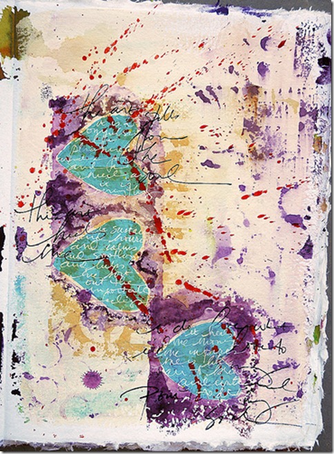
By Dina Wakley
If you want a page element to be powerful, contrast it with its opposite and you have mega-impact.
Contrast is what makes a piece of art surprising, or interesting, or even just plain good.
Contrast is essentially the use of opposites on the same piece of art. Opposites used together will draw the eye and provide excitement. Think in terms of light and dark, big and small, smooth and rough, upside down and right-side up. Any sort of opposite that you introduce will give you an interesting contrast.
Robert Henri, a famous American painter, said “A curve does not exist in its full power until contrasted with a straight line.” I love that. If you want a page element to be powerful, contrast it with its opposite and you have mega-impact.
Here’s how you can get contrast on your art journal pages.
A simple way to add contrast is to use complementary colors.
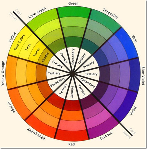
Complementary colors are colors that are opposite on the color wheel (such as blue and orange, yellow and violet, red and green). If you don’t have a color wheel, you need one. Print one from the internet or buy one from an art store, it doesn’t matter. A color wheel is very useful to consult when you’re looking for color ideas.
One way to use complementary colors (without totally overwhelming your work) is to first choose a dominant color, such as orange.
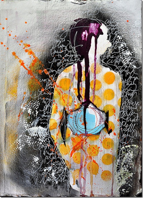
When you add orange’s complement, blue, add it thoughtfully and in small amounts. In this page, there are bold orange circles in the body of the silhouette. Then I introduced the small blue circle, and it really pops against the orange.
Even though I love contrast and I love complementary colors, I rarely use them together on the same background layer.
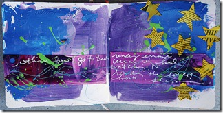
Let me clarify. If I am using yellow and purple, I don’t put yellow and purple on my palette and paint both colors on my background at the same time. Yellow and purple may very well end up in my background (as in this art journal page), but they are not the same layer. When complements mix, they make brown. Keeping complements out of the same layer helps you avoid muddying your work.
Let me tell you about my secret “contrast” weapon.
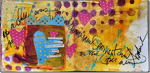
My secret weapon is…paint splatter. I know, it sound simple, but trust me, it will rock your world. Sometimes when I create a page, I like it, it’s fine…but it needs some “oomph.” A simple way for me to introduce a bit of “oomph” without overwhelming the whole page is with paint splatter in a complementary color. Splash a contrasting color across your work, and your page will come alive! On this page, I splashed orange paint over the blue hearts. Voila, instant contrast and energy!
Try using contrasting colors in your work…I think you’ll like it!
[lovejournaling][dwakley]

