by Debbie Hodge
At Masterful Scrapbook Design, the inspiration issue delves into the many ways to find and use inspiration.
Here, I share 5 things I learned from the inspiration issue and plan to use on my own scrapbook pages.
1) It’s good to be crafty.
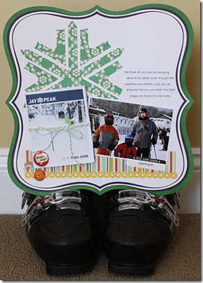
Look to your inspiration piece for embellishments that you can custom make and, thus, personalize your page. Celeste Smith (who we discovered accomplishes more during her lunch break than I do all day) used the logo from Jay Peak ski slopes as the inspiration to make a custom embellishment for her page featuring photos of her family skiing there.
2)Keep a closer eye on your food.
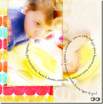
Yes. Even the food being eaten in the photos you’re scrapbooking can provide design inspiration. Here, on her page about her son’s love of noodles, Anna Aspnes used the curl of the noodle to inspire her journaling placement. (Think I’m joking about this whole food thing? Nope. You should see Anna’s waffle-inspired page!)
3) Photo arrangement gets a lot easier when you use an inspiration piece.
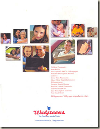
Paula Gilarde has long used advertisements to inspire her scrapbook pages—especially since it can often be the key to arranging photos on multi-photo pages. Here, she replicated the photo arrangement (and even the journaling placement and alignment) from a Walgreen’s print ad.
In our interview, I checked with Paula and can verify that she does NOT tear ads from the magazines at doctor’s offices—she snaps a photo with her phone instead.
4) It doesn’t have to have a rectangle to inspire page layout.
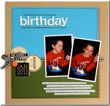
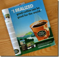
Lisa Dickinson blew us away in her webinar as we talked about how she used this Green Mountain Coffee print ad to inspire the layout on “Birthday.” It was an “aha” moment for me when I understood that there doesn’t have to be a rectangular photo on the inspiration piece to cue placement of a photo in that very spot! Rather, look to your inspiration piece to guide focal point (here the two photos subbing for the coffee cup), embellishments, titlework, color, and overall placement. I learned tons by understanding Lisa’s comprehension of this ad’s potential and her application of it.
5) The places you go will make you say: “Oh!”
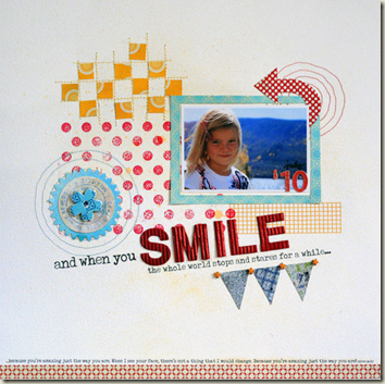
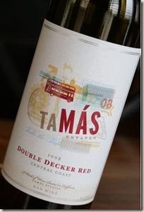
Lisa Dickinson says that she chooses wines by their labels – and she sure did right by this one. Just stop and look and see how she has replicated colors, layering, and angles here – even finding a spot for her photo that echoes the pale blue rectangle on the piece. Brilliant!
In-depth seminars, focused lessons, live webinars (with video & audio recordings), and annotated galleries make membership at Masterful Scrapbook Design an inspiring and instructional value. Join now and grab a discounted bundle of archived issues.

