by Debbie Hodge
Here’s a quick and easy way to get a scrapbook page started, improved, and then finally tweaked with small details.
It usually takes me 2.5-3 hours to make a page – no matter whether it’s paper or digital. In a quest to start speeding things up, I’ve come up with a process in which I just “get it down,” then make “macro” changes, and, finally, “micro” or detail changes.
Begin simply.
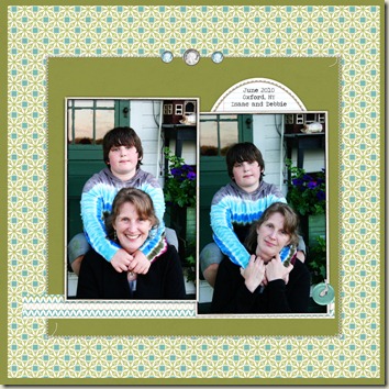
 Select your photos in standard sizes. Pick out a cardstock and one or two patterned papers you’d like to use. Place your photos in a simple, centered design that shows them off well.
- Here, I’ve got two portrait-oriented photos and some busy patterned paper (I love patterned paper).
- To make sure the photos stand out, I’ve added a narrow white frame (it could be a mat) and placed them on a solid cardstock.
- I cut a strip of coordinated patterned paper to run beneath the photos, and I used a simple oval label for my short journaling.
- What to embellish with? I used three gems in blue and grey to match the paper and then a blue button to repeat the blue and the circular shape of them gems but in a different size and style.
Make macro changes.
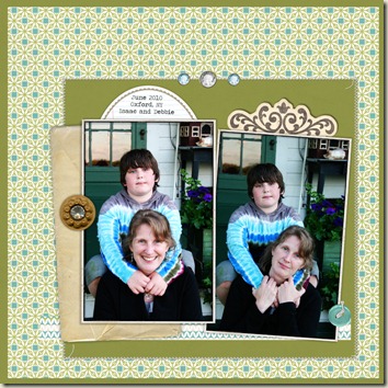
 The first thing I did was to move the entire grouping that’s matted on solid cardstock off center. I moved it down and to the right. If you’re wondering why I did this, read about asymmetry in page design.
- The next move I made was to add layers. I like layers, and my preference is usually for vintage look papers and elements. What do you like? Maybe misting, stamping, or brushwork is your preference. I added an aged envelope under the photo on the left. I added a scrolled journaling card peeking out from the top of the photo on the right.
- I tilted the photo on the right a bit clockwise—things were just feeling a little too rigid and formal.
- I scootched the oval label and journaling over to the left. To ground (or connect) the elements, I added a brown button. Its color repeated the brown in the scrolled journaler, and the gem in the center repeated the gems at top center of the cardstock mat.
Make micro changes.
 I finished the page by tweaking the details.
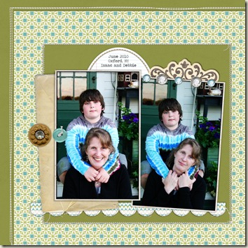
- The final change I made is the one that you’re probably noticing first – so I’ll talk about it first. I moved the patterned paper off center and bled it right off the bottom and right edges. This is really more of a macro change, but I didn’t know I wanted to do it until after all those little micro changes. It might be a little much for some folks – but I like it.
- The first detail I changed was to cut scallops from the strip of pattered paper running beneath the photos. The shape repeats the curve of the oval label and looks great against the cardstock—much more interesting that the straight edge. The styling of the elements I’m using works with this kind of romantic or frilly touch.
- Next, I was bothered by the separation between the oval label and the scrolled journaler, so I moved them to overlap.
- I decided to move away from the formality that the three centered gems were creating. I added a couple more and moved them to top off just one photo.
- Finally, I decided to move the blue button to sit up next to the brown button. I like how they contrast and aren’t as matchy-matchy as the series of gems.
And that’s it! I think I made this page in about an hour – a record for me!
Check out the supplies for this digital page in my DesignerDigitals gallery.

