When I blog with photos, my photos are cropped into a few predictable size/shape combinations. Knowing this, I’ve come up with quick and easy approaches for turning blog posts into scrapbook pages. These are not elaborately designed and embellished pages (which I also like to make). These are pages that get my family’s stories onto the page and into the album. This is especially important to me right now as I’m pulling together year-end albums for myself and extended family.
the photos: 3 to 5 portrait-oriented shots
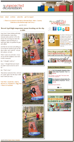 the approach: “Tilted Series”
journaling and title: Use a premade digital title and your journaling directly from your blog. Paper scrapbookers can set this up in Word on an 8.5” x 11” document and print to cardstock that size. I used Ali Edwards’ “The Story Titles” and ended up cropping my journaling and title block down to 7”x10” after I’d arranged things. Use a solid cardstock canvas. Place your journaling block to the right side of the canvas.
photos: Print or crop several portrait photos to the same size (about 3” x 4.5”). Trim them leaving a narrow border, or digital scrapbookers can add a “stroke” layer style. Here I’ve used a 25px white stroke placed “inside.”
Arrange photos in a tilted series on top of the journaling paper and running horizontally across the page.
embellishments: Select one accent color and then embellish with meaning-neutral embellishments like brads, tags, paper flowers, and ribbon of that color. Run a couple of strips of ribbon horizontally beneath the photos. Attach the journaling block with brads in the corners. Add a simple embellishment cluster.
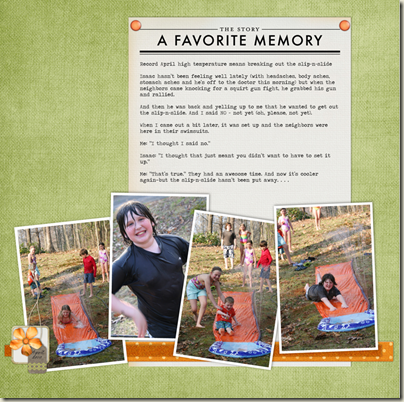 Supplies: Orange Crush kit by Lynn Grieveson, Brad Bonanza by Pattie Knox, The Story Titles by Ali Edwards, Mossscape Kit by Mindy Terasawa—DesignerDigitals.com.
the photos: 5 4”x6” photos — 3 of them landscape and 2 of them portrait
the approach: “The Big Block”
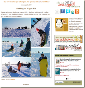 title: In your photoediting software, add the title to one of your photos. Use a premade digital title or your own digital title in a script font like Prelude or Pea Olson. Select one accent color for your embellishing and render the title in this color. To help the title stand out against the photo, “stickerize” it. Here’s a quick how-to for making stickers from fonts at The Daily Digi.
photos: Print your photos or arrange them on your digital canvas: Arrange the landscape photos in a column and the portrait photos in another column right next to them. Mount on subtle patterned paper or cardstock. Use stitching (digital, rub-on, or machine) to provide definition between photos.
embellishments: The title is the first point in your visual triangle. Place two other embellishment points on your page to complete the triangle. I used a red button on a snowflake at one point and a red brad at another.
journaling: Handwrite your journaling along one or both sides of your photo block
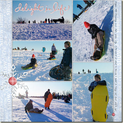 Supplies: Christmas Whimsy, Big Fabric Buttons, Foil Flakes by Jesse Edwards; Brad Bonanza by Pattie Knox; Everyday Hand Drawn Brushes by Ali Edwards. DesignerDigitals.com.
the photos: a mishmash of photo sizes & orientations
the approach: “Working From a Foundation”
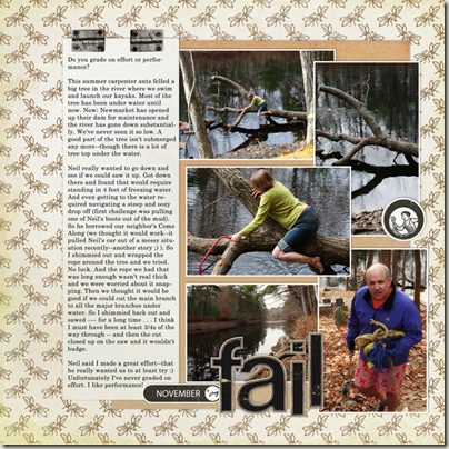
 Place an 8” x 10” “foundation” piece off-center on your page.
journaling: Type or write your journaling (straight from the blog) on a tall narrow block– I’ve used 3” x 10”.
photos: If you’ve got more than three photos, size/trim them to around 4.5” x 3” (similar to what we did on the slip-n-slide page). Trim your photos leaving narrow white borders (digital scrapbookers add a narrow white stroke/layerstyle). Since the photos are collaged and overlapping the stroke/border will give them definition.
Arrange your journaling block and the photos on your foundation – falling off the edge is fine, even good. The foundation gives you a base from which to work. Even if you don’t keep everything on it, it organizes and unites the grouping.
title: Use a simple one or two-word descriptive title and your favorite “chunky” alphabet—stickers, chipboard, die cut . . . Select a color that will contrast strongly with the background upon which it will sit.
embellishments: Embellish at the top of your journaling block – perhaps with a fastener. Use an embellishment that echoes the look of your title (this could be color, texture, material, styling). Now you’ve got a diagonal draw path from top of journaling to title. If you want to add more you could embellish near the title or add a third point in the triangle as I did the the black circle tag and epoxy on the right toward the top.
 Supplies: Backyard Expedition Kit, Printed Alpha, Handyman Elements by Lynn Grieveson, Date Spots, Hinge Pack by Katie Pertiet. DesignerDigitals.com.

