by Melanie Grimes (aka Britgirl)
Editor Intro: I’ve often admired the polish that Melanie Grimes’ digital scrapbook pages have, and I asked her to share some tips for finishing off pages.
Melanie is a photographer and digital scrapbooker from the United Kingdom. She’s a member of the Designer Digitals Creative Team (where she goes by Britgirl) and the owner of Melanie Grimes photography. You can keep up with her daily doings at her blog, Sweet Nothings and check out her digital scrapbooking gallery at Designer Digitals. If you’re looking for serious inspiration take a look at the iTunes challenge at Designer Digitals hosted by Melanie. She definitely pushes scrappers to work with unexpected inspiration for great results with this challenge.
Get the shadowing right
I try to make sure the shadowing is as realistic as possible. I really don’t like the ‘floating above the page’ look. But I don’t like the ‘no shadows whatsoever’ look either. When I used Photoshop Elements, I learnt to make shadows with the method Cassie Jones teaches in Laser Cuts and Drop Shadows. In a nutshell this technique includes selecting the item to be shadowed, feathering the selection, adding a layer beneath, filling it with a dark shade, lowering opacity, and nudging—Cassie’s got all the specifics on this in the tutorial.
I have Photoshop CS now, and I do it a little differently–BUT it was that tutorial that showed me how far and how much a shadow should show up. Getting this right has made a huge visual difference to my pages.
I play with the darkness and ‘spread’ of my shadows depending on the item. For example, thick solid metal elements would leave a different shadow than would a thin piece of paper. A soft crochet flower leaves a different one again.
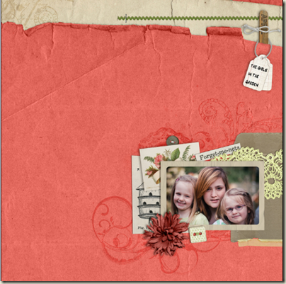
The red flower on this holiday page gets a softer shadow with more distance – even bending a bit (another trick you can learn from Cassie Jones in Bending Shadows. I’ve also included shadows with more depth on the wooden stick at top right and the string around it. For the paper pieces, though, I use a cleaner shadow with less feathering. See the card with the birdhouse and it’s sharp line. Notice the card above it (the one tucked behind the photo) is just a bit softer and has a bit more distance as it stacks up on the button and card beneath it.
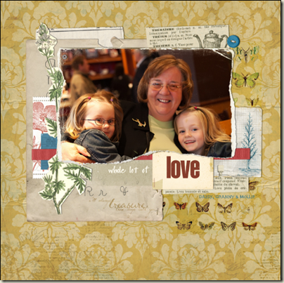
“Whole Lot of Love” is a page that I shadowed to get a realistically layered look without things seeming to “float” – something that happens when your shadows are so big and soft they make an element appear to not even be attached to the page.
Pay attention to the navigator thumbnail
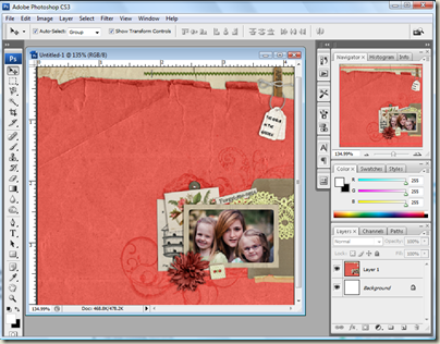
I use Photoshop CS3 and I have my workspace set to the default settings. Thus, there is a thumbnail of my page in the top right corner. I find that glancing at this gives me a better perspective of the overall layout of the page than viewing close up does. Often if I am ‘scattering’ items or brushwork and am not sure exactly where to place the next button, I’ll watch the thumbnail screen to see where it balances the page – or looks ‘just right.’
Dodging, burning and distorting. :)
They sound like a particularly aggressive set of directions don’t they?!
The very first place I learnt to dodge and burn was in the darkroom at college–it’s a valuable tool when you’re working with real negative film! So I knew how to use it on my photos, but it was via Cassie Jones’ tutorial Blend, Burn, and Dodge that I realized how valuable a tool it is for layouts, too! I use these tools to darken or highlight areas to add realism. For example, if I’ve got a photo attached with masking tape, I’d burn at the edge of the photo to get it a bit darker. This can really make a difference to how real it looks.
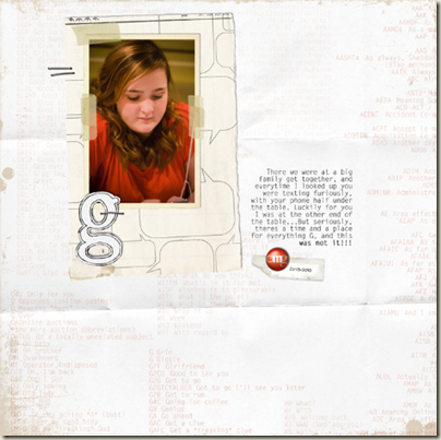
On “G,” at the edge of the photo where it’s overlaid with masking tape, I burned a narrow line to make it look more realistic.
After checking my spelling, I often rasterize my text. This enables me to warp or distort it on things like bent or creased journaling spots. {I have a mac and I hold the cmd key down whilst hovering over the edge of the text—which turns the cursor arrow to a grey triangle. Without letting go of the cmd key, I drag the cursor in whichever direction I need.} Unless you’re going for some wild effect less is definitely more here! I often also change the blending mode of my text, and lessen the opacity a small amount, trying out whatever makes it look more like ‘ink on paper’ than typing on a screen :)
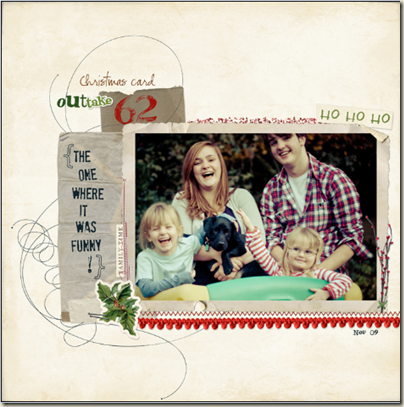
The type on the envelope on this holiday page has been reduced opacity-wise, and blending modes have been changed to make the text look more ‘on the card’ than typed on the top.
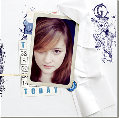
On “G Today,” I created a shadow over the top, right corner on the frame and then distorted it to make it look more like it was tucked under the paper.
Set the date. Name the person.
Always, always, always put the date on a page. I know: I too, am absolutely sure I will never forget which month of what year I went to Paradise, or which Baby that picture is of. But, then I remember the biggest reason I began to scrapbook: the frustrating box of nameless, dateless vintage photos under my parents’ bed. And I go back and add names, initials, and dates to every single page I make!
So, now, tell us: what are your finishing touches?
[learndigi]

