If you’re looking for some inspiration or ways to take your scrapbook page layouts in new directions, try using something different–something you don’t usually reach for. Below are three layouts that all use the same background paper by Die Cut With A View and the same page sketch–Sketch #39 by Debbie Hodge.
1. try a different style
There are so many great styles out there to choose from, try channeling a different style and chances are you’ll come up with an awesome hybrid of of the two styles! My page here is inspired by “Making an Art Journalish Layout” by Dina Wakley.
2. try using your supplies in a new way
Whether it be using a doily as a frame, or an alpha as an embellishment, or even your digital supplies on your paper layouts, every supply has multiple uses, so get creative and see the difference it makes! “Celebrating Us” was inspired by Paula Gilarde’s Designer Project and ebook “Embellishing with Alphas” by Debbie Hodge.
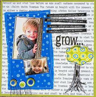
3. try out a new technique
Fun techniques can give your pages a boost, so pick a technique you’d like to learn and take a class or find an online tutorial! I think you’ll like the process of learning something new and the effect new techniques will have on your current style! “Grow” incorporates techniques I learned in Oodles of Doodles with Michelle Houghton and “Scrapbooking with Fabric” with Tania Willis.
.
[akingsford]


