by Debbie Hodge
What is asymmetry?
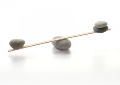
Asymmetry means “without symmetry.” Nothing is mirrored or centered. You could have an odd or mismatched number of differing elements. Designing with an absence of symmetry, does not mean there is not balance. Since there is no formula for asymmetrical balance, you must achieve it by sensing whether it looks balanced or not.
Why bother with asymmetrical balance?
While asymmetrical balance is more difficult to achieve than symmetrical balance, it is also more interesting. It requires more active involvement by your viewer and thus has more energy.
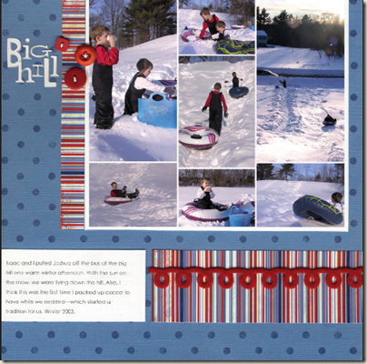
A large block of photos bleeding off the top edge dominates the upper right area of “Big Hill.” This unexpected placement draws the eye in immediately. The block is balanced and supported by journaling and patterned paper that fill a smaller area but run from edge to edge. Page title and three buttons at top left ground the photo block to the canvas as well as provide counterweight to the trim along the bottom in this asymmetrical page.
Are there at least some guidelines for creating asymmetrical balance?
Why, yes! Yes, there are.
Consider:
- as an element moves away from the center of your page it gains weight
- an interesting element has more weight than a less-interesting one
- an element on the right side of your layout has more weight than the VERY SAME element on the left side
- an element on the top of your layout has more weight than the VERY SAME element on the bottom
- the more you isolate an element the more weight it has
- regular shapes tend to have more weight than irregular shapes
Avoid:
- putting anything in the center of your page (on ANY axis going in any direction, horizontal, vertical, diagonal)
- putting any element in the center of any other element
- putting any element in the corner of your page or in the corner of another element
- putting any element half-on any other element
- lining elements up on their center axes
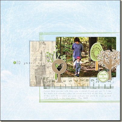
The photo and embellishment block in “10 Years Ago” is balanced against a larger area of white space. The block takes on weight with its placement to the right and its interesting content. Making it smaller than the white space and moving it closer to page bottom than page top reduces its weight and sets it in balance on the page.
Can I test for asymmetrical balance?
Again: yes!
Ask yourself where your eye goes when you look at the page. Does it move around more or less evenly (which would signal balance) or is it always returning to an area that is not your intended focal point (which would signal you to rethink your design)?
Now, go make a page with asymmetrical balance and link us up to it in the comments.


