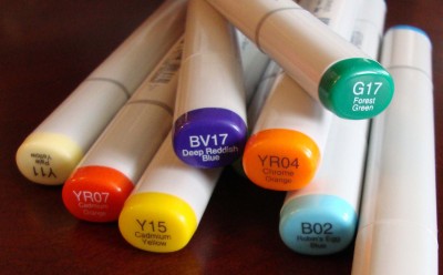
This is the 2nd article in a series by Michell on copic markers. See the first: An Introduction to Copic Markers.
The next step once you have some Copics is to get them out of your drawer and start using them. The magic of these markers, like I said, is in blending the colors together so lets look at how to do that. Before I start though let me say that this takes practice! For a lot of people blending and shading does not come naturally. It is an acquired skill that takes time to learn. So like anything worth doing it does take time to do it well. There will be some of you who pick up these pens and just get it, there will be others that have to work at it. Either way, here is some helpful info to get started and some step by step for those who need it.
You will want a quality smooth cardstock to work on. Heavier paper will stand up better to more moisture and the smooth texture is a must for your drawing. Most people will start with a stamped or drawn image to fill in with their Copics. If you are stamping make sure to use an ink that will be compatible. The one that is being highly recommended right now is Memento. The ink needs plenty of drying time. Make sure to allow a few hours, or if you are short on patience like myself, you can use a heat gun to speed up the process a bit. DO NOT use your Staz On ink, this will ruin your Copics! If you are wanting to start with your own doodle or sketch Copic makes their own black pens that work well with the Copic markers. There is the Multiliner, Multiliner SP, and Sketch pen. These are harder to find and my local scrap booking store did not know about them even though they are selling Copic markers like crazy. You will probably have to find an art store to locate one of these. As you would with any pen try it in the store so you can double check thickness and feel. What I liked about the Multiliner SP, that I purchased, is no drying time, just doodle and then fill in your design. Both other pens would work this way as well.
Once you have an image stamped or drawn you are ready to start playing. Now remember this takes practice so no starting on the image already attached to your card you are sending to Mom in the mail today! Get out a practice sheet stamp or draw a dozen images and get ready to experiment.
Step 1) Pick your lightest color and fill the area you are going to be shading completely from edge to edge. Move your marker in small circle strokes, this helps avoid streaking. I prefer working with the brush tip of my markers, but try both to see what works for you. You want to get nice even coverage. Do not worry about getting the page too wet, the alcohol that suspends the ink is not like water, it will not tear up your paper. I am starting on a stamped image. I used a stamp by Hero Arts, ink by Memento and Copic Sketch marker B00.
Step 2) Take your next marker that is one or two numbers higher. It should be one or two shades darker but in the same family as your first color. Add this darker color on top of your lighter color where you want your shading to occur. If you are not sure where to put the shadows, try experimenting with edges and along creases for now. I will come back with another lesson on creating depth with Copics if there is an interest. For this step I added Marker B02.

Step 3) Come back with your first marker, the lighter one, and again using small circular strokes go over the area where the two colors intersect. The alcohol in the markers acts as a solvent softening the edges and blending the two colors together. You want to work fairly quickly through steps. Letting the inks dry in between makes it considerably harder to blend and often leaves your work blotchy. I came back with marker B00 to do the blending.
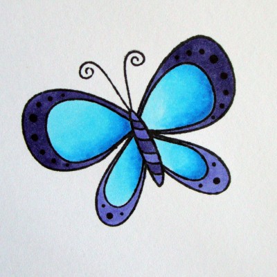
 Step 4) You can finish with step 3 or you can go on and add darker shades. Each time you will work back through your lighter pen to blend the colors together. Do not worry about contaminating the tip of the lighter pens they do not pick up the ink they just push it around. On my image I added a third color B05 to the blue and colored the other wings in the same way. Then I used BV13 and BV17 to complete my butterfly. I did not do any blending with the blue, violet colors, just used them to fill in the body and wing outline.
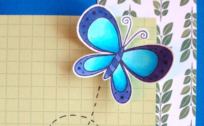
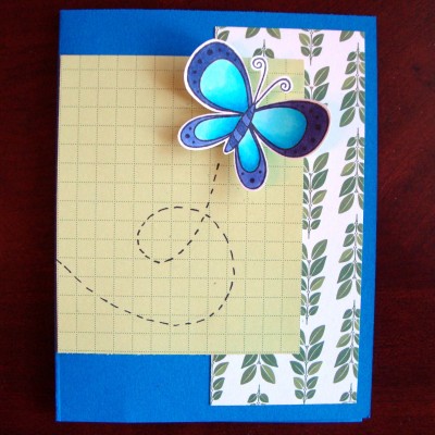
Here is my finished butterfly all cut out and ready to fly through the mail to a friend. I am not a great card maker but I have to say this little colored butterfly sure made a nice card!

